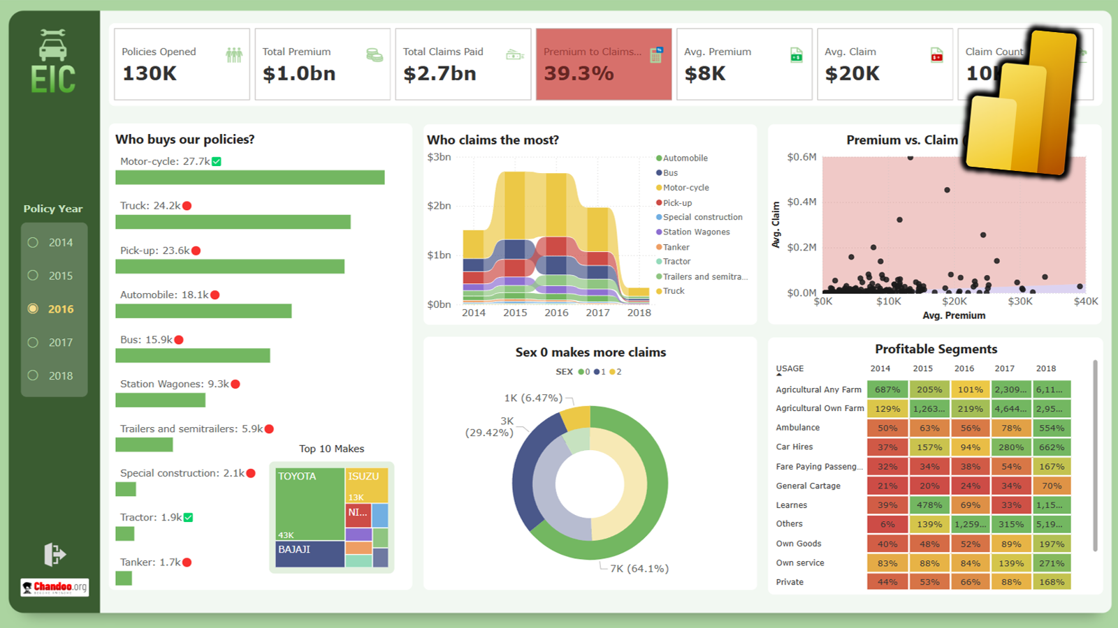
Here is a best practice to improve your dashboard usability. If you have an interactive dashboard, highlight user selections thru conditional formatting.
Check out below quick video to understand what this means.
You may watch this video on our YouTube channel too.
Download Example workbook
Please click here to download the example workbook for this video. Play with conditional formatting rules to learn more.
More ways to create awesome dashboards
- Never use simple numbers in your dashboards
- Place all vital information in golden triangles
- Show alerts & warning icons in dashboards with conditional formatting
- Create duplicate controls to improve usability of dashboards
- Add text narrative to your dashboards – case study
- Use shapes to enhance dashboards & charts
- Process & explanation – how to create awesome dashboards – podcast


7 Responses to “CP014: How to create awesome dashboards – 10 step process for you”
Very interested in topic unfortunately I get no sound when I play it.
Where can I get add ins for excel 2007
#Budala
Try using Google to search for Excel Addin
I would like to join your email newsletter.
@Andy
Goto: http://chandoo.org/wp/
The newletter registration is top Right corner
Hello Chandoo,
i am one of the great fan of your. i am one MIS executive in realstate company.And i try make dash board for CRM(Client Relation Management) Dept formance and anlysis process.Its get created not so effective according to can u suggest me .what i hve to give or take for makeing it for effective and attractive?.
regards,
Shashak verma
Hi,
I want to create an interactive dashboard in excel (Google Drive) which should have multiple data along with beautiful charts..
I handle two teams in IT Tech support so were preparing 2 different dashboards.. however need to club and want to create single report, can anyone help something like