
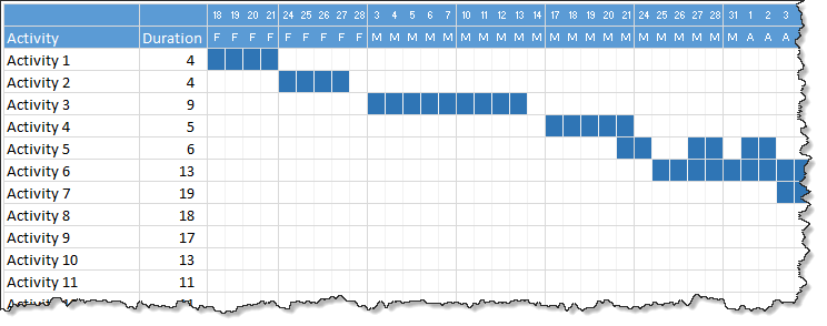
Gantt charts are a very popular way to visually depict project plans. Today, let us learn how to use Excel to make quick & easy Project Plan Gantt Chart.
This is what we will be creating,
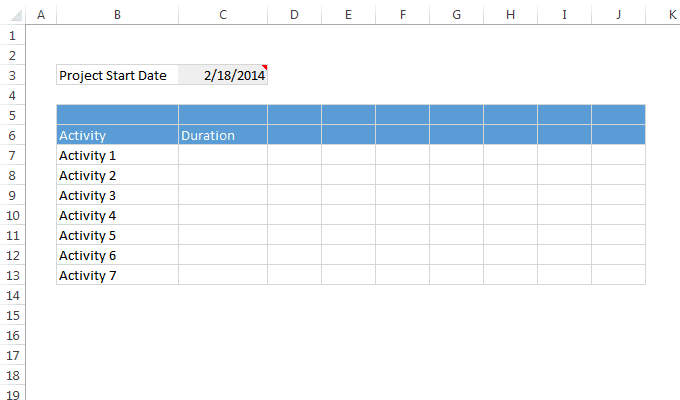
Step 1: Set up project plan grid
First step is simple.
In a blank worksheet, set up an empty grid like this:
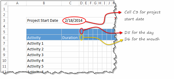
Key things to note:
- Project start date goes in to cell C3
- Project dates appear from cell D5 & D6 onwards, one day per column.
- Make the grid as big as you want. I choose 20 activities x 120 days.
Step 2: Fill up dates
Now, lets load the dates in to the plan. The first day of the project is known (it is in cell C3.)
- Select D5 and point it to C3 by typing =C3
- Set D6 to the same value as D5 by typing = D6
- Now, both D5 & D6 contain the same date. (Why 2 dates? You will understand in a minute!)
- In next column (E), we want the next working day.
- So in E5 type =WORKDAY(D5, 1)
- Now, select D5:E5, format them so only DAY portion of date is shown. To do this, press CTRL+1 after selecting them, in Number tab, select Custom and type d, click ok.
- Select D6, format it so only the first letter of the month is shown instead of entire date. To do this, set number format code as MMMMM.
- Drag E5 sideways for all the dates.
- Drag D6 sideways for all the dates.
- Our dates are ready!
Here is a demo of all the steps:
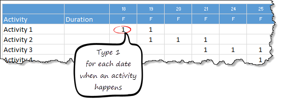
Step 3: Enter project plan data
Now that our grid is ready, enter the data. This is simple. Just type 1 whenever an activity is happening on a date. For example, if Activity 1 happens on 18th & 19th of February, type 1 in both cells.
Step 4: Calculating Duration
This is really simple. In the duration column, select first cell and type =COUNT(D7:DS7)
Note: Make sure you change the cell references based on the number of columns and where your data is!
Drag down the formula to get duration for all activities.
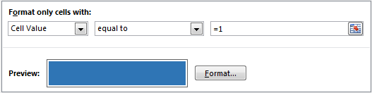
Step 5: Apply conditional formatting
Now that all the plan data is ready, lets tell Excel to highlight all 1’s so that we get a Gantt chart. Quick & Easy!
- Select the entire grid (excluding activity names, durations & dates)
- Go to Home > Conditional formatting > New rule (Related: Introduction to conditional formatting)
- Specify a rule to fill color in all cells with 1.
- Also, set cell formatting to ;;; so that the contents (ie 1s) are not visible. (Related: Making cell contents invisible)
- See the conditional formatting rule I have used below:
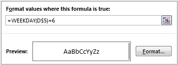
Bonus trick: Visually separate weeks with a border
Since our plan has many weeks, it would be cool to show a vertical line between every week. To do this:
- Select the grid again.
- Add a new conditional formatting rule
- Select the type of rule as “Use a formula…”
- Use this formula =WEEKDAY(D$5) = 6
- Set up formatting so that right-side vertical border is shown when the rule is met.
- You are done!
That’s all, our quick Gantt chart is ready
That is all. Your quick project plan is ready. Go ahead and show it off. Use it for an upcoming project and impress your boss.
Download the quick Gantt chart template
Click here to download the template. It contains instructions on how to modify the template. Go ahead and example the formulas, conditional formatting rules to understand more.
How do you like this quick & easy template?
Although I have a lot of complex project plan templates, often I rely something quick & easy like this. It simply works and lets me focus on the project at hand.
What about you? Do you use quick templates like this? Please share your experiences and ideas using comments.
More on Project Management using Excel
Are you a project manager or analyst? Here are a few more examples, templates & resources for you.
- Excel Project Management page – huge collection of tips, resources and downloads.
- Gantt charts using Excel
- Project status dashboard using Excel
- Project Portfolio dashboard using Excel
If you are a project manager or analyst, you would be working with Gantt charts, status reports, issue trackers & project dashboards every day. If you are tired of creating these from scratch, get my Excel Project Management template pack.
It contains 25+ Excel templates for various needs of project management – right from planning to tracking to reporting. All beautifully designed and easy to customize so that you can be an awesome project manager.
Click here to know more and get your copy today.


7 Responses to “Project Dashboard + Tweetboard = pure awesomeness!!!”
I would like to see actual hash-tagged DM tweets go out to the specific information consumers. That would be an interesting way to communicate the key daily data to interested parties.
A Twitter-like secure application like Yammer might be a good fit with this.
For example, how about daily tweets to selected user groups (secure) that would display sales, bookings, cash receipts, cash disbursed and a second version that would show the same info for MTD, QTD or YTD figures.
@Dan, it would be great. I did not taught about implementing it on this dashboard because twitter is blocked to the whole intranet here. However, there's a discussion here about how can we send these tweets to blackberries (probably through e-mail) automatically. (I'd like to see this implemented on a jabber restricted network as well, but here it'll probably not happen)
The wrap-up versions you mentioned doesn't apply to my particular scenario, but on a sales tweetboard it would be a great tool indeed - choosing who will receive which message according to hashtags. I'll think on something, thanks for the advice. 🙂
(Ah, btw, I'm Fernando... 🙂 )
@Dan: That is a fun idea. Instead of tightly integrating twitter functionality with a dashboard, i think it would be cool if we have a "tweet this" button that users can click after selecting a range of cells. We can easily show a dialog with the concatenated output of the selected cells and ask user to edit the text and eventually "send to twitter".
For eg. you can select the annual sales figure cell and click on "tweet this" button upon which a dialog will show the value. Then you can pre-pend it something like "DM @boss look at our sales this year: "
@Aires.. thanks once again.
Wow it looks really good. Not sure though how much the tweet facility would help in real world project management, but certainly having a dashboard on a project should be a key deliverable when learning how to manage a project
The other use of this is during the software development life cycle especially when you have parallel streams of development and testing going on. Using a dashboard is a quick way for everyone on the team to see where the project is at and how it all fits together.
Regards
Susan de Sousa
Site Editor http://www.my-project-management-expert.com
Hi Chandoo,
I purchased the project management toolkit but the dashboard shown above with the imbedded scroll bars. Is it included in the project pack??
Thanks
Sue
The gantt chart section of this dashboard is similar to one I have recently created: http://xlcalibre.com/hr-dashboard-gantt-chart-traffic-light-reportIt has a similar approach with scroll bars, but has a couple of additional features. I've tried to incorporate a traffic light report element, and also allow the timescale to adjusted so that can view it by days, weeks or months.I really like the other tables that you've incorporated, I may well try to replicate them to improve my version!
I am a monitoring and evaluation consultant in international development, and one of the services I offer is to help non-profits and foundations develop performance dashboards. I often advise them to develop dashboards for ongoing programs, rather than for one-time or pilot projects, because of the time involved. I am trying to find out from a few people how long it takes you to develop a project management dashboard, and to what extent the indicators vary from one project to the next.