
For every column chart that is done right, there are a dozen that get messed up. That is why lets talk about 5 simple rules for making awesome column charts.
Tip: Same rules apply for bar charts too.
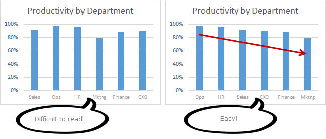
Rule #1: Start at zero
The first rule is simple. Always start your column charts at zero. When looking at column (or bar) charts, our mind measures height of each column and compares. So, if a column starts at some arbitrary point instead of zero, it can mess with our perception of how each column compares with other. Don’t believe me. See yourself.

Related: What is the most embarrassing charting mistake you made?
Rule #2: Thou shall sort
Sort your columns in a meaningful order. For example, sort them by descending order (of column heights), alphabetical order or chronological order. This will make reading the chart easy.
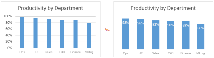
Rule #3: Slap a title on it
Give your chart a meaningful, clear title. Few examples of good and bad titles shown below.
 Rock star tip: Using smart titles & legends in your charts
Rule #4: Axis & Grid-lines vs. Labels
For most charts you can use data labels instead of axis & grid-lines. This will keep the chart clean.
If you choose to go with Axis and gridlines, then make sure they follow below guidelines.
- Axis label text should be relatively small & dull.
- Grid lines & axis line should be dull too.
- Do not display too many or too little major units on axis. You can change major unit size by selecting axis and pressing CTRL+1 (or axis options pane in Excel 2013).
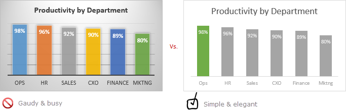
Rule #5: Too much lipstick and you have a pig
Make sure the formatting (colors, fonts, special effects, backgrounds etc.) of your chart are really subtle and meaningful. If you use too many colors, you end up with a pig. People will then focus on all these colors, fonts instead of actual data.
Few ways to add wow factor to your chart without messing it up:
- Highlight a particular column (for example max value, min value etc.) using different series technique.
- Use descriptive titles, clever data labels to show more information.
- Use drawing symbols or shapes to enhance the message of chart.
- Make your chart interactive to give users control.
- Add Emojis even
So there you go. Follow these rules and your column charts will stand tall.
Share your rules for making awesome column charts
While above rules capture the gist of making good looking column charts, there is more to learn and follow. So go ahead and share your rules and tips using comments. Teach us how you make stunning column charts (or bar charts). Post your comments below.
Make charts often? Check out these tips:
If your job involves analyzing & charting data, then check out below tips to learn more.


26 Responses to “FIFA Worldcup Excel Spreadsheets [Roundup]”
Nice roundup! Do you know of any one-page spreadsheets which will be updated by an administrator after each game? Would be nice to be able to print out the latest results whenever I feel like checking them as I probably won't be following closely every day.
I actually haven't tried any of the above ones yet, but I thought I'd mention this one that I found which makes a nice one-page form you can fill in dynamically. http://exceltemplate.net/sports/world-cup-2010-schedule-and-scoresheet/
I would like to recommend you these one: http://www.anotagol.com/
You can choose your interface language (english, spanish, italian, portuguese, german or french) and your country for the timezone of match. I like it very much.
An awesome online world cup calendar in flash.
http://www.marca.com/deporte/futbol/mundial/sudafrica-2010/calendario-english.html
Got one more tracker in excel (one page)
http://cid-b09e57e6e960505c.office.live.com/browse.aspx/.Public
[...] Passend zu gerade laufenden Fußball-WM gibt es auf Chandoo.org alles wissenswerte über Excel-Anwendungen für den Fußball-Fan. [...]
Great!!!
I strongly recommend this :
http://www.en.excel-soccer-2010.de/downloads
Chandoo how you found this ...
@Rohit.. really beautiful file. I missed it during my research. Now, I recommend it. 🙂
Hi Chandoo - thanks for the recommandation 🙂 - Regards
[...] Excel, then print it on the other side of your Match Schedule from step 2 above. There are several other Excel spreadsheet templates you can download, but this is probably the only one-page version you can find; plus, it [...]
Does anybody know how to re-create this(?): http://www.marca.com/deporte/futbol/mundial/sudafrica-2010/calendario-english.html
...or do you know where a template can be found? I am DYING to have something like this on my site. When I found it, I had been looking for the longest time for a circular calendar. I found a couple that weren't adequate. Then I stumbled upon this one and my eyes nearly popped out of my head. If anyone can lead me in the right direction, I would be eternally grateful!
Thanks in advance!
Robert
@Robert...
Doing something like that is a lot of work. You can probably get it done with some hired help from a flash developer.
@Robert, the World Cup flash in the Spanish Marca newspaper is impresive, but not much as my own animated spreadsheet with the Goals of 2010 World Cup South Africa in Excel that I just published into my blog:
http://pedrowave.blogspot.com/2010/06/goals-of-2010-world-cup-south-africa-in.html
Download from here:
http://cid-6b219f16da7128e3.office.live.com/view.aspx/.Public/Goals%20South%20Africa%20Animated.xlsx
And start to enter the goals of the rest of matches.
Has anyone seen, or made, a Spreadsheet where you can record the scorers and see a 'top scorers' chart. Would be a nice enhancement
@Neil... checkout this one http://www.inflexionary.com/sports/world-cup-2010-excel
it uses macros to fetch scores from web (and provides very comprehensive analysis too)
@All.. Thanks for the comments. I have updated the post with few more links now.
Hi,
Check this dashboards too:
http://dashboards.org/world-cup-dashboards-and-visualizations/
😉
[...] Here is a collection of FIFA World Cup Spreadsheets if you are more in to that sort of thing. | [...]
[...] Cup fever is here!In FIFA Worldcup Excel Spreadsheets Roundup, Chandoo has some links to useful World Cup tracking workbooks. Only one of them (the first one) [...]
[...] World Cup fever is here!In FIFA Worldcup Excel Spreadsheets Roundup, Chandoo has some links to useful World Cup tracking workbooks. Only one of them (the first one) [...]
Hey, you missed ours! It has everything you need and more, but not a whole pile of silly extras (National Anthems, etc). I'll be making another one for the 2014 world cup. We had over 4000 hits on it!
@Michael Harwood.
Where is it then? You should have posted a link
Sie sollten an einem Wettbewerb teil zu nehmen für einen der besten Blogs im Web. Ich werde empfehlen Sie diese Seite!
Google translation: You should take part in a contest for one of the best blogs on the web. I will recommend this site!
[...] and welcome to the forum, Maybe these similar spreadsheets might give you a few initial ideas: FIFA Worldcup Excel Spreadsheets [Roundup] | Chandoo.org - Learn Microsoft Excel Online If you have specific areas / formulae / layout choices for parts of your spreadsheet that you are [...]
Calling all football fans around the globe! The biggest football festival will kick off on the 12th June 2014 and everyone is placing their bets of who will have the honour of lifting the golden trophy.
Use our free interactive Excel templatel to predict the World cup finalists ! No macros !
http://www.spreadsheet1.com/world-cup-2014-free-excel-prediction-template.html
I also made a Worldcup-tracker, with MS Access, which can also generate reports in Excel
e.g. a match-schedule with locations on y-axis and dates on x-axis, see:
http://worktimesheet2014.blogspot.com.es/2014/05/excel-with-match-schedule-for-2014-fifa.html
and:
http://worktimesheet2014.blogspot.com.es/2014/05/match-access-app-to-track-world-cup.html
where can i find raw data in excel file format of fifa world cups (1930-2014)
@Vivek
Have a read of: http://chandoo.org/forum/threads/goal-of-world-cup.17637/
The location is mentioned in Somendra's comments
Free XLSX Prediction Spreadsheet for World Cup 2018 Russia!
https://www.spreadsheet1.com/fifa-world-cup-2018-russia-free-prediction-templates-for-excel.html