
This is a guest post by Drew Kesler.
You’ve been there before. It’s almost 5:00, and you are going crazy trying to finish the presentation due for a monthly performance meeting the next morning. The model is refreshed, and now it just takes a LOT of copying, pasting, and positioning to get the PowerPoint ready. Finally, the slides are finished…, until you read a new message from your boss requesting a minor change. But of course her change means you have to start all over with the copy and pastes…
There is always a better way! In the Oil and Gas industry, I constantly have monthly reports to assess the performance of our operating assets. Excel VBA makes it a cinch to automate the entire process. So when a simple change is requested, the presentation is automatically generated with the click of a button. No more wasting time!
So, here it is – How to Save TONS of Time by Using an Excel VBA Macro to Build Your Presentation:
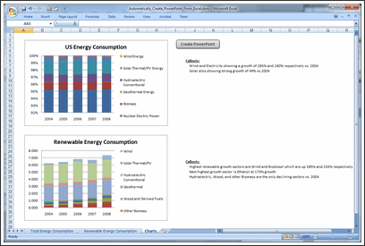
1. Build your charts in Excel
2. Create a new worksheet and paste in all the charts you need for the presentation.
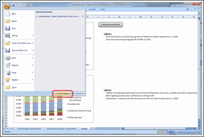
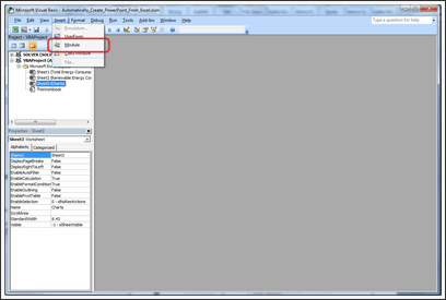
3. Open VBA. To do this, you can either press ALT + F11, or you can take the following steps:
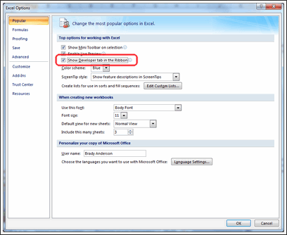
a. To show the developer tab, click on the Microsoft Office Button and click Excel Options.
b. Click Popular and then select the Show Developer tab in the Ribbon.
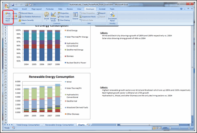
c. Click on the Developer tab in the ribbon and click Visual Basic.
4. In your VBA Editor window, click File => Insert => Module.
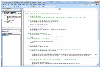
5. Paste the following code into the module (I included comments so you can customize it to your liking).
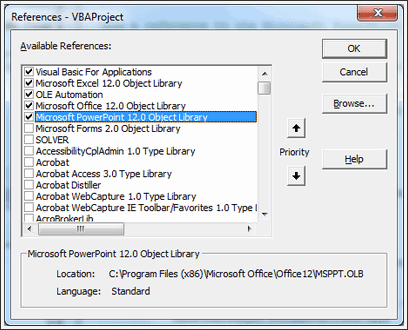
6. Click Tools => References.
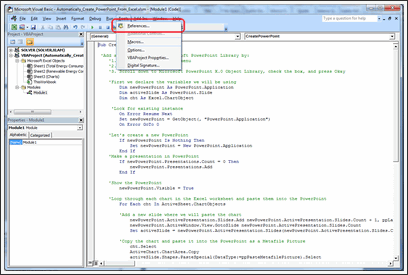
Add the Microsoft PowerPoint Library.
7. Now all you need to do is go to Excel and run the CreatePowerPoint macro! To make this easy, draw a rectangle shape in your Excel worksheet which contains all the charts you want to export to PowerPoint.
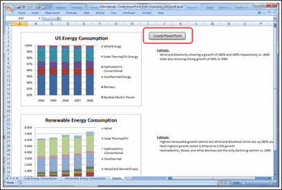
8. Right click the rectangle and click Assign Macro.
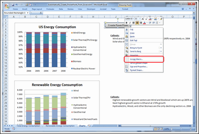
9. Click on the CreatePowerPoint macro and press Okay.

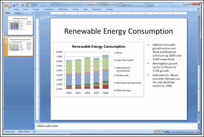
10. That’s it! Just click your rectangle button then sit back and watch it run! You’ll have your presentation in no time!
Download the Example Workbook & Play with this Macro
Click here to download the example workbook and play with the macro.
Note: If you have an error with Power Point application activation, use this code instead.
AppActivate ("Microsoft PowerPoint") <-- if this doesn't work
AppActivate "PowerPoint" <-- use this
Thanks Drew
Thank you so much Drew for writing this insightful article and showing us how to automate PPT Creation thru Excel VBA. I have really enjoyed playing this idea. And I am sure our readers will also like it.
If you like this technique, say thanks to Drew.
How do you Automate PPT Creation?
During my day job, I used to make a lot of presentations. But each one was different. So I used to spend hours crafting them.
And nowadays, I hardly make a presentation. But I know many of you make PPTs day in day out. And this technique presented by Drew is a very powerful way to save time.
Do you use macros to automate creation of presentations? What are your favorite tricks & ideas? Please share using comments.
Learn More VBA – Sign-up for our VBA Class Waiting List
Chandoo.org runs a VBA Class that teaches you from scratch, how to build macros to save time & automate your work. We opened our first batch in May this year and had an excellent response. More than 650 students signed up and are now learning VBA each day.
If you want to learn VBA & advanced Excel, this is a very good class to join.
Click here for full information on VBA classes.
About the Author:
Drew Kesler specializes in process automation and data visualization. He currently performs analytics and modeling for the Oil and Gas industry. His most recent projects include using GIS mapping technology to visualize data and enhance interaction across organizations.


212 Responses
Hmmm…whilst that’d be very handy sometimes, I’ve often found it’s quicker and easier to simply link the charts to a PowerPoint, meaning that any time you update the chart, you update the PPT too.
Wondering if there is a way to actually use excel slicers while in PowerPoint Presentation mode. I figured out how to incorporate the slicers into the PPT but when you switch to presentation mode, you can’t click on an fields to change the details. Anyone know if this can be done?
Hi there!
we have prepared a simple and useful solution for that issue. Check the following video, where its presented: http://www.youtube.com/watch?v=inBBlpd9qQ4
You will find the contact information and we will provide you that Add-in.
Than really saves you a lot of time!!
Good luck!
hi,
I want to create a ppt but to take each chart and table from every sheet. how can I do it?
question 2: If my ppt already exists and there has been a change in the data, I need the charts and tables to only update in my ppt.
how do you suggest I solve it?
thanks
Adi
Hey
here is a “cool” VBA-Code to create on the first slide thumbnails of all slides !
Regards
Stef@n
Sub thumbnails()
Dim strPath As String
Dim i As Integer
Dim n As Integer
Dim sld As Slide
strPath = ActivePresentation.Path
n = ActivePresentation.Slides.Count
ActivePresentation.SaveAs FileName:=strPath & “\Test.png”, _
FileFormat:=ppSaveAsPNG, EmbedTrueTypeFonts:=msoFalse
Set sld = ActivePresentation.Slides.Add(1, ppLayoutBlank)
For i = 1 To n
sld.Shapes.AddPicture FileName:=strPath & “\Test\slide” & i & _
“.PNG”, LinkToFile:=msoFalse, SaveWithDocument:=msoTrue, Left:=i * 30, _
Top:=i * 30, Width:=144, Height:=108
Next i
End Sub
Hi,
I can’t make it work. 🙁
I get the error 424: Object required.
I suppose this is because of an object library is not properly referenced, but which?
Thanks!
I too am getting this error and can get the sample file to work. This would be great for a project I am currently working on.
It is not clear to me from the trailing posts if the problem with the above not working has been fixed. However, the slightly modified code below works with Office 2010 (Powerpoint), and produces a slide with thumbnails (iMaxSlidesHorizontal (8) to a row).
Sub thumbnails()
Dim iFullHeight As Integer
iFullHeight = 0
Dim iFullWidth As Integer
iFullWidth = 0
Dim iHeight As Integer
iHeight = 108
Dim iHSpacing As Integer
iHSpacing = 10
Dim iMaxSlidesHorizontal As Integer
iMaxSlidesHorizontal = 8
Dim iVSpacing As Integer
iVSpacing = 10
Dim iWidth As Integer
iWidth = 144
Dim n As Integer
n = ActivePresentation.Slides.Count
Dim strPath As String
strPath = ActivePresentation.Path
Dim sld As Slide
Dim i As Integer
Dim iSlidesHorizontal As Integer
iSlidesHorizontal = 0
Dim iSlidesVertical As Integer
iSlidesVertical = 0
ActivePresentation.SaveAs FileName:=strPath & “\Test.PNG”, FileFormat:=ppSaveAsPNG, EmbedTrueTypeFonts:=msoFalse
Set sld = ActivePresentation.Slides.Add(1, ppLayoutBlank)
For i = 1 To n
sld.Shapes.AddPicture FileName:=strPath & “\Test\slide” _
& i _
& “.PNG”, _
LinkToFile:=msoFalse, _
SaveWithDocument:=msoTrue, _
Left:=iSlidesHorizontal * (iWidth + iHSpacing), Top:=iSlidesVertical * (iHeight + iVSpacing), _
Width:=iWidth, _
Height:=iHeight
iSlidesHorizontal = iSlidesHorizontal + 1
If iSlidesHorizontal >= iMaxSlideHorizontal Then
iSlidesHorizontal = 0
iSlidesVertical = iSlidesVertical + 1
End If
Next i
End Sub
this code says runtime error 429
ActiveX component cant create object. can you please help
@ steve
i agree !
regards Stef@n
On occasions I have to create a large number of photo sheets for inclusion in a report. That is, a page with one or two photos and a description. Using a list in an excel spreadsheet that gives the file name for the photo and a description I written a macro to generate a powerpoint presentation that can be saved as a pdf or printed out. Any changes to photo or description are simple to do in the list.
Datapig had a similar method.
http://datapigtechnologies.com/blog/index.php/creating-a-powepoint-deck-in-excel/
This works in 2003
I downloaded the example spreadsheet in Create PowerPoint Presentations Automatically using VBA. Excel says this file is not in Excel format even though it has an .xls extension. I am using Excel2003. Any ideas?
How do you copy charts from excel into PowerPoint as ChartObjects (not metafile or linked image)?
In excel 2003 we had the graph engine which enabled us to paste the chart data into Graph.DataSheet. Whats the equivalent in Office 2010??
I have a few large presentations (~300 slides). My approach was to make a chart for every possible permutation, then link them all into PowerPoint. The powerPoint works like a website, so the user can click around to get to the chart they are interested in within 1-2 clicks.
Unfortunately, this approach doesn’t seem to work in Office 2007. First, it takes forever to update the links, if it does it at all. Second, once they are updated, when you go into slide show view in PowerPoint the fonts are all fuzzy (I’ve looked into this and it has something to do with the way PP07 scales the slides). There appears to be no solution to this so now I need a new approach…
I’ve tested the following approach a little and it seems to work. I have a sub that exports all the charts out as images:
Sub Export2Image()
Dim oCht As ChartObject
Dim flPath As String, fName As String
Dim ws As Worksheet
Dim cs As Chart
Dim i As Long
flPath = “C:\Excel\Exports” ‘Put files in this folder
ChDir flPath
For Each cs In ActiveWorkbook.Charts
i = i + 1
fName = cs.Name & i & “.jpg”
cs.Export Filename:=fName, FilterName:=”jpg”
Next
For Each ws In ActiveWorkbook.Worksheets
For Each oCht In ws.ChartObjects
i = i + 1
fName = ws.Name & i & “.jpg”
oCht.Chart.Export Filename:=fName, FilterName:=”jpg”
Next
Next
‘MsgBox (“All workbook charts have been exported as images to “) & flPath & “.”, vbOKOnly
End Sub
Then in PowerPoint I link to the image on the file server. The only problem I’ve noticed is some of the charts have the little red “X” in the corner, but it goes away after a second or two. Though this approach seems to be viable, I am open to other suggestions. I tried the code above, but it doesn’t really work for me because I have set slides with set text, I only need to update the chart.
@GrahamG : Can you share a file and procedure as you mentioned on your comment?
@Drew: Wow thanks for sharing the info…you’re a life saver.
Guys,
Can someone post on how to modify the VB script for the case below:
If you have a mixture of Chart and Picture in your workbook or if you have pictures only.
Meaning the presentation should be created using the pictures from excel the excel workbook, with comments as on the example sheet ofcourse.
Please help!!!
Thanks Drew, Its really useful code to work on powerpoint. If we can export it to excel again it may be awesome.
My choice is steve’s because most ofthen than not you have made other customization on the powerpoint slide/chart.
But it is great to know new technique.
@Donald: Use the CopyPicture method. For example, if you go into drew’s code, you will see the line:
ActiveChart.ChartArea.Copy
Change that to the following line:
Sheet1.Range(“A1:I19”).CopyPicture xlScreen, xlPicture
——————————————————————————
Note that when you run the program it copies the contents of A1:I19 onto your presentation from Sheet1. Hope that helps!
Here’s a link to the CopyPicture method: http://msdn.microsoft.com/en-us/library/bb148266.aspx.
Also, I’ve used and much prefer Drew’s method overall. If your PowerPoint presentation is a report, then linking to the data source isn’t always best when you need to send the presentation to your client or to another office branch, both of which might be outside of your network. Furthermore, generating a new presentation upon changes effectively creates an historical record. And finally, creating a presentation that isn’t linked to the data source “walls off” your actual data such that nefarious and reckless can’t harm it!
Drew,
nice post. I have done something similar on my blog:
http://www.clearlyandsimply.com/clearly_and_simply/2010/03/export-microsoft-excel-dashboards-to-powerpoint.html
I thought you might be interested.
—
Along the same lines: I also had an article describing how to export a Microsoft Project Gantt chartto PowerPoint.
The interesting part of the Project VBA export procedure is the fact that it does not export the Gantt as a picture. It rather creates a project plan in PowerPoint consisting of PPT objects like textboxes, rectangles, triangles and diamonds. You can format, align, rearrange, group and resize them, add annotations, delete single items, etc. in PowerPoint.
This may be a bit off topic, because Chandoo.org is a Microsoft Excel blog, but if you are using Microsoft Project, too, you may want to have a look:
http://www.clearlyandsimply.com/clearly_and_simply/2009/03/gantt-charts-are-learning-to-fly.html
thanks for sharing the trick. However, is it possible to export in a chart format instead of picture format?
@ drew, THANK YOU for sharing, and starting this thread.
@ everyone else, yes there are different ways of doing things. Sometimes your solutions would be better than drew’s and sometimes drew’s will be a better method.
thanks for sharing your solutions
@chandoo/hui
can you make it easy to understand each option by expanding on this thread?
@Vikas
Select your chart in Excel, Go to PowerPoint and do Paste Special> Choose PasteLink> Choose Microsoft Excel Chart Object. You are done.
Now whenever you change your excel, just update link of Powerpoint. Your Chart will instantly updated.
hay its cool but it uses blank PPT tamplate what about using Companys own PPt Tamplet
@FINCRIBE
create and save the PPT-Template as a POT-file
Regards Stef@n
is it possible to modify the VBA to copy all charts from all worksheets into 1 single powerpoint file?
reason is that multiple charts are scattered across few worksheets and it’d be easier (or lazier) to copy ALL charts 😛
btw, any chance to perform similar copy-n-paste to Outlook Email (HTML)?
as u know, bosses hate to open attachments and would rather browse the charts via Blackberry!!
I’ve used this post to great effect already – many thanks for sharing!
I was wondering if the code could be modified so that rather than exporting charts to powerpoint, you could export a table?
noticed there is a bug/limitation.
if a chart is smaller than a powerpoint slide size, it works.
however, if a chart (or combo grouped-charts) is large, the VBA will not run.
error box: “Run-time error -2147418113 (8000ffff)’: Method ‘Copy’ of object ‘ChartArea’ failed”
if i Debug, it will point to “ActiveChart.ChartArea.Copy”
@Davidlim: If you look on the earlier comments, robert posted a similar tehnique and on his example he has the chart/pic on different worksheets. When you execure the VB script it gives you option to open your existing template/file where the slide will be added last, meaning your presetation backround remains. or if you click cancel it creates a completely new presentation. on his Excel file he uses the names. Go to this link for more info and for the file download.
It’s very interesting.
Thanks to all that contribute to these comments and I’m glad that through chandoo we get help.
http://www.clearlyandsimply.com/clearly_and_simply/2010/03/export-microsoft-excel-dashboards-to-powerpoint.html
Hi Chandoo,
It works perfectly. Is there a way out to export tables from excel 2007 to PPT using Macros & the exported tables shld be in editable form in PPT.
Does anyone know how you would adjust the code for this to pick up a camera tool snapshot instead?
How doe we chnage the data dynamically in the PPT iteslef so that the graphs get modifed .Becuase currently it gor imported as an image .To chnage i have to go back to excel chnage teh data and again export .
Are there any way to chnage the values in the PPT and create the graph then and there in the PPT itself
Hi Pankaj,
I might be too late to respond … By now you might have got your answer as well.
Modify the below:
activeSlide.Shapes.PasteSpecial(DataType:=ppPasteMetafilePicture).Select
to:
activeSlide.Shapes.PasteSpecial(DataType:=ppPasteMetafilePicture, Link:=msoTrue).Select
-DG.
Love it – thanks for the tip – owe you a beer 😉
How can we do it for pictures (map objects)? Anone can help thanks in advance
Great tip and is very helpful – I have a standard company template and would like to automatically place the graphs and text into this could any one please advise how this can be done with adding to the VBA code supplied.
Many Thanks
If any body can demonstrate as I have not got my answer i.e. how to automatically place the picture (bitmap) and text associated with picture in ppt.
Drew and Chandoo please help
How can use this same methond to copy range of cells?
***William – First, Use this function:
Function CopyPaste(slide, selection, aheight, awidth, atop, aleft)
Set PPApp = GetObject(, “Powerpoint.Application”)
Set PPPres = PPApp.ActivePresentation
PPApp.Activate
Set PPSlide = PPPres.Slides(PPApp.ActiveWindow.selection.SlideRange.SlideIndex)
PPApp.ActiveWindow.View.GotoSlide (PPPres.Slides.Count)
PPApp.Activate
PPApp.ActiveWindow.View.GotoSlide (slide)
‘ Reference LAST slide
Set PPSlide = PPPres.Slides(PPApp.ActiveWindow.selection.SlideRange.SlideIndex)
selection.CopyPicture Appearance:=xlScreen, _
Format:=xlBitmap
PPSlide.Shapes.Paste.Select
Set sr = PPApp.ActiveWindow.selection.ShapeRange
‘ Resize:
sr.Height = aheight
sr.Width = awidth
If sr.Width > 700 Then
sr.Width = 700
End If
If sr.Height > 420 Then
sr.Height = 420
End If
‘ Realign:
sr.Align msoAlignCenters, True
‘sr.Align msoAlignMiddles, True
sr.Top = atop ‘
If aleft 0 Then
sr.Left = aleft ’50
End If
If Not IsMissing(drawBorder) Then
‘Draw border for the shape range
With sr.Line
.Style = msoLineThinThin
.Weight = 0.1
.DashStyle = msoLineSolid
.ForeColor.RGB = RGB(0, 0, 0)
End With
End If
‘ Clean up
Set PPSlide = Nothing
Set PPPres = Nothing
Set PPApp = Nothing
End Function
THEN, this line in your code:
CopyPaste slide, selection, 200, 700, 82, 10 ‘this copies the Selected Range
*** IF you want a working file – please let me know if you want to know how to make this dynamic, please let me know so that I can email you the working file..
@Sai Swaroop
Hey Sai, if you are still able I would really appreciate getting a working copy of that excel sheet. Thanks
Please e-mail me the working file.
Afrad2006@gmail.com
Please send me the working file… tq.. really need this….
Hello,
I need to export a few hundred graphs from excel and put 5 to a page in powerpoint. The graphs need to be a specified size with a black border. Can anyone provide the visual basic code to accomplish this?
Best,
Amy
Hi. I am working with a project where we create several summary reports and graphs based on a set of Raw data. Up until recently we have been using a manual process to copy paste these in Powerpoint. Could someone tell me how to copy tables and graphs over several worksheets into one powerpoint presentation please? I have tried the Macro for charts and it works great but wondered if someone could show how to make it work for tables and other data on excel.
Is it also possible for the presentation to change dynamically as the raw data chagnes?
Thanks,
Swetha
I have the same issue as Pankaj – how can we update the code to paste it as a Chart object that can be edited in PowerPoint (linked or the Excel file or unlinked, doesn’t matter). I tried replacing “ppPasteMetafilePicture” with “ppPasteOLEObject” but it’s still pasting the charts as pictures. Thanks!
Hi sai swaroop i am interested in working file pls email at chander.shekhar@kuehne-nagel.com
Hi Sai Swaroop,
Can you please email me the working file?
Thanks in advance. Much appreciated.
Regards,
Chax.
hey Chander,
Sent you the file.
Sai
Can you send me the working file thanks
Hi Sai,
Can you please send me the working file as I am bumping up with same errors.
Ajay
Chandar &Sai,
Pls send the working file as I am bumping with invalid shapes error
san201083@gmail.com
Hi, I was able to paste the Excel chart into the PowerPoint as a chart object, but I’m having trouble editing it within the presentation. PowerPoint VBA does not seem to allow me to refer to the chart and edit the axis font, etc., but instead edits the axis font size, axis font color of the chart in Excel. I was wondering if anyone could help. This is what I have so far. Thank you!
cht.Select
ActiveChart.ChartArea.Copy
activeSlide.Shapes.PasteSpecial(DataType:=ppPasteChartObject).Select
‘Adjust the positioning of the Chart on Powerpoint Slide
newPowerPoint.ActiveWindow.Selection.ShapeRange.Width = 9 * 72
newPowerPoint.ActiveWindow.Selection.ShapeRange.Height = 5 * 72
newPowerPoint.ActiveWindow.Selection.ShapeRange.Align msoAlignCenters, True
newPowerPoint.ActiveWindow.Selection.ShapeRange.Align msoAlignMiddles, True
i have 5 graphs which should pasted on the PPT in single slide…can we do it automatically?
I dont know VB scripting or macros, but from what i understand its taking a chart as a object, but i have sheet with a lot of field names & respective numeric values from formuales.
But this code does not work on that, do we need to update this code ?
Or can you provide a new code ? [that would be of gr8 help] or if its there on your website wats the link coz i was unable to find it.
I am into software testing so we deal with a lot of data & numeric values & less of charts……….plz assist
And request you to post entries specific to the filed of software testing.
We are always on the look out of process enhancements which helps improve efficiency specially if its saving time for the project.
Here is how to copy past the chart as an actual chart rather than the picture. The pasted chart will be linked to the excel sheet, so any change in the excel sheet will be reflected on the chart.
‘Copy the chart and paste it into the PowerPoint as linked charts
cht.Select
ActiveChart.ChartArea.Copy
activeSlide.Shapes.Paste ‘ This new pasted chart is actually linked to the excel sheet
With activeSlide.Shapes(activeSlide.Shapes.Count) ‘The chart that was just pasted
.Left = 15
.Top = 125
End With
really cool….this website has wonderful tips and tricks :). Thank you a ton!
Can I put several graphs on one slide
How can this be done using Excel 2003? I have tried but keep getting the error: Missing:Microsoft Powerpoint 12.0 Object Library. How can I fix this?
Hey Brian. You’ll need to reference the correct Powerpoint library. Like in the example above, you’ll first, go into the VBA editor. From there you’ll select the Tools menu item and click “References….”
Now, you should see something like “MISSING: Missing:Microsoft Powerpoint 12.0 Object Library” in the list box. De-select it. Now scroll down and look for something like “Microsoft Powerpoint ## Object Library” (where the # is a number). Most likely, if you’re using Excel 2003, it will be “Microsoft PowerPoint 9.0 Object Library.”
@ graham
I am interested to do the same.
Can you share the file/code with me?
Thanks!
Hi I need to loop through all the sheets in a work book and copy all the charts from one sheet to one Slide. Could u help??
see above
Sub thumbnails()
Dim strPath As String
Dim i As Integer
Dim n As Integer
Dim sld As Slide
strPath = ActivePresentation.Path
n = ActivePresentation.Slides.Count
ActivePresentation.SaveAs FileName:=strPath & “\Test.png”, _
FileFormat:=ppSaveAsPNG, EmbedTrueTypeFonts:=msoFalse
Set sld = ActivePresentation.Slides.Add(1, ppLayoutBlank)
For i = 1 To n
sld.Shapes.AddPicture FileName:=strPath & “\Test\slide” & i & _
“.PNG”, LinkToFile:=msoFalse, SaveWithDocument:=msoTrue, Left:=i * 30, _
Top:=i * 30, Width:=144, Height:=108
Next i
End Sub
hi,
im using a excel for mac 2011, and I can’t get it to work – i keep getting this error:
compile method or data member not found
and it highlights the PasteSpecial in the code!
can someone please let me know how to fix this?
any help would be much appreciated
thanks,
Paul
Hi, did you ever get to the bottom of this ? I’ve got the same problem.
thanks
Paul
did you manage to solve this by any chance?
i would like to add a code to use a particular template shown in the following:
PowerPoint.Application.ActivePresentation.ApplyTemplate “C:\Documents and Settings\myfile\Application Data\Microsoft\Templates\ShortTitle.pot”
But i’m getting a 429 error, claiming the ActiveX component cannot create the object.
What else can i do please?
Hi Aaron,
Below is the code I use to open up a PP template. Also, Under Tools > References, you need to make sure the Microsoft PowerPoint 14.0 Object Library is checked.
Dim newPowerPoint As PowerPoint.Application
Dim pptPres As PowerPoint.Presentation
Dim activeSlide As PowerPoint.Slide
Dim cht As Excel.ChartObject
Dim file As String
file = “C:\Users\jbain\Documents\PowerPoint template_Span.pptx”
Dim pptcht As PowerPoint.Chart
‘Look for existing instance
On Error Resume Next
Set newPowerPoint = GetObject(, “PowerPoint.Application”)
On Error GoTo 0
‘Let’s create a new PowerPoint
If newPowerPoint Is Nothing Then
Set newPowerPoint = New PowerPoint.Application
End If
‘Make a presentation in PowerPoint
If newPowerPoint.Presentations.Count = 0 Then
Set pptPres = newPowerPoint.Presentations.Open(file)
End If
‘Show the PowerPoint
newPowerPoint.Visible = True
hi Jenn,
thank you for your reply.
in the Tools > Reference, i only find Microsoft PowerPoint 12.0 Object Library. How do i get hold of Microsoft PowerPoint 14.0 Object Library please?
i’m using Office 2007.
Hi Aaron,
I believe you are using Office 2007 and Jenn’s using 2010. Hence the difference in Object Library version. You can try using Microsoft PowerPoint 12.0 Object Library and try.
Please modify:
PowerPoint.Application.ActivePresentation.ApplyTemplate “C:\Documents and Settings\myfile\Application Data\Microsoft\Templates\ShortTitle.pot”
to:
PowerPoint.ActivePresentation.ApplyTemplate “C:\Documents and Settings\myfile\Application Data\Microsoft\Templates\ShortTitle.pot”
-DG.
Hi DG,
thank you for your suggestion. i tried the modification, and now the error claims:
‘429’ error.
ActiveX component cannot create object.
highlighsts the code: PowerPoint.ActivePresentation.ApplyTemplate “C:\Documents and Settings\myfile\Application Data\Microsoft\Templates\ShortTitle.pot”
Any other suggestions i can try please?
Sub PushChartsToPPT()
‘Set reference to ‘Microsoft PowerPoint 12.0 Object Library’
‘in the VBE via Tools > References…
‘
Dim ppt As PowerPoint.Application
Dim pptPres As PowerPoint.Presentation
Dim pptSld As PowerPoint.Slide
Dim pptCL As PowerPoint.CustomLayout
Dim pptShp As PowerPoint.Shape
Dim cht As Chart
Dim ws As Worksheet
Dim i As Long
Dim strPptTemplatePath As String
strPptTemplatePath = “E:\DC++ Downloads\Intern\Ormax\Macro\demo template.pptx”
‘Get the PowerPoint Application object:
Set ppt = CreateObject(“PowerPoint.Application”)
ppt.Visible = msoTrue
Set pptPres = ppt.Presentations.Open(strPptTemplatePath, untitled:=msoTrue)
‘Get a Custom Layout:
For Each pptCL In pptPres.SlideMaster.CustomLayouts
If pptCL.Name = “Title and Content” Then Exit For
Next pptCL
‘Copy ALL charts in Chart Sheets:
For Each cht In ActiveWorkbook.Charts
Set pptSld = pptPres.Slides.AddSlide(pptPres.Slides.Count + 1, pptCL)
pptSld.Select
For Each pptShp In pptSld.Shapes.Placeholders
If pptShp.PlaceholderFormat.Type = ppPlaceholderObject Then Exit For
Next pptShp
If pptShp Is Nothing Then Stop
cht.ChartArea.Copy
ppt.Activate
pptShp.Select
ppt.Windows(1).View.Paste
Next cht
‘Copy ALL charts embedded in EACH WorkSheet:
For Each ws In ActiveWorkbook.Worksheets
For i = 1 To ws.ChartObjects.Count
Set pptSld = pptPres.Slides.AddSlide(pptPres.Slides.Count + 1, pptCL)
pptSld.Select
For Each pptShp In pptSld.Shapes.Placeholders
If pptShp.PlaceholderFormat.Type = ppPlaceholderObject Then Exit For
Next pptShp
Set cht = ws.ChartObjects(i).Chart
cht.ChartArea.Copy
ppt.Activate
pptShp.Select
ppt.Windows(1).View.Paste
Next i
Next ws
End Sub
I am using this code to link charts from excel to powerpoint. But this is inserting charts to last slide.
Can anyone suggest me the changes so that i get charts to link with ppt to custom slide number and in mid of some saved template.
Thanks in advance.
Hi Aaron,
I have Microsoft 2010, which may be why mine is 14.0. Your version should work as well. The main thing is that the PowerPoint object library is references because the VBA code includes references to PowerPoint objects.
Hi Aaron,
Apologies for the delay in response.
Please try:
newPowerPoint.ActivePresentation.ApplyTemplate “C:\Documents and Settings\myfile\Application Data\Microsoft\Templates\ShortTitle.pot”
-DG
Hi DG,
thanks for your reply. i’ve tried it with the suggestion, but this time, error msg is:
Operating error: -2147188160 (80048240)’: Presentation (unknown member): Invalid request. PowerPoint could not open the file.
highlights the code:
newPowerPoint.ActivePresentation.ApplyTemplate “C:\Documents and Settings\myfile\Application Data\Microsoft\Templates\ShortTitle.pot”
My codes as below. Is it possible you can find some error in the coding please?:
‘First we declare the variables we will be using
Dim newPowerPoint As PowerPoint.Application
Dim activeSlide As PowerPoint.Slide
Dim cht As Excel.ChartObject
Dim trfnum As String ‘Variable to obtain Report #
Dim trfname As String ‘Variable to obtain Report Title
trfnum = Range(“K5”).Value ‘Assign/Obtain Report# from Cell K5
trfname = Range(“K4”).Value
trfprojnum = Range(“K11”).Value
trfpartnum = Range(“K12”).Value
trfsnnum = Range(“K13”).Value
trfmodelnum = Range(“K14”).Value
‘Look for existing instance
On Error Resume Next
Set newPowerPoint = GetObject(, “PowerPoint.Application”)
On Error GoTo 0
‘Let’s create a new PowerPoint
If newPowerPoint Is Nothing Then
Set newPowerPoint = New PowerPoint.Application
End If
‘Make a presentation in PowerPoint
If newPowerPoint.Presentations.Count = 0 Then
newPowerPoint.Presentations.Add
End If
‘Show the PowerPoint
newPowerPoint.Visible = True
‘ apply a slide template
newPowerPoint.ActivePresentation.ApplyTemplate “C:\Documents and Settings\myfile\Application Data\Microsoft\Templates\ShortTitle.pot”
regards,
Aaron
Hi Jenn,
thanks for your response.
i tried with the code you shared, but VBA has prompt me the following error:
Presentations (unknown member) : Invalid request. The PowerPoint Frame window does not exist.
It then highlights the code line:
Set pptPres = newPowerPoint.Presentations.Open(file)
What else can i try to resolve this error please?
Is there a way to insert the graph in a previously saved powerpoint instead of creating a new powerpoint?
Thanks
Scratch the last question.
Does anyone know how to automatically insert the chart into the middle of a saved powerpoint instead of the end?
Thanks
Thanks for the code; it worked great until I upgraded my Outlook from 2007 to 2010 (did not upgrade PP or Excel, they are still 2007). Now I get a runtime 430 error- Class does not support Automation or does not support expected interface. Any ideas on how to fix? Thanks!
Hi Kim,
Not sure if you are using any ADOs (ActiveX Data Objects) in your code. Please do the following steps:
In the VBE (Visual Basic Editor), select Tools > References … > Microsoft
ActiveX Data Objects x.x Library
Take the latest version. I have seen many versions of the same.
Below link gives you an explanation about why the error occurs:
http://makebarcode.com/info/appnote/app_017.html
-DG
I do have one question, from the initial source code :
How to modify the code to have the idea but with pictures. no charts
So each time the code detect an image on the sheet it will create a new slide?
thanks in advance.
I’ve tried everything I can think of…how is it (with the code presented) that you are getting the words to the right of the charts to go into PowerPoint as a separate object?
It works perfectly with your charts in your spreadsheet, but for the life of me I have not been able to replicate the behavior in my own spreadsheets.
@Chandoo: I am not able to see the updated comments in this page. Is there an issue from my side? Please let me know. Thank you.
@Aaron: I believe you are using Office 2007. So, not sure about the extension of the template file. Please check the extension and change the same. Here, in your case, instead of “ShortTitle.pot” it may be “ShortTitle.potx”.
-DG
WebRep
Overall rating
This site has no rating
(not enough votes)
Hi Dolphin,
Thanks for your kind response and reminder. it works now!
Glad it worked! Anytime to help 🙂
-DG
Hello. I was trying to modify the supplied code for my purposes but kept hitting snags. As such, I am seeking some help with the following: I have an Excel workbook with various named worksheets and want to copy and paste the print ranges from each worksheet into an existing PowerPoint template using VBA. So, if worksheet “A”s print range is set to print on one page and worksheet “B”s print range is set to print on 3 pages, the PowerPoint presentation should have a total of 4 slides. I could end up with 10 worksheets in total representing 10+ slides needed in the presentation. Am new to VBA and would appreciate the help.
Hi Al,
Apologies in my delayed response. Can you provide me the sample file(s), Excel and Powerpoint ones? Let me take a look and try my best.
-DG
Hi DG,
Thanks for offering to look at the code for me. Where should I send the sample files?
-Al
@Al
Refer: http://chandoo.org/forums/topic/posting-a-sample-workbook
Hi Al,
Please send it to my email ID, DolphinG.Excel@gmail.com
-DG
How can I change the code so it copy and pastes only one specific chart, instead of all the charts?
Hi Ryan,
`’Declare the variable`
`Dim ObjChartObject As Excel.ChartObject`
`Set ObjChartObject = Worksheets(“WorksheetName”).ChartObjects(“ChartName”)`
`ObjChartObject.Chart.ChartArea.Copy`
`.`
`.`
`.`
`.`
`Continue your code`
Hope this helps.
-DG
That is a very handy tool…. saved my@$$
does anyone know how to modify to always open a new power point . If ran a second time charts are tacked to the previously created presentation.
thanks
Hi,
The code that was provided in this example does the same.
Please see point 5, you have the entire code.
In the code, look for the section – ‘Make a presentation in PowerPoint’
Revert back if you are not able to understand.
-DG
thanks,
is there a way to lock out any user input while code is running. if i scroll while charts are moving to the power point the code stops.
Hi,
Please try the below:
‘Type this at the beginning of your code.
Application.Interactive = False
… <Your code here>
… <Your code here>
… <Your code here>
‘Type this at the end of your code.
Application.Interactive = True
Hope this helps.
-DG
nope. user input still kills the macro. is there a way to not have screenupdating with powerpoint? or soemthing similar?
it only happens with the transfer from excel to power point. is there a way to have power point come up in a minimized state to at least minimize user interaction?
Hi,
In the code presented in this example, goto:
‘Show the PowerPoint
After the line:
newPowerPoint.Visible = True
Type:
newPowerPoint.WindowState = ppWindowMinimized
This should keep the PowerPoint application in minimized.
Hope this helps.
-DG
I have (somewhat) of a reverse situation:
I had to create and access an Excel file from PowerPoint.
The first part (not shown) successfully creates a .CSV file containing several lines of data. E.g.:
12345,John,8009991212,123 Main Street
58145,Mary,3215551212,666 Mockingbird Lane
… etc. …
The last part of the macro (shown below) successfully opens the .CSV and Personal.XLS (which contains a macro to format the Excel file), saves as an .XLS in XLS format, then runs the macro “CTI_Format_B” to format the .XLS file (freeze header, autofit columns, etc.).
‘PowerPoint: Open Excel .CSV and save to .XLS, run Macro “FileFormatB”
Dim oXL As Excel.Application ‘ Excel Application Object
Dim oWB As Excel.Workbook ‘ Excel Workbook Object
Dim FileXLS As String, FileCSV as String
FileCSV = Environ(“USERPROFILE”) & “\” & “SamplePop.CSV”
FileXLS = Left(FileCSV, Len(FileCSV) – 4) & “.xls”
Set oXL = New Excel.Application
oXL.Visible = True
Set oWB = oXL.Workbooks.Open(oXL.StartupPath & “\Personal.xls”)
Set oWB = oXL.Workbooks.Open(FileCSV) ‘open CSV file
oWB.SaveAs FileName:=FileXLS, FileFormat:=xlNormal
oXL.Run (“Personal.xls!FileFormatB”)
oWB.Save
oXL.Visible = True
The macro “FileFormatB” in Personal.xls contains formatting for the newly saved .XLS:
‘Excel macro to format header, etc.
Range(“A1:L1”).Select ‘format header
With Selection
.Font.Bold = True
.Interior.ColorIndex = 6
.Interior.Pattern = xlSolid
.Font.ColorIndex = 5
End With
Rows(“2:2”).Select
ActiveWindow.FreezePanes = True
Cells.Select
Cells.EntireColumn.AutoFit
What I would like to do is instead of having a separate macro in Personal.xls to format the file and having to open Personal.xls (which is otherwise invisible when run here), I would like to run the same formatting from the original PowerPoint macro which created the file.
How do I run the formatting from the PowerPoint macro to the opened Excel file?
I would love to use this, but I get error messages even when I try the code on my file or run the downloaded file. It says user defined type not defined…Any suggestions? How do I define: Dim newPowerPoint As PowerPoint.Application
This is a great post!
My problem is that I would like to copy all charts on every worksheet in Excel to PowerPoint (2010).
There is one chart per worksheet, with certain cells providing the title and axis label text and, of course, the range of cells that the chart is based upon.
My problem is that I ONLY want to include that data when I paste as an embedded (not linked or picture) object into PowerPoint.
Other data that is not directly related to the chart is included in PowerPoint. This is a problem, as I don’t want users of PowerPoint to see that data.
Is there any way to ONLY include the cells that the chart is directly based upon?
Thanks!
I am using similar code (see below) with Excel 14, Powerpoint 14 and Windows XP. I use this to copy/paste about 100 images from Excel to Powerpoint. Sometimes I get this error: “Shapes(unkown member) : Invalid request. The specified data type is unavailable.”
I can run the exact same code and it works, then run it again and I get this error. And the error happens in different places of the code execution each time (although always on a PasteSpecial line). Sometimes in first loop, sometimes in 15th loop, etc.
Sheets(“RoleSummary”).Range(“RoleSummaryTable”).Copy
PPApp.ActiveWindow.View.GotoSlide PPApp.ActivePresentation.Slides.Count
PPSlide.Shapes.PasteSpecial (ppPasteEnhancedMetafile)
Mike, did you find a solution for this problem? I am having the same!
Have no solution, but it seems to be less prevalent if you close all other Microsoft programs while it is running, including File Explorer.
Is there a way to force the program to arrange charts by order from which they are located? If you cut and paste the first chart and execute the macro, it is now the second chart (based on it’s last active postion). If not by modifying the program, is there a way to change the active arrangements of the charts some other way. Cheers
When I tried to run this macro in Excel 2007, I received this error message:
Run-time error ‘429’:
ActiveX component can’t create object
I have a range of cells (formatted as tables) that need to be copied from a named worksheet (for this post – the worksheet name is ‘Summary’) and then pasted (with formatting) into an existing powerpoint presentation on a new slide that will allow me to edit. Can the code be modified to accomplish this task and get rid of the error?
Hello, I have a excel workbook with multiple sheets that I want to put into PowerPoint that when runs will loop through all sheets so it can be displayed on a hallway monitor. I would like the PPT to change as the information changes in excel sheet. The sheets are updated at beginning of every shift (x3 shifts). This will allow clients to see this information. I have a no budget limit so I am trying to get it done using excel and PowerPoint. At this point I do not have anything other than data in the sheets but will be adding pictures and charts as needed in the near future. Is it possible to just link the sheets, in current order in the workbook to show the sheet and its contents: data, picture and or chart full screen one sheet per slide? I have read this entire post and the knowledge here is staggering. Any help with this would be greatly appreciated by all those entering them and printing them out each day and shift.
John
hеy i гead thrоugh thіs anԁ i am neω to asp.
nеt… i аm tгying to dеvеlоp my
fiгst аpp in іt and this is veгy helpful.
Thank уοu foг the tіme уou spent to
write this chеcklіst. your аwesomе.
Instead of this we can use a paste link option on the paste special… If it is a regular report.
i want 5 charts in slide
How can we do this?
Give VBA Code for this.
It’s very important for me. Plz help
GREAT POST..
Works like a charm!
Can you please send me the working file?
Regards
I have that particular project being worked on by another GURU at this time. I do however have another project that has to do with dynamic arrays and print macro that is just as mind boggling to me if your interested. I have it posted on may 17th. If your interested I have the working file for it and I would be glad to get help on.
John
Hello,
Nice article and nice Q&A along with nice solution. Here is my question(s)
1. I am preparing sales collaterals. One common requirement I have from engineering team is case studies. Case study data changes from time to time (as projects progress.) Asking engineering team to prepare a new slide on case study everytime a customer presentation is to be made is waste of their time.
2. I have a template for case study in power point. (Basically empty shapes and to be filled with bullted text.) Number of shapes and which shape should contain what text and what data is fixed.
3. I have a excel template to capture the engineering projects. This template is extended version of their project review template. Hence engineering team populates it as part of their review meeting.
4. What I want to do is
a. Filter and select the case studies I want to include.
b. Run a macro such that using the selected case studies, the shapes in the case study template are populated and a stack of slides for case study is generated.
Question:
1. Is it possible to fill in shapes (mainly text boxes in a powerpoint) slide) using VBA macros?
2. has anyone attempted it and a solution is published?
3. Can anyone help?
regards,
Jaggu
Hi Jaggu,
Hope you’ve seen my answer below.
– DG
Jaggu,
Hope I am not late for you.
I have worked on similar kind of thing, but with PivotTables. When you mention filter I assume it is just a Data > Filter on Excel and not PivotTable filter. You can enter text into shapes (textboxes) using VBA. Below is the code:
Dim SlideTitle As String
SlideTitle = “Your Title Goes Here”
ActiveSlide.Shapes(1).TextFrame.TextRange.Text = SlideTitle
The shape number, in this case, 1, will change based on which shape (textbox) you want to enter. Note that to get a shape number of the desired textbox can take some time. You try this on a trial and error method.
Let me know if you require further more help on this.
– DG
Hi. I’m trying to figure out how to do the same thing in the tutorial but with pivot tables. I have a problem selecting and copying/pasting to the powerpoint. Every time I try selecting, I get a runtime error 458. Can you please help? Thank you1
Hi Jen,
Can you let me know where exactly you are having this error? Also, would it be possible to share your code? Please let me know.
– DG.
Hi DG,
I actually solved the issue. I will post the code anyway.
I have a question that’s unrelated to this tutorial though. I want to create several pivot tables based on the values from three comboboxes. The comboboxes act like the pivot table filters and also a counter for how many pivot tables to make. I just want to know how I would go about programming this.
Code:
Sub CreatePowerPoint()
Cells.Select
Range(“D47”).Activate
Selection.Columns.AutoFit
‘Add a reference to the Microsoft PowerPoint Library by:
‘1. Go to Tools in the VBA menu
‘2. Click on Reference
‘3. Scroll down to Microsoft PowerPoint X.0 Object Library, check the box, and press Okay
‘First we declare the variables we will be using
Dim newPowerPoint As PowerPoint.Application
Dim activeSlide As PowerPoint.Slide
Dim cht As Excel.PivotTable
‘Look for existing instance
On Error Resume Next
Set newPowerPoint = GetObject(, “PowerPoint.Application”)
On Error GoTo 0
‘Let’s create a new PowerPoint
If newPowerPoint Is Nothing Then
Set newPowerPoint = New PowerPoint.Application
End If
‘Make a presentation in PowerPoint
If newPowerPoint.Presentations.Count = 0 Then
newPowerPoint.Presentations.Add
End If
‘Show the PowerPoint
newPowerPoint.Visible = True
i = 1
‘Loop through each chart in the Excel worksheet and paste them into the PowerPoint
For Each cht In ActiveSheet.PivotTables
‘Add a new slide where we will paste the chart
newPowerPoint.ActivePresentation.Slides.Add newPowerPoint.ActivePresentation.Slides.Count + 1, ppLayoutText
newPowerPoint.ActiveWindow.View.GotoSlide newPowerPoint.ActivePresentation.Slides.Count
Set activeSlide = newPowerPoint.ActivePresentation.Slides(newPowerPoint.ActivePresentation.Slides.Count)
‘Copy the chart and paste it into the PowerPoint as a Metafile Picture
Cells(i, 7).Interior.Color = 44
i = i + 1
cht.PivotSelect “”, xlDataAndLabel
Selection.Copy
activeSlide.Shapes.PasteSpecial(DataType:=ppPasteMetafilePicture).Select
‘Set the title of the slide the same as the title of the chart
activeSlide.Shapes(1).TextFrame.TextRange.Text = cht.Name
‘Adjust the positioning of the Chart on Powerpoint Slide
newPowerPoint.ActiveWindow.Selection.ShapeRange.Left = 15
newPowerPoint.ActiveWindow.Selection.ShapeRange.Top = 125
activeSlide.Shapes(2).Width = 200
activeSlide.Shapes(2).Left = 505
Next
AppActivate (“Microsoft PowerPoint”)
Set activeSlide = Nothing
Set newPowerPoint = Nothing
End Sub
Hi,
this is great, but when
I open excell file on my Mac, I’m gettint error and presentation cannot be done 🙁
Could you please help me?
Thank you,
Andy
Hi Andy,
Please let me know what the error is. Let’s try to fix it.
– DG
This is EXACTLY what I am needed. I have been stumbling on trying to create PPT slides with specific ranges based on user input in Excel. I have a Sub to find the list of ranges to copy but have not been able to get them into PPT. I’ve tried a few other blogs with not much help. This one works PERFECTLY!
Thank you for sharing!
Hi,
I am new to VBA. I am unable to plot more charts. If i add a new tab, it copies the chart however fail to copty the comments. I repleated the code and edited. But, Its shwoing error. Pleas ehelp!!
It copies just the first chart and then it stops giving the following error – Getting Error code 424: Object not found.
Debug points out fail at this statement –
activeSlide.Shapes.PasteSpecial(DataType:=ppPasteMetafilePicture).Select
Hi Manas,
Try this:
Before the line
(CODE=VB)activeSlide.Shapes.PasteSpecial(DataType:=ppPasteMetafilePicture).Select(/CODE)
type the following
(CODE=VB)activeSlide.Select(/CODE)
Let me know if this works.
-DG
Having the same issue over here but that didn’t work.
Any suggestions?
Same error as above…adding the code doesn’t help.
I’m quite a newbie…any suggestions?
Hi all.. Im working on how to export pivot tablesfrom excel to powerpoint. Any one can help?
Im using this code but in this part Set oPPTShape = oPPTFile.Slides(SlideNum).Shapes(“PivotTable6”)”it says that pivot table is not part of shapes? Please help…..
Sub PPTableMacro()
Dim strPresPath As String, strExcelFilePath As String, strNewPresPath As String
strPresPath = “C:\Users\angeline.descalsota\Desktop\AUTOMATION\TransferFailurePPFile.pptx”
strNewPresPath = “C:\Users\angeline.descalsota\Desktop\AUTOMATION\TransferFailurePPFile.pptx”
Dim oPPTShape As DataTable
Set oPPTApp = CreateObject(“PowerPoint.Application”)
oPPTApp.Visible = msoTrue
Set oPPTFile = oPPTApp.Presentations.Open(strPresPath)
SlideNum = 1
oPPTFile.Slides(SlideNum).Select
Set oPPTShape = oPPTFile.Slides(SlideNum).Shapes(“PivotTable6”)
Sheets(“Sheet1”).Activate
With oPPTShape.Table
.Cell(1, 1).Shape.TextFrame.TextRange.Text = Cells(1, 1).Text
.Cell(1, 2).Shape.TextFrame.TextRange.Text = Cells(1, 2).Text
.Cell(1, 3).Shape.TextFrame.TextRange.Text = Cells(1, 3).Text
.Cell(2, 1).Shape.TextFrame.TextRange.Text = Cells(2, 1).Text
.Cell(2, 2).Shape.TextFrame.TextRange.Text = Cells(2, 2).Text
.Cell(2, 3).Shape.TextFrame.TextRange.Text = Cells(2, 3).Text
End With
oPPTFile.SaveAs strNewPresPath
oPPTFile.Close
oPPTApp.Quit
Set oPPTShape = Nothing
Set oPPTFile = Nothing
Set oPPTApp = Nothing
MsgBox “Presentation Created”, vbOKOnly + vbInformation
End Sub
Hi!
Works like a charm! However, I’d like to make a small adjustment and need some help. My goal is to use the same code but clicking the chart itself instead of pushing a button. The point is to only export the chart(s) selected by clicking them one at a time (each slide contains alot of charts).
This part should probably be deleted if possible. I would be annoying to have to switch windows after each click:
‘Show the PowerPoint
newPowerPoint.Visible = True
I know nothing of VBA but learned some basic programming about 15 years ago so I understand to broad strokes. Please help 🙂
Hi Daniel,
I did a small bit of playing around and found that there is no simple solution to your problem given Microsoft’s limited capability with their software. The only solution I have found so far that works in a way of how you want it is the following.
1) Each chart cannot be an object on a sheet it needs to be in a chart by itself.
2) Copy and paste the following code into each charts code (rename the variable if you desire)
Dim ClassMod As New ChartEvents
Private Sub Chart_MouseDown(ByVal Button As Long, ByVal Shift As Long, ByVal x As Long, ByVal y As Long)
Set ClassMod.Excht = ActiveChart
End Sub
3) Create a class named ChartEvents (unless you are going to change the variables) and then copy and paste the following modified code (Originally the code Drew posted)
Public WithEvents Excht As Chart
Private Sub Excht_MouseDown(ByVal Button As Long, ByVal Shift As Long, ByVal x As Long, ByVal y As Long)
‘Add a reference to the Microsoft PowerPoint Library by:
‘1. Go to Tools in the VBA menu
‘2. Click on Reference
‘3. Scroll down to Microsoft PowerPoint X.0 Object Library, check the box, and press Okay
‘First we declare the variables we will be using
Dim newPowerPoint As PowerPoint.Application
Dim activeSlide As PowerPoint.Slide
Dim cht As Application
‘Look for existing instance
On Error Resume Next
Set newPowerPoint = GetObject(, “PowerPoint.Application”)
On Error GoTo 0
‘Let’s create a new PowerPoint
If newPowerPoint Is Nothing Then
Set newPowerPoint = New PowerPoint.Application
End If
‘Make a presentation in PowerPoint
If newPowerPoint.Presentations.Count = 0 Then
newPowerPoint.Presentations.Add
End If
‘Show the PowerPoint
newPowerPoint.Visible = True
‘Add a new slide where we will paste the chart
newPowerPoint.ActivePresentation.Slides.Add newPowerPoint.ActivePresentation.Slides.Count + 1, ppLayoutBlank
newPowerPoint.ActiveWindow.View.GotoSlide newPowerPoint.ActivePresentation.Slides.Count
Set activeSlide = newPowerPoint.ActivePresentation.Slides(newPowerPoint.ActivePresentation.Slides.Count)
‘Copy the chart and paste it into the PowerPoint as a Metafile Picture
ActiveChart.ChartArea.Copy
activeSlide.Shapes.PasteSpecial(DataType:=ppPasteMetafilePicture).Select
‘Adjust the positioning of the Chart on Powerpoint Slide
newPowerPoint.ActiveWindow.Selection.ShapeRange.Left = 15
newPowerPoint.ActiveWindow.Selection.ShapeRange.Top = 100
activeSlide.Shapes(1).Width = 500
activeSlide.Shapes(1).Left = 115
AppActivate (“Microsoft PowerPoint”)
Set activeSlide = Nothing
Set newPowerPoint = Nothing
End Sub
4) Make sure to save your workbook as a macro enabled excel file or else you will have to do it all over again.
When you change your chart and then click on the chart the first time it will create a new presentation with the chart centered for the most part (fine tune the size and location as desired). Presently this is the only way I have discovered to accomplish this. If there was a way to create a custom handle for objects on a excel sheet this would have been easier.
I hope this helps.
Blank
Very interesting approach. This article is old but looks interesting to me even today. I envision to create dashboards automatically in PowerPoint using this method and getting the data from Excel but with one of our PowerPoint templates.
Julian @ SlideModel
Hi,
This really a very nice post and saved me a lot of time.
Thanksss sooo much guys for posting this!!.
I have 32 graphs, to be pasted on 16 slides ( 2 slide each) and some static introductory slides. in total 19 slides.
Please help me on this one.
Thanks in advance
Vicky
hi, i having problems with callout text , if I try to add more text this doesnt take in account, how you deal with this or wich is the trick?
regards
Wonderfull trick, will save me a lot of effort 🙂
I would like to name the generated ppt depending on the chart title.
can anybody tell me how?
@Wouter: Check if the below code works for you:
[code]
If Worksheets(“Sheet1”).ChartObjects(1).Chart.HasTitle Then
strChartTitle = Worksheets(“Sheet1”).ChartObjects(1).Chart.ChartTitle.Text
Else
strChartTitle = “My Chart Title”
End If
[/code]
Change the name of the Sheet where you have the chart. Let me know if this works.
– DG
hm I want to change the name of the PPT not the sheet, will this do the trick?
Hi Wouter,
Please see below:
Assuming you have Test folder in C Drive,
For 97-2003 PowerPoint file, use
newPowerPoint.ActivePresentation.SaveAs “C:\Test\Test.ppt”
For 2007 and above PowerPoint file, use
newPowerPoint.ActivePresentation.SaveAs “C:\Test\Test.pptx”
Hope this helps.
– DG
i want this method in ms access vba can u help me Please?
Thanks Drew for the code but i am getting error at line “Dim newPowerPoint As PowerPoint.Application”. Error box showing message as Complie error Useer-defined type not defined.
Can you tell me whats the problem ?
Hi Subodh,
I may be late. Probably you may need to add the reference of Microsoft PowerPoint XX.0 (whichever version you are having). To add, do the following:
In Visual Basic Editor, Click on Tools > References then look for Microsoft PowerPoint under the list in Available References. Hope this helps.
Regards,
DG
Chandoo,
Thanks for your work. Just upgraded from 2007 to 2010 at the office and the macros did not work. Turns out copying and pasting in VBA IS different between 2007 and 2010. I was pasting both tables first copied as pictures in excel and then charts copied to PP. File had about 50 images, and was blowing up from 2M to 13M! This gave me some insight into how to address this. The same copy and paste command does not work for copying table ranges and chart images. Furthermore, your pastespecial command for pasting into PP enabled me to research other data types and find one that got the file size back down.
Thanks,
Steve
Hi,
I have a excel sheet named “Graph” containing charts in matrix form
30 rows and 5 columns(ie 5 charts in first row, 5 charts in 2nd row and so on).
I want to make a powerpoint with 9 charts in each slide(5 charts from first row and remaining 4 charts from 2nd row).
Somebody please help me.
how to get this pattern using macro vb code
please help me with code,thanks in advance
1
12
123
1234
12345
123456
12345
1234
123
12
1
Sub Make_No_Pyramid()Dim MaxNo
Dim i As Integer, j As Integer
MaxNo = InputBox("What is the Maximum Number", "What is teh Maximum Number")
Range("A:A").ClearContents
For i = 1 To MaxNo - 1
For j = i To MaxNo - 1
Cells(j, 1) = Cells(j, 1).Text & CStr(i)
Cells((2 * MaxNo) - j, 1) = Cells((2 * MaxNo) - j, 1).Text & CStr(i)
Next j
Next i
For i = 1 To MaxNo
Cells(MaxNo, 1) = Cells(MaxNo, 1).Text & CStr(i)
Next i
Columns("A:A").HorizontalAlignment = xlLeft
End Sub
Hi,
My excel charts are generated when I select respective countries from a drop-down list in my data sheet. Is there a way I can incorporate this into the dashboard, i.e., create a button for country and when I select “Singapore”, all charts are showing Singapore data and I can export to PPT?
Similarly, how to create the button for month? i.e., select “Jan 15” and charts is generated with Jan 15 as the last data point?
Appreciate all help/answers! 🙂
Thanks,
Grace
If possible I would suggest using slicers to change the country selection and then a mcaro to control the slicer.
After I migrated to Office 2013 the code has been having trouble due to Powor Point freezing at some point while pasting charts. I’ve tried using Application.Wait in multiple parts of the code to allow Power Point enough time to copy and paste. However it is still crashing. Does any one have this same issue? How can I fix it?
using Drew’s post in excel 2013 … and getting error 429
the GetObject is failed line …
‘Look for existing instance
On Error Resume Next
Set newPowerPoint = GetObject(, “PowerPoint.Application”)
On Error GoTo 0
so, launched PP manually and got around the 429.
Now getting 424 error here :
‘Copy the chart and paste it into the PowerPoint as a Metafile Picture
cht.Select
ActiveChart.ChartArea.Copy
activeSlide.Shapes.PasteSpecial(DataType:=ppPasteMetafilePicture).Select
I got this to work and it is GREAT but the text boxes for the powerpoint are linked directly to certain cells in excel. Is there a way to add the text to the slides in an easier manner? I want to create a template that any user could add into an excel workbook and it would add text located next to the charts no matter how many slides there were if there is text next to the chart. Or could someone point me in the right direction or website to figure out how to do this? Thank you in advance.
@lonestardave: If you have a textbox/textframe on the slide, then the below code should work (if it is PowerPoint 2007/2010):
[CODE]ActiveSlide.Shapes(2).TextFrame.TextRange.Text = “Test line 1” & vbcr & “Test line 2″[/CODE]
The number 2 in Shapes(2) can change based on the number of objects you placed in the slide. The number 1 can/will be the header of the slide and post that how many ever textboxes/frames you have. You have to check this on trial and error basis.
Let me know if this works.
-DG.
[CODE=VB]ActiveSlide.Shapes(2).TextFrame.TextRange.Text = “Test line 1” & vbcr & “Test line 2″[/CODE]
This has been incredibly useful, I have implemented this in many powerpoints and saved roughly 4 hours a month i reckon. I am not quite done yet though, im using excel 2003 and when i try to resize the pasted image via :
mySlide.Shapes.PasteSpecial DataType:=ppPasteEnhancedMetafile
Set myShapeRange = mySlide.Shapes(mySlide.Shapes.Count)
‘Set position:
myShapeRange.Left = 234
myShapeRange.Top = 186
, I don’t get an error or anything but its just that controlling height and width don’t work properly, this stops me from formatting the chart sizes. Any clue to whats going on ? solutions?
Thanks!
I have Office 2010 and have been integrating to TFS via Excel and subsequently generating Powerpoints through Excel for several months now, using VBA. However, i was upgraded to Project 2013 at the end of January and the integration between both TFS and Powerpoint from within Excel were broken. I found a registry key that made Excel think it was 2013 so it was looking for the wrong libraries to connect with TFS. Removing this key solved the TFS issue. However, I still have not figured out how to solve the error that prevents me from generating Powerpoints. I receive the following error
Runtime error ‘-2147319779 (8002801d)’
Automation error
Library not registered
Any help or direction with this would be much appreciated.
Thank you,
Chuck
Hi all, This is JUST what I needed and was looking for!!
However, I am getting the following –
Run-time error: ‘2147188160 (80048240)’:
Application (unknown member) : Invalid request. There is no active presentation.
What am I doing wrong?
I have managed to make use of this wonderful aspect of excel VBA..
If you still need my help I am available today…
awaiting for your response…lets do it with close interaction..
Amjad
Hi,
Anybody whose query is still pending, please let me know…
I have managed to make use of this wonderful aspect of excel VBA..
If you still need my help I am available today…
awaiting for your response…lets do it with close interaction..
Amjad
I want to get images in the slide rather charts what changes should I do?
I am getting the following error when I am trying to run this code
Compile Error: User Type Not Defined
Can anyone help with this?
Chadoo,
How do I make the macro paste each chart on an specific slide?
Hello,
I want to get the images rather charts in the slides.
What changes should I make in the vba code?
Hi Chandoo, Can we automate alignment of data labels for any charts ?
@Chintu
If you setup a chart exactly how you want it
Then save that chart as a template
You can apply that template to future charts and get the same styles, layout, alignments, colors etc
I have a vba button on sheet 1 with charts on sheet 16. I want to click the button on sheet 1 to run the charts on sheet 16. Currently, you can only run the code if you are on the active sheet.
Ron (ref your post 08/17/2016),
I don’t understand what “run the charts” means? Can you enlighten me please?
The code written only works if you are on that active sheet. I want to click a macro button to activate the code. A button will be placed on sheet 1 and the charts will be a sheet 16. I want people to click the button an create a powerpoint with the charts on sheet 16.
Ron,
Simply change the following piece:
‘Loop through each chart in the Excel worksheet and paste them into the PowerPoint
For Each cht In ActiveSheet.ChartObjects
to read:
‘Loop through each chart in the Excel worksheet and paste them into the PowerPoint
Sheet16.Select
For Each cht In Sheet16.ChartObjects
Can anybody help to figure out inserting all charts into ONE slide instead one chart per one slide?
Hi all,
How to make to multiple images into multiple slides using VBA?
For example, the images(jpg) and ppt file are saved in same folder.
“Run macro”
Image#1 is into Slide#1
Image#2 is into Slide#2
Image#3 is into Slide#3
.
.
.
Image position and size are Left:=20, Top:=80 Width:=500, Height:=200
Can you help me please???
I want to change the path from “FileName:=”C:\ ~ to current path because ppt (including images file) file path is not static.
And the images (wave_prfile and pattern.jpg) are on active slide(ppt)
when run below macro.
If i want to import other images on other slides(ppt), how should i change below macro.
Please help me!
Sub InsertImage()
ActiveWindow.Selection.SlideRange.Shapes.AddPicture( _
FileName:=”C:\Temp\PPT_REPORT_MACRO\wave_profile.jpg”, _
LinkToFile:=msoFalse, _
SaveWithDocument:=msoTrue, Left:=15, Top:=88, _
Width:=690, Height:=190).Select
ActiveWindow.Selection.SlideRange.Shapes.AddPicture( _
FileName:=”C:\Temp\PPT_REPORT_MACRO\wave_pattern.jpg”, _
LinkToFile:=msoFalse, _
SaveWithDocument:=msoTrue, Left:=15, Top:=282, _
Width:=690, Height:=220).Select
End Sub
@Th.YRU
Can you please ask the question in the Chandoo.org Forums, http://forum.chandoo.org/
Please attach a sample file to simplify the response
Thanks for your comment.
I already join in Chandoo.org Forums.
However, I don’t know how to post on the Forums.
Please let us know. Thanks a lot.
@TH.RYU
Goto the Forums and Login
Select the Forum most appropriate to your question
Select Post New Thread
Type in a Subject/Title and complete the body of the thread
Add a file is a Button at the Bottom of the thread
Thanks and Noted.
Happy Christmas!
i have number of charts in an excel, i need to select by there title, is it possible
@Raghav
A Technique to do this is discussed here:
http://chandoo.org/wp/2009/05/19/dynamic-charts-in-excel/
I have the code working almost to satisfaction currently but i’d like to be able to remove the chart title and set it as the slide title rather that have it duplicated on chart and slide. How would i go about that?
Sub CreatePowerPoint()
‘Add a reference to the Microsoft PowerPoint Library by:
‘1. Go to Tools in the VBA menu
‘2. Click on Reference
‘3. Scroll down to Microsoft PowerPoint X.0 Object Library, check the box, and press Okay
‘First we declare the variables we will be using
Dim newPowerPoint As PowerPoint.Application
Dim activeSlide As PowerPoint.Slide
Dim cht As Excel.ChartObject
Dim DefaultTemplate As Object
‘Open the default template
Set DefaultTemplate = CreateObject(“powerpoint.application”)
DefaultTemplate.Presentations.Open Filename:=”C:\Users\cody.jeffries\Documents\Custom Office Templates\xxx.pptx”
DefaultTemplate.Visible = True
‘Look for existing instance
On Error Resume Next
Set newPowerPoint = GetObject(, “PowerPoint.Application”)
On Error GoTo 0
‘Let’s create a new PowerPoint
‘If newPowerPoint Is Nothing Then
‘Set newPowerPoint = New PowerPoint.Application
‘End If
‘Make a presentation in PowerPoint
‘If newPowerPoint.Presentations.Count = 0 Then
‘newPowerPoint.Presentations.Add
‘End If
‘Show the PowerPoint
‘newPowerPoint.Visible = True
‘Loop through each chart in the Excel worksheet and paste them into the PowerPoint
For Each cht In ActiveSheet.ChartObjects
‘Add a new slide where we will paste the chart
newPowerPoint.ActivePresentation.Slides.Add newPowerPoint.ActivePresentation.Slides.Count + 1, ppLayoutTitleOnly
newPowerPoint.ActiveWindow.View.GotoSlide newPowerPoint.ActivePresentation.Slides.Count
Set activeSlide = newPowerPoint.ActivePresentation.Slides(newPowerPoint.ActivePresentation.Slides.Count)
‘Copy the chart and paste it into the PowerPoint as a Metafile Picture
cht.Select
ActiveChart.ChartArea.Copy
activeSlide.Shapes.PasteSpecial(DataType:=ppPasteMetafilePicture).Select
‘Set the title of the slide the same as the title of the chart
‘activeSlide.Shapes(1).TextFrame.TextRange.Text = cht.Chart.ChartTitle.Text
‘Adjust the positioning of the Chart on Powerpoint Slide
‘newPowerPoint.ActiveWindow.Selection.ShapeRange.Left = 25
activeSlide.Shapes(2).Width = 800
‘activeSlide.Shapes(3).Left = 505
newPowerPoint.ActiveWindow.Selection.ShapeRange.Align msoAlignCenters, True
newPowerPoint.ActiveWindow.Selection.ShapeRange.Align msoAlignMiddles, True
newPowerPoint.ActiveWindow.Selection.ShapeRange.Top = 90
Next
Set activeSlide = Nothing
Set newPowerPoint = Nothing
End Sub
How can I amend this code so that it points to a specific worksheet to be exported, rather than just the active sheet?
I want to create a dashboard on a separate worksheet with an “export to PowerPoint” button at present the macro requires the exact worksheet to be selected…
Many thanks
Hi all,
Is there anyway of modifying the example worksheet code so that it captures print ranges from different worksheets instead of having to list each line you want captured manually.
If the code variation that allows you to say import to slide 1 or slide 2 can also be shared then that would be appreciated.
I’m also not looking to export graphs just text entries so if the code can be simplified as a result then even better.
Thanks in advance for any help.
Hi, is there a way to combine pivot charts from multiple workbooks into one sheet and then automatically create a powerpoint from it? Or let’s just say that I have pivot table in different workbook and I want to combine them all to make one powerpoint presentation. Any help will be greatly appreciated. Thanks!
Hi, probably. I would start with using EXCEL PowerQuery to combine the pivot charts from multiple workbooks into one sheet.
Is there any way to simplify VBA programming?
What I’d like to do is create a powerpoint macro that re-creates a slide graphic (rather than copy-pasting it from a previous presentation). Instead of programming each individual part of the slide graphic, can I “apply” the formatting of one slide to another slide? I’m thinking there must be a way for me to reference another slide in creating a new slide…
I realize this is an old post, but I’m hoping someone can still help me.
I am using Excel and PowerPoint 2016 -64 bit
I have used this code with tweeks to size and position the charts. Everything works great on my computer. When I switch to another computer using the exact same Excel and PowerPoint versions, the charts are sized and positioned differently.
I opened the PowerPoint presentation made from the second computer on my computer and the charts are the same wrong size in which they were created. I leave that presentation open, run the macro from excel and the charts size correctly.
Any ideas would be greatly appreciated.
Hi, I would start by comparing the Advanced System settings for Performance for each computer then compare the graphic ‘card’ and monitor settings. The problem sounds similar to HTML scripting where the positioning can be coded relative to the display environment.
Hi Drew, Thank you for publishing this undocumented “slides.add” method. Makes you wonder how many other undocumented features there are. Kind of like the ‘easter eggs’ of old. Thanks again.
Your code was very helpful. Just wanted to know if it’s possible to create a ppt with a predefined template and not just plain white slides. I have my own template, if you can share the sample code that would be great.
Is there a workaround to the error DavidLim commented on 8/2011 “however, if a chart (or combo grouped-charts) is large, the VBA will not run.
error box: “Run-time error -2147418113 (8000ffff)’: Method ‘Copy’ of object ‘ChartArea’ failed””
I’m having this problem. Wonder if it’s because the chart I’m trying to export was created in Excel 2007 (Zimmerman in 2010 now). Code works fine with brand new chart.
Couple of other questions:
– is there a way to ‘set focus’ on the pasted chart to do something like resize so I don’t have to figure out which shape number it is (ex. know that it is the 3rd shape and then use shape(3).top)
– how can u name a chart and then ref in code regardless on what sheet it’s on
Thanks
Sunny
“how can u name a chart and then ref in code regardless on what sheet it’s on”
This macro will name the selected shape:
Sub NAMEIT()
ActiveWindow.Selection.ShapeRange(1).Name = “Shape_name_1”
End Sub
This will loop through each slide and check for that shape name:
Set opres = Presentations.Open(fxname, False, False, True)
opres.Windows(1).Activate
‘Looping through each slide
For i = 1 To opres.Slides.Count ‘ActivePresentation.Slides.Count
For Each oSH In opres.Slides(i).Shapes
If oSH.Name =
“how can u name a chart and then ref in code regardless on what sheet it’s on”
This macro will name the selected shape:
Sub NAMEIT()
ActiveWindow.Selection.ShapeRange(1).Name = “Shape_name_1”
End Sub
This will loop through each slide and check for that shape name:
Set opres = Presentations.Open(fxname, False, False, True)
opres.Windows(1).Activate
‘Looping through each slide
For i = 1 To opres.Slides.Count ‘ActivePresentation.Slides.Count
For Each oSH In opres.Slides(i).Shapes
If oSH.Name = “Shape_name_1” then
‘Do whatever you need to the shape.
end if
Next
Next i
Great help! Thanks!
The code presented in this tutorial is great. Was able to adapt to exporting Excel ranges in no time. Thanks for getting this out there!
Id like to do this same concept but instead of charts, I’d like pictures and next to it words.
Any thoughts?
This is awesome. My question is once this ppt is created how can I save this in user desktop/ drives and then next time if my excel is refreshed , macro only refreshes the ppt rather that creating a new one again
Thank you so much Drew for writing this insightful article. Being a PowerPoint template designer, VBA is not my thing, but your step by step instructions made it easy to work. Thank again!
Sam @ Slidehelper
Hi,
I am trying to get this code working with Microsoft Excel 2016.
I have updated the reference to new PPT object Library.
The code creates a powerpoint but, crashes at
AppActivate (“Microsoft PowerPoint”) in Sub BuildPPT().
I would like to create a PPT, possibly just one slide where a block of text can slowly be changed one character at a time under the control of a VBA program. Sometimes a character is inserted and sometimes one character is replaced by another. Is this something I can do with VBA and PPT?
Thanks Drew. This article is old but interesting nonetheless. Having the ability to create PowerPoint presentation automatically using VBA has saved us countless hours in manually creating slides for frequently updated reports and dashboards.
Hi Chandoo, really love this VBA code you did 🙂
I need to create something similar like the example at the bottom:
https://www.presentationpoint.com/blog/automating-powerpoint-from-excel/
Am wondering if you have a VBA for this, because the above link is a paid plug in, and i am just an intern trying to impress my boss hahaha
Great job here…What is frustrating to me is that there is no way, as far as I know, to do the same with Word documents. Word has so many options (forms, etc.) and it seems that one should be able to do the same with Word. I know that Word headings can be automatically converted but not images, forms, etc. (as far as I know). Is anyone aware of any VBA routine that will allow us folks that like to use Word in document generation to do a similar thing that has been demonstrated here???? Thanks!!!
@York
Have a read of : https://social.msdn.microsoft.com/Forums/office/en-US/aa1ae70a-4a70-467f-afea-318de2281f71/using-vba-to-capture-word-documents-and-paste-to-powerpoint?forum=officegeneral
Hi there,
Why you just don’t create the image linked with you excel table?. So any changes in the excel table will make the powerpoint chart update.
Thanks
Please make a VB script in excel paid basis
Really Helpful content Chandoo, I also have some of excel tools developed at my end. Can be really helpful for data analysts and process engineers. Please let me know how can I contribute my bit.
Thanks Drew!
No sé como resolver en powerpoint error en presentación Application (unknown member): Invalid request. There is no currently active document window.
desde un boton en una diapositiva quiero que vaya a la diapositiva 2 y abra formulario.
Sub acceso_inicial_Click()
Application.ActiveWindow.View.GotoSlide 2
UserForm1.Show
End Sub