
This post is part of Excel Dashboard Week
Early in Jan, I got this mail from Mara, a student in Excel School first batch.
Hi Chandoo,
I took your first Excel batch class and loved it. I created a dynamic and interactive dashboard for my work. My boss thinks it’s an excellent tool and I have you to thank for and also Francis Chin who shared his travel dynamic dashboard. I integrated things you taught so thanks so much!
I felt very proud reading her email, so I asked her if she can share the dashboard with some dummy data so that we all can learn from her example.
Being a lovely person Mara is, she gladly emailed me the workbook and I am thrilled to include it in Dashboard Week.
Customer Service Dashboard Snapshot:
Here is the dashboard that Mara prepared.
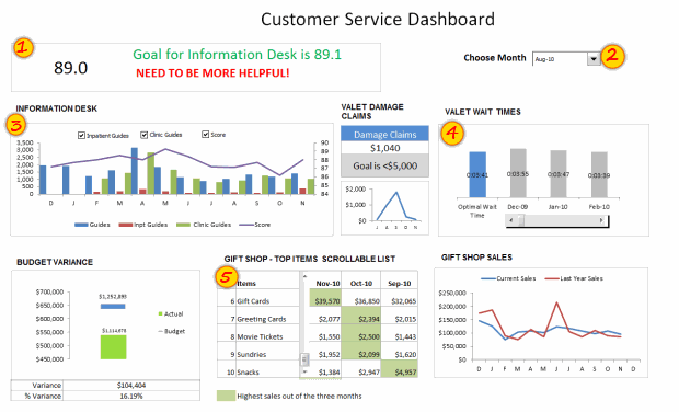
[View this dashboard image in full size | Demo of this dashboard]
Techniques used by Mara to Create this Dashboard:
Mara used several techniques to create this dashboard. But I specifically liked 5 things about this dashboard. They are,
- Tweetboard kind of area at the top where she showed summary of status. [Related tip]
- Dynamic dashboard which can be filtered based on a month.
- Interactive chart with check boxes to show / hide information. [Related tip]
- Interactive comparison chart to compare target with actual performances (of valet wait times). [Related tip]
- Scrollable list of various gift shop items. [Related tip]
Download Customer Service Dashboard Excel Workbook
Click here to download the workbook prepared by Mara.
I encourage you to examine the file and see how you can implement similar dashboard in your area of work.
Thank you Mara
Thank you so much for your generosity and enthusiasm to educate us. I have enjoyed examining your dashboard. You have shown creativity and skill in putting this together.
If you like this file, say thanks to Mara.
Contribute to Excel Dashboard Week by sharing your tips / files:
You too can share your tips, excel workbooks, snapshots to make this Excel Dashboard Week truly awesome. Just fill this simple online form to send your contributions.


29 Responses
Looks good, Mara. Keep up the good work!
Thx Mara, your work is great, congratulations…
wow ! Great stuff Mara !!
I am amazed on the work you did !
What I like about your dashboard
1. The first impression is the colors used. Very smart use of colors that matches each other, easy on the eye – make people wants to find out more !
2. Clear message shown for the tweetboard for Quick overview on the state of situation.
3. Use of creative titles for your charts “Information Desk”.
4. Clear and uncluttered charts. Gives reader a clear perspective with good use of charts colors too.
5. Good use of Legend to describe what color meant “Highest Sales out of the three months”
6. Of course, good use of Check boxes and Slider bar to offer interactiveness on your charts.
Suggestions
1. You may want to consider formatting your Y and X axis labels to show thousands, in $500K format instead of $500,000, so you can even made your chart look much neater.
2. Budget Variant Chart – This one is special…I took a second look and try to understand it. I am not sure if this is the best chart to visualize Sales VS Budget and Variances. And the Variance of 16.19% is positive, so u may want to use conditional formatting to make it green color, red if negative.
Overall is Great Work and Great Effort !!! Keep it up and I am so proud of you !
Francis Chin
http://www.francischin.com
Great Work Maya, just wondering if “5” Scrollable list of various gift shop items, can compare the previous 2 and current month selected in the above picklist, just one more suggestion if we can use top 5 gift category by using donut and bar mix chart to show sales mix for different months
Chandoo I would like to thank you for posting such helpful tricks for creating dashboards, I have learned a lot from your KPI Dashboard demo, I have created one dashboard to compare performce of Sales Associates, thaks a lot again
Thanks for the idea! Great job! You are giving me a lot of inspiratons!
Thanks everyone for the nice comments. I’m such a novice at this so I was so grateful for Chandoo’s class and for everyone who submits ideas on his blog.
Francis: Thanks so much for your comments. You’re an inspiration. For the budget variance chart, I actually got that idea from one of Chandoo’s post on budget vs actual. There was one that was simple and easy to read so I learned how to do that and made it dynamic. I’m open to any other ideas you have for budget vs actual. I’m always looking for ways to improve.
Sabrina: Thank you for you for your suggestion on the top 5.
Dear Mara,
Great work.
But i one suggestion regarding the INFORMATION DESK graph is consist of month but which year it belong is not there if it would be there it would be great.
Warm Regards
Bhushan Sabbani
+91 98208 26012
Thanks for this idea… Great Stuff !!
Excellent dashboard Mara.
The best I like about the dashboard is the choice of colors. They are cool and not distracting. Thanks for sharing the file.
@Chandoo
Thanks for the dashboard week Chandoo. I am learnt a lot in the last 2 days. I am excited over the next 3 days! 🙂
Regards,
Ravi.
Great work Mara ! Thanks for sharing .
Mara, I liked the line, “Need to be more helpful.” Our government needs to print this line, laminate it and post it in all government offices for the staff to see.
Hi there, i have been recently visiting this blog it is really great, the best one for Excel, wish Chandoo great success ahead.
I have one query, if you protect the data sheet the chart with the checkbox gives and error saying the data is protected and cannot be modified, is there a way around. This is cause if we want to publish this to someone who should only see it and do no changes to the data, is it possible please guide.
This could be a silly but bear me i am novice to excel 🙂
Thanks.
nice work.
inspired me a lot, working on few dashboard projects…
dear mara
looks great .any reason why you have not used the bullet chart for the actual vs target chart.on the whole it is simple and elegant .jay.
Dear Chandoo,
The word Dashboard in the heading is misspelt.
Wow. Very Nice work Mara. Next week I am going to take the Course, I will try to post my work here.
Thank you so much for your helpful blog. Always appreciated your tips and tricks.
I am proud that you belongs to our Vizag City.
The above comment, I forgot mentioned about Chandoo, those two paras is about Chandoo. 😀
Thank you Mara!
Thx Mara, your work is great, congratulations…
Great Work Mara!!!!!!!!!!!!!!!!!!!!!!!!!!
Hi Chandoo,
I had been following your blogs for tips and tricks on excel. I am working with Media agency and we collect the data. Now this data has several parameters based on several legends. For eg Class A – legend color red, classB – legend color green and so on. Class A has several characteristics and parameters and heading etc. Now everytime we gather data and make pivot then based on the data in the pilot tables – top 10 we need to insert those in charts manually and also need to change the colors of legends and also. We create nearly 300 slides every month sector wise and it takes nearly our 4-5 days in doing that. Do you have any sample dashboard which will be helpfull to us and we can create it in a day.
Thanks really amazing one,
it helped me in desgining OTACE report
Regards
Gowravan M
9980651792
Awesome Job done here ………….
very good master piece but wont to know if you can design KPI’s for a financial institution. Thank you
I need help to make performance for our company
we have about 10 products from 5 years old