
We make charts with date axis all the time. For example, lets say you want to plot the number of donuts consumed per month in a chart, like this:
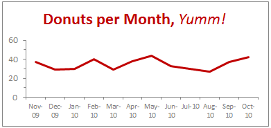
2 things become quite obvious when you look at this chart,
- The year -09 and -10 repeating across bottom of axis is pure chart junk.
- Aww, dude. How many donuts do you eat!?!
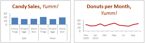
Now, there is nothing much I can do about donut consumption. But I can tell you how to fix that axis so it looks a lot better, may be like this:

Interested? Follow this simple recipe:
- Process your data: Assuming your data looks like what I shown to left, just use simple formulas to make it look like the table to right. [related: how to work with dates & times in excel]

- Now, make a chart from the data. Use both year and month columns for axis label series.
- That is all. Excel shows nicely grouped axis labels on your chart.
Pretty simple, eh?
Download the Excel Chart Template
Click here to download excel chart template & workbook showing this technique. Play with the formulas & chart formatting to learn.
2 Bonus Tips:
1. This technique really works with just any types of data.
So you can just have Product Group & Product Name in 2 columns and when you make a chart, excel groups the labels in axis.
2. Further reduce clutter by unchecking Multi Level Category Labels option
You can make the chart even more crispier by removing lines separating month names. To do this select the axis, press CTRL + 1 (opens format dialog). From Axis options, un-check Multi Level Category Labels option.
How do you format date axis on charts?
Most of the times when I make charts with date axis, the axis has 12 or 13 months of data. So I knock off the year part completely. But in some cases, I end up making charts that show data from multiple years. Now, repeating year value across bottom is a waste of chart ink. So I tend to use the above technique to make the chart look much more professional.
What about you? How do you format date axis? Please share your ideas and experiences using comments.
More Charting Formatting Tips:
- How to change data labels in charts to whatever you want
- Making your chart legends look awesome
- Use paste special to Speed up chart formatting
- … More chart formatting tips


5 Responses to “Preparing Profit / Loss Pivot Reports [Part 2 of 6]”
[...] Preparing Pivot Table P&L using Data sheet [...]
[...] Preparing Pivot Table P&L using Data sheet [...]
[...] Preparing Pivot Table P&L using Data sheet [...]
I am not getting sound from the videos. I have checked all the settings and spent several hours searching the Internet to no avail.
Has anyone else had this problem?
Is there anyway to get the Grand Total to be broken out in the same fashion as the items above it? For instance, if you have in column 1, widget a, widget b, and have their sales by month in column 2, I'd like to see the grand total also be by month, for widget a & b combined.
I can't get anything other than a single line for the grand total, rather than the same format as the data above.
Widget A Month Sales
Jan 100
Feb 200
Widget B
Jan 150
Feb 250
Grand total - here I would also like to have Jan, Feb.
Jan 250
Feb 450