This is a guest post by Myles Arnott from Clarity Consultancy Services – UK.
- Part 1: Introduction & overview
- Part 2: Dynamic Charts in the Dashboard
- Part 3: VBA behind the Dynamic Dashboard a simple example
- Part 4: Pulling it all together
In this the final post we are going to pull it all together to create our final Dynamic Dashboard model.
The dynamic dashboard VBA example can be downloaded here [Mirror]
Firstly a quick recap of what we have covered so far:
- How to structure a workbook with user friendly front page and user notes
- Using a structured inputs or driver page
- How to create a range of dynamic charts
- Some simple VBA to move items around a page based on the user’s parameters
Ok, so lets get to work to combine all of the above into a workable model. There is a lot to cover here so as Chandoo often says, may be time to grab a coffee!
First things first you need to bring all of the charts that you want to have in your dashboard into the spreadsheet and label up the tabs accordingly.
Homepage
I find that for a model that has multiple tabs a homepage allows any user to easily understand the contents and easily navigate to the page they are interested in.
Obviously you can make the homepage look entirely how you want. I use this design as my standard layout with a relevant title, business logo and contents structured to suit the model.
I use the free form shape to draw my boxes. This can be a bit fiddly to achieve but I think that the end result is worth the effort.

Links are achieved by inserting hyperlinks. I choose to reformat these to change the color and remove the underlining. [related: create a table of contents sheet in excel]

The help sheet is courtesy of John Walkenbach. Of all of the possible user note solutions I have encountered this to me offers the simplest and most user friendly approach. I use this in all the models that I develop for clients.
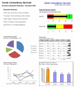
Now on to the central point of the model: The Dynamic Dashboard
There are three key parts to the dashboard, the driver area, the report area and the chart location matrix.
Driver area
This is the user interface which allows the user to hide, view or position a particular chart.

Each title is hyperlinked to the page containing the chart in question. Each location cell is a named range with data validation to control the inputs. I have also added an input message via the data validation function.
The named range relates to the chart eg: Chart one is CH_1, chart 2 is CH_2 etc.
The validation list is based on a named range Position_Range (in the Inputs tab)

The input message is defined in the Input message tab within the validation function menu.
Report area
This is your dashboard, the area to contain your charts. It is simply an area defined and formatted to be the container for the dashboard charts that the user chooses.
The Chart Location Matrix
The entries for this matrix are made in the inputs tab and pull through to the dynamic dashboard tab. Each cell of the matrix in the dynamic dashboard tab is a named range. These named ranges are referenced in the VBA. I will discuss this later in the post.

This matrix defines where each chart will be placed. Getting these positioning references correct takes a little bit of trial and error but is pretty simple to achieve.
Now onto the images themselves. The images that the model moves around are pictures of the charts in each tab. This is achieved using the camera tool. Chandoo has written an excellent post on the camera tool so I will not repeat that here.
I have then renamed the images by selecting the image and changing the name in the name box.
As you can see the chart below is called Chart4. You will also notice that in the formula bar it refers to =’CH4′!$B$2:$F$17. This is the image that it has taken from the CH4 tab.

The final step is to add a hyperlink back to the chart page so that the user can navigate to the relevant page by clicking on the image.
So now we have a structured model, images of our charts and everything in place to put in the VBA.
The VBA
The basics for the VBA were covered in part 3 – VBA behind the Dynamic Dashboard a simple example.
Location
Unlike in part 3, as we would like to avoid clicking on a button every time we want to update the layout, the VBA is located in the Dynamic Dashboard sheet itself rather than in a module.

The event target
It important to restrict the event function to specific cells. This stops the macro running completely every time any cell is changed in the sheet. In this case I have restricted it to the cells where the user chooses the chart’s position.
Variables
We need to define the variable in the VBA so that Excel knows where to put the images we have moved.
To do this we firstly define the variables and then link them to the named ranges in the chart location matrix.
To manage the loop code I have also used “I” as the current iteration and “ix” as the last desired iteration.
Moving the charts
This is based on the VBA used in part three of the post.
Loop
To avoid having to rewrite the code for each chart we instead use a loop that continues to loop as long as the current iteration “I” is less than the last desired iteration “ix”. I.e. loop for the eight charts and then stop.
The variable “I” is also passed to the position part of the VBA to select the relevant image to move:
ActiveSheet.Shapes(“chart” & i).Select
Ok So here is the full code:
Dim Topleft_T As Integer
Dim Topleft_L As Integer
Dim MiddleLeft_T As Integer
Dim MiddleLeft_L As Integer
Dim BottomLeft_T As Integer
Dim BottomLeft_L As Integer
Dim Topright_T As Integer
Dim Topright_L As Integer
Dim Middleright_T As Integer
Dim Middleright_L As Integer
Dim Bottomright_T As Integer
Dim Bottomright_L As Integer
Dim Hide_T As Integer
Dim Hide_L As Integer
Dim View_T As Integer
Dim View_L As Integer
Dim i As Integer
Dim ix As Integer
‘Define the position values (based on named ranges)
Topleft_T = Range(“Top_Left_T”).Value
Topleft_L = Range(“Top_Left_L”).Value
MiddleLeft_T = Range(“Middle_left_T”).Value
MiddleLeft_L = Range(“Middle_left_L”).Value
BottomLeft_T = Range(“Bottom_left_T”).Value
BottomLeft_L = Range(“Bottom_left_L”).Value
Topright_T = Range(“Top_right_T”).Value
Topright_L = Range(“Top_right_L”).Value
Middleright_T = Range(“Middle_right_T”).Value
Middleright_L = Range(“Middle_right_L”).Value
Bottomright_T = Range(“Bottom_right_T”).Value
Bottomright_L = Range(“Bottom_right_L”).Value
View_T = Range(“View_T”).Value
View_L = Range(“View_L”).Value
Hide_T = Range(“Hide_T”).Value
Hide_L = Range(“Hide_L”).Value
‘Set ix to be the number of charts
ix = 8
‘reset i
i = 1
”Select the shape and position it
Do While i <= ix
ActiveSheet.Shapes(“chart” & i).Select
If UCase(Range(“CH_” & i).Value) = “TOP LEFT” Then
Selection.ShapeRange.Top = Topleft_T
Selection.ShapeRange.Left = Topleft_L
ElseIf UCase(Range(“CH_” & i).Value) = “MIDDLE LEFT” Then
Selection.ShapeRange.Top = MiddleLeft_T
Selection.ShapeRange.Left = MiddleLeft_L
ElseIf UCase(Range(“CH_” & i).Value) = “BOTTOM LEFT” Then
Selection.ShapeRange.Top = BottomLeft_T
Selection.ShapeRange.Left = BottomLeft_L
ElseIf UCase(Range(“CH_” & i).Value) = “TOP RIGHT” Then
Selection.ShapeRange.Top = Topright_T
Selection.ShapeRange.Left = Topright_L
ElseIf UCase(Range(“CH_” & i).Value) = “MIDDLE RIGHT” Then
Selection.ShapeRange.Top = Middleright_T
Selection.ShapeRange.Left = Middleright_L
ElseIf UCase(Range(“CH_” & i).Value) = “BOTTOM RIGHT” Then
Selection.ShapeRange.Top = Bottomright_T
Selection.ShapeRange.Left = Bottomright_L
ElseIf UCase(Range(“CH_” & i).Value) = “VIEW” Then
Selection.ShapeRange.Top = View_T
Selection.ShapeRange.Left = View_L
ElseIf UCase(Range(“CH_” & i).Value) = “HIDE” Then
Selection.ShapeRange.Top = Hide_T
Selection.ShapeRange.Left = Hide_L
End If
i = i + 1
Loop
End If
End Sub
Closing Thoughts
We now have a model that provides pertinent summary information to aid management decision making. It combines a high level of flexibility within each report and then allows the user to choose which reports to include and where to position them. This allows an enormous amount of flexibility over the message to be communicated.
I hope you enjoyed the post and please feel free to make comments and suggestions on the model.
Finally a huge thank you for Chandoo for agreeing to host this post for me.
Download the complete dashboard
Go ahead and download the dashboard excel file. The dynamic dashboard can be downloaded here [mirror, ZIP Version]
It works on Excel 2007 and above. You need to enable macros and links to make it work.
Added by Chandoo:
Myles has taken various important concepts like Microcharts, form controls, macros, camera snapshot, formulas etc and combined all these to create a truly outstanding dashboard. I am honored to feature his ideas and implementation here on PHD. I have learned several valuable tricks while exploring his dashboard. I am sure you would too.
If you like this tutorial please say thanks to Myles.


64 Responses to “How do you make charts when you have lots of small values but few extremely large values? [Debate]”
A wonderful surprise to see a question I asked in your forum appear as an article in your website. Many thanks for helping me tackle this problem, and also for considering it something that merits an actual article. I look forward to reading the replies.
Cheers
Mike (now happy)
How about a dot plot with a logarithmic scale? That way you can see the outliers, and you are not visually comparing the length of the bars.
How about putting the outliers on the secondary axis? When I use this technique I'll often use a distinctive color for those columns and then draw a box over the secondary axis in the same color so that the reader associates, for example, green columns with the green axis on the right.
@Mike... You are welcome. It was an interesting question, and I wanted to see what our readers thought about it.
@Joe.. interesting idea. A dot plot or scatter plot is infact better as viewers do not measure the height to compare values.
As with all graphs, you need to know your audience. Taking logs is the preferred method for audiences that will understand what you are doing. However, I do not use bar graphs with log scales. I use graphs judged by position rather than length such as line graphs or dot plots. In Creating More Effective Graphs, I recommend either taking logs for more technical audiences or using complete scale breaks for others. By complete scale break I mean two separate panels; not little parallel lines that can easily be missed.
Here is how I would approach it:
http://a.imageshack.us/img405/823/largesmall.png
I usually don't like having multiple axis charts, but I sometimes use them to show charts with two colors for a series (for example with one color for positive and another for negative). I think the same principle can be used here. Then I used a custom format, color code, and a text box to hopefully clearly convey the message that the two data points are anomolies.
It seems to me that understanding the seasonal sales peak in Dec and Jan is the most important part of the chart... particularly in relationship to the 10 other months where nothing much happens. This firm must need to plan staffing very carefully. I would go with option one and add bar value labels (so you can see that there were sales in the early months of the year) plus a 2nd y-axis plot with a cumulative percentage curve starting at feb and going to jan). Logging this data series completely destroys the point of the chart. Both the log and Option 3 are way too geeky. Option 4 looks like the person who released the information just didn't care or didn't get the point that could have been made.
I agree with Naomi Robbins. Use a full break with dots instead of #3 or #4. Never use a break (full or partial) with bars because of how bars encode data. If your audience understands logarithms, use lines or dots and a log scale.
I am awaiting Microsoft to allow multiple Y axis indexes to use with a line chart.
@Tiffany I didn't notice your post before, but you basically summarized exactly how I approached it. :o) Scale is still a question when using the approach, but as long as it is clearly delineated, I think it makes sense.
Nice tricks Chandoo.
This reminds me of a recent situation that came to me where there were 50 x axis points (for various projects) so the chart had become too lengthy.
What can be done with such charts where there are too many labels and the distribution of chart does not come proper?
Working in the pharm industry this was often a common occurrence when looking at growth trends of new products on a quarterly or MAT basis. As senior management where generally interested in seeing both actual values and growth I tended to opt for your example four with growth charts. The growth was somewhat meaningless for these new products and their actual sales showed how well they were performing when looked at on a rolling quarter basis.
dont forget Line charts too for multiple series:
few series on lower-range values, but few on higher-range values.
I'd prefer to split them apart, but if you have 12 series or more, it'd be tedious to show mutiple charts on mgmt report (summarize in 1-2 slides).
@Nimesh
I would generally group them (eg North, Sth, East, West or whatever is appropriate for your business) and chart or only show the top 5-6 performers and then group the rest (Others)
Depends on the data. Right now I have a couple of regular charts with several large contributors and a handful of tiny contributors.
I've taken to top 5 values plus a 6th with 'other'.
Another problem with 2-axis diagrams is when you take B&W prints. It gets harder to interpret the chart when only one type of visualization is used (e.g. only bars not bar and line).
Log-scales are also problematic as we do not often encounter them, Say, you have 8-10 graphs in a report and in only one graph this large value problem is there. So if you use a log scale for this single graph, the graph itself become a outlier.
I would prefer breaking the Y-axis by hi-tech way (Pelter, Tushar Mehta) if I have time or do it by pasting two charts as suggested here.
Possibly, a macro can be written to place two charts together like this??
Naomi's suggestions are excellent: for audiences that are used to interpreting logarithmic axes, take the logarithm; for all other audiences, use a complete scale break, such that you have separate panels. This is, in fact, the advice offered by William Cleveland in "The Elements of Graphing Data," (pp 103 - 104).
I would also suggest using dot plots instead of bar graphs. Dot plots are like a sideways bar plot, using dots instead of bars. They provide the following advantages: more space for labels; more compact arrangement; clearly mark out the value being plotted, rather than the range from the axis to the value (less non-data ink). Here's a nice introduction: http://www.b-eye-network.com/view/2468.
Since a picture is worth a thousand words, I've created an example of a dot plot with a complete scale break:
http://yfrog.com/b9rplot2p
For the curious, this was done in R (http://www.r-project.org), with the following code:
month <- c("Feb 09", "Mar 09", "Apr 09", "May 09", "Jun 09", "Jul 09", "Aug 09", "Sep 09", "Oct 09", "Nov 09", "Dec 09", "Jan 10", "Feb 10")
sales <- c(200,300,200,300,200,300,350,400,450,1200,100000,85000,450)
SalesRange <- shingle(sales, intervals = rbind(c(0, 5000), c(5000, 200000)))
salesdata <- data.frame(month = month, sales = sales, order = c(1:13), SalesRange = SalesRange)
salesdata$month <- reorder(salesdata$month, rev(salesdata$order))
dotplot(month ~ sales | SalesRange, data = salesdata, strip = FALSE, layout = c(2, 1), levels.fos = 1:50, scales = list(x = "free"), between = list(x = 0.5), par.settings = list(layout.widths = list(panel = c(2, 1))), xlab = "Sales (US$ x 1000)")
Tom - Thanks for your kind words and for recommending my article. Thanks also for showing the complete scale break. I was not at my computer when I commented yesterday and was just going to draw a complete scale break when I saw that you already did it.
Hi Guys,
Lot's of tricky answers... But for my money the response saying "know your audience" is on the money.
What I usually suggest, and most times I provide both examples and let them make a decision:
1. multiple axis - only when it still looks ok (not off the chart so to speak)
2. Do a "% of total" graph, with a data table containing the actual values underneath the chart - remember Excel has other functions that do compliment each other. charts/ tables/ pivots etc
Thanks and good to see so many responses to this one.
Several people have suggested using double-Y axes (also called dual scaled axes). My experience is that readers sometimes miss the second axis, sometimes are confused by the second axis, and often place meaning where none exists (e.g., where lines cross). Double axes are especially dangerous when both represent the same variable (number of sales or dollars or whatever.) See Wainer's "Visual Revelations", http://amzn.to/cxKuMv, or my "Creating More Effective Graphs", http://amzn.to/9qc6Mq, for examples of double-Y axes that deceive. Stephen Few wrote an article that describes my feeling about dual axes as well. See his article at http://bit.ly/4ycwgZ.
Christian indirectly raises a good question: with such a small data set, is a graph really needed, or the best way of presenting the data? The table at the top of the page is more compact than any of the graphs presented and, arguably, easier to interpret. It certainly avoids the problem of presenting such highly skewed data on a graph.
Although I agree with Tom and Christian that a table might be easier to interpret than a graph for this particular data set, I think that the issues raised in this post go far beyond this one data set.
Hi,
I have a similar situation, but in this case with the x-axis. How do I represent a line chart of 3 Y-axis variables against the x-axis that has values with large disparity (0.001-100 mg/ml) ?
Thanks.
Excellent points everyone. Thank you for thoughtful discussion Naomi.
Few additional points:
(1) Log axis: Use it with caution. I have never really seen a log axis graph that is effective outside scientific publications. Your audience need to be in right mindset to digest logs.
(2) Chart vs. Tables: My intention in this post is to discuss how we can chart when data has wild ups and downs. The data set I used is almost meaningless. Of course, if I want to make a chart for the above data alone, I would rather go out and party as the sales skyrocketed during holidays.
(3) Secondary Axis: While this approach is creative, I would avoid it as it can be confusing. Usually secondary axis works best when you have 2 diff. series (sales vs. profits, market share vs. profits etc.) But if you have been using this approach and your readers already know it, then you are golden.
(4) Complete split vs. axis split: I agree with Naomi that it has to be a complete split. I was too lazy to work out the mechanics of complete split thru excel. (Good work by Tom showing how to get full split thru R). You should go thru Jon's tutorial on full axis split in excel here: http://peltiertech.com/Excel/Charts/BrokenYAxis.html
(5) Dot Plots: I think these are even better than bars. Alas, there is no native support for dot plots in excel and you have to do some bit of circus to get them right.
Again, thanks to Naomi, Tom, Christian, Rajdeep, Dan, Hui, Sanford, Nimesh, Mark, David, Bill, Michael, Jason Sanford and all others for sharing what you think about this issue. Your comments are a testimonial to what our community is all about... 🙂
[...] Highly Skewed Data Recently Chandoo.org posted a question about how to graph data when you have a lot of small values and a few larger [...]
Chandoo,
I created an Excel graph of how I think this exercise should look. Since a picture is worth at least a "crore" of words, I put a capture of it on-line at
http://img839.imageshack.us/i/chartswithsmalllargeval.png/
Which brings up an area that I hope you could help enlighten me on with a how to article... specifically, what is the best demonstrated practice for sharing stuff online (pictures and spreadsheets) when leaving non-text comments on blogs? For instance, I am having a lot of trouble getting Microsoft Skydive to work. Also, how do these web-based sharing areas control security (for instance, how can I create a "public" area and a "private" areas)?
bill
Bill
Have a read of this post for some File and Picture sharing sites
http://chandoo.org/forums/topic/posting-a-sample-workbook
Each method is different and some allow Private and Public areas.
Generally you only get Private areas when you pay.
Always remember to anonymise data, especially names or data if it is commercial in nature.
I just came across an old post on another blog that discusses this topic and might interest readers here. Some of you already commented on this post.
Sorry - I omitted the link. http://www.datadrivenconsulting.com/2009/12/charting-data-with-one-disproportionally-large-value/
A post on another blog that was written after this one discusses this topic and might interest readers here. Some of you already commented on this post. http://chandoo.org/wp/2010/08/20/charts-with-small-and-large-values/
Hello Chandoo,
I accidently landed on your website but I must say that it has changed my entire analysis skills.....of course, have made these skills much better. So first of all, I would like to thank you for all the information you have posted on your website.
I have one question: what should we do when we have huge difference in values? I mean I have the data for which has the values like 5000, 50000, 100000, 500000, 2000000, 10000000 and 50,000,000. I need to show all the values on one chart...what should I do? but several small values are not visible as there are several large values and several mid level values. I hope i am clear enough. Can you please help me?
I had a similar problem, but with a lot more data points. In the end, a historgram solved it for me.
@Gurpreet KANG
Is your audience suitable that you could use a log plot? If you data escalates exponentially like your example, might be a good use.
Other thoughts would be to have a xy graph with a line (but wound show near 0 early on), or change your numbers to a percentage increase/decrease from the previous?
As alreayd discussed, knowing what you want to present (actual values? change in sales? human population?) and what message you want to give are important things to consider.
I use a mac and have excel 2008. I have a huge database and need to find and remove duplicate entries
@Shailesh have a look at Google Refine. It's a free, downloadable framework for cleaning data that runs in a browser on any OS. One of its many capabilities is to find duplicate data, even when the data is not identical (i.e. it deals very well with typos).
i always use option 4,
1. my audience will have difficulty with log scale, or axes with different scale, this eliminate option2 & option micheal#6
2. cut/broken exist tamper with actual visualisation, this eliminates option 3
3. option 1 tampers with analysis of common trend vs offshoot data, with improvement by option bill#25, this is good, but it requires reading all the small values.
4. plot graph by tom#18, complicates matter. Instead of bars, they now see dots, which is not friendly to older people (no offense here), a line might help but it clutter the space for data labelling
So i use option 4, fix the y-axis for the majority data & label the offshoot data to let my audience's imagination do the visualisation.
best solution for me, but might be not for all of us... 😉
chandoo,
How about method #6 I learned from my my boss, scaling the large values X times. see it http://twitpic.com/4p2bsl What do you guys think?
TalKohlberg (#36), the label approach has all of the disadvantages of the split-axis method, with the added disadvantage that there is almost no visual cue that the longer bars should be visually distinct from the shorter ones. In Cleveland's terms, pattern perception and table lookup are completely at odds, while basic requirement for any graph is that the two operations need to compliment each other.
The only reason that I can see for making a graph like this is that it is easier to create in Excel than many of the alternatives.
xsaed (#35), you raise a good point that we have not yet considered: that the "normal" rules may not apply for all audiences (or mediums) due to visual acuity. There is a parallel here with typography: the normal rules for maximizing readability (e.g. using serif typefaces and certain type sizes) are modified in print for the visually impaired. Though there are few good studies, the rules may also need to be modified for on-screen displays, where the resolution is ten times lower than in print.
It would take some careful studies and consideration to identify the best solution for low-resolution displays and the visually impaired.
Tom (#37), Thank You for taking time to comment. There is no split axis in this method # 6, the scaling approach. I do see what you mean about distinguishing the scaled bars so I made scaled bars darker and legend indicating scaling factors in red, see it here http://twitpic.com/4qs8iy Is it easier to see now?
TalKohlberg (#39) It's always fun to discuss such matters and see new approaches; thank you for the opportunity.
Highlighting the three bars helps to bring the viewers attention to them, but does not fix the underlying problems with the graph design. I do like, however, that you used shades of color rather than different colors to do the highlighting; people often forget that a sizable portion of their audience will be unable to see distinctions based only on color.
When a person reads a data graph, they are performing two distinct operations: what Cleveland calls "pattern perception" and "table look-up." Pattern perception happens first and is an interpretation of the geometric arrangement of the graph (relative distance, size, position, etc.). So pattern perception tells us that the third bar from the right is biggest; the smallest bars cluster on the left half of the graph; some bars are darker than others and there's some extra labels over them; etc. Table look-up is where the user reads the labels and axes to gain a quantitative understanding of the data underlying the graphical display. Here is where we learn that the third bar from the right is "100x" and the short bars on the left are in the range of 200 - 300.
For a graph to be effective, pattern perception and table look-up have to tell the same story; they have to be fully complimentary. In addition, a graph should only show those elements that are needed to support these two operations. Extra labels or fancy elements ("chart junk") degrade the reader's ability to correctly perceive the patterns in the graph and to read the critical labels.
So, applying the above model to your graph, we have the problem that pattern perception tells a very different story than table look-up. To overcome this problem, you are adding extra labels to assist table look-up and highlighting some bars to try to draw the reader's attention to the significance of those extra labels.
A better solution would be to have a graph where pattern perception and table look-up are fully complimentary, instead of conflicting. For this reason, an axis break is actually better, and a full axis break is better still, because a full axis break is more obvious for pattern perception than the more subtle axis break. See my comment #18 for an example of the full axis break. Log scales are better still, if your audience has the skill to correctly interpret them.
Finding the best graph for an audience is a difficult problem, and there is no one-size-fits all solution, as the lengthy discussion on this post has demonstrated. We can only learn, try out new ideas and improve.
The labeling approach suffers from a further limitation: it doesn't scale well. For such a small data set, it's fine, but if we have dozens of extreme values, it's a lot of work for you to construct the graph and table-look-up and correct interpretation become a real burden for the reader.
If you are interested in learning more, I highly recommend Edward Tufte's book, The Visual Display of Quantitative Information, and William Cleveland's more technical book, The Elements of Graphing Data.
Tom (#40) Thanks for the dialogue. It looks like it is just you & I on this topic now. On balance, Chandoo and other posters may still find this scaling approach http://twitpic.com/4qs8iy as worthwhile method# 6. It is there for all to judge.
Hi Chandoo,
well, i'm from morocco, every day, I learn new tips. Keep rock, you inspired me
[...] The Learning As You Go blog has a nice article about plotting highly skewed data, at Graphing Highly Skewed Data. The article covers use of secondary axes (a bad idea), breaks in the axis (also a bad idea), logarithmic axis scales (okay if users understand log scales), and multiple charts. This article is a response to a discussion started by Chandoo in How do you make charts when you have lots of small values but few extremely large values? [...]
[...] ♥ Smart chart labels♥ How to make charts when you have too much data [...]
I like the trick of creating two charts.
This is one of the best places for learning about XL.This site has improved me a lot and helped me getting promotion in my job.Thanks a lot to chandoo.
I'd make two charts and sit them side by side and clearly state why you've had to do this. I'd never split the axis in case it misleads.
TalKohlberg (36, 39, 41)
I think your method of scaling some bars is very dangerous. You are hoping people are able to let their conscious mind (a) notice the scaling factors, (b) do the math, and (c) override their preconscious interpretation of the plotted points. You'd be better served with a simple table than with a chart that doesn't show precognitively what it shows "tabularly". These are Cleveland's terms “pattern perception” and “table look-up” (thanks for the Cleveland terms, Tom).
I covered this in my blog recently, in Broken Y Axis in an Excel Chart. Contrary to what the title implies, I advise not to break an axis, but to show the data in two separate panels.
i think you could also represent the ten months of non-interesting values below a certain threshold as a single bar (size) and of course label those as such. This single size for the uninteresting low sales is a nominal height that is big enough to see but, pales into significance compared to the two big months sales, and still reads ok as a constant axis scale chart. Surely there's not much point in showing the exact values on the chart for the minute differences during slow sales months?
Bhai thanks a lot.
My problem is solved . thaks once again
TQ it is very helpful for beginner likes me
In my industry we come upon this often as a very large percent of our revenue comes from sales that occur in the same month.
I've often found that what people really want to know is "How well are we doing?", and that this question can be answered just as well by using data comparisons that eliminate the problems with large outliers.
For example:
1) If Sales are seasonal, show Sales as a percent of the Sales for the same month of the previous year. If your business is selling air conditioners, it's likely everyone already knows your company sells more of them in the summer. This approach can help your audience understand if Sales are improving relative to a comparable prior period.
2) Otherwise, show the YTD Sales as a percent of the YTD or annual Sales goal (this is similar to the Project Management concept of a "burndown chart"). Again, another way to let people know whether or not Sales are "on track".
I would agree with Jon that if the raw Sales data are required, showing the data as a table is far less likely to confuse your audience. However, the approaches above may help provide a quick visual impression for those in your audience who are not "numbers" people.
Good day, everyone!
I am new to charting and I am currently having trouble presenting Revenue to Expense Ratio (R:E) and number of accounts in one chart. I have 138 institutional clients to compare across. R:E ranges from 0.01 to 806.48 while number of accounts ranges from 1 to 3,280.
Appreciate your idea please on how to effectively and efficiently chart these two metrics across the 138 institutions.
Thank you in advance.
@Dyan
Obviously there isn't an easy way to compare 138 customers across such a large range of ratios
What about:
Showing the top 10 or 20 in one chart
Showing the bottom 10 or 20 in one chart
Showing the top 10 or 20 by revenue in one chart
Showing the bottom 10 or 20 by revenue in one chart
Can they be grouped or filtered in Zones or Regions or Divisions or States etc
Hi, Hui.
I really appreciate that you took time to answer my query.
I will heed your advice and go for the last reco on grouping my data and have a separate chart for the groups.
Thank you so much! =)
Dyan
Hi Chandoo
That was awesome! Thank you
Thank you so much for this, very helpful
Great discussion! I think I like Jon's panel charts best as well as the bottom 2 magazine style charts on the Data Driven website. My use case is for a dashboard full of the same style charts, so while these are great, I can't have 2 different formats on my page, and quite frankly, they're just too big!
I tried the approach to add a data table to my charts and found out I was in for a new set of headaches. I seem to remember Jon having lots of examples of labeling magic, and I stumbled on what may be my answer: http://peltiertech.com/Excel/ChartsHowTo/OutlierLabels.html
This is very similar to Chandoo's #4, but with Excel handling the dirty work in a very elegant way. For dashboard use where the chart needs to be small, I think this may be the best option.
Here's my attempt:
http://chandoo.org/forum/attachments/compliance-chart-v2-jpg.3585/
Ok this post is 4 years old but here is a great technique once again from the Frankens team, which offers another solution
https://sites.google.com/site/e90e50fx/home/broken-line-panel-charts
Hui...
Team Chandoo,
Nicely put examples. Helped me in one of my reports. Thanks a lot!
Very useful.
Thanks