
There is a chart called “Evolution of Privacy on Facebook” going around on the web. The chart made by Matt Mckeon, a developer in IBM’s visual communications lab has created quite a stir in the interwebs. You can a small animated version of that chart below:
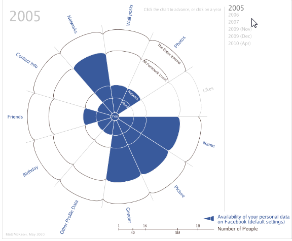
While Matt made a few mistakes with the chart, I think this is a stunning way to depict how facebook privacy policies have changed since 2005.
(How to read the above chart: It is radar-like chart, with logarithmic scale for spoke axis. The concentric circles depict number of people – inner most is you, then your friends, friends’ friends, entire facebook and entire internet. Privacy is measured on 9 areas – Name, Picture, Demographics, Extended Profile Data, Friends, Networks, Wall posts, Photos, Likes of you. A portion of the radar is shaded blue if that information is available to that portion by default.
For eg. in 2005 what you liked (likes) is known only to you. But, by 2010 entire internet can know what you liked.
Also, the data is based on Matt’s observations. More…)
I liked this chart and challenged myself to build the same in excel. Then as I was exploring the data (hidden inside the source code of his visualization), I had a better idea. “Why not make a panel chart“.
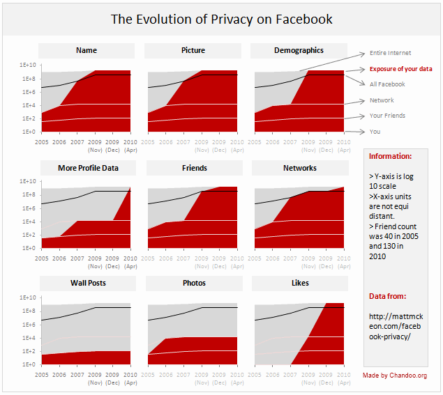
So I made this,
Evolution of Privacy Policies on Facebook
[click here for a larger version]
How to read this chart?
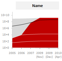 Each panel depicts how privacy policies have changed for one area of privacy since 2005 to 2010. So, for eg. if you are looking at the “Name” panel,
- Your Name was visible only to 1000 people in 2005 but in 2010, Entire internet (1.8 Billion) can see your name on Facebook.
- The dull gray color portion shows entire Internet population (it grew from 1B in 2005 to 1.8B in 2010).
- Red color portion shows how much of internet population can get your data from Facebook.
- The y-axis is log 10 scale, meaning each increment in y-axis value is actually 10 times more than previous value.
- The 3 lines indicate your friends, network and entire face book users respectively. Facebook users is shown on top in black color.
How is this chart made?
- After downloading the source code of original visualization by Matt, I just copied the data points from code to excel.
- Then I cleaned and transposed the data so that area charts can be made.
- The chart panels are combo-charts with both areas (red and gray portions) and lines (facebook, network, friend counts).
- Once made the first chart, I just duplicated it 8 more times and changed source points. (press CTRL+D to duplicate).
- A little bit of alignment and formatting to make it look clean and simple. [chart alignment tip].
Known issues in this chart:
- The horizontal axis (dates) are not equally spaced. The measurement times and accuracy are unknown.
- I am not 100% sure if areas are a good way to depict such data. But they seem ok to me.
Download the Excel File:
Click here to download the excel file [Excel 2007 version here] with facebook privacy policies excel panel chart. Play with it a bit to understand how it works.
How would you improve or visualize such data?
I used time as the axis and privacy areas as panels since the message is “how privacy policies have changed since 2005”. But I am sure you would love to explore this data in a different way. Go ahead and get the download file and make your own charts. Then share them using comments.
Also, suggest alterations or your impressions on this chart. Discuss.


7 Responses
I know this is off-topic, but regarding the eroding privacy on Facebook: who cares? If you don’t like it, don’t use it. The creators of Facebook must be happy that whenever they make any change, there’s an uproar. I’m sure that junkies complain when the dealer raises his fee.
I’ve been scratching my head on how to do an excel chart like Matt’s for a while
Chandoo – I am curious on what you identified as mistakes that were made on the development of the original chart.
For your chart, I’d be inclined to color-code every segment differently. You’d have to split your data into separate series and use a stacked chart for this.
While I like your interpretation (with the exception of the scientific notation in the labels) I think I prefer the radar chart. While your panel chart gives more information at a glance in terms of time trends, the animation of the radar chart is easier for me to take in. However, this is a good time to point out that there is only one legitimate use of a radar chart, and you’ll find it at this link:
http://cid-f380a394764ef31f.skydrive.live.com/self.aspx/.Public/Only%20legit%20use%20of%20a%20radar%20chart.xlsm
🙂
@Ron… The radar chart puts your focus on area (where as Matt encoded one dimensional data). He should have sqrt’ed the data at least.
@Jeff.. the clock is awesome use of radar. Why didnt I think of it earlier.. ?!?
Btw, I liked the radar chart too. I think Matt’s chart is one of the few radar charts that works.
I was playing around with radar charts today in response to this post when I realized they would make a good clock. I’ve got a much better, simpler version almost finished…I’ll post a link to it here when I’m done.
I think Matt should have animated his chart so it ticked through the different years every couple of seconds…would look really cool.