
This is a guest post by Myles Arnott from Clarity Consultancy Services – UK.
In this and next 3 posts, we will learn how to make a Dynamic Dashboard using Microsoft Excel.
At the end of this tutorial, you will learn how easy it is to set up a dynamic dashboard using excel formulas and simple VBA macros.

[Click here for large version of the image]
Introduction:
The dashboard also demonstrates the standard approach I use in all of my models which is to incorporate three key sheets in addition to the data and analysis tabs.
These are:
- Home page
- Inputs (or drivers)
- Helpsheet
The dynamic dashboard can be downloaded here [mirror, ZIP Version]
The dashboard file works in Excel 2007+. Pls. enable macros to get it work.
The plan is to break this dashboard tutorial down into four parts over the next four weeks. If further topics fall out as a result of discussions either Chandoo or I will pick them up and if necessary post further parts.
- Part 1: Introduction & overview
- Part 2: Dynamic Charts in the Dashboard
- Part 3: VBA behind the Dynamic Dashboard a simple example
- Part 4: Pulling it all together
I would like to take a quick opportunity to give credit for some of the elements of functionality in the model:
- Boxcharts – Chandoo [Link]
- Scrolling report – Chandoo [Link]
- Competitor analysis – Chandoo [Link]
- Use of camera tool – Chandoo [Link]
- In cell microcharts – Chandoo [Link]
- Helpsheet – John Walkenbach
Okay so lets get started with an overview:
What is the objective of the report?
The Dynamic Dashboard is intended to provide pertinent summary information to aid management decision making. Combining a high level of flexibility within each report and then allowing the user to choose which reports to include and where to position them allows an enormous amount of flexibility over the message to be communicated.
What does this Dynamic Dashboard do?
The dynamic dashboard allows the user to select a report from the range of reports within the model and decide where to position it on the page. The user can select “hide” to hide a report that they do not want to see or select “view” to preview it prior to choosing its position.
- Clicking on either the hyperlink name or the report image will take you to the report.
- Each report is highly flexible allowing the user to cut the data in many ways to show management the most pertinent information.
Overview of Dashboard Tabs:
Home Page
I always include a homepage in my models and often set an auto_open routine to select this as the first page seen on opening. The Home page is designed to present the contents of the model to the user and provide links to each page for easy navigation.

The Dynamic Dashboard
This is the main tab for pulling together the dashboard and will be covered in parts 3 and 4.
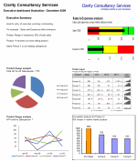
Inputs
This is the page for all validation lists and drivers.

Help Sheet
Once again a sheet that is in all of my models. This user form based help sheet provides the user with a quick help function and complements the accompanying user notes. I find it helpful to lay it out in tab order.

This is how the Help user form looks once opened. The user can either choose the topic from the dropdown or by clicking next.

Chart 1 and 2 : Flexible pie charts
Dynamic pie charts with the option to select the KPI, period and product/salesperson to be analyzed. These are covered in part 2.

Chart 3 & 4: Flexible line charts
Dynamic line charts with the option to select the KPI, period and product/salesperson to be analyzed. These are also covered in part 2.

Chart 5: Box Chart
Details on how to create these box charts.

Chart 6: Scrolling Report of KPIs
Chandoo’s blog on how to create this scrolling report can be found here. Micro charts which is of my favorite blogs from Chandoo are covered here.

Chart 7: Scrolling Comparison Chart
Details on how to create this scrolling chart.

Chart 8 : Executive Summary
A simple executive summary. Please see Chandoo’s article on a twitter board for an alternative view.

So that was an overview of the model and its main tabs.
What Next?
Next week we will look at Part 2 of this series and learn how to construct dynamic charts.
Download the complete dashboard
Go ahead and download the dashboard excel file. The dynamic dashboard can be downloaded here [mirror, ZIP Version]
It works on Excel 2007 and above. You need to enable macros and links to make it work.
Added by PHD:
Myles has taken various important concepts like Microcharts, form controls, macros, camera snapshot, formulas etc and combined all these to create a truly outstanding dashboard. I am truly honored to feature his ideas and implementation here on Chandoo.org. I have learned several valuable tricks while exploring his dashboard. I am sure you would too.
If you like this tutorial please say thanks to Myles.
Related Material & Resources
- Excel Dashboards – Tutorials & Templates Section of PHD
- 6 Part Tutorial on Making KPI Dashboards in Excel
- Recommended Product: Jorge Camoes’ Dashboard Training Kit
This is a guest post by Myles Arnott from Clarity Consultancy Services – UK.


13 Responses to “Gantt Box Chart Tutorial & Template – Download and Try today”
Hi Chandoo
As one of your students I have followed your detailed example through with great success. However, Excel is acting in an unexpected way and I wonder if you could take a look?
http://cid-95d070c79aef808e.office.live.com/self.aspx/.Public/Gantt%20Box%20Chart.xlsm
On my version, I have to type 40239 (Which equates to 2 Mar 2010) to get the chart to display 31 May 2010 (which should be 40329)!!??
Have I done something wrong or is Excel acting up?
Thx
Oli
PS Your example file in 2007 displays correctly.
Hi,
I like this idea a lot, but I agree the name is a little drab.
As an American I may just be seeing things, but to me the combination of lines and bars on your chart looks like a bunch of cricket bats.
Maybe you could work that into a catchier name. 🙂
Cheers!
Here is some code I use to keep the axis synched.
It may be useful to some of your readers
It is based on a comment I saw on Daily Dose of Excel.
Function SynchGanttAxis(Cname, lower, upper)
'Sets the X min and X max for Category axis
Application.Volatile
On Error Resume Next
'
'Top Horizontal Axis
With ActiveSheet.Shapes(Cname).Chart.Axes(xlCategory, 1)
.MinimumScale = lower
.MaximumScale = upper
End With
'Bottom Horizontal Axis
With ActiveSheet.Shapes(Cname).Chart.Axes(xlValue, 2)
.MinimumScale = lower
.MaximumScale = upper
End With
End Function
Function SynchVerticalAxis(Cname, lower, upper)
Application.Volatile
On Error Resume Next
' Excel 2007 only
'Right hand vertical axis
With ActiveSheet.Shapes(Cname).Chart.Axes(xlValue, 1)
.MinimumScale = 0
.MaximumScale = upper
End With
End Function
@Oli.. Can you check your file again.. I see 40329...
@Dave: Even I saw things.. the bars actually looked like lollipops. How about calling this lollipop chart - now that would be yummy and goes along the tradition of naming charts after eatables (bar, pie, donut...)
@Bob: Superb stuff... thanks for sharing 🙂
Hi Chandoo
This looks really good and I think it can also be applied to show project phases / milestones.
Question: Thinking further could this be amended to display a project lifecycle (Idea through to Implementation say 7 phases) on one bar / row? Just imagine 20 projects within a programme all on one chart one bar each showing their respective lifecycle stages i.e. on one page.
Idea: As the Gantt Box Chart this is quite intensive to set up re formatting etc how about the added extra of once you have completed this to "Save as template" i.e. saves the formatting and layout of the chart as a template so you can apply to future charts. Simple to do and will save the time formatting etc again and again and again.
Therefore tip: Click on your chart demo and then click on Save As template icon (2007) - edit file name and click on save. Ready to use / apply via Templates in Change Chart Type window.
Thanks and be very interested if the lifecycle question can be resolved
Mike
How embarrassing.
I was obviously suffering from numerical dyslexia. I was one of those days.
@Mike H: You can easily make this chart to work like a generic project lifecycle plan chart. All you have to do is,
1. in a separate sheet define the steps of lifecycle and various dates in a table (with 5 columns for each of the projects you have).
2. now use a control cell to input the project name you want to show in the chart
3. based on the input, use OFFSET Formulas to get the correct data
4. Rest is same as the tutorial above
For more info on the dynamic charting visit http://chandoo.org/wp/tag/dynamic-charts/ and http://chandoo.org/wp?s=OFFSET
Your solution is really smart but in the en Excel isn't meant to do stuff like this. I, as a former PM, always thought is was frustrating that you had to do stuff like this for something simple like a Gantt chart. So I built Tom's Planner. And would like to plug it here. I think it really solves the problem you are trying to solve in the most efficient way. Check out http://www.tomsplanner.com for a free account or play around with the demo.
Hi there,
Chandoo - this is really a very nice and helpfull chart - I adopted it, so I can report a forecast or the delay of a certain task (coming from my role as an auditor for projects).
One topic I´m currently struggeling with: I do have a project lasting for lets say 12 month. For a management reporting, I want to have kind of snapshot, lets say one month back and 2 month in the future. I tried with the offset formula, but failed. Any idea?
Thx
Lopi
[...] Ein viel geliebter Klassiker ist die Erstellung von GANTT-Diagrammen mit Excel. Wir hatten das Thema wiederholt schon hier. Chandoo.org hat sich mal wieder mit einer neuen Variante hervorgetan: Das GANTT-Box-Chart. [...]
[...] [...]
Hi Chandoo - fantastic xls. One thing I can't figure out how to do is adjust the alignment of the vertical axis. I would like to left align so that I could indent to represent sub tasks. Can that be done? Or is there a better way?
I've been trying to work out if there's a way to show weekends on the graph. The closest thing I've got is to add them on a secondary axis, but then I haven't been able to keep both axis lined up together! Any ideas?
Following on from this - is it possible to show things like holidays?