
This is part 3 of 6 on Profit & Loss Reporting using Excel series, written by Yogesh
Data sheet structure for Preparing P&L using Pivot Tables
Preparing Pivot Table P&L using Data sheet
Adding Calculated Fields to Pivot Table P&L
Exploring Pivot Table P&L Reports
Quarterly and Half yearly Profit Loss Reports in Excel
Budget V/s Actual Profit Loss Report using Pivot Tables
 This is continuation of our earlier post Preparing Pivot Table P&L using Data. We have learned to prepare Pivot Table P&L. The report prepared in last post has all the major data to prepare a P&L but it is not a complete P&L report. Now we will add calculated fields to make it a complete P&L. We will also format data points to make it a complete P&L report.
We need the following extra values in our P&L
- Gross Margin = Sales – Cost of Goods Sold
- Gross Margin % = Gross Margin / Sales
- Operating Expenses = Rent + Personnel Cost + Utilities + Consumables + Misc Exp
- Operating Profit = Gross Margin – Operating Expenses
- Operating Profit % = Operating Profit / Sales
Making these extra fields in Pivot Table using Calculated Fields Features:
Click on PivotTable Tools > Calculated Items to define a new calculated field. [tutorial: how to add calculated fields to pivot tables]
Check out below screencast. Just replace the Field Names and Formulas to add the rest of the calculated fields.
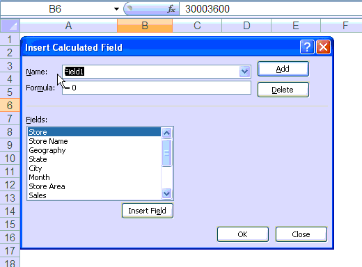
Once you have added all the calculated fields to Pivot Table, these will start showing at the end of PivotTable. You will need to drag them to their respective position on P&L
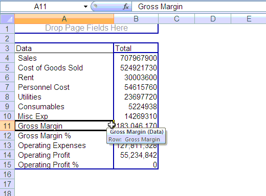
Now you are almost ready with your P&L report, only few steps more to format data are required. You may have noticed that % Fields are showing as zero as of now. This is because they are formatted as numbers instead of percentages.
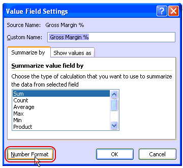
Do not use standard cell formatting to format them, instead use Value Field Setting Option to format pivot table fields. This one is useful as it will show data always as per the format set for particular field. Use Percentage format for % fields and Accounting Format for other value fields.
Few More steps like formatting certain fields as bold and italics and your PivotTable P&L is ready, you can play with is as any other pivot table and start presenting on various dimensions with few clicks
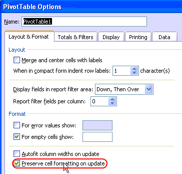
Make sure that you have correctly setup “Preserve Cell Formatting on update” option under pivot table options. This will help you retain the same format while you play with your PivotTable P&L.
The Final Profit & Loss Pivot Report
Once you finish all the formatting and settings, this is how the final report should look like:

Download the profit and loss report excel file
Download the excel file and play with it to understand the techniques discussed in this post.
What Next?
In the next part of this series, we explore this pivot table further, Continue reading.
Added by PHD:
- Please share your feedback and ideas for this series using comments. Yogesh and I will reply to your questions. Also, say thanks if you like the idea and want to learn more.
- Sign-up for PHD E-mail newsletter because you will get updates as new posts are live.
 Yogesh is an accountant with 13 years of experience in India and abroad. His specialties are budgeting and costing, supplier accounting, negotiation of contracts, cost benefit analysis, MIS reporting, employees accounting. He writes about excel at http://www.yogeshguptaonline.com/


20 Responses
This works nicely when you have a separate field for each profit & loss account – Sales, Cost of sales, etc. What do you do if you have one field, titled “Account”, and another titled “Amount”. Potential records within account would be Sales, Cost of sales, etc. I can’t calculate “Account” minus “Account”, or can I??
@ Jim: In that case I would use a pivot table as an intermediate step and then use GETPIVOTDATA in another tab to build the P&L. That way you have much more flexibility.
Those calculated fields are great, can’t wait for next lesson!
When I try to add the calculated fields, only the first 3 show up in the pivot table. But when I use the ‘List Formulas’ button, it shows that there are 5 calculated fields. Any idea why only the first 3 only show in table?
I would like to know which animated gif software is used here at chandoo.
Thanks !
Thanks, this was a massive help for me. Found the article via Google. Saved me oodles of time and complication.
hi,
Thank you for this tutorial section.!!!! great job.
But i have a question. When I enter the formulas in pivot table via pivot table>tools>formula then i did the same as its done here. The first three formula of gross margin and its % came but other two operating profit and its % didnot came in the table, though it is showing in the list formulas .
Could you help me with this. may b i am making some mistakes
dhooni
This is great work,i am new at excel but i have found this posting of great help, in coming up with profit and loss. Fantastic work on pivot tables
I am facing the same problem what dhooni is facing, if you can help with the problem.
Hi all, I am working on a P&L constructed in a form of pivot table with a # of calculated fields and calculated items as the article highlights. When dragging the calculated items around in the pivot – usually 2 unique ones — it takes about 3-5 min to complete refreshing (because it seems to calculate everything, not just the fields I am filtered on). Adding a 3rd field can take 20 + mins. How can I speed this process up? Any more an excel crashes. Turning off option DEFER LAYOUT UPDATE in table options doesn’t work here….when I make the update with it off it still takes the same time. The source data has about 10,000 rows only, and if I remove the calculated items the speed problem goes away, so I am quite certain that is the root cause of the issue…..does anyone know of a way to speed this up? As it stands, the P&L is too slow to use regularly……..
Thanks in advance!
When I’m doing these things in excel it’s not working what was the problem can you explain about this briefly…….?
How can I create the GM and GM% rows when I have muliplte months as columns and multiple rows for various revenue accounts and various rows for COGS accounts, and the dollar amounts for each row/month?
HI I need to bring formula in Pivot table for more than 80 fields going with calculated field taking more time to complete the task. Is there any way to simply the task. Please help
In the section of Value Field Settings there is tab that says Summarize Values By….and it shows a list Sum, Count, Average, Max, Min and Product. Can you, tell me what is the “Product” for? Thanks.
@Hilda
Product means to Multiply
So I assume it means to Multiply all the values together
Try it?
Hi there Chandoo,
I have been looking everywhere for a solution to my problem to no avail, so I am turning on my bat-signal.
I have some daily sales data, with order date and shipment date. I would like to know how many days in average it takes for my company to process the order and ship the product. I created a calculated field that simply substracts one date to the other one, but when I insert a pivot table and try to show the average, Excel is adamant in showing me to total SUM. Whether I choose to show the field as SUM, AVERAGE or COUNT, Excel still shows the SUM, although it changes the header. I have seen this happen with a few other calculated fields and I havent found a way around it. Very frustating!!
Hope you have some time to help me out.
Thanks!
@Victor… Thanks for your comment. I suggest using “create measure” feature if you have any new version of Excel. Power Pivot is more suitable and easy to work with for these kind of problems.