
Most of you already know that using the REPT formula along with pipe (“|”) symbol, we can make simple in-cell charts in excel. For eg. =REPT("|",10) looks like a bar chart of width 10.
Despite the simplicity, most people don’t use in-cell charts because these charts don’t look anything like their counterparts. But you can overcome this drawback with a secret I am share now.
Just change the font to “Playbill”. See this to understand the difference.
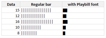
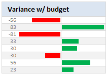
With a simple font change, you can make your incell charts magical. What more, combining incell charts with conditional formatting and some awesome alignment, you can make charts like this with ease.
PS: Playbill is one of the default fonts of Windows operating system, so you don’t need to worry about the availability.
Related: Tutorials on in-cell charts | REPT formula help & syntax | Conditional Formatting Basics | Quick tips


