
One of the annoyances of charts is that they all look like boxes (except for pie charts, they just look wrong). Boxes might be ok when you are making 1 or 2 charts. But a whole dashboard of boxes can look little rigid. So how can we make the charts peppy without loosing any effect? Like these charts below:
![Use Shapes and Images make Prettier Charts [Dashboard Tricks]](https://chandoo.org/img/c/pretty-charts-with-shapes.png)
Very simple, we use drawing shapes in MS Excel to draw whatever we want and overlay the chart on top.
See this 3 step tutorial.
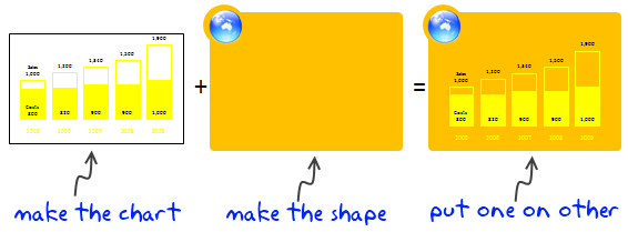
Step 1: Make the chart
This is simple, just make the chart and remove the background color. Also adjust series colors so that they look good when you combine the chart with drawing shape.
Step 2: Make the drawing
Go to Insert > Shapes (in excel 2003, select drawing toolbar and draw a shape) and insert some shapes. Arrange them so that you get desired effect.
Step 3: Put Chart on top of Drawing
This is simple. Just drag the chart on to the shape (s). If needed “send shapes to background”. That is all.
Download Example Charts
Click on these links to download example charts – Excel 2007 | Excel 2003
There are millions of possibilities when using shapes. Try something new for your next dashboard or report.
Note: Shapes can add clutter if you overdo them. Remember, the purpose is to let readers focus on the chart, not on shapes.
Additional material on excel dashboards.


7 Responses to “Project Dashboard + Tweetboard = pure awesomeness!!!”
I would like to see actual hash-tagged DM tweets go out to the specific information consumers. That would be an interesting way to communicate the key daily data to interested parties.
A Twitter-like secure application like Yammer might be a good fit with this.
For example, how about daily tweets to selected user groups (secure) that would display sales, bookings, cash receipts, cash disbursed and a second version that would show the same info for MTD, QTD or YTD figures.
@Dan, it would be great. I did not taught about implementing it on this dashboard because twitter is blocked to the whole intranet here. However, there's a discussion here about how can we send these tweets to blackberries (probably through e-mail) automatically. (I'd like to see this implemented on a jabber restricted network as well, but here it'll probably not happen)
The wrap-up versions you mentioned doesn't apply to my particular scenario, but on a sales tweetboard it would be a great tool indeed - choosing who will receive which message according to hashtags. I'll think on something, thanks for the advice. 🙂
(Ah, btw, I'm Fernando... 🙂 )
@Dan: That is a fun idea. Instead of tightly integrating twitter functionality with a dashboard, i think it would be cool if we have a "tweet this" button that users can click after selecting a range of cells. We can easily show a dialog with the concatenated output of the selected cells and ask user to edit the text and eventually "send to twitter".
For eg. you can select the annual sales figure cell and click on "tweet this" button upon which a dialog will show the value. Then you can pre-pend it something like "DM @boss look at our sales this year: "
@Aires.. thanks once again.
Wow it looks really good. Not sure though how much the tweet facility would help in real world project management, but certainly having a dashboard on a project should be a key deliverable when learning how to manage a project
The other use of this is during the software development life cycle especially when you have parallel streams of development and testing going on. Using a dashboard is a quick way for everyone on the team to see where the project is at and how it all fits together.
Regards
Susan de Sousa
Site Editor http://www.my-project-management-expert.com
Hi Chandoo,
I purchased the project management toolkit but the dashboard shown above with the imbedded scroll bars. Is it included in the project pack??
Thanks
Sue
The gantt chart section of this dashboard is similar to one I have recently created: http://xlcalibre.com/hr-dashboard-gantt-chart-traffic-light-reportIt has a similar approach with scroll bars, but has a couple of additional features. I've tried to incorporate a traffic light report element, and also allow the timescale to adjusted so that can view it by days, weeks or months.I really like the other tables that you've incorporated, I may well try to replicate them to improve my version!
I am a monitoring and evaluation consultant in international development, and one of the services I offer is to help non-profits and foundations develop performance dashboards. I often advise them to develop dashboards for ongoing programs, rather than for one-time or pilot projects, because of the time involved. I am trying to find out from a few people how long it takes you to develop a project management dashboard, and to what extent the indicators vary from one project to the next.