The other day while doing aimless roaming on the dotcom alley, I have seen some cool optical illusions. There are so many valuable lessons optical illusions can teach us – chart makers. Don’t believe me? Read on…
We cant measure sizes either
Much has been said about our inability to measure angles. That is why most of the charting gurus recommend you to not use pie charts. But what about sizes? Well, it seems we are bad at measuring them too. Look at this illusion.

Both the orange circles are of same size. As you can see, they don’t look so. I call this a bubble chart illusion.
What can this illusion teach us?
- Use data labels
- When you make a big chart, the neighbors of a data element determine how they are perceived. Avoid this illusion by adjusting axis, rearranging data or using color.
Colors are what we think they are
We talk alot about colors in charting. But when it comes to interpreting colors, our mind is very subjective. Look at this color illusion.

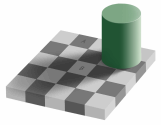
Can you believe both cells A and B are of the same color?
What can this illusion teach us?
- Use fewer colors when possible. Better still use one color.
- When you need to use multiple colors, make them distinct. If you use shades of same color, make sure they are not poorly juxtaposed.
Too much data can create un-necessary patterns
Look at this optical illusion that looks like a stacked bar chart. See how the lines don’t seem parallel.

I am sure some of you would have seen a stacked bar with enough data that looks closely like the above illusion.
What can this illusion teach us?
- If you are plotting too much data on a chart, make sure the chart is readable.
- Dont place chart elements (bars in this case) close to each other, don’t separate them too much either.
Gray color messes with our gray matter
There are just so many optical illusions involving gray color that I don’t know where to begin. See this for eg.

Because of its neither here nor there nature, gray color can easily mess with our mind (and eyes). One reason why excel 2003 and earlier charts looked so ugly is because of the gray color. They had that as default background.
What can this illusion teach us?
- Do not leave your chart’s underwear on – In other words, remove that default gray background from your charts.
- Avoid using close variations of gray when you plot multiple series of data.
No matter what your chart says, your audience will see what they want
You might think your chart proves pattern A. But your audience only see the pattern B. For eg. look at this illusion:

Some people instantly see a flower vase. Others see 2 faces. And this could be true for your charts.
What can this illusion teach us?
- Don’t leave the messages for interpretation. Spell them out if you can.
We over estimate our memory power
Our mind is notoriously forgetful and unlearns things so fast. Don’t trust me? Well, see this animated illusion.

Both yellow lines are of same length. But the moment the guiding lines are removed our mind tends to think first line is smaller than the next one. Add the guiding lines again and our mind quickly learns the fact that they are of same length. Remove it and it is as if we never learned the fact. In this great TED talk, the speaker Dan Ariely talks about the same and asks whether our mind is in complete control of the decisions we make.
What can this illusion teach us?
- Next time you set out to make that 50 slide presentation, remember this: “we are poor at remembering things”
- Use data labels, keep things simple and together if you can.
No one talks about a chart, but everyone talks about an illusion
Well, what can I say. I look at at least a dozen charts everyday. And yet, here I am, talking about optical illusions. That is true for most of us. We like magic, we like wonderful things and want to talk about them. We have seen one too many charts that they don’t excite us anymore. Show me an optical illusion and I am ready to stare at the black dot for 30 seconds. Show me a pie chart and I am yawning already.
What can this teach us?
- Whenever you can, tell a great story.
- Connect with your audience in unusual and exciting ways.
- Break some rules and don’t be shy to add a spark.
Additional charting resources to help you make magic:
- Better excel chart templates – Create great looking charts with these templates
- Vizooalization – What your neighborhood zoo can teach about visualization
- Charting Principles – Simple yet very effective rules to make great charts


49 Responses to “Introduction to Slicers – What are they, how to use them, tips, advanced techniques & interactive reports using Excel Slicers”
Great article!
If you want to learn a bit more about using slicers in VBA, head over here:
http://jkp-ads.com/articles/slicers03.asp
Hi
I downloaded cube-formula-slicer-selection.xlsx.
Why is 'Report Connections' grayed out?
Great article!! Thank you very much... This post is one of the most helpful for my job!
Great Introduction. Thanks very much.
Wow! trying to use this on the reports that I have now. I really liked that Quantity and Amount Bar graph used on the pivot-multi tab, but for the life of me, I can't seem to replicate it from scratch. Help please?
[…] http://chandoo.org/wp/2015/06/24/introduction-to-slicers/?utm_source=feedburner&utm_medium=email… […]
This is awesome! I will favorite this page in my blog, http://www.exceltoxl.com
Since I've known slicers about 2-3 yrs ago, I've pretty much used them in every damn report I do. Everyone that sees it for the first time is like "This is the best thing ever. Did you do that using excel or something else?" 😀 My bosses are so used it that when they see a report from someone else that doesn't have slicers they send it to me to redo it :).
Couple of tips:-
Tip 1:
If for lack of space or say you want ability to search within a filter due to numerous values being present but still want it to connect to multiple pivot tables or charts then
1. Setup a pivot table with just the report filter
2. Create a slicer with the same field and tie that to all the pivot tables/charts that you want.
3. Just place it some out of sight.
Now you have a dropdown with all your values with search option plsu it is also connected to all your charts and pivot tables.
TIP 2:
In Excel 2013, slicers can be used with just plain tables as well. Not limited to pivot tables.
Congrats!
Nice content : )
Very comprehensive. Explained in an extremely simple way. I have been using Slicers for a while, but still learnt new things from this post. Thanks for sharing. Best wishes.
Awesome Explanation !!
I have joined this blog recently. Brilliant tools are available that I started using in my day to day work. Brilliant site. Thanks heaps.
[…] Read the full article here: Introduction to Slicers – What are they, how to use them, tips, advanced techniques & interact… […]
Oh wow. I've only just started using Excel 2010 and had no idea this even existed. It makes dynamic charts so much easier!
You are my Hero! I am working with PowerPivot due to the huge amount of data I have and could not use my usual tricks to get the scatter chart title to change. For some reason the CUBE function wouldn't work (who knows why, I don't have time to dig into it now) but your "dummy" solution did.
thankyouthankyouthankyou!
Clare
On a normal PivotTable filter, you can choose whether to allow multiple items to be selected or not. Is that possible with slicers (in Excel 2010)? I've had a look through the options and not found a way to do it yet!
Hi Stevie... this is not possible with slicers.
Just hold down control when you're choosing them...can then either click another (without control) and it will show only the new one, or click the filter with the red 'x' to revert back to all options.
Not a limitation that can be placed on the slicer but still a potential workaround depending on your needs.
Very comprehensive note on slicer. I haven't yet used ms excel 2010, but learnt Slicer tool very well
How should I apply Slicer in excel 2010 version, not able find options
as directed, could you please tell me that step by step
@Arif
In Excel 2010 slicers could only be applied to Pivot tables/Charts not Regular tables
@Arif
In Excel 2010 slicers could only be applied to Pivot tables/Charts not Regular tables
I have a longitudinal line graph with the count of exams scored at each level(1-4). I need a longitudinal line graph that shows the percentage for each level. I made my pivot with the count in the field settings with a calculation of % of row total. This works great until you add a slicer fo that you can look at one level at a time. When I do this, it shows as 100% because it seems to lose the rest of the row calculations. How can I set it up to show the percent. I do not have the option of adding it to my data table. I am using straight Pivot, not PowerPivot.
@Mary
I'd suggest asking the question in the Chandoo.org Forums http://forum.chandoo.org/
Attach a sample file with an example of what you are after, even hand drawn
Hi, thanks for these tips. Is it possible to link a slicer to *different data sets*? All my data sets have a "year_opened" and "month_opened" fields, and I'd like do a single filter and update everything at once. Is that possible?
Hi,
Can someone tell me how to format a date field in a slicer to tell July 2016 instead of 07/31/2016?
Thanks in advance.
Great post - easily explainable for non excel whiz.
Thanks for the slicers post. I'm knew to this feature so don't be to harsh on me 🙂
In the example bar chart graph: "Quantity breakup by Customer Profession and & Product category" you get a different picture depending on which area is chosen "East, Middle, North, South, West". That part I get. But the graph itself doesn't specify which region you are in.
Is it possible to put the filtered criteria into the Chart title. For example if I chose West, the title would read "Quantity breakup by Customer Profession and & Product category - West".
Is that possible? Just curious. Thanks
It is possible...I have this on a number of my reports.
1) create a pivot table with just the column your slicer is set on
2) assign the slicer to that pivot table
3) create a string in cell B3 (or wherever):
="Quantity breakup by Customer Profession & Product Category- "&A3
(assuming that A3 is the cell that the chosen region appears in)
4) click (once) on the graph title, then in the formula bar type =B3
As you change the slicers, B3 will update as will the chart title.
Couple of tips:
1) if you need to have a new line for the title, use CHAR(10) e.g.
="Quantity breakup by Customer Profession & Product Category"&CHAR(10)&A3
(this will have the region on a new line)
2) if multiple regions will be chosen, I've added in an IF statement
=IF(COUNTA(A3:A10)>1,"Multiple Regions",A3)
(I'm sure there are ways to concatenate the strings but for mine it could get up to 20 and that just gets ridiculous for the graph heading)
Just Wow
I am trying to create a duplicate dashboard using data in one workbook and creating a new workbook to place in a shared file for my coworkers. I have created a separate worksheet in the original workbook for the new pivot charts and slicers I want to use in the new workbook/dashboard. I don't want all of the source data in the new workbook, as it is very large. I am having trouble making new slicers work. They work in the original workbook, but when I copy them to the new workbook they don't work. Am I going about this the right way or is there an easier way?
Very good post! Helped a lot. Keep up the good work!
how can you prevent multiple selection in a slicer box? In short, in any slicer box, only one entry is allowed and not multiple entries.
Fairly new to forum's, hoping I'm not breaking a rule here, but I found this forum which seems to provide a solution:
https://wessexbi.wordpress.com/2014/03/17/just-one-slice-please/
I have 2 files. (1. .xlsx 2. .xlsm)
1 file contains all the pivot tables and charts. its also macro enabled.
2nd file contains the source data which is a .xlsx file.
but I am unable to run slicer on my 1st file.
can anybody help me out?
chandoo.org: one of my favourite Excel sites for years.
Slicers tutorial: excellent as usual.
Animated gifs: sorry, but REALLY distracting!! Especially with two on the same screen. Is there any way they can be activated only when we click on them, or something?
Hi Team,
I have inserted a slicer to a pivot table with 4 fields...I need to add another field for the same slicer...help me with this..
First of all I would like to say terrific blog!
I had a quick questio in whiich I'd like to ask if you don't
mind. I was intereested to know how you center yourself and clear your head
before writing. I've had a hard time clearing my mind in getting my ideas out there.
I do enjoy writing however it just seems like the first 10 to 15 minutes are generally lost simply just tryying to figure out how
to begin. Any recommendations oor tips? Many thanks!
Hi All
Im trying to connect a slicer to 2 pivot tables with different sources
Both data tables have been sorted and have duplicates
ie
Table 1
Name Week FTe
A 1 7.2
A 2 7.3
B 1 7.3
B 2 7.3
Table 2
Name Month Fte
A Jan 2.6
A Feb 3.2
A Mar 4.4
B Jan 2.2
B Feb 6.4
B Mar 2.2
etc
I have created 2 pivot tables and have sorted it out the way i want with charts etc
Now all i want is to connect the Name Slicer to be connected to both of those pivot tables but problem is they have duplicates and are from different tables/sources
how can i connect/add this to a data model and connect to my name slicer?
Im sure it maybe something simple but minds not with it
So in short 1 to connect 1 slicer to 2 different pivots from different sources but not all pivots (There are dups in both) - as shown in the example
Thank You
Hi H
This is how you can do it. Create a third table with all slicer options (in this case it would be Name column) with one row per unique value. Now add this table to your source list. Then link all two tables via this third table thru Data ribbon > Manage relationships feature. Finally add a slicer on this third table column and link the slicer to both pivot charts.
Please note that you need to construct the tables and charts after data model is created.
See this page for more explanation on how to use relationships - https://chandoo.org/wp/introduction-to-excel-2013-data-model-relationships/
Hi,
Using Cube Value with Slicers is great. I am new to cube value, but it is so powerful. I am stuck on an issue where I want to filter on a slicer for all values except 1 and the slicer has thousands of values. I get #N/A in the results, when trying to do this. Any ideas on how to do an exception calc or how to get around this with the multi select slicer functionality?
Thanks in advance.
Cyleste
@Cyleste... thanks for your comments and welcome to Chandoo.org. You can use DAX to calculate such things as Excel pivot tables alone cannot function like the way you want. You can use DAX formula EXCEPT() to achieve this. For example,
=CALCULATE(SUM(data[sales]), EXCEPT(ALL(data[filter_column]), VALUES(data[filter_column]))) can tell you the sum of [sales] column in the data table by ignoring slicer selected values.
Hope that helps.
Hi Chandoo,
Thank you for your quick reply. I am not familiar with DAX but it sounds like I won't be able to apply the calculation you provided after converting the power pivot to excel formulas via OLAP.
Cyleste
Thanks Chandoo, I like yours tricks & always I use slicers. Regards from México.
Hi Chandoo,
I have a lot of text in the slices (Pivot table). The text is not completely visible. What should I do?
Please Help
Thanks
Hi Girish,
Slicers are useful only for items with short text, for ex: categories, product names etc. For longer values, you are better off using form controls for interaction - Here is an overview of form controls Form Controls – Adding Interactivity to Your Worksheets
Thanks so much for this, it's brilliant! I think it's almost there - I've actually followed the steps on the example linked in my post. I just can't get it to filter properly; it just returns 0 when I add a date into Cell O2. Should I be doing it differently?
slicers dont work with non-admin roles in OLAP Pivot Tables