
Who said Excel takes lot of time / steps do something? Here is a list of 15 incredibly fun things you can do to your spreadsheets and each takes no more than 5 seconds to do.
Happy Friday 🙂
1. Change the shape / color of cell comments

Just select the cell comment, go to draw menu in bottom left corner of the screen, and choose change auto shape option, select a 32 pointed star or heart symbol or a smiley face, just wow everyone 🙂

2. Filter unique items from a list

Select the data, go to data > filter > advanced filter and check the “unique items” option.
3. Sort from Left to Right

What if your data flows from left to right instead of top to bottom. Just change the sort orientation from “sort options” in the data > sort menu.
4. Hide the grid lines from your sheets

Go to Options dialog in tools menu, uncheck the “grid lines” option to remove gridlines from your worksheets. You can also change the color of grid line from here (not recommended)
5. Add rounded border to your charts, make them look smooth

Just right click on the chart, select format chart option, in the dialog, check the “rounded borders”. You can even add a shadow effect from here.
6. Fetch live stock quotes / company research with one click

Just enter the stock symbol (MSFT, GOOG, AAPL etc.) in a cell, alt+click on the cell to launch “research pane”, select stock quotes to see MSN Money quotes for the selected symbol. You can fetch company profiles in the same way. Learn more.
7. Repeat rows on top when printing, show table headers on every page

When you are on the sheet view, just hit menu > file > page setup, go to the last tab, specify “rows to repeat”. You can “repeat columns while printing” as well from the same menu.
8. Remove conditional formatting / all formatting with one click

Just go to Menu > Edit > Clear > All to remove all the formatting from selected cell / range.
9. Auto sum cells with one click

Select a bunch of cells and click on the Sigma symbol on the standard tool bar. Alternatively you can use Alt+= keyboard shortcut.
10. Find width of a column with formula, really!

Just use =cell("width") to find the width of the column to which that formula cell belongs. Width is returned as the nearest integer.
11. Find total working days between any two dates, including holidays
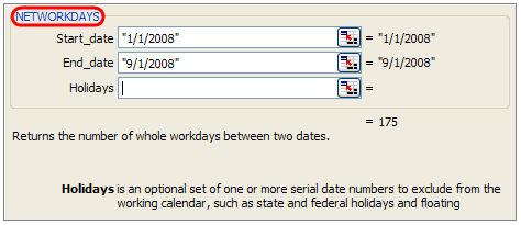
If you work on project plans, gantt charts alot, this can be totally handy. Just type =networkdays(start date, end date, list of holidays) to fetch the number of working days. In the above sample you can see the number of working days between New years day and September first of this year (labor day).
12. Freeze Rows / Columns in your sheet, Show important info even when scrolling

Select the cell diagonally beneath the row / columns you want to freeze (for eg. if you wan to freeze row 1&2 and columns A&B, click in C3), go to menu > window and click on freeze panes.
13. Split sheets in to two, compare side by side to be more productive

Just click on this little vertical bar on the bottom right corner of the sheet (see below) and drag it to create a vertical split. You can do the same way for a horizontal split as well 🙂

14. Change the color of various sheet name tabs
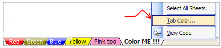
Right click on sheet and select “Tab color” option to change the worksheet tab colors. Group them with similar colors if you have lot of sheets, it looks nice.
15. Insert a quick organization chart

Click on menu > insert > diagram to open the above dialog, just select the organization chart option, enter node values and you have a pretty organization chart. Alternatively learn how to create org charts in excel.

So what do you say now? Isn’t Excel Exciting? 😀


121 Responses
Great tips! Another good one is highlighting a bunch of cells and changing the autosum visual at the bottom right to be Average or Count instead of auto sum.
one note on the “unique items” tip – this only works with numerical data – if you’re looking to weed out unique text entries, no dice – I work in Excel a lot with names and proprietary tags and would love a way to select a unique text entry – any suggestions?
You can filter duplicate text entries as described above if you use the advanced filter option, however it will not allow you to do an additional filter on an adjacent column afterwards without duplicating the data first.
The method detailed below will allow you to filter our duplicate entries based on a conditional format.
Select the range from which you wish to filter out duplicate text entries
Click on Conditional Formatting > New Rule… > Use a formula to determine which cells to format
type the following formula in the text box: =AND(COUNTIF(“RangeAddress“, “FirstCellAddress“)>1, MATCH(“FirstCellAddress“,”RangeAddress“, 0)<> ROW()) making sure to substitute accordingly. Note: RangeAddress should be absolute(“$A$1:$A$20”), and FirstCellAddress should be relative (“A1”).
Set the format to fill the cells with a color, depending on the application I use either a faint off-white to down play the color or a bright yellow to really make it pop – the choice is yours.
Ta-da your duplicates are now colored. You can now filter by color if you use 2010 to see only duplicates or only unique records (unique being only one record per value). Pre-2010 you can sort by color to get them at the top/bottom of your list.
Maybe if you use Access.
First post on chandoo.org, wahoooo!
Anyways, after reading the above comments I just realized there’s a similar way to flag duplicate values with a formula, and one that works for strings as well as numbers. If you’re working in column A with a header row then your IDs will be in cells A2:A___. The following formula can be entered in B2 and filled downward to return FALSE when the ID is a repeated value, i.e. it is not the first instance of that value:
“=MATCH(A2,$A$2:$A$__,0)=(ROW(A2)-ROW($A$1))”.
Re: =MATCH(A2,$A$2:$A$__,0)=(ROW(A2)-ROW($A$1))
That’s a brilliant formula – I shall use that.
Many thanks for sharing!
Just highlight duplicates and then filter out the highlighted cells.
OK, my hint, I think this excel function have never been documented or referred even in manuals:)
If you want to insert a part of a worksheet as picture (e.g. you want to include a small chart to a preformatted excel document), do the following:
DRAW anything, a square, circle, etc.
SELECT the cells you want to insert as a picture
SELECT the object you made (square,etc.)
PASTE
Voila:)
I can’t get the comment to change. It just wants to draw a new autoshape.
To change the shape of the comment In Excel 2010 – I had to Customize the Ribbon [FILE, OPTIONS] and add a “Format” tab to the Main Tabs to allow the Format tab to be available all the time. Now I can Edit the shape.
@Adam.. It works for text data for me, which version of excel you are using, all these tips are tested in Excel 2003.
@PK … when you select comment to edit (shift+f2) click on the border of the comment, then go to bottom left corner in the screen and select draw > change auto shape. Should work in excel 2003 and above. Let me know if you see some problems 🙂
nope, it still doesn’t work. There is no draw -> change auto shape available for me. The left bottom corner of the screen just shows ‘Ready’ and if I right click on it it shows a lot of other things to activate, none of it is Draw or Auto options. I use Excel 2007
Hi,
I was also facing the same issue but found a solution for it on this weblink
http://www.officetooltips.com/excel/tips/changing_a_comment_shape.html
You’ve missed an important step in your first tip. The Drawing toolbar must be active for this to work. Mine is not on by default, so I have to take the extra set to turn it on.
Very nice, thanks!
Could you clarify “You can also change the color of grid line from here (not recommended)” What is the recommended method.
The graphic designer-side of my job hates Excel, but the business owner side of me finds it to be essential. These tips help bring both sides (designer / business owner) closer together. Thanks!
@MM.. you are right, I have assumed the draw toolbar is on… thanks for pointing it out.
@Jason… “You can also change the color of grid line from here (not recommended)”, I said that to convey changing grid line colors is not recommended, as it can scare people or otherwise make your sheet look extremely busy… but you can change the color if you wish.. 😀
I use the NETWORKDAYS function all the time and it just blows people away.
Dude,
networkdays is my fav.
🙂
Nice post.
-Nikhil
My favorite excel command Ctrl and ~
displays all formulas
Thanks you pointy haired Dilbert, this is definitely a great list, like always bookmarked for future uses 😀
greats tips
i like command for displaying all formulas
thanks
Great tips!
However, #14 You need to right-click on the tab not the sheet.
#10 You can just left click and hold on the right most line of the column letter. Also, another tip a lot of users don’t know is that you can change a section of columns you want to one width by highlighting a column with the width you prefer and left-click-hold on the bottom right corner of that column letter and drag it through as many columns as you need.
Great history class. Should have gone for Excel 97 while you were at it 😉
Hey, HEY
Don’t be rude. It’s a waste of everyone’s time – including yours. Totally unnecessary.
******
Thanks for this post! I really enjoyed reading these tips. I will bookmark this post and will also subscribe to your weekly newsletter!
Thanks so much.
Fun things? 😀
@Wade: you are right, you have to click on sheet name and not on sheet
and #10 was meant to show another way to find column width, but yeah, I always use the left click hold technique to see if the width is enough for me. Thanks for sharing it with everyone 🙂
@0751firewire: thanks 🙂
@everyone… I am happy so many of you liked this post and enjoyed these small but very useful stuff hidden away in the Excel.
Dear Chandoo,
I have discovered you only 3 days back . I want a help from you . I am using a software which makes a grid file of lat,long and elevn. data (x,y,z) on 25m into 25m mesh size . I feel that this grid file which is made from a xcel csv sheet containing random x,y,z points can be made on xcel sheet itself. Can i do that ? example of a source data shown below
x y z
100 50 12.5
200 40 14.0
220 75 12.0
202 60 15.0
@Leo Da Vinci
You can either import and existing CSV file or setup the file directly in Excel as a workbook
You can not make a grid gragh on xeel because it has boxes you would have too get speacial advanced software like the sciencestes do:
i know more that somebody from the GEEK squad!!
@Whatever
Can you post a sample of a Grid Graph or a link where we can see what your referring to?
Tip #13: In case anyone is an excel newbie like me, to remove the new vertical bar, just double click on the bar.
Thanks fir the tip re vertical bar.
I am a baby Excel beginner at 86!!!!!
thats cool duede
Unique text entries can be found easily — use COUNTIF function for each row. You can use autofilter to delete anything with result > 1.
To the person joking about Excel 97 — that version of Office is still the standard at my workplace. No joke.
Adv
I tried second tip to remove the duplicate entries from the row by copying it in another location but its not working if I use data in A’ th column as
A1 aa
A2 aa
A3 bb
and I am trying to copy the unique records to column B.
The above scenario is not working if duplicate entries are present in A1 and A2.
It will work if duplicate entries are present below first record.
@Arti
Autofilter as well as advanced filter needs titles of the columns in the first row. If you have only the three items in your list, Excel assumes, the first “aa” is the title (field name) of your list, not an entry in the list itself. As a result, Excel writes into column B again the first aa as the title and the second aa and bb as the 2 entires.
Simply insert a row above your list and give your list a name in cell A1. Then it should work.
Good day!
It is very informative and has a very good quality in it.
I like it…
http://www.Squidoo.com/MPI
mliragana.blogspot.com
Thank you very much for your time.
Nr. 5
-> does not work. And I have Excel 2003!
@Melli .. Welcome to PHD…
Are you sure rounded borders are not working. I have made this example in Excel 2003 and they are working alright for me. You have to select the entire chart to change borders to rounded, not the plot area alone.
I did not know excel is this much fun.
@ Adam & Chandoo…
For removing / filtering the duplicate entry / unique data…one can use the readymade menu from JMT utilities….very useful…
Thx so much PHD…tusi gr8 ho ji…:)
i cannot find CHANGE AUTO SHAPE option in Excel 2007 to design my comment box. Please help?
@Francis… Excel 2007 has made it little difficult to change comment shapes, but it is still possible. First add a regular shape (like rectangle) to the worksheet. Now select it. This will show a new ribbon called “format”. From here, you can find the change shape tool. Add this tool to Quick Access Bar.
Now Select the comment cell and edit comment. At this point, use the change shape tool from QAT to change the shape of comment.
all right!! Thanks, this answers my question posted above. Yes, now it does work and it looks great! 🙂
Its really made easy.
Its a bit of a faff in 2007, not sure if its just my work computer than won’t let me change the default shape for comment boxes… But for this one workbook i’ve added a simple:
ActiveCell.Comment.Shape.Select
Selection.ShapeRange.AutoShapeType = msoShapeVerticalScroll
Or you can change msoShapeVeriticalScroll to any shape you like…
Dear All
Thank you all very much. You guys have taught me a lot of new things in Excel. Keep continuing the good work.
thanx so much…it really is of gr8 gr8 help to me…… :))
The color sheet tab option has disappeared. Was there and working fine but now when I right click there isn’t an option to change the color of my sheets. How can I get this option back?
@Deanna.. you can reach this from Format button on home ribbon. Key board short code – ALT + HOT (just press h,o and t one after another).
Hello,
Can I know the name of the last person who saved the file last.
In a team of 10 members working on a shared excel file, this information will help me to know the name of the person who modified the file.
@Sanjay: Open the workbook – Click on File -> Properties -> Click on the Statistics Tab for the information you are looking for.
Too nice thanx 4 sharing
Wish I could see those images, because they’re now blocked by photobucket. Next time use imgur, or host it on your own server.
Brilliant!
Helped me teach my pupils loads in I.C.T today!
LOL
you don’t have references 🙁
I liked a lot this web site
thanks
@chandoo ji
can we change default comment cell box shape in excel 2007or 2010?
Hi Friends
Can we Increase the Column width >500 in excel 2003.
Pls help…
I really like tip #1 but I’m how can you do it if you’re using Excel 2007. I don’t see the drawing toolbar…I believe it’s gone in 2007 but not certain. I did see the autoshape when I select the commnent and right click but nothing happens when I select it.
This is possible in Excel 2007 (and 2010) too. Follow below steps:
This is awesome Chandoo ! Tip#1 I was most impressed. #6 I was not able to replicate – if you meant Alt + (Mouse left) click, it did not work. But manually triggered the reference – but was unable again to make it available as embedded “auto look up” in the sheet itself.
wow! this site is awesome
Some tricks are not working with Excel 2003
But others are too cool thanx
Can anyone help. I want to be able to hide a row for exampe row A if the Cell A1 is empty after i have sorted the rows.
I can write the macro to sort the list then I am stuck.
Any HELP OUT THERE.
Regards ken
why isnt my thing working
=NETWORKDAYS(“11/11/2011″,”12/12/2012”,[holidays])
It’s not going to work that way. At least not with the parentheses. Try entering the two dates in two cells and referring those cells within your formula 🙂
It will work – a date in formula is entered as follows:
=NETWORKDAYS(DATE(2011,11,11),DATE(2012,12,12),0)
I’m doing an address directory. All I want to do is find out how to delete a blank line or move the second line up to the first line in the cell? Appreciate any help you can give. Thanks.
How to make comments of different shapes in Excel 2010?
we have shared the workbook, so other user can access and feed data at their respective fields, all user can view list of users accessing the shared file,but unfortunately if a user removed from list of user name then that user will be disconnected and whatever changes made will be proved to be useless as file become exclusive.
Could you please anybody help me out how to protect the username list so nobody could removed from the list.
how to change font color in cell by using formula
This can be done using conditional formatting. Is there a specific thing that you are looking at ?
Hi Chandoo,
I bumped into your site two days ago and am hooked to it.
Very helpful and elaborate articles.
Thanks.
Can anyone help me to do the following:
Is there any option to copy all the procedures done for a set of values to other set of value which we will input in later stages.
In other words: Imagine I have a list of values(first set) for which I need to do some mathematical and logical operations and I will get the final required output.
Also if I have one more set of values(second set) for which I need to do the same procedure to get required output.
So my question is : Is there any way to get the final output directly for set-2 values based on the steps(procedures) done for set-1 so that it will reduce lot of work.
Please help me.
Thank you all.
@Prakash
Can you ask the question in the forums
http://chandoo.org/forum/
Please also attach a sample file with an example of what results you want
whey it is appearing
I think you should mention that this feature available from WHAT Version otherwise users go crazy!
Oh very cool stuff! Thanks
This is really a good article even I read some comments which were really useful.
That was cool Sir. Thanks for sharing these tricks with us.
Help!! I just pulled data out of a different software and pasted values only in excel. Anything with a character other than a number is shifted to the left of the cell. Anything with only numbers is shifted to the right of the cell.
The VLOOKUP is only working on the ones shifted to the right. The formatting on the home tab is all the same. Why is it working on some but not the others? Is there underlying format that can be erased??
The VLOOKUP is only working on the ones shifted to the left.********
(Only works for cells that have characters other than numbers, in addition to numbers)
thanks for your tips and tutorials excel for children… i like
Hat tip to you, OSUM Chandoo!
I’m adding birthdates to a column. I need to know how to differentiate a birthdate in the 19 hundreds (19XX) from a birthdate in the 2 thousands (20XX).
I appreciate any help!!! Thank you
Assuming your birth date column is G and is a date datatype:
=if(YEAR(G1) < 2000, "Born in 20th Century", "Born in 21st Century")
Is there any way that, I can overlap and compare between two worksheets. This is required in case to auto highlight edited data between the copies. Please help….
Nice post . Step -> 7. Repeat rows on top when printing, show table headers on every page – will be useful . Thank you.
Hi Chandoo,
Firstly, I wanted to say a big thank you for whatever you are doing for people like me who need knowledge of excel and power BI.
I wanted to know how we can highlight cells which have dates between the given range.
for example, i want to highlight cell which have dates between Jan 1, 2022 and June 30, 2022.