What is new in Microsoft Excel 2010? [Office 2010 Week]

Share

Facebook
Twitter
LinkedIn

Excel 2010 - What is new?This week we are celebrating Office 2010 launch at chandoo.org

Office 2010 [download beta version | purchase], the latest and greatest version of Microsoft Office Productivity applications is going to be available worldwide in the next few weeks. I have been using Office 2010 beta since November last year and recently upgraded my installation to the RTM version (Ready to Manufacture, a version that is final and used for burning CDs that MS sells).

I was pleasantly surprised when I ran Microsoft Excel 2010 for first time. It felt smooth, fast, responsive and looked great on my comp.

This week, we are going to celebrate launch of Office 2010 by learning,

  1. What is new in Excel 2010
  2. Introduction to Excel 2010 Spark-lines
  3. New Conditional Formatting Features in Excel 2010
  4. Making your own ribbon in Excel 2010
  5. Using the Backstage View in Excel 2010
Leave a comment to win a copy of Office 2007 – Home & Student Edition
(with free upgrade to Office 2010 in June)

What is new in Excel 2010?

There are a ton of new and cool features in Excel 2010. My favorite new features are,

Sparklines

Excel 2010 - Sparklines
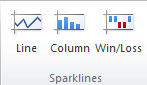
These are small charts that can be shown inside a cell and are linked to data in other cells.You can insert a line chart, win-loss chart or column chart type of spark line in excel 2010. They add rich information analysis capability to mundane tables or dashboards. We learn more about using them in tomorrows article.
[meanwhile: Learn how you can make sparklines in earlier versions of Excel]

Slicers

Slicers to filter pivot tables with ease
Slicers are like visual filters. They are an easy way to slice and dice a pivot table (what is a pivot table – tutorial). A sample slicer at work is shown above.

Improved Tables & Filters

Tables show filters even when you scroll down
When working with tables in Excel 2010, you can see the table filtering & sorting options even when you scroll down (the column headings – A,B,C… change to table headings)
[Related: Introduction to Excel Tables]

Also, in Excel 2010, data filters have a nifty search option to quickly search and filter values you want. (I still prefer the excel 2003 style one click filtering).

New Screenshot Feature:

Excel 2010 - Screenshot Picker tool
Now, using Excel (or any other Office 2010 app) you can grab a screenshot of any open window. This could be very useful for those of us in teaching industry as you can quickly embed screenshots in to your teaching material (like slides or documents).

Paste Previews:

Preview before pasting
There are a ton of cool paste features buried in the Paste Special Options in earlier versions of Excel. MS has bought all these to fore-front with Paste Previews feature in Office 2010.

Improved Conditional Formatting:


Excel 2010 added a lot of simple but effect improvements to conditional formatting. One of my favorites is the ability to have solid fill in a cell based on the value in it. This provides an easy way to create in-cell bar charts.

Customize Pivot Tables Quickly

Excel 2010 - Pivot Table Options
Now you can easily change pivot table summary type and calculation types from Pivot Table “Options” ribbon in a click (learn how to do this in Excel 2007 and earlier).

Also you can do what-if analysis on Pivots (I am yet to try this feature).

Customize Add-ins from Developer Ribbon

Excel 2010 - Add-in Menu in developer ribbon
In Excel 2007, if you want to customize or add a new add-in, you have to circumnavigate cape of good hope. But Excel 2010 makes it a pleasant experience again. There are two buttons, right on developer ribbon tab using which you can quickly add, change any add-ins.

(also, it seems like developer ribbon is turned on by default, which is pretty cool.)

Customize Ribbons and Define your own Ribbons

You can customize ribbon in Excel 2010
One the most beautiful and powerful features about Office products is that you can customize them as you want. You could easily add menus, change labels, and define toolbars the way you like to work. It made us feel a little powerful and awesome. Then, for some reason, MS removed most of these customizations in Office 2007 leaving us frustrated and powerless. Thankfully, they restored some of that in Office 2010. In this version of office, you can easily add new ribbons or customize existing ribbons (by adding new groups of tools).

One File Menu to Rule them all

Excel 2010 - File Menu and Backstage View
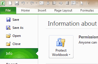
One of the biggest WTFs in Excel 2007 is Office Button. It wasn’t immediately clear for most of us, how we should save or work with existing files as everything was hidden behind the office button. Office 2010 rectified that problem beautifully by restoring “File” menu. But the engineers at MS didn’t stop there. They also added a host of other powerful features to the file menu and branded it as “backstage view”. Kudos! [Learn more about File Menu and Backstage view on this Friday]

Many more new features:

Not just these, there are many more subtle UI enhancements, features and improvements in Excel 2010 (and all other Office products). For eg. macro recorder now works with charts too, you can double click on chart elements to format them, you can collapse ribbon with a click, there is a new UI for solver, lots of statistical formulas have improved accuracy, there is exciting PowerPivot Add-in (my review of powerpivot) to let you do poweful BI and Analysis work right from Excel and many more. [read about all changes in Excel 2010 at TechNet]

You could win a Copy of Office 2010 – Home & Student Edition

Through out this week, I will be posting about Excel 2010’s new features and how you can use them to be even more awesome. I have 2 3 free licenses of Office 2007 Home  & Student Edition (free upgrade to Office 2010) to giveaway.To qualify, all you need to do is drop a comment on any of the 5 posts this week.

The contest is sponsored by Microsoft and winners will be chosen randomly.

Addendum: I got 3 licenses to giveaway. 2 of them for Indians and one for a lucky international reader.

So, what are you waiting for? Go ahead and tell me what your favorite feature in Excel 2010? Leave a comment to win an Office license.

Things to do:

Facebook
Twitter
LinkedIn

Share this tip with your colleagues

Excel and Power BI tips - Chandoo.org Newsletter

Get FREE Excel + Power BI Tips

Simple, fun and useful emails, once per week.

Learn & be awesome.

Welcome to Chandoo.org

Thank you so much for visiting. My aim is to make you awesome in Excel & Power BI. I do this by sharing videos, tips, examples and downloads on this website. There are more than 1,000 pages with all things Excel, Power BI, Dashboards & VBA here. Go ahead and spend few minutes to be AWESOME.

Read my storyFREE Excel tips book

Overall I learned a lot and I thought you did a great job of explaining how to do things. This will definitely elevate my reporting in the future.
Rebekah S
Reporting Analyst
Excel formula list - 100+ examples and howto guide for you

From simple to complex, there is a formula for every occasion. Check out the list now.

Calendars, invoices, trackers and much more. All free, fun and fantastic.

Advanced Pivot Table tricks

Power Query, Data model, DAX, Filters, Slicers, Conditional formats and beautiful charts. It's all here.

Still on fence about Power BI? In this getting started guide, learn what is Power BI, how to get it and how to create your first report from scratch.

33 Responses to “Show Months & Years in Charts without Cluttering”

  1. eladberko says:

    Very CooOOOoool 🙂

  2. JP says:

    Would it work if I merely change the display format for the dates, or do they actually need to be retyped in that format (Nov, Dec, etc)?

    ps- it's only about 34 donuts per month, or slightly more than 1 per day. Yum!

  3. Jon Peltier says:

    To make it work automatically when you create a chart, delete the labels above the Year and Month columns, but keep the label above the Y data (Donuts). The blank cells tell Excel that the first row and first two columns (indicated by the blanks) are special, so it uses the first row for series names an the first two columns for X axis labels.
     
    This is better than the other kind of donut chart, but you'll soon be carrying a big donut around your midsection.

  4. Erin Smith says:

    First off, thank you Chandoo for being respectful and taking out the "Jesus" comment. Not that I'd threaten to kill you, or start world-wide riots, or make you go into hiding if you didn't (as OTHERS would; wink, wink, nudge, nudge)... I just really appreciate your respectulness and consideration; so thank you. I was meaning to write you about it, but when I came to your site you'd already made the edit... so again, thank you!

    Secondly, I wanna say I think there's an easier way to do what you are demonstrating. I've got a pivot chart with months of data and all I had to do was right-click the x axis and then select "format axis", under "Axis Options" there's a check-box that says "Multi-level Category Labels". The chart I was able to do this on was a pivotchart however so maybe it wouldn't be that easy for a non-pivotchart.

    Anyway, love the site. Keep up the good work. Thanks also for being so open about your success, it's very encouraging and motivating.

    God (aka Jesus) Bless. 🙂

  5. Terry Dukes says:

    Hi Chandoo - great site! Another option to save space is to simply rotate the orientation of the text by 90 degrees, so the dates read vertical rather than horizontal. However, I like the elegance of your solution also.

  6. Kien Leong says:

    Hey Chandoo -- Great tip. Only yesterday I was working through some strange behaviour with formatting dates in PivotCharts. Seems the axes never want to cooperate. This is a neat and elegant solution I hadn't thought of using. May need to abandon pivotcharts to use formulas like that, but if we use dynamic named ranges, no big sacrifice.

    BTW, whatever did you do to get your site blocked in China? Never heard of regime change by a grass-root spreadsheet movement. Maybe your ISP is hosting some problem sites. Chandoo.org is certainly worth it for me to fire up the VPN, but I'm sure you would lose a lot of other visitors from the middle kingdom.

  7. Kapil says:

    Chandoo ... pls help.. the link is blocked over here... pls can you put the regular link... 🙂

  8. Chandoo says:

    @JP... Excel Axis formatting is linked to cell formatting by default. So you can just have the dates which are formatted to look like months (mmm).

    @Erin: It was not my intention to mock anyone's faith or religion. I just used the word as it is quite common. I decided to remove it as I got 2 emails from readers requesting for the same.

    Also, the pivot charts take pivot table groupings by default, so you need not do any of the above while making charts from pivot tables.

    @Kein: I am not sure why Chinese authorities decided to block my site. I wish they would actually look at the content instead of blocking sites based on simple text matching rules.

    @Kapil: The file is mirrored here: http://chandoo.org/img/d/date-axis-months-years-trick.xls

  9. Prateek says:

    Cool, really cool...

  10. SS says:

    Nice one Chandoo,

    Also would like to mention abt useful method while creating dynamic charts.

    In any chart where in the months keep on adding - instead of changing the range for the chart every time we add a month, we can actually format the months as dates (probably 1st of every month) still keep the format as "mmm" AND while selecting the data, we can select a huge rows (date column) once and for all, and the chart adjusts automatically with the data that we entered. So next month when I enter Dec's data, I need not change the source data of the chart, however it automatically adjusts.

    Hope I made sense.!

    Regards,
    SS

  11. Tom says:

    Thanks, Chandoo! This is a great tip - one that I will definitely put to use. I typically have an axis with mmm yy format, aligned vertically, but this will definitely look a bit cleaner (except in cases where the chart is too small for the axis labels to be displayed horizontally, even without the mmm yy on one line). Thanks again!

    Tom

  12. Josh says:

    Chandoo,
    Thank you for the posts you are very diligent not to mention very helpful. I would like to know how to get the separation lines on the axis? For example your candy sales chart has longer lines separating east and west how do you format that?

    Thanks for being very awesome!
    -Josh

  13. Alvaro says:

    Hi Chandoo, we can look the formulas because there is a message:"Unsupported features".
    Could you send a diferent Link ?
    Thanks.

  14. Matt says:

    @SS But what if you've got formulas in the data block (i.e where you would enter static data for the month of december)? My chart now shows #N/A #N/A in the axis with no data for all future dates.

    Chandoo, I've got a dynamic range set up showing #N/A errors for future dates. The MMM-DD date format format in row works fine, but when I use YYYY and MMM in two rows, the axis shows #N/A #N/A for all future dates with no data. How would you go about keeping those future months hidden?

  15. Jon Peltier says:

    Matt -

    In order for the axis to automatically extend to the dates within the range and ignore #N/A at the end, you need a date-scale axis, and for this you need to use one column with the complete date, not two columns with year and month.

    If you want to use two columns, you need to generate Names in the worksheet which define ranges only as long as the number of months. I have a review of dynamic chart approaches in http://peltiertech.com/WordPress/dynamic-chart-review/ and a whole category on my blog at http://peltiertech.com/WordPress/category/dynamic-charts/. Chandoo also has examples of his own on this site.

  16. Ethan says:

    How do you make a dynamic chart out of this?
    I can't get the axis labels range right.
    I tried something like this:
    =OFFSET(REPORT!$H$10:$I$10;0;0;COUNTA(REPORT!$H$10:$I$100);1)

    Any idea?

  17. Jon Peltier says:

    Ethan -
     
    Your offset formula defines a range 1 row in size, but the technique here requires 2 rows. Your definition should end with
     
    ;2)
     
    instead of
     
    ;1)

  18. Ethan says:

    Thanks Jon,
    Got it working now

  19. Neal says:

    Great! Now, is there any way to do this directly in Powerpoint? I don't like having linked excel files, so I create the graphs right inside Powerpoint, any way to do this there? I tried and was unsuccessful.

    Thanks.

  20. Joe says:

    Cool tip Chandoo......thanks

  21. [...] extract year and month from dates to avoid a mess in our stock chart. Chandoo has a great post: Show Months & Years in Charts without ClutteringIn cell B2:=YEAR(D2)In cell B3:=IF(YEAR(D3)=YEAR(D2), "", YEAR(D3))Cell C2:=IF(TEXT(D2, [...]

  22. Bilal says:

    Hi there,
    I have got a data ranging for 3 years. I want to show a chart which shows Jan of 2011, 2012 and 2013 together side by side; then Feb11, Feb12 and Feb13 side by side, then Mar11, Mar12 and Mar13, and so on until December.
    Please help. Thanks.

  23. Down With This Sort Of Thing says:

    Hi there

    Very good solution this. I have another question on it, though. How do you format the X-axis with monthly gaps (ie, with labels "Jan 2012", "Apr", "Jul", "Oct", "Jan 2013", "Mar", etc), when you're dealing with a data series with weekly or daily data points? The Axis Options dialogue box doesn't appear to offer "Date axis" as an option under the "Axis Type" section.

    I've managed to do it in one case with weekly data by setting the interval between tick marks at 13 -- the approximate number of weeks in a quarter -- to get 3-month intervals. But this wouldn't work if I wanted to show 1-month intervals, or had a more detailed daily data series to work with.

  24. Herro says:

    Any luck getting the dates to work on a scatter graph? I'm only getting numbers. Works fine on line graphs though.

  25. Apoorve says:

    How can we do the vice versa? i.e. on the x-axis showing year on the level 1, and months on level 2.
    I wanted to build these kind of axis labels for 5 years, with year on top and months at the bottom, but it should form in such a way that the seperating lines should seperate the entire data set only at December of each year, and no lines in between any month.

  26. Carlos says:

    Like!!
    Three times already today I have used this website and saved a ton of work time in researching excel tricks.

    Suggestion: Why not have a "like" or "this article was useful to me" button. That way you can see what is most useful by your users and maybe generate more content based on those "likes".

    Just saying. Thanks again and you're doing a great job!

  27. Haj says:

    Thanks for the tip. However, I couldn't download your file. The link is broken.

  28. JeteMc says:

    Thank You for taking the time to post this tip. I hope that you have a blessed day.

  29. Tom says:

    The link does not work properly and I'm not sure how to actually get the graph to display like this, its frustrating me a tonne. I cant work out what to google either to find an answer elsewhere! 🙁

  30. parag says:

    Is this possible with waterfall chart. Data hereunder -

    Years Abbrevation Amt

    2020 BEG 2,006
    REV 1,950
    EMP 1,058
    DM (3,244)
    OOE 1,078
    OPMT 182
    AB (638)
    END 2,392
    2021 REV 8,534
    EMP 67
    DM (2,142)
    OOE (3,120)
    OPMT 510
    AB 1,008
    END 7,249

Leave a Reply