
Sometime during the 2nd half of 2013, I finished 10 years of Excel usage. In the last 10 years, I completed my studies, got my first job, married, had kids, visited 15 different countries, quit my job to start a business, bought first car, first house, made dozens of new friends, read 100s of books, wrote a book and learned 1000s of new things. And all along, Excel stayed a true companion. Right from MBA entrance exam preparation in 2003 to making my summer internship project reports in 2005 to planning my wedding expenses in 2007 to getting a promotion in 2009 to planning my kids feeding schedule in 2010 to running a successful business in 2014, Excel helped me in every step.
So today, I want to tell you the top 10 things I learned using Excel in last decade. Grab a hot cup of coffee, buckle your belts and get ready for time travel.

Late 2003 & 2004: Using Excel to track exam prep & making sales reports using Excel + Java!!!
During 2003, I got my first job as software engineer. I used work more roughly 10 hours a day + 2 hour commute. This left me with very little time to prepare for MBA entrance exams. So I used Excel to plan my time efficiently, track my preparation progress, mistakes made in mock examinations and test scores. Everyday before sleep I used to review the Excel workbook to understand how I can improve, where I am struggling. If any of you remember the Active Desktop feature of Windows 2000, I used it to show the Excel workbook as my desktop wallpaper so that it was never out of sight.
Although the workbook was not very sophisticated, it helped me greatly in securing admission to one of the best MBA colleges in India.
During my work as software engineer, I got an interesting challenge. I was asked to create Excel based sales reports from Java / JSP code. Back then, there is no API to directly create Excel files from Java. So I used Apache’s POI HSSF (Poor Obfuscation Interface – Horrible Spread Sheet Format) to create a Java class called as ExcelBridge. This can take raw data (from MySQL) and convert it in to Sales report Excel workbook. Last heard, my company & their clients are still using ExcelBridge to publish sales reports.
Although ExcelBridge is a complex piece of work, I learned little about Excel thru it. I had a colleague (Roja), who knew how to format Excel files, how to use VB Script, so she helped me with Excel part while I focused on Java & MySQL.
Things learned: coloring cells, using Excel to track data.
2005: IF()
Later when I joined B-School, I had to learn how to use formulas like IF() to model real world situations. And boy oh boy, that proved to be a very difficult experience. I still remember that one afternoon when I spent more than 2 hours trying to debug the IF() formula.
Later in 2005 during my summer internship, I learned how to use Pivot tables to analyze survey data. Although I made the reports, I did not have a clue as to what pivot tables were doing.
A part of Excel report made during my summer internship. Don’t ask me what it says.

Things learned: IF formula and few others, very little bit of VBA coding
2006: Analyzing data
By July 2006, I started working as business analyst with a leading IT company in India. During my first 4 months, all I was doing is analyzing data in Excel and making presentations. This was a very intense learning experience. During one of the assignments, I was analyzing annual reports of 70 Fortune 500 insurance companies using Excel. Lots of numbers, text and details.
It became obvious that to shine as a business analyst I must be very good in Excel & Power Point. So I used make Excel files modeling many problems from my personal life, like planning my retirement. Here is one such thing I made in 2006.

Things learned: formulas, charting concepts, creating & maintaining large workbooks.
2007: Modeling, more analysis
During 2007, one of the work projects required that I visit Hong Kong to meet a Chinese health insurance company and understand their claims process. If you have ever had a health insurance claim, you know what complex cobweb it is. Not only I had to understand that, but I had to explain it in Excel (and Word) so our coding team can create programs to improve the claims process. This made me understand the true power of Excel. My colleague (Eldhose) & I created elaborate models to explain the claims process, classification of diseases, treatment procedures and more.
Things learned: how to use data validation & form controls can help in user interactivity and controlling formulas.
2008: Gantt Charts and Conditional Formatting
For a few weeks in early 2008, I became a makeshift project manager. One of the first things I had to do was to create a plan and share with it our client. I quickly whipped up a Gantt chart using Excel. Our clients loved the plan that they asked me to continue full-time.
2008 is also the year I started writing more often about Excel on Chandoo.org. Until then, Chandoo.org used to be a mixed bag with lots of personal stories, rants and observations.
This Gantt chart almost got me a promotion.
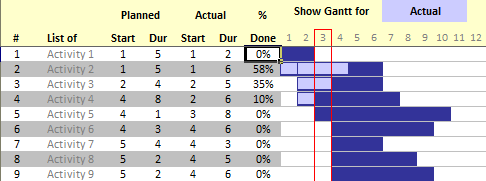
Things learned: using features like formulas & conditional formatting to make gantt charts.
2009: SUMPRODUCT, Tables, Charts & Reports
By 2009, I was managing a small team of business analysts and started working with another insurance giant in Sweden. Most of my work involved reporting, analysis and meetings. Naturally, Excel became my ally as I was making charts, reports, trackers and presentations almost everyday. Whatever I was learning, I used to post it on Chandoo.org (I still do.) SUMPRODUCT also became my best friend as I had to calculate numbers based on various criteria. And Tables became the greatest ally. I used them everywhere.
Things learned: SUMPRODUCT, Excel Tables, chart customization, tweaking and building better charts.
2010: Dashboards
Although I started learning about Dashboards in 2008 (thanks to my good friend Robert’s excellent KPI dashboard articles), by 2010 I was making them more often. New features in Excel 2010 like slicers, sparklines helped me even more.
In 2010, I quit my job finally to work on Chandoo.org full time. Naturally I started using Excel to manage my business. 2010 is also the start of a really intense and rapid learning phases in my life. I learned new concepts and usages of Excel almost every week since then. Since I do not want to keep this knowledge, I started Excel School program. Now thousands of people all over the world are Excel pros, thanks to this course.
An example dashboard you will learn in Excel School
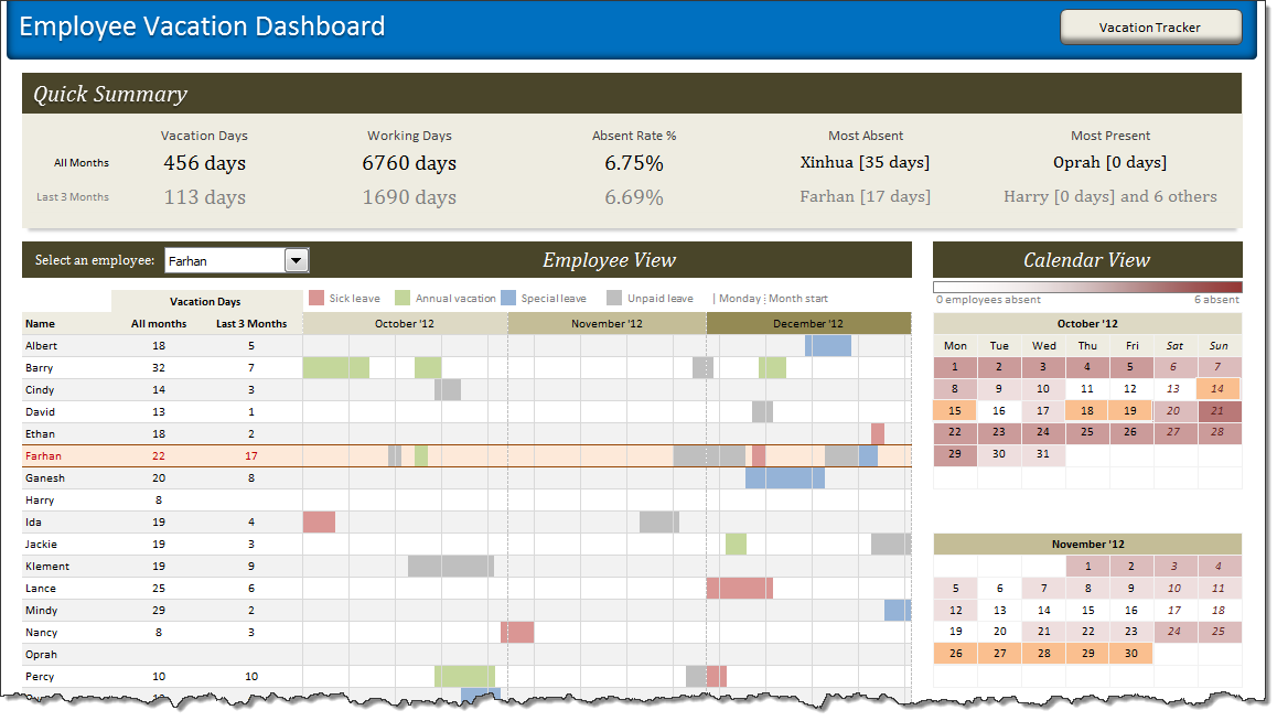
Things learned: Creating and formatting better looking dashboards
2011: VBA & Macros
Although I have been coding in VB since 1999, I have not used it with Excel very much until 2011. So during late 2010, I started brushing up my VBA concepts and by early 2011 I was building small apps and cool things with VBA. With the confidence I gained in VBA, I launched our VBA Classes so that many more of you can become awesome in VBA & Macros.
One of the many VBA apps I built
Things learned: VBA, Macros, Excel 2010 slicers
2012: Improving my analysis skills
In 2012, I focused on improving my analytical skills. I spent a lot of time using pivot tables, formulas and charts to analyze my own business data, examples shared by readers on Chandoo.org. Some of this can be seen in customer service dashboard, analyzing 20,000 comments, Usain Bolt vs. Rest and Excel salary survey dashboards.

Things learned: Advanced data analysis, dashboard special effects thru VBA
2013: PowerPivot
During late 2012, I started learning PowerPivot. Although, PowerPivot has been around for a few years, I never used it well until then. I bought a few books and by early 2013, I became proficient in PowerPivot, DAX and creating awesome dashboards with it. I took all these beautiful ideas and packaged them in to my online Power Pivot classes, which helped more than thousand people become awesome.
An example Power Pivot dashboard we discuss in Power Pivot class

Things learned: PowerPivot, DAX, Data Explorer (now Power Query).
So what is in store for 2014?
I am really excited about 2014. This year, I am hoping to dip my feet in to Power View, more ways to analyze data, smarter formulas and creating better looking charts.
What about you?
What are you planning to learn this year? Please share in comments.


41 Responses to “Calculate Elapsed Time in Excel [Quick Tips]”
Hi Chandoo,
To calculate time lapses in excel I usually use the DATEDIF function. Even though is undocumented by MS there is a great explanation of its use in Chip Pearson's site :
http://www.cpearson.com/excel/datedif.aspx
Is pretty easy to use and has great flexibility.
See you and keep Excelling!!!
Another great article, I will be linking to it on my blog.
Oliver:
Yes, I think that DATEDIFF do it better.
Great post! This a fantastic tutorial on calculating elapsed time in Excel that could be helpful even to a novice user. Keep up the useful tips!
Also, the Office community on Facebook could really benefit from you knowledge! Check it out at http://www.facebook.com/office
Cheers,
Andy
MSFT Office Outreach Team
hi, Chandoo !!!
for elapsed time , we can use this unique formula either for hours, minutes or seconds : NOW()-A1)
but using respective special number formats
for hours : [h] ==> 46553
for minutes : [m] ==>2793212
for seconds : [s] ==> 167592763
We can also use mean duration for years (orbital period of the Earth around the Sun : i-e tropical year) which is : 365.25 days
and mean duration for month : 365.25/12 days
be Excelent !!!!
@Oliver... Thanks for the pointer to datediff(). I will update the post with information about this as well.
@Glen... thanks for the linklove 🙂
@Andy... Welcome. Thanks for telling us about the office community on FB.
@Modeste ... that is very cool. I will remember these formatting codes for an upcoming article on number formatting codes 🙂
Great tip Chandoo! I use the formula to calculate years elapsed all the time. It can seriously help save a ton of time with calculations. Also, NETWORKDAYS is one that helps and can seriously impress a boss. Keep up the great work here!
No problem! I will definitely be directing people with tough Excel questions to your blog. Keep up the great posts!
Andy
MSFT Office Outreach Team
Hi,
always great posts and a good way to start my day
but regarding the elapsed time calculations: have you never noticed that there is a result difference between using =TODAY()-A1 and using =NETWORKDAYS(A1,TODAY())?
try it for A1= a Monday such as 21sep09 and "today" is e.g. a Thursday; you get 3 or 4 respectively as a result, depending on the formula used; this is because formula =networkdays() always includes both the startdate and the end date and not only the time between these 2.
This is easily corrected/compensated bij always adding a -1 to the =networkdays() formula because the majority of us will count startday as day 0 and then the result will be consistent across the different formulas.
However, you then get into trouble if you calculate the networkdays for a date further in the past and where either the start or end date falls in a weekend.
just thought to point this out as to me these formula's are not interchangeable just like that!
have a great day!
Paul
=DATEDIF([DOJ],TODAY(),"Y") & " Y, " & DATEDIF([DOJ],TODAY(),"YM") & " M, " & DATEDIF([DOJ],TODAY(),"MD") & " D"
This will fix your 30 Days problem
I calculated the time diff between two date+ times by subtracting 2 cells & custom formatted it to "d hh:mm" format.
E.g.
Cell A1 04-Jan-12 6:00 PM
Cell A2 05-Jan-12 4:45 PM
Cell A3 0 22:45 (formula: =A1-A2)
Wat shud i do 2 not display the "zero" values i.e. no. of days in this case is zero hence the cell shud display " 22: 45" and not "0: 22: 45".
@Amol
Try the Custom Format code:
[
<1] hh:mm ; [>=1] d “d” hh:mmHi Chandoo,
If possible to compute the interval of time and date in one column.
In column C I would like to compute the total days and hours . What formula ? Please help
Example.
Column A Column B
2/13/12 3:30 AM 2/14/12 12:00 AM
In referenc to Elapsed time in months
To calculate the elapsed time in months, we can use the formula =(NOW()-A1)/30. This returns the value in 30 day months.
I use to apply formula =ROUND((TODAY()-A1)/30,0). Today, I faced a peculiar situation, A1 has date 01-Mar-2009, and today being 01-Mar-2012, it should be 36 months, but it is showing 37 months!!
Any suggestions to avoid such errors?
Regards,
Prasad DN
All I want to do is add up a series of times and receive a reply that gives me a total. What I used to do was subtrace the end time from the start time and format the result as [hh]:mm but this doesn't seem to work anymore. How has Bill Gates confounded me?
@Pete
I use Excel 2010 and it still works
The times must be entered as times in the format hh:mm:ss or hh:mm without seconds
Adding up times is as simple as =Sum(Range) or =Sum(A2:A10)
then using a Custom Number format as you have mentioned [h]:mm
If this isn't working, 2 ideas
1. Check your times are times and not text
2. Can you share your data or file with us?
My hospital tracks times from patient arrival to various procedures or treatments. When those times cross over midnight, the regular formulas (2nd time minus first time) don’t work because the result is negative and Excel (2007) won’t show a negative number in time format.
I couldn’t find a solution here (chandoo.org) but found one elsewhere that worked and it’s very simple. I would like to share it.
Assuming 1st time in A1 (column for patient arrival time) (11:00 PM), and 2nd time in B1 (column for x-ray given) (12:30 AM)). Should be 1:30 elapsed time.
=B1-A1+(B1<A1) [This comparison is the key to the solution.]
=12:30 AM – 11:00 PM + (12:30 AM < 11:00 PM)
=0.0208 – 0.9583 + (True)
=-0.9375 + (1) [This is the key! If it is false, Excel adds 0. If it’s true, Excel adds 1 and that is what corrects the negative number. Now Excel can interpret the number as a time.]
=0.0625
Converted to hh:mm = 1:30
I wrapped this formula inside an IFERROR one to alert my data entry person if she messed up and applied it to lots of different columns and it has worked wonderfully. No more complaints from the data entry person who just plugs in times from medical charts.
Very interesting solution. Thank you so much for sharing it with all of us.
HI,
I am working on a Xl application..
I want to capture time between two clicks.
Ex, in my application during run somewhere I press OK button and then I click Cancel.. I want to measure time between these two clicks... Is it possible??
Pls help on this...
@shashidhar
The answer is Yes
You will have to add an appropriate VBA event to start and stop a timer.
There are techniques which can time to the millisecond so maybe look those up on the net
WOW!!!!!! I truly love your excel time format program! WHOOOO! I am very interested in how the time formats "update" (manually on a physical keyboard) that "updates" the time into its respective decimal time formats, such as:
YYYY.yyyy, HH.hhh, etc...
How do those formulas or equations work if not in Excel mode? Example: TI calculators, Word, or any other computer language programming? Just wanted to see how it works. E-mail me at Ultra64848689Ti@gmail.com.
Thanks again for an EXCELLENT Excel program into decimal time formats!
Here's an idea: how about creating an APP for iOS and Android? Just wanted to point that out. =-D
Regarding the elapsed time in months:
I made this function to determine the time elapsed since a date using the number of days in each respective month. It's a simple subtraction and I think it works very well:((Year Today-Year A1)*12++(Month Today - Month A1)+(Day Today/Days in Month Today)-Days A1/Days in month A1)
Here's the function:
=((YEAR(TODAY())-YEAR(A1))*12)+(MONTH(TODAY())-MONTH(A1))+(DAY(TODAY())/DAY(DATE(YEAR(TODAY()),MONTH(TODAY())+1,0))-DAY(A1)/DAY(DATE(YEAR(A1),MONTH(A1)+1,0)))
Have a Merry Christmas everyone!!
I need the ability to calculate how much progress we have made between two dates and I want to represent that as a percentage.
I am thinking this would be a combination of today, networkdays & dividing the days elapsed vs the total days. Then it should be as easy as formatting my cell. Any help would be greatly appreciated.
@Christian
Your correct
dates are just numbers and so you can use simple math to derive the percentage
=(Date Now-Start Date)/(End date-Start date)
that will give you a number between 0 and 1
which you can format as a %'age
is there a way out to calculate the productivity for an employee
The day start is at 08:00 and day end is 20:00
The start date / time is recorded and end date / time is recorded
I want to calculate the timelapse taking into consideration the day begin and dayend time.
If the work begins and ends the same day, a simple formula b1-a1 would compute the productivity.
But if the process remains incomplete and is carried over to the next day, then timelines to be computed accordingly
to clarify,
if start time of an activity is 03/15/2015 18:00 hrs and end time is 03/16/2015 11:00 hrs, then the resultant formula should be 5 hrs (ie 18:00 to 20:00 hrs on day1 + 08:00 to 11:00 hrs on day2) ie 2+3
please guide.
Venkatesh, try (b1-a1)-0.5
This will subtract the fixed amount of time between shifts, 12 hours. If the time between shifts varies, then you could reference other cells that contain the variables.
Please help. when I use the networking days formula I get a date (2-may-00) I want actual number of days. I managing projects and I need to know how many days have passed since we received a project to the current date. Please help Thanks
@Aria: Just format the cell as general or number. that will fix the problem.
You rock! I looked at 17 other sites and they all did not work. Yours did. Thanks!
Hi folks ...
calculating age in years , months and days
=text(now()-a1,"yy")&" y " &text(now()-a1,"mm")-1 &" m "&text(now()-a1,"dd") & " d"
Hi, the Elapsed time in days [ =TODAY()-A1 ] works great however, if I do not have a date in A1, it shows 42157. Anyway to get it to display 0 or a Null value?
@Dan
=If(A1="",0,TODAY()-A1)
I get #NAME? and the formula does not work.
Hi Chandoo,
This might be a challenge - I am looking to calculate elapsed time between two columns
Start date Complete date
9/9/2015 7:21 10/2/2015 11:01
I need to take into account the following:
1) The employee works 7:00-3:15 pm each day
2) Std Work hours are 7hrs 45 min each day
3) Need to take into account all holidays in between start and end date
4) Work week is Mon through Friday.
Can you help?
Thanks!
Hi, i have a certain name (wilium) in column A and against this name i have 2 option, 1 Done and 2 Inprogress. i want that i count done again wilium and count inprogress against wilium separately. which formula will work for it??
Hi, i have a certain name (wilium) in column A and against this name i have 2 option, 1 Done and 2 Inprogress in column C. i want that i count done again wilium and count inprogress against wilium separately. which formula will work for it??
Year, month, day results for DoB.
The formulas I have found on the net and the datedif function do not work. This is what I came up with using a Microsoft support paper dated April 1997 with some modifications:
IF(OR(A2>$A$1,ISBLANK(A2)),"",IF(YEAR($A$1)=YEAR(A2),0,IF(MONTH($A$1)>=MONTH(A2),YEAR($A$1)-YEAR(A2),YEAR($A$1)-YEAR(A2)-1))&" years "&MONTH($A$1)-MONTH(A2)+IF(AND(MONTH($A$1)<=MONTH(A2),DAY($A$1)<DAY(A2)),11,IF(AND(MONTH($A$1)=DAY(A2)),12,IF(AND(MONTH($A$1)>MONTH(A2),DAY($A$1)=DAY(A2),ABS(DAY($A$1)-DAY(A2)),DAY(EOMONTH(A2,0))-DAY(A2)+DAY($A$1))&" days")
Check it out...
Hi, Augustin
what about :
calculating age in years , months and days
=YEAR(NOW()-DoB)-1900 & " y " & MONTH(NOW()-DoB)-1 & " m " & DAY(NOW()-DoB) & " d"
Hi Chandoo,
I am looking for help with the elapse time formula. I have a recruitment tracking sheet where we track the number of days the positions are opened, and when they are finally closed.
The opened positions will have a running turnaround time (TAT) formula and I am using this formula:
=NETWORKDAYS (start_date, TODAY (), Holidays2018)
Now, without disrupting the running TAT formula, how do I then get the TAT to stop when we have a final end date? All the information below is row:
- start_date --> Cell A
- TODAY () --> cell B
- end_date --> Cell C
Hope you are able to help. Thanks!
Interesting question. Try this:
Thank you for this helpful article. I was trying for days now to figure it out. Now the only issue I have is that if I do not have a value inputed for =TODAY()-[@[Date Precured]] Date Precured then it shows 44055. How can I get it to leave it blank if there is no data? Thanks again!!!