
Hi friends, readers & fans of Chandoo.org,
I want to share a happy news with you all.
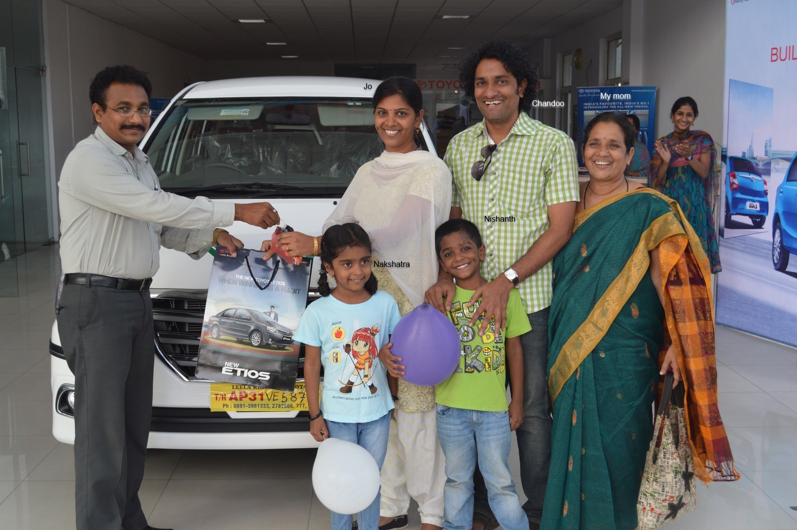
On Saturday (1st of February), we bought a new car. It is Toyota Innova. Pictures below (click to enlarge.)
Thank you & Excel
Before I tell you why I bought another car or how it is, first let me tell you this – Thank you. You constantly inspire me to learn more and share my knowledge. You support my little business in numerous ways – by joining our courses, purchasing our templates and recommending our site. With out your support and love, I would not even thought about buying a comfortable and lovely car like this. Thank you.
And I want to thank Microsoft Excel too. It is the reason why today my family is living a happy, healthy and peaceful life. Thank you Excel.
Why another car?

Long time readers of Chandoo.org remember that we already have a car. And if you know me, you know that I like to consume less and lead a frugal life. So adding another car to our family seemed like a conflicting choice. But we (my wife Jo & I) rationalized this by,
- Our current car doesn’t have any security features (no airbags, ABS etc.) So when we go on long drives, we have this nagging thoughts in our minds.
- Our current car is good for 4 people. As we frequently travel with other family members or friends, going out became an exercise in human squeezing.
- Driving Alto is fun, but driving it for anything more than an hour proved to a back-breaking punishment.
After spending few weeks short-listing car models, we narrowed down to our choice to Toyota Innova. Almost everyone we asked said, ‘Get Innova, it is boringly reliable’. It matched our expectations.
A little more about our car
- Our car is Innova ZX variant.
- It can seat 7 people (2,2 and 3)
- It has good safety features (2 airbags, ABS etc.)
- It drives like a car instead of MPV. Very convenient and comfortable.
- It has all the features you would expect in a car of this size.
- We paid roughly Rs. 1,800,000 (US $28,000) for this. No loan of course (I do not like buying things that I cannot afford.)

Thank you once again
Almost everyday I wake up with a smile, spend the day learning, feeling passionate about my work and go to sleep thinking nothing but how fortunate and blessed my family & I are. All thanks to you. Thanks to your kind support, generous attitude and love for learning, we have a home, car and all the comforts anyone can ask for. Thank you.
And thank you Microsoft & Excel for making my life exciting every day.
More personal stories:


23 Responses to “Learn Top 10 Excel Features”
What it looks like if excel without formula?? 🙂
It would be not excel it would just be fancy tables in which you could just use power point. (Chandoo) would Access be an alternative?
Awesome piece of work!!!
Great article.
Chandoo - my biggest interest in the article was the awesome word-graphic at the top - where did you go to get it done into a shape?
@Rich.. thank you. I used http://www.tagxedo.com/ to generate this word cloud. I took all the comments in the original post, pasted them in tagxedo website and set up the shape etc.
Awesome Chandoo.. You need always needs coffee to start up with. BTW , how did u created the Heart Shaped picture filled with High Repetitive text in it .. Please put it on your Next blog ...
Chandoo, good article. I’ve added a link to it from Connexion – our collection of the most useful and interesting spreadsheet-related articles from the web. See http://www.i-nth.com/resources/connexion
Hi,
Just one small question. Where the hell have been I in the past for not discovering this website sooner?
I've lost a job interview recently where even though I had the subject knowledge, I was not upto their mark in Excel.
Thank you for all the free tips, guidance and for creating this forum environment.
[PS: I've just been through the site for the 1st time, and have signed up for the newsletter. You can expect pretty stupid questions from me soon]
Hy Chandoo, you always inspire me with to explore something new in excel. This data structure table is only for excel 2007 or compatible to 2010. I recently installed latest excel version 2013 in my System and experience problems regarding operating according to previous one. I'm waiting your article relates to that excel version.
Thanks
Awesome article Mr. Chandoo and that is a awesome heart shaped pic you created. Great tips as well.
[...] Learn Top 10 Excel Features | Chandoo.org – Learn Microsoft Excel Online. [...]
Chandoo is awesome..
Thanks, i got better, And i always get 90.50 in my grade card but now i get 96.50 i improved because of the tutorials you gave, Thank You Very Much Chandoo Guy.
Hi chandoo, i am intersted in seeing the video or step by step done procedure of analysing the comments and presenting in the data percentage steps. I think this one would be first step in finding out how generally happens data calculation. Thank you.
As well i would like to know how to get that black shape art of your face which i see in chandoo. I am interested in making it for me.
Nice to see the features considered by Excel users to be most useful. It might be a good idea to also analyze StackOverflow Excel questions to see what keywords appear most often.
Here are my top 10 Excel Features (for advanced users):
http://www.analystcave.com/excel-10-top-excel-features/
Thanks a ton for this it totally helped with my homework ????
Very good effort
Thank you for this. Lots of learning in the links you've provided for this septuagenarian.
Pls send me new post
Dude, your humor ? ?
Loved your work.
Hello Sir,
I am Sanjeev Khakre and i from Indore City, India , I am your big follower and i have watch your videos and learnt a lots of excel trick or function and many more . thanks so much for all of your excellent support.
Your excel knowledge is real awesome.
Thanks
Sanjeev
Your work is excellent but pls willing to know more details about the features of microsoft excel
Chandoo Would Access be a better alternative than VB?