
It is Olympic season. Everyone I know is tracking the games and checking their country’s performance. One thing that we notice when looking at medal tally is,
A single Gold medal is worth more than any number of Silver medals. Like wise, a single Silver medal is worth more than any number of Bronze medals.
So, when you look at the ranking of countries, you see countries with single Gold medal higher up than countries with lots of Silver and Bronze medals (but no Gold).
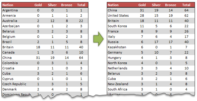
So how do we sort our data in Olympic medal table style?
It is simpler than it looks. All you have to do is use custom sort feature in Excel.
- Select your data
- Go to Home > Sort & Filter > Custom Sort
- Now specify the sort levels and sort orders.
- Click ok and you are done!

Using SORTBY() formula to sort the table
Excel 365 introduced a new formula to sort data by multiple-levels using formulas. SORTBY
Assuming your medal data is in the table named medals you can sort with below formula.
=SORTBY(medals, medals[Gold],-1, medals[Silver], -1, medals[Bronze],-1,
medals[Team / NOC],1)
The -1 parameter tells SORTBY to sort in descending order.
Learn more about SORTBY function & other new formulas in Excel 365.
What if your version of Excel does not have SORTBY
Well, there is a work around. Add an extra column in your data and calculate sort order using a formula, as shown below.
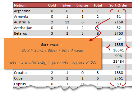
Once you calculate sort order, sort on this column in descending order and you are done.
Video – Sorting Excel data in Olympic medal table style
Watch this short & fun video to learn the sorting technique outlined in this page.
Example file – Olympics Medal Table style sorting in Excel
Please download this Excel file if you want to practice the custom sort or SORTBY() approach.
Do you use custom sort?
Custom sorting is very useful when you 2-3 levels in your data. For example, sorting all projects by department & % completed or sorting all products by region & sales volume. I use it often to understand how my data is.
What about you? Do you use custom sort? What is your experience like? Please share your tips & thoughts using comments.
More Quick Tips on Sorting & Filtering
If you find yourself constantly sorting and filtering, then check out below tips. I am sure you will learn something new.
- Sorting:
- Custom sorting in Pivot tables
- Which formula to use to check if a list is sorted?
- Formula 1 style sorting in Excel
- How to round and then sort data in Excel
- Sorting text values using formulas!
- Shuffling a list in random order in Excel
- How to sort across columns (ie change sort orientation)
- Filtering:
- Filtering values using advanced filters
- How to filter odd or even rows only?
- Right click to filter fast…


29 Responses to “Sorting values in Olympic Medal Table style [Quick Tip]”
Chandoo's comment "Use a sufficiently large number in place of 30"
should be
"Use a sufficiently large number larger than the largest number in the Silver/Bronze categories"
In the example if a Team had 31 Silver they would rank higher than a team with only 1 gold
Why not just multiply gold by 1000000 and silver by 1000. That is easier to read and the resulting number still shows the medal count. 23G, 12S and 1B is 23012001 and 1G, 24S, 3B is 1024003.
David
hahahahahaha! David i agree with you.
Or you could do it manually. Sort Bronze column in descending order, then Silver, then Gold. =)
What about
=(gold * (Max of Silver +1)^2) + (Silver * (Max of Bronze +1) )+ Bronze
That controls for a country that goes on a silver or bronze medal run.
Agree with your formula but change a little bit logic, see my post below.
Dear all
another solution
=gold + silver / 50 + bronze / 2500
or (for larger rows)
=gold + silver / 100 + bronze / 1000
Regards
Stef@n
This is similar to mine above but moves the silver and bronze to after the decimal. One thing to watch out for is that it is possible to have over 100 medals (though maybe not likely, but there are 302 medal events). I would change the second formula to
=gold + silver/1000 + bronze/1000000
This will work for all medal counts (until they get up to 1000 medal events).
David
sorry
=gold + silver / 100 + bronze / 10000
Is there a VBA code if I need do same 3 layers customer sorting repetedly?
I never thought sorting with multiple keys would be considered "custom sorting"...
Hi all,
Look like a sample logic for this:
First thing, you sum all medal by category: example there are 10Gold, 50Silver, and 100Bronze in total.
In this case, imagine you have 1 Silver, and I have 100 Bronze, your ranking is higher than me, so we can score: For you: 1*(100+1) (1silver *(100 +1) + 0Bronze, and me: 100 (0silver*(100+1) + 100 Bronze).
For Gold medal, 1 medal is worth than every silver and bronze, so 1G>50silver*100Bronze, for sure, we can setup 1G=(50+1)silver*(100+1)Bronze.
I checked for some example and saw that looks quite good.
For general case, assume that total Silver is A, total Bronze is B (all country), your Score is: Gold*(A+1)*(B+1) + Silver*(B+1) + Bronze
Looking for your comment,
Yes, I often use the custom sort, a great help.
What would count more, 1 gold, 0 silver or 0 gold, 51 silvers? I could imagine, that still the gold will win.
Like you could calculate:
For 1 Gold, 0 silver: score is 1*(51+1)*(0+1)+0*(0+1)+0=52
For 0 Gold, 51 silvers: score is 0*(51+1)*(0+1)+51*(0+1)+0=51
So the 1Gold is the winner.
Hi all,
After reading all comments, I got 2 solutions.
First, using calculation, you could use the
Infinitive number; the first comment of David, so you could easily remove all effect of Silver on Gold, of Bronze on Silver and Gold, the solution of Steph@n is on this logic.
Or, you could use the Largest number; like the mine, I used the Total Bronzes and Total Silvers as Coefficient of Gold and Silver (read my comment).
But I think the best is Clay's solution, use the Large enough number; in this case use the Max Bronze and Max Silver like the Coefficient, however, for Gold, using (Max Silver+1)*(Max Bronze+1) in place of (Max Silver+1)^2 is more logical.
Second, on the idea of David, you could use Concatenate, ex, Gold as 1, Silver as 0. By this way, you have to setup for number of Silver and Bronze. The mine, I used =Rept("0",5-len(A2))&A2. Ex, if A2=1, it will be shown 00001, if A2=12, it is shown 00012. Normally, you will have a string like: 12100021000035 for 12 Golds, 21 Silvers and 35 Bronzes.
Thanks for all comment and looking for others solutions,
Maybe its just me, but all this discussion on how to weight in so that the sort order is correct seems a little redundant.
Whilst several news sources will indeed score purely on gold (which in the above example places Italy ahead of Russia even though they have over twice as many medals) this doesn't make it right.
The Olympic committee do not recognise any country as winning, which therefore makes any weighting or ranking unofficial.
I would suggest the best approach would be to shove it in a spreadsheet and have the user decide the weighting. That way rather than just have a "gold always wins" approach, the user could say that two silver are equal to a gold, and two bronze a silver, or however they like.
Personally I would say that with the two countries of Italy and Russia, to say that the one additional gold medal is worth more than 11 silver medals and 13 bronze, is a not only incorrect, but also disrespectful to the 24 athletes/teams who are still the 2nd and 3rd best in the whole world.
And we havent even got to the discussions on Gold per Capita and Gold per GDP debates which surface every post-Olympic wrap up
=CONCATENATE(REPT(Gold,4),REPT(Silver,2),G11)
@Rushabh... interesting solution. Can you explain why this works?
When I tried with 2 cases:
1G, 10S and 5B ->111110105
2G, 6S and 6B -> 2222666
On your way, this could turn to the rank of the first is higher than the second, in fact, it is reverse. That's right?
One simple option would be
=Gold&"."&Silver&Bronze/10
The decimal place deals with issues where a value >=10 could shift all the digits. The dividing the bronze by 10 ensures that when tied for gold and silver, 10 bronze would score ahead of 6 bronze.
@Shadow... I doubt this will work. Assume two countries with 1 gold, 3 silver, 0 bronze and 1 gold 12 silver, 0 bronze. In your case, they will read,
1.30
1.120
hence ranking 3 silvers above 12 silvers
You have a keen eye! I missed that scenario completely.
I'm going to quit while I'm behind 😛
@Shadow, it would be good enough if you control the length of number of Silvers and Bronzes.
I always keep my treatment of string, and your formula will be totally working by:
=Value(Gold&"."&Rept("0",5-len(Silvers))&Silvers&Rept("0",5-len(Bronzes))&Bronzes)
@Chandoo, your cases are:
1.00003 and 1.00012
That's done.
Thank Tadovn.
After a little bit of thought I could have done something very similar.
=(Gold&":"&Silver&":"&Bronze)*1
by converting it into a time instead of a decimal, this correctly handles the variation in len. Providing the number of silvers or bronze does not exceed 59 then it works perfectly. Considering no one has more than 25 bronze or silver I would say its not a problem.
It's no better than some of the approaches, but its always fun to learn a different way to cook an egg.
Quite clever to use Time to deal with this.
Another variation is to use years for gold, days for silver and seconds for bronze. This give you more freedom as maximum gold can be 8,099, silver can be 365 and bronze can be 86,400. You can use this for next few hundred olympics (unless China conquers US, UK & Russia, retains its sports competitiveness and convinces Olympic authorities to add a bunch of events).
Hi
Some interesting posts on how to present the data.
However, in presenting any data I think it's always good to see whether it could be presented in a different way to provide even more useful insight.
For example, the Gold medal table takes no account of the relative population differences of the respective counties.
The USA leading the table with 41 gold medals achieves this on a per capita basis of 1 gold for each 7.7m inhabitants. Hungary in 8th place with 8 medals achieved this on a capita basis of 1 gold for each 1.2m inhabitants, and would be ranked 1st per Capita.
Put another way the USA would have to get 252 gold medals to achieve the same per capita result as Hungary!
For discussion, I have done a top 10 table and change chart with a link here:
http://tinyurl.com/cxhruro
The problem with the use of per capita is it does not directly relate to the number of competitors in the Olympics. I would suggest using the number of athletes instead.
Alternatively:
=Rank(gold)*100+rank(silver)+rank(Bronze)*0.01
Olympic medal table from 2012 in London is also available on:
http://eexcel.co.uk/2012/06/30/london-2012-medal-table/
Regards, Jacek