
My friend Paresh writes excellent commentary on charts on his blog Visual Quest. Last week he gave a home work, asking his readers to recreate the small multiples chart shown below.
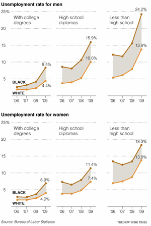
I found this quite interesting. Small multiples, also called as panel charts, are a powerful way to depict multidimensional data and bring out insights. They are easy to read too.
So, today, let us learn how to create such charts using Excel.
Step 1: Arrange your data
Almost any chart or visualization worth its salt must begin with proper arrangement of data. Since I could not get the data for the unemployment chart, I made up a few numbers for a fictional Confectionery Company. The data is shown below.
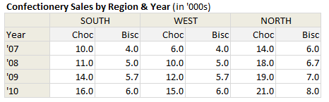
So, we have the data for years 2007 thru 2010, for the regions – South, West & North and for the product lines – Chocolates & Biscuits
Step 2: Select Products for one region & make an area chart
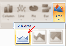
This is simple. Just select data for chocolates & biscuits for one region and make an area chart. You should have something like this:
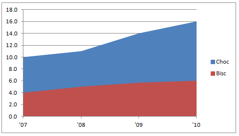
Step 3: Resize the area chart & format it
Now, we need to make this area chart closer to what we want.
- Select the bottom area series and fill it with white color.
- Now resize the chart so that we can fit 3 of them in the area you got.

Step 4: Add same data to the chart
Now, select the same region data, press CTRL+C to copy it. Select the chart and paste it by pressing CTRL+V. See below demo to understand how to do this.

We are doing this because we want to have lines with markers on our chart. But the area chart lines cannot show markers. So we are going to add the same data one more time, but this time format it to be shown as a line.

Step 5: Select the new series and format them as line charts
Select each of the new area series and format as line chart with markers.
You should have something like this at the end.

Step 6: Format the chart
This is where you unleash the creativity. In order to match the look of NYTimes chart, here is what you can do.
- Set the fill color between lines to something dull.
- Format 2 lines in distinct colors.
- Format gridlines & axis lines to something dull.
- Set axis maximum to 25 (as all charts in small-multiples should have same axis settings)
- Set axis major unit to 5.

Step 7: Repeat this for other regions
Now, just copy and paste this chart a couple of times. Just adjust the data source so that we have new charts using this technique.

Note: Learn how you can add descriptive labels to charts.
That is all. You just made a small multiples chart that looks awesome. Congratulations.
Download Small Multiples Example Workbook
Click here to download the example workbook and play with it. You can see the steps for making one of the charts in the workbook as well.
Do you use Small Multiples or Panel Charts?
I really love to use small multiples or panel charts whenever I am analyzing data or presenting results of the same. They offer excellent value per pixel. That said, they take some time to construct. Also, you must tweak axis settings and plot area to get the perfect result. That is why I prefer the in-cell variation of these charts. They are quick to setup and easy to wow (for more on these techniques, see below).
What about you? Do you use Small Multiples or Panel charts? How do you find them? Please share using comments.
Interested to learn more? Read these
As you can guess, small multiples is one of my favorite ways to explore and present data. So we have written quite a few articles explaining this technique. Read these to learn more.


26 Responses to “FIFA Worldcup Excel Spreadsheets [Roundup]”
Nice roundup! Do you know of any one-page spreadsheets which will be updated by an administrator after each game? Would be nice to be able to print out the latest results whenever I feel like checking them as I probably won't be following closely every day.
I actually haven't tried any of the above ones yet, but I thought I'd mention this one that I found which makes a nice one-page form you can fill in dynamically. http://exceltemplate.net/sports/world-cup-2010-schedule-and-scoresheet/
I would like to recommend you these one: http://www.anotagol.com/
You can choose your interface language (english, spanish, italian, portuguese, german or french) and your country for the timezone of match. I like it very much.
An awesome online world cup calendar in flash.
http://www.marca.com/deporte/futbol/mundial/sudafrica-2010/calendario-english.html
Got one more tracker in excel (one page)
http://cid-b09e57e6e960505c.office.live.com/browse.aspx/.Public
[...] Passend zu gerade laufenden Fußball-WM gibt es auf Chandoo.org alles wissenswerte über Excel-Anwendungen für den Fußball-Fan. [...]
Great!!!
I strongly recommend this :
http://www.en.excel-soccer-2010.de/downloads
Chandoo how you found this ...
@Rohit.. really beautiful file. I missed it during my research. Now, I recommend it. 🙂
Hi Chandoo - thanks for the recommandation 🙂 - Regards
[...] Excel, then print it on the other side of your Match Schedule from step 2 above. There are several other Excel spreadsheet templates you can download, but this is probably the only one-page version you can find; plus, it [...]
Does anybody know how to re-create this(?): http://www.marca.com/deporte/futbol/mundial/sudafrica-2010/calendario-english.html
...or do you know where a template can be found? I am DYING to have something like this on my site. When I found it, I had been looking for the longest time for a circular calendar. I found a couple that weren't adequate. Then I stumbled upon this one and my eyes nearly popped out of my head. If anyone can lead me in the right direction, I would be eternally grateful!
Thanks in advance!
Robert
@Robert...
Doing something like that is a lot of work. You can probably get it done with some hired help from a flash developer.
@Robert, the World Cup flash in the Spanish Marca newspaper is impresive, but not much as my own animated spreadsheet with the Goals of 2010 World Cup South Africa in Excel that I just published into my blog:
http://pedrowave.blogspot.com/2010/06/goals-of-2010-world-cup-south-africa-in.html
Download from here:
http://cid-6b219f16da7128e3.office.live.com/view.aspx/.Public/Goals%20South%20Africa%20Animated.xlsx
And start to enter the goals of the rest of matches.
Has anyone seen, or made, a Spreadsheet where you can record the scorers and see a 'top scorers' chart. Would be a nice enhancement
@Neil... checkout this one http://www.inflexionary.com/sports/world-cup-2010-excel
it uses macros to fetch scores from web (and provides very comprehensive analysis too)
@All.. Thanks for the comments. I have updated the post with few more links now.
Hi,
Check this dashboards too:
http://dashboards.org/world-cup-dashboards-and-visualizations/
😉
[...] Here is a collection of FIFA World Cup Spreadsheets if you are more in to that sort of thing. | [...]
[...] Cup fever is here!In FIFA Worldcup Excel Spreadsheets Roundup, Chandoo has some links to useful World Cup tracking workbooks. Only one of them (the first one) [...]
[...] World Cup fever is here!In FIFA Worldcup Excel Spreadsheets Roundup, Chandoo has some links to useful World Cup tracking workbooks. Only one of them (the first one) [...]
Hey, you missed ours! It has everything you need and more, but not a whole pile of silly extras (National Anthems, etc). I'll be making another one for the 2014 world cup. We had over 4000 hits on it!
@Michael Harwood.
Where is it then? You should have posted a link
Sie sollten an einem Wettbewerb teil zu nehmen für einen der besten Blogs im Web. Ich werde empfehlen Sie diese Seite!
Google translation: You should take part in a contest for one of the best blogs on the web. I will recommend this site!
[...] and welcome to the forum, Maybe these similar spreadsheets might give you a few initial ideas: FIFA Worldcup Excel Spreadsheets [Roundup] | Chandoo.org - Learn Microsoft Excel Online If you have specific areas / formulae / layout choices for parts of your spreadsheet that you are [...]
Calling all football fans around the globe! The biggest football festival will kick off on the 12th June 2014 and everyone is placing their bets of who will have the honour of lifting the golden trophy.
Use our free interactive Excel templatel to predict the World cup finalists ! No macros !
http://www.spreadsheet1.com/world-cup-2014-free-excel-prediction-template.html
I also made a Worldcup-tracker, with MS Access, which can also generate reports in Excel
e.g. a match-schedule with locations on y-axis and dates on x-axis, see:
http://worktimesheet2014.blogspot.com.es/2014/05/excel-with-match-schedule-for-2014-fifa.html
and:
http://worktimesheet2014.blogspot.com.es/2014/05/match-access-app-to-track-world-cup.html
where can i find raw data in excel file format of fifa world cups (1930-2014)
@Vivek
Have a read of: http://chandoo.org/forum/threads/goal-of-world-cup.17637/
The location is mentioned in Somendra's comments
Free XLSX Prediction Spreadsheet for World Cup 2018 Russia!
https://www.spreadsheet1.com/fifa-world-cup-2018-russia-free-prediction-templates-for-excel.html