
Michael Anderson, a web designer has posted this delicious looking visual resume [full image]
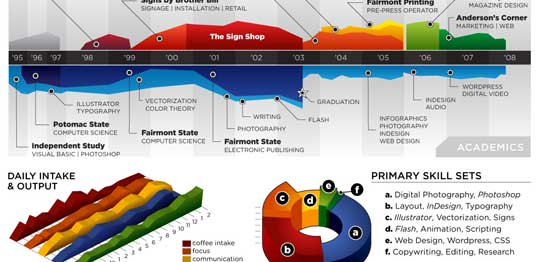
While the resume looks stunning at a glance, a closer inspection reveals that you cant really make any valuable conclusions about Michael’s past experience and qualifications. Of course if the purpose of this resume is to show that he is a fabulous designer, then the resume definitely achieved that. It has got way better presentation that lots of professional resumes out there.
It uses some of the more flamboyant and often avoided chart types like area chart, 3d area chart and a 3d donut area chart (oh dear God !)
Here are few things that I think are wrong with this data visualization:
- In-consistent color: The colors don’t convey any particular message. Especially, given the fact that he repeated the colors. Same color means coffee, layout design and sign-shop work experience. One of the primary rules of data visualization in dashboards is to use color for repetition. For eg. using one color for each product.
- Poor choice of charts: While 3d charts look great, they are not the best ones to describe real information. Instead of 3d area charts and 3d donut area charts, a better choice would have been to use bar charts. They are simple, elegant and convey rich information very easily. Hey, you can make eye candy using bars too.
- Irrelevant Data: If I am someone planning to hire Michael, I would definitely be more interested in what great kickass stuff he has done (and I am sure he has done stuff like that, looking at this) than how much coffee he takes each day (and still I cant figure out how many cups he drinks, thanks to weird chart selection)
Not showing the numbers:As Anderson said in his post “[T]his is just concept art, as there are almost no real metrics represented except for time.” and I guess, this comment doesn’t apply.We all know that resumes work well, when they talk numbers (made 500 XHTML compatible pages in 50 hours, 25 magazine cover designs, 500k downloads for my icon library etc.), unfortunately Michael missed on that totally. One can assume any number of things about his work in “the sign shop” or “Comor inc.”
What are your thoughts on this data visualization? Awesome or awful ?
Thanks to Manoj for sharing the link via e-mail


11 Responses to “Use Alt+Enter to get multiple lines in a cell [spreadcheats]”
@Chandoo:
One more useful trick.......
In a column you have no. of data in rows and need to copy in the next row from the previous row, no need to go for the previous rows but entering Alt + down arrow, you will get the list of data, (in asending order), entered in the previous rows...
This is another great tip. I use this all the time to make sense of some *very* long formulas. As soon as the formula is debugged I remove the break.
Great tip Chandoo!
I use this feature often and it has even gotten the, "how did you do that" response.
Thanks!
@Ketan: Alt+down arrow is an awesome tip. I never knew it and now I am using it everyday.
@Jorge, Tony: Agree... 🙂
[...] Day 1: Insert Line Breaks in a Cell [...]
how can we merge a two sheet.
excellent idea. Chandoo you are genious
Hi chandoo,
I have used ctrl+enter to break the cell. But I did not get the result.
Please tell me how can i break the cell in multiple lines.
Hi, Ranveer,
Its not Ctrl+enter to break the cell, use Alt+Enter to make it happen.
hi Chandoo....
how we can use Alt+Enter in multiple rows at the same time please reply hurry i have lot of work and have no time and i m stuck in this. 🙁
Alt+J worked once 🙁
So I found another more reliable way:
=SUBSTITUTE(A2,CHAR(13),"")
Where A2 is the cell that contains the line breaks which the code for it is CHAR(13). It will replace it with whatever inside the ""