
Here is an interesting scenario.
Imagine you are responsible for customer satisfaction at ACME Inc. Every month you track customer satisfaction rate for the 3 products you sell which are conveniently named Product A, B & C.
You also have bands for the satisfaction rating.
- Rating of 85% or below is Average
- Rating between 85% & 95% is OK
- Rating above 95% is good
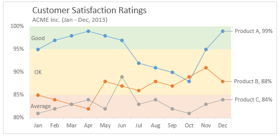
At the end of the year, you want to visualize the ratings for last 12 months for 3 products along with bands.
Something like this:
Unfortunately, there is no “Insert Banded line chart” button in Excel. So what to do?
That is what we will learn today. Ready?
Create a line chart with KPI bands
The process of creating a line chart with background bands is simple. Follow these steps.
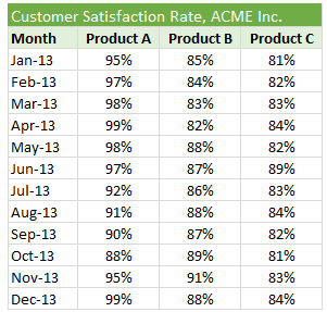
Step 1: Arrange your data
Lets say your data looks like this:
Now, add the band information to it and make it look like this:
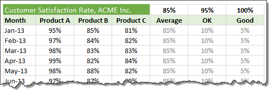
Use simple formulas to generate OK & Good columns from the bands.
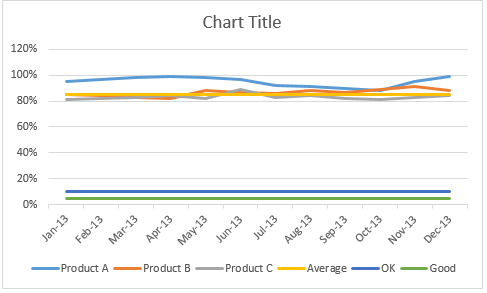
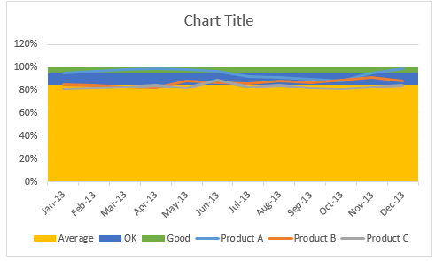
Step 2: Create a line chart with all data
Select all 6 columns of data and insert a line chart.
This is how it looks.
Step 3: Convert Average, OK & Good lines to columns
This step changes depending on the version of Excel you are running.
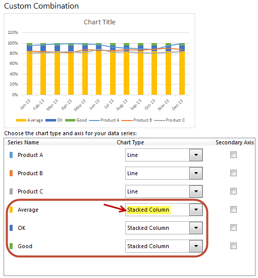
In Excel 2013:
- Right click on any line and choose “Change series chart type”.
- Now, set up “Stacked Column” as chart type for Average, OK & Good series. (As shown in above picture)
- Done!
In earlier versions of Excel:
- Right click on Average line and choose “Change series chart type”.
- Change it to “Stacked Column Chart”
- Repeat the steps 1 & 2 for OK & Good lines too
- Done.
Step 4: Make columns wider by setting gap width to 0%
 Right click on any of the columns and choose format.
Change the gap width to 0%.
Step 5: Adjust axis settings & column colors
Since our focus is to show variation in customer satisfaction ratings between the band of 80% to 100%, adjust axis min to 80%, axis max to 100% and major unit to 5%.
Also, fill columns with dull & subtle colors. This way, user’s attention shifts to the lines.
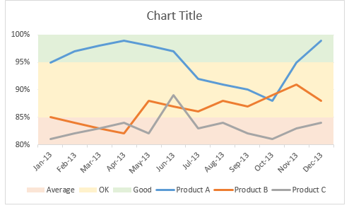
Step 6: Format the lines & axis labels
Now let’s make those lines stand out. You can add markers, adjust line thickness. While at it, fix the orientation of axis labels and remove year (as it is not needed).
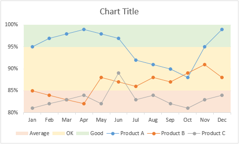
Step 7: Add a title, apply labels to important points and annotate bands
This is the last step. Lets add a descriptive title to the chart.
Also, apply data labels (only to the last data point). To do this:
- Click on the line. All points will be selected.
- Click on the last point alone.
- Now only last point will be selected.
- Right click & add data label.
- Click on data label.
- Click on it again (this will select only that label, not the entire series)
- Format it by adding series name.
Annotate bands by either adding data labels or text boxes.
Our chart is ready.
Download line chart with bands template
Click here to download the chart template. It has detailed images of all the steps. Examine the chart settings to understand this better.
Do you make banded line charts?
Although I make very few banded charts, I think they are great for several scenarios.
What about you? Do you make banded line charts to report this kind of data? What techniques you rely on? Please share your tips & ideas using comments.
More charts like this:
If you like banded line charts, you will surely enjoy these other charts too:
- Bar chart with lower & upper bounds
- Shading above or below a line chart to depict boundaries
- Indexed charts to depict change from point in time
- Thermo-meter chart with last year value
- World education rankings visualization – a case study
Your journey to Excel awesomeness – a banded line chart

Why stop at banded line charts? You want to learn how to create different types of charts, reports, dashboards & analytical models to supercharge your career. And this is where my Excel School program can help you most. It is an online course with more than 50 lessons on various aspects of Excel, right from basics to advanced concepts.
You can login and access the lessons from anywhere at anytime. You can learn at your own pace and become awesome in Excel.
Please click here to learn about Excel School program & join us.


129 Responses to “Write a formula to check few cells have same value [homework]”
=NOT(STDEV(A1:A4))
this also works for large ranges of numerical values (but not for text)
@Arie
Nice formula Arie
Except that it doesn't work for Text values
I'll submit
=COUNTIF(A1:A4,A1)=COUNTA(A1:A4)
which works for Numbers and Text
and answers the two bonus questions as well
This is waaay more elegant than my solution. Nice one :).
I had =NOT(COUNTIF(A1:A4,A1:A4)-COUNTA(A1:A4)), somehow I keep forgetting we can use more than one "=" sign on a given formula :-/
Hi
Works for numbers, text and logical values on a range from A1:An.
=COUNTIF(A1:An,A1)=ROWS(A1:An)
well if you name the range, you could use following:
=IF(SUMPRODUCT(1/COUNTIF('range','range'))=1,1,0)
Hello lockdalf
The IF()-part is not necessary.
=SUMPRODUCT(1/COUNTIF(‘range’,'range’))=1
Not Working for =IF(SUM($C$1:$F$1)=0,"",SUM($C$1:$F$1)) in cell A1 to A4
My solution is a, perhaphs slightly complex, array formula as follows:
{=IFERROR(AVERAGE(IF(ISBLANK(A1:H1),9999,SUBSTITUTE(A1:H1,A1,9999)*1))=9999,FALSE)}
Assuming there is a value (numerical, text, logic etc) in cell A1, this formula will work - and it will 'ignore' any cells that are 'blank' within the range A1:H1 (which can be extended to the required size).
Breaking the formula down, the SUBSTITUTE(A1:H1,A1,9999) replaces all values (be it text / numerical) in the range A1:H1 that MATCH the value of cell A1 with the number 9999 (this should be changed to any number that WON'T APPEAR IN THE RANGE).
These values are then multiplied by 1 (as SUBSTITUTE results in a text answer).
Wrapping this in an IF(ISBLANK(A1:H1),9999,.........) formula takes care of any blank cells, setting them to this default value of 9999 also - this allows you to set the formula up once for a large range and then not have to alter as more data comes in.
An Average is then taken of all these values - if all cells that contain values are the same, the average will come back to 9999.
If all values are numerical but some differ, the average will differ from 9999 and will result in a FALSE answer. If some / all of the values are text and some differ from that in cell A1, the AVERAGE function will result in an Error, but in these instances the Match needs to return FALSE, hence the IFERROR function.
Sure there's a simpler way to do this though!!
`{=IF(AND(COUNTA(RANGE)-SUM(--ISNUMBER(FIND(UPPER(FIRST ELEMENT IN RANGE),UPPER(RANGE))))=0,LEN(FIRST ELEMENT IN RANGE)=MAX(LEN(RANGE))),TRUE,FALSE)}`
so if your data was in Column 1 and began in A1, you'd use
`{=IF(AND(COUNTA($1:$1)-SUM(--ISNUMBER(FIND(UPPER($A$1),UPPER($1:$1))))=0,LEN($A$1)=MAX(LEN($1:$1))),TRUE,FALSE)}`
This will work for strings and things, if you want it to be case sensitive (I don't), just remove the UPPER() part.
What this does:
`COUNTA($1:$1)`
tells you how many entries you're looking at over your range (so we can work with an undetermined size).
`--ISNUMBER()`
ISNUMBER will return TRUE or FALSE depending on if the value inside is a number or not. the -- part converts TRUE/FALSE in to 1 or 0.
`UPPER()` OPTIONAL
converts the value in to upper case. If passed a number it changes it to text format. This is what stops it from being case sensitive.
`FIND($A$1,$1:$1)`
will return a number if A1 is contained in each cell containing an entry in column 1.
`LEN($A$1)=MAX(LEN($1:$1)`
checks that all elements are the same length. This is needed to avoid partial matches (without it, if A1 contained zzz and A2 contained azzza it would flag as true).
REMEMBER this is an array formula, so enter with ctrl+shift+enter.
{=MIN(--(A1=OFFSET(A1,,,COUNTA(A1:A4))))}
Gives 0 if false and 1 if true
=COUNTIF(A:A,A1)/COUNTA(A:A) = 1
This meets both bonus requirements and is dynamic. Keep adding more contents in column A and it will include these automatically.
I like this a one a lot. I would make one small change by inserting a table for my data range. Makes it dynamic without selecting the whole column
=IF(COUNTIF(tableName[colName],A2)/COUNTA(tableName[colName])=1,TRUE,FALSE)
For only Numeric values
=MAX(A:A)=MIN(A:A)
Awesome!
=(A1=B1)*(B1=C1)*(C1=D1)
Case sensitive.
=SUMPRODUCT(0+EXACT(A1:A4,A1))=COUNTA(A1:A4)
Regards
I'd use this
=COUNTIF(range,INDEX(range,MODE(MATCH(range,range,0))))=COUNTA(range)
It takes Hui's formula but ensures that the test value for the countif is the value or string that is most common in the range. Just in case you get a false but the problem is just with your test value being the odd one out.
=SE(E(A1=A2;A1=A3);SE(E(A1=A4;A2=A3);SE(E(A2=A4;A3=A4);"ok")))
SE = IF
E = AND
Seems you could shorten it with
=AND(A1=A2,A1=A3,A1=A4)
Bonus question 1 & 2
Array formula: {AND(A1=A1:AN)}
This will test all cells in range, including text and numbers.
Cheers
A very simple solution uses Excel's Rank function. Insert in B1 = Rank(A1, $A$1:$A$4). Copy down this formula to B4. If the answers in B1 thru B4 are all 1, the values are equal. For an open range of cells, label the range of input (example "TestData") and place the label in the funtion (= Rank(A1, TestData) then copy down to an equivelent length of rows as the range.
=IF(SUM(A1:A4)/COUNT(A1:A4)=A1,TRUE,FALSE)
=IF(SUM(A1:D1)/4=A1,"True","False")
I enjoy your emails. I have learned a lot from them. Thank you for what you do.
.
{=PRODUCT(--(A1=A1:A4))}
.
Change A4 to An.
Greate
{=PRODUCT(- -(A1=A1:A4))}
=IF((SUM(A1:A4)/COUNT(A1:A4))=A1,"TRUE","FALSE")
I would use the formula which is mentioned below:-
=IF(PRODUCT($A:$A)=A1^(COUNTIF($A:$A,A1)),"Yes","No")
At last a homework assignment that I could answer on my own. And I even understand some of the elegant answers from other readers this time.
My solution was to nest IF statements:
=IF(A4=A3,IF(A3=A2,IF(A2=A1,TRUE,FALSE),FALSE),FALSE)
This satisfies bonus question 2 but I think the structure makes it impossible to modify this solution to satisfy bonus question 1. And I wouldn't want to use this strategy to compare very many values...
This answers all of your questions:
=PRODUCT(--(INDIRECT("$A$1:$A$"&$B$1)=$A$1))
where column A contains the values and $B$1 has the number of rows to assign to last A-cell.
Sorry, forgot the braces:
{=PRODUCT(–(INDIRECT(“$A$1:$A$”&$B$1)=$A$1))}
=IF(A1=A2:A2=A3:A3=A4>1,"TRUE","FALSE")
=IF(A1=A2:A2=A3:A3=An>1,"TRUE","FALSE")
=SUM(HELLO, A1)
{=IF(SUM(IF(A1:A4=A1,0,1))=0,TRUE,FALSE)}
This will work for numbers or text, and will work for any number of cells (A4 would just be An)
Here's another alternate, assuming values in cells a1:d1
=IF((A1*B1*C1*D1)^(1/COUNT(A1:D1))=AVERAGE(A1:D1),1,0)
{=IF(AND($A$1:$A$4=OFFSET(A1,0,0)),1,0)}
=SUM(IF(FREQUENCY(MATCH(A1:A4,A1:A4,0),MATCH(A1:A4,A1:A4,0))>0,1))
REVISED FORMULA
=IF((A1=A2)*AND(A1=A3)*AND(A1=A4),"TRUE","FALSE")
Regards
=IF(SUMPRODUCT(--(A2:A5=A2))/COUNTA(A2:A5)=1,1,0)
- should be --
I would use something like this: =COUNTA(A1:A4)=COUNTIF(A1:A4,A1)
You can even do a whole range and as you enter data into the range it tells you if they all match. Going down to row 5000: =COUNTA(A1:A5000)=COUNTIF(A1:A5000,A1).
Thanks,
B
Just saw Hui response. I really did come up with this and didn't just copy his.
{=SUM(--(A1:A101=A1))=(COUNTA(A1:A10)+COUNTBLANK(A1:A10))}
For numeric values:
=(OFFSET(list,,,1,1)=AVERAGE(list))
where list = A1:A4
I need to retract my own post here guys.
It is WRONG! Let me explain.
Suppose we have
A1 = 1
A2 = 0
A3 = 2
then Average = 1 and OFFSET(list,,,1,1) = 1
so 1 = 1 but all the elements are NOT equal.
correction
{=SUM(--(A1:A10=A1))=(COUNTA(A1:A10)+COUNTBLANK(A1:A10))}
=IF(A1=B1,IF(B1=C1,IF(C1=D1,TRUE,FALSE),FALSE),FALSE) ....
=COUNTIF(OFFSET($A$1,0,0,COUNTA($A:$A),1),$A$1)=ROWS(OFFSET($A$1,0,0,COUNTA($A:$A),1))
I have a little more flexible approach. Suppose the value of 'n' is known. There is a possibility that only some of the cells in a row are filled up. For example if n = 10, then in a row, A1 to A10 must be compared. But in case only cells upto A7 are filled up. The formula thus has to adapt accordingly. Below formula does that:
=COUNTIF(INDIRECT(ADDRESS(ROW(),1)&":"&ADDRESS(ROW(),COUNTA(A1:J1))),A1)=COUNTA(INDIRECT(ADDRESS(ROW(),1)&":"&ADDRESS(ROW(),COUNTA(A1:J1))))
In A1:A100 is word/number
In B1 is word/number we look
C1=MAX(FREQUENCY(IF(A1:A100=B1,ROW(A1:A100)),IF(A1:A100<>B1,ROW(A1:A100)))) array formula
We can use an array formula
{=PRODUCT(--(A1:An=A1))}
OR if we want n variable
{=PRODUCT(--(INDIRECT("A1:A"&COUNTA(A:A))=A1))}
Just as an add on...
The range could be 2D as well
{=PRODUCT(–(A1:Zn=A1))}
{=AND(A1=A2:An)}
I would use this one (simlpe)
=(COUNTA(A:A)=COUNTIF(A:A;A1))
try this
=MAX(A1:A4)=MIN(A1:A4)
Olso try this
{=SUM(RANK(A1:A10,A1:A10))=COUNT(A1:A10)}
Please notice it is an Array Formula
Dear All,
i used that formula
{=IF(COUNTIF(A1:A4,A1:A4)=COUNTA(A1:A4),TRUE,FALSE)}
Love the variety of responses.
=MAX(A1:A4)=MIN(A1:A4)
and
=COUNTA(A1:A4)=COUNTIF(A1:A4,A1)
will return true if the input range has blank cells
My personal fave is the array formula {=AND(A1=A1:A4)}. Short and sweet, and easy to read. Blank cells will tally as a mismatch.
A close second is
=SUMPRODUCT(1/COUNTIF(A1:A4,A1:A4))=1
which will throw an error if blanks are present.
=PRODUCT(B1:D1)=B1^COUNT(B1:D1)...will return TRUE or FALSE
Dear Sir,
My answer is =exact(a2,a1)
=IF((a1=a2=a3=a4),1,0)
4 equal values gives me a 0 ???
Hello Chandoo,
We can also use Conditional Formatting......
For Numerics..
=SUM(A1:AN)/A1=COUNT(A1:AN)
results in True/False.
=AND(IF(A1=B1,1,0),IF(B1=C1,1,0),IF(C1=D1,1,0))
=AND(A1=A2:A4) array entered
Generic
=AND(A1=A2:An) array entered
=--(COUNTIF(A1:A4,A1)=COUNTA(A1:A4))
will give value as 1 or 0
Hi there, here's a simple formula to determine not only whether all 4 cells (A1 --> A4) are equal, but also whether any of the cells are equal and identifies which cells they are ...
=COUNTIF($A$1:$A$4,A$1)*1000+COUNTIF($A$1:$A$4,A$2)*100+COUNTIF($A$1:$A$4,A$3)*10+COUNTIF($A$1:$A$4,A$4)*1
A result of 1111 means no cells are equal, 4444 means all cells are equal, 1212 would mean there are 2 cells the same & they are in A2 & A4, etc
=((A1=B1)+(A1=C1)+(A1=D1))=3
Obviously doesn't cover bonus question 1, but does so for q2 🙂
If formula
=MIN(A1:A4)=MAX(A1:A4)
Try this formula
=IF(COUNTIF(A1:A4,A1)-ROWS(A1:A4)=0,"True","Flase")
I used the Swiss knife of excel: SUMPRODUCT, works for numeric as well as for non-numeric cell content and A1:A4 is obviously easily changed to any range.
=IF(SUMPRODUCT(--(OFFSET($A$1:$A$4,0,0,ROWS($A$1:$A$4)-1,1)=OFFSET($A$1:$A$4,1,0,ROWS($A$1:$A$4)-1,1)))=ROWS($A$1:$A$4)-1,TRUE(),FALSE())
All of the individual non-array formulas (didn't test the array ones) have one flaw or another - mostly specifically if all the columns are blank, the result would still be false.
Another formula in the comments worked for these but didn't work for when all columns had "0.00" in them. My solution was to OR the two. If H3 through H149 have your values, then this is what worked for me:
=IF(OR(COUNTIF(H3:H149,H3)=COUNTA(H3:H149),SUMIFS(H3:H149,H3:H149,1)=COUNT(H3:H149)),IF(H3="","Blank",H3),"")
This solution puts "Blank" if all the rows are blank, otherwise, it puts whatever the value that's in all of the rows - "0.00" or whatever.
Thanks for all the answers!
I used a nested if statement which also showed, via the false message, the first instance of cells which were not equal for the cells a1 to a5.
=IF(A1=A2, IF(A2=A3, IF(A3=A4, IF(A4 = A5, "True","False A4"), "False A3"), "False A2"))
Hi,
First, let me begin by saying, I am a big fan of all your posts and read your emails, mostly on the same day as you send them. I have not replied as much as I wanted to.
This is my first attempt at answering a question on your post
I came up with a simple check which will test if all values in a range A1:An are same or not
Assuming range you want to check is A1:A10,
In Cell B1, insert the formula
=IF(COUNTIFS(A1:A10,A1)=COUNTA(A1:A10),"All cells are same","All cells are not same")
The idea I applied is counting total number of non-blank cells and then counting the number of cells which match cell A1. If these are same, then it means
a) all cells have the same value! (All can be blank, then both counts will be zero)
I am working on finding the range automatically 🙂
Can extend this into VBA and use InputBox etc to generate some user interaction
Thanks
Shailesh
=IF(COUNTIF(A1:A4,A1)=COUNT(A1:A4),TRUE,FALSE)
For homework & Bonus Question 3
=IF(AND(A1=A2,A2=A3,A3=A4),1,0)
=IF(SUMIFS(A12:A15,A12:A15,1)=COUNT(A12:A15),1,0)
One possible solution could be =+IF(COUNTIF(A1:A4,A1)-COUNT(A1:A4)=0,1,0)
where A1:A4 is data range which can be a dynamic range and the formula can be modified accordingly.
Rgds,
Sanjeev Sawal
I got the right result with this one:
=IF(A1=B1;IF(C1=D1;IF(B1=C1;1;0);0);0)
=and(a1=a2,a1=a2,a1=a3)
ANSWER FOR bONUS 1
=MAX(A1:A10)-MIN(A1:A10)
=AND(A1:A3=A2:A4)..Confirm with Ctrl+Shift+Enter (As as array formula). Works well for Text values and large range of values as well.
suppose cells contain 2 values ==== Yes | no
formula :
1
=counta(a1:a4)=countif(a1:a4,"yes")
It will return True or False.
2
=IF((COUNTA(A1:A4)=COUNTIF(A1:A4,"yes")),"Same value","Mis-match")
it will return Same Value OR Mis-match.
Hope you like it.
Regards
Istiyak
Also can use this formula
=IF(AND(A1=A2,A1=A3,A1=A4),"1","0")
Let say the values are in the range $B$1:$E$1, then the formula is:
If(sumproduct(--($B$1:$E$1=$B$1))=CountA($B$1:$E$1);1;0)
Please check that:
* $B$1 was used as pivot value and could be randomly selected
* It works well if parenthesis is omitted for values "1" and "0"
* This formula applies also to "n-values" and non-numeric values (text, logical, etc.)
Regards,
A
This formula is equivalent to
If(CountIF($B$1:$E$1,$B$1)=CountA($B$1:$E$1),1,0) mentioned before...
Hi, first time trying to solve a probleme.
New at this but really enjoying Chardoo.org
Think the following will work in all 3 questions
{=IF(SUM(IF(A1=$A:$A,1,0))=COUNTA($A:$A),TRUE,FALSE)}
Regards
Jorrie
use below formula for to get True / False
=COUNTA(A1:A4)=COUNT(A1:A4)
and use below formula for to get {1/0} or {match / Mismatch}
=IF(COUNTA(A1:A4)=COUNT(A1:A4),{1,0} or {match,Mismatch})
=IF(COUNTA(A1:A4)=COUNT(A1:A4),1,0) or =IF(COUNTA(A1:A4)=COUNT(A1:A4),"Match","Mismatch")
[...] Last week in Write a formula to check few cells have same value [Homework], [...]
Hi, sorry if it's repeated, this array formula works well with numbers or text, the range can easily be dynamic: {=AND(A1:An=A1)} Now, after three days, I understand a lot more about array formulae, thanks?
=IF(AND(A1=A2,A2=A3,A3=A4),"TRUE","FALSE")
What if there are not only four cells to compare but An?
how will I determine if there is one cell that is not equal from any other cells?
=IF(COUNTA(A1:A4)=COUNT(A1:A4),1,0)
=IF(COUNTA(A1:A4)=COUNT(A1:A4),”Match”,”Mismatch”)+
=IF(AND(A1=A2,A2=A3,A3=A4),”TRUE”,”FALSE”)
=iF(AND(EXACT(C15,D15),EXACT(E15,F15)),"Match","Mis-match")
how this formula works in excel (B4+E4)/50*20
I'm a little late to the party, but I figured I'd post anyways.
For numbers only:
=NOT(VAR.P(A1:An))
The formula given below will fulfill the all criteria including bonus questions
=IF(COUNTA(A:A)=COUNTIF(A:A,A1),"True","False")
REGARDS
=IF(MATCH(A1,A2:A4,0),TRUE,FALSE)
=IF(COUNTIF($A$1:$A$4,A1)>1,"true","false")
=IF(COUNTIF(A:A,A1)>1,"true","false")
@Naveen
You can simplify your formulas as below:
=COUNTIF($A$1:$A$4,A1)>1
=COUNTIF(A:A,A1)>1
Excel will return True or False without the need for the If() function
Hi ,
This question is similar to the one in the post.
I have Text values in cell A1 and A2.
If A1 = A2, update 10 in cell A3 , else 0.
Is there any formula for this. I am new to VB and hence do not have much knowledge. Eager to learn!!
Thanks in advance !!!
=AND(A1=A2,A1=A3,A1=A4)
also =IF(AND(A1:A4=A1),TRUE,FALSE)
my question is
finding the total of values in cell A1,A2,A3,A4,andA5
@Norine
Is it as simple as =Sum(A1:A5)
One can use "IF, AND" formula.
=IF(AND(A1=A2,A2=A3,A3=A1),"True","False")
=COUNTIF(A:A,A1)=COUNTA(A:A)
Enter array formula like, = IF($B$16:$B$21=$B$17:$B$22,"Yes","No")
Sorry, Enter a array formula like this: =IF(AND($B$16:$B$21=$B$17:$B$22),"Yes","No")
=IF(AND($E$5=$E$6,$E$6=$E$7,$E$7=$E$8),"true","flase")
it can work try this one
A question for you
sheet 1 table A1:C10
What formula in sheet 2 A1 will give me what is entered in the table sheet 1 A1:C10
There is usually only one entry made in the table but if you can supply the answer to 1 or 2 entries I would be grateful
=max(A:A)=min(A:A)
FOR TEXT DATA
=COUNTIF(A1:A5,a1)=COUNTIF(A1:A5,"*?")
FOR VALUE DATA
=COUNTIF(A1:A5,A1)=COUNTA(A1:A5)
Both Return TRUE or FALSE
=if({sum(1/countif($A$1:$A$n,A1:An)}=1,"All Same","Not All Same")
I use formula A1=B1 and get value of TRUE / FALSE in C1. I had dragged this formula for 10 rows. Now in cell D2 i tried to put formula..
=if(and(c1="False", c2="true"), "conflict", "no conflict")
but even when the condition is true i am still getting no conflict.
Can you please advice?
thanks,
Manish
@Manish
Remove the " from around True and False
=if(and(c1=False, c2=True), "conflict", "no conflict")
In C1 and C2 you have a Boolean expression and it evaluates as True/False
These are not text, although they do appear as Text, they are not 1/0 although they sometimes behave as 1/0, they are in fact Boolean values True/False
So in your example you can simplify it as
=If( And( Not(C1), C2), "conflict", "no conflict")
=SUMPRODUCT(MATCH(A1:A4,A1:A4,0))=COUNTIF(A1:A4,A1)
Answer to both bonus questions 2 and 3:
=COUNTIF(A1:An,A1)=COUNT(A1:An)
answer to all questions:
={IF(ISERROR(MATCH(FALSE,((A1:An)=$A$1),0)),"same","different")}
this works with numeric, non-numeric, and blanks:
COUNT will not count numeric
COUNTA will count blanks as one
=SUMPRODUCT(1/COUNTIF(B1:J1,B1:J1))
This will tell you how many unique values exist in the selected range. Text or numeric mixed.
{=IF(AND(A1:A9=A2:A10),"EQUAL","NOT EQUAL")}
this is an array formula, insert it with CSE.
COUNTA/UNIQUE
=SUMPRODUCT(A:A)/A1=COUNT(A:A)
=COUNTIF(A1:A4,A1) = COUNTA(A1:A4)