
Just like millions of viewers around the world, I too have been spending hours watching FIFA world cup football matches on TV. I don’t like spending hours watching TV. But when its FIFA world cup time (which is once every 4 years), I am glued to the idiot box. Blame it on PaWaRa, my school teacher in 8th grade who instilled this passion.
So while watching the match day before yesterday (it was Holland vs. Chile), the commentator said, “This has been a world cup of late goals” as both teams maintained 0-0 until 77 minute mark when Leroy Fer scored a goal for Holland.
That got me thinking,
Is this really a world cup of late goals?
But I quickly brushed away the thought to focus on the match.
Later yesterday, I went looking and downloaded all the goal data for 2006, 2010 & 2014 FIFA world cup matches (2014 data for first 36 matches).
Lets examine the hypothesis “2014 has been a world cup of late goals”.
Attempt 1: Distribution of goals on 90 minute timeline
There have been 147 goals in 2006, 145 goals in 2010 and 117 goals in 2014 (as of 24th June, 2014). Out of all these goals, only 5 goals were scored after the 90 minute mark. So I ignored these 5 goals for our analysis.
Also, I assumed that any goals scored in injury time are part of the 45th minute or 90th minute mark (for simplicity).
One more: I have included data only up to 23rd of June, 2014 – so only first 108 goals of this edition are considered. This reflects accurately the moment commentator made that remark.
Lets see the chart.
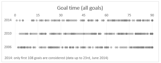
Each dot depicts a goal. The dots are filled with semi-transparent color, so we can see the density of goals at each point of the 90 minute timeline.
As you can see, there is no clear pattern of late goals in 2014.
While we could see higher density of dots in first half of 2006 & 2010 editions, that can be attributed to having full data vs. partial data (for 2014).
Attempt 2: % of goals scored in each 15 minute block
May be if we look at % of goals scored in each 15 minute block, we can conclude something.
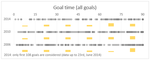
This gives an indication that 2014 world cup indeed has slow first half. But then you also see conflicting proof with more goals scored in last 30 minutes in 2006 & 2010 editions.
Attempt 3: What if we consider only first 100 goals in each world cup
Lets remove some noise. The commentator said this has been a world cup of late goals. If we consider only first 100 goals (ie first 30 odd matches) in each world cup may be we can see how 2014 fares compared to 2010 & 2006 editions.
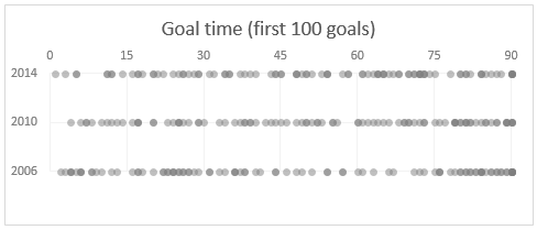
Here too the chart does not reveal much. If anything, we can conclude that 2006 has clear pattern of high number of goals in first & last 30 mins.
While 2014 has high density in the last 30 mins, it has good distribution throughout the 90 minutes.
Attempt 4: Lets consider only the first goal of each match
I guess the impression of slowness is created if you have to wait a lot of time to see the first goal in any match. After that usually things pick-up.
So what if we consider only the first goal times in each match.
This is what we get.
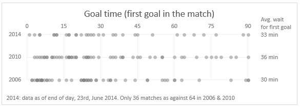
Now this is clear. You can see that 2014 has high density in first half. Remember, for 2014 only 36 matches data is considered where as 2010 & 2006 have 64 matches data.
But we can also see the high density of goals in first half for 2006.
If you look at the average wait time for first goal, 2006 is the least with 30 mins and 2014 is in second place.
So if any, we could say 2010 was the world cup of late goals.
Attempt 5: Cumulative % of goals by minute
If a particular world cup has many late goals, then it will show thru when we plot cumulative goal distribution (as a %).
Here is what we get.
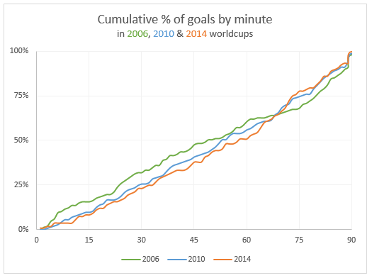
From this you can see that 2014 line lags behind 2006 & 2010 for first 60 minutes, before climbing to top place.
This does indicate that 2014 has a lot of late goals.
But the difference is negligible, so we cannot really say much.
What do you think?
I do feel that some of the matches are slow to watch. But this is purely because I have been looking forward to the world cup and could not wait for the action.
What do you think? Do you think this has been a world cup of late goals?
Also, tell me what you think about this analysis? Wow or meh?
About the data
Thanks to Soccer Worldcups & Wikipedia from where I obtained this data.
More like this
If you want to dig a few a more charts and see how they can help you analyze data, check out:


19 Responses to “Free Invoice Template using Excel – Download”
Nice post! Invoicing for the small biz or solo entrepreneur is something I see a lot of interest in. Also there are great templates from http://office.microsoft.com/en-us/templates
This is awesome.
I would need a little more. e.g. say I generate a Inv. # 1 with all the details. Once done I can click a button all the relevant details gets stored in some table. Further, when i generate a new invoice those details gets stored in same table but just below the previous invoice.
Is their a way to do this?
I did create a solution you are looking for, however its wrapped in a larger 'Medical Scheduler' and it uses VBA, But you can Save, Update, Lookup, Email, Print & Apply Payments to the Invoice.
You are welcome to download it here:https://www.dropbox.com/s/2yvo0o2tgq9quhe/Medical_Massage_and_Salon_Application-Free.xlsm
The Invoice Items are created from the Appt. Types & Service Items table.
I would love all feedback from this
Thank you for sharing. I will definitely have a look at it.
Daily dose of Excel held a competition in 2005 for this same topic
It obtained 9 solutions which are shown:
http://dailydoseofexcel.com/archives/2005/10/27/invoice-app-the-results/
[…] http://chandoo.org/wp/2014/03/19/free-invoice-template/?utm_source=feedburner&utm_medium=email&a… […]
How can i removed Dollar Sign, As want to use this in india.
Please reply.
Also if possible then can i use Indian Rupee Sign and how?
Hi Chandoo,
Thanks for sharing this invoice template, Let me tell you this template will definitely help me since I got a process to handle where this invoice piece comes. Just a small doubt, can we store all the invoice details in PRODUCT & SERVICES sheet. So that whenever I select an invoice number from invoice sheet I can take print out and I can share it as well. Can we do that?? Since I will be dealing with this on monthly basis.
It would be great if you can help me with this.
Thanks in advance for your help!
Regards,
Gaurang Mhatre
Hi Chandoo,
I was thinking learning excel is quite tuff task but your blog proved me wrong. You made it very interesting. Thank you. Also the template you have provided for Invoice is very helpful to us.
Thanks thanks thanks.. Very helpful. 🙂
Hi i love the speadsheet but would like to ask how do i get it to add the description into the invoice as well
Hi Randy, I tried to download one of your link "https://www.dropbox.com/s/2yvo0o2tgq9quhe/Medical_Massage_and_Salon_Application-Free.xlsm" However, i found the link unavailable. Can you please help me get the new link or can you please send this VBA file on my Email-ID.
Hello Anuj,
Thanks for alerting me to the broken link. This one should work:
https://www.dropbox.com/s/gz89gshex1ad0ex/Medical_Massage_and_Salon_Application-Free.xlsm?dl=0
Please let me know if you have any questions.
Randy
Thank you so much Buddy. will check and revert you soon.
Hi, is there any chance that this can work with the "Products & Service" sheet outside of the Invoice sheet. I create multiple invoice files for the numerous clients. Updating the product sheet for each of them maybe a task. Hence, I want to create a MASTER FILE from which data can be picked up without having to insert new data in each of the invoice files.
Possible? Or am I asking for the moon 😉
Thank you so much for tutorial.
This example can be reviewed for the example of the advanced invoice that made with excel userform :https://youtu.be/Qr-4of-38DI
Good Day
i love this template may i ask if it could be modified to have the following
when you lookup a item code in the next column to the right it brings up the description then the quantity, unit cost, discount and then total otherwise i love the template
Item Code Description Quantity Unit Cost Discount Total
When creating an Invoice template in Excel are you able to utilize the auto row height and wrap feature when the cell is a merged cell? I need to have a number of cells merged together to allow for enough space to type in the description of work performed (lets say cells A-D are merged in each row) however it seems that I am unable to utilize the auto format feature. To work around this I have to manually increase the row height after each entry. Is there a better solution for this? Thank you!