
 This is a guest post by Myles Arnott from Clarity Consultancy Services – UK.
- Part 1: Introduction & overview
- Part 2: Dynamic Charts in the Dashboard
- Part 3: VBA behind the Dynamic Dashboard a simple example
- Part 4: Pulling it all together
In this the final post we are going to pull it all together to create our final Dynamic Dashboard model.
The dynamic dashboard VBA example can be downloaded here [Mirror]
Firstly a quick recap of what we have covered so far:
- How to structure a workbook with user friendly front page and user notes
- Using a structured inputs or driver page
- How to create a range of dynamic charts
- Some simple VBA to move items around a page based on the user’s parameters
Ok, so lets get to work to combine all of the above into a workable model. There is a lot to cover here so as Chandoo often says, may be time to grab a coffee!
First things first you need to bring all of the charts that you want to have in your dashboard into the spreadsheet and label up the tabs accordingly.
Homepage
I find that for a model that has multiple tabs a homepage allows any user to easily understand the contents and easily navigate to the page they are interested in.
Obviously you can make the homepage look entirely how you want. I use this design as my standard layout with a relevant title, business logo and contents structured to suit the model.
I use the free form shape to draw my boxes. This can be a bit fiddly to achieve but I think that the end result is worth the effort.

Links are achieved by inserting hyperlinks. I choose to reformat these to change the color and remove the underlining. [related: create a table of contents sheet in excel]

The help sheet is courtesy of John Walkenbach. Of all of the possible user note solutions I have encountered this to me offers the simplest and most user friendly approach. I use this in all the models that I develop for clients.
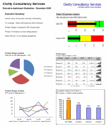
Now on to the central point of the model: The Dynamic Dashboard
There are three key parts to the dashboard, the driver area, the report area and the chart location matrix.
Driver area
This is the user interface which allows the user to hide, view or position a particular chart.

Each title is hyperlinked to the page containing the chart in question. Each location cell is a named range with data validation to control the inputs. I have also added an input message via the data validation function.
The named range relates to the chart eg: Chart one is CH_1, chart 2 is CH_2 etc.
The validation list is based on a named range Position_Range (in the Inputs tab)

The input message is defined in the Input message tab within the validation function menu.
Report area
This is your dashboard, the area to contain your charts. It is simply an area defined and formatted to be the container for the dashboard charts that the user chooses.
The Chart Location Matrix
The entries for this matrix are made in the inputs tab and pull through to the dynamic dashboard tab. Each cell of the matrix in the dynamic dashboard tab is a named range. These named ranges are referenced in the VBA. I will discuss this later in the post.

This matrix defines where each chart will be placed. Getting these positioning references correct takes a little bit of trial and error but is pretty simple to achieve.
Now onto the images themselves. The images that the model moves around are pictures of the charts in each tab. This is achieved using the camera tool. Chandoo has written an excellent post on the camera tool so I will not repeat that here.
I have then renamed the images by selecting the image and changing the name in the name box.
As you can see the chart below is called Chart4. You will also notice that in the formula bar it refers to =’CH4′!$B$2:$F$17. This is the image that it has taken from the CH4 tab.

The final step is to add a hyperlink back to the chart page so that the user can navigate to the relevant page by clicking on the image.
So now we have a structured model, images of our charts and everything in place to put in the VBA.
The VBA
The basics for the VBA were covered in part 3 – VBA behind the Dynamic Dashboard a simple example.
Location
Unlike in part 3, as we would like to avoid clicking on a button every time we want to update the layout, the VBA is located in the Dynamic Dashboard sheet itself rather than in a module.

The event target
It important to restrict the event function to specific cells. This stops the macro running completely every time any cell is changed in the sheet. In this case I have restricted it to the cells where the user chooses the chart’s position.
Variables
We need to define the variable in the VBA so that Excel knows where to put the images we have moved.
To do this we firstly define the variables and then link them to the named ranges in the chart location matrix.
To manage the loop code I have also used “I” as the current iteration and “ix” as the last desired iteration.
Moving the charts
This is based on the VBA used in part three of the post.
Loop
To avoid having to rewrite the code for each chart we instead use a loop that continues to loop as long as the current iteration “I” is less than the last desired iteration “ix”. I.e. loop for the eight charts and then stop.
The variable “I” is also passed to the position part of the VBA to select the relevant image to move:
ActiveSheet.Shapes(“chart” & i).Select
Ok So here is the full code:
Dim Topleft_T As Integer
Dim Topleft_L As Integer
Dim MiddleLeft_T As Integer
Dim MiddleLeft_L As Integer
Dim BottomLeft_T As Integer
Dim BottomLeft_L As Integer
Dim Topright_T As Integer
Dim Topright_L As Integer
Dim Middleright_T As Integer
Dim Middleright_L As Integer
Dim Bottomright_T As Integer
Dim Bottomright_L As Integer
Dim Hide_T As Integer
Dim Hide_L As Integer
Dim View_T As Integer
Dim View_L As Integer
Dim i As Integer
Dim ix As Integer
‘Define the position values (based on named ranges)
Topleft_T = Range(“Top_Left_T”).Value
Topleft_L = Range(“Top_Left_L”).Value
MiddleLeft_T = Range(“Middle_left_T”).Value
MiddleLeft_L = Range(“Middle_left_L”).Value
BottomLeft_T = Range(“Bottom_left_T”).Value
BottomLeft_L = Range(“Bottom_left_L”).Value
Topright_T = Range(“Top_right_T”).Value
Topright_L = Range(“Top_right_L”).Value
Middleright_T = Range(“Middle_right_T”).Value
Middleright_L = Range(“Middle_right_L”).Value
Bottomright_T = Range(“Bottom_right_T”).Value
Bottomright_L = Range(“Bottom_right_L”).Value
View_T = Range(“View_T”).Value
View_L = Range(“View_L”).Value
Hide_T = Range(“Hide_T”).Value
Hide_L = Range(“Hide_L”).Value
‘Set ix to be the number of charts
ix = 8
‘reset i
i = 1
”Select the shape and position it
Do While i <= ix
ActiveSheet.Shapes(“chart” & i).Select
If UCase(Range(“CH_” & i).Value) = “TOP LEFT” Then
Selection.ShapeRange.Top = Topleft_T
Selection.ShapeRange.Left = Topleft_L
ElseIf UCase(Range(“CH_” & i).Value) = “MIDDLE LEFT” Then
Selection.ShapeRange.Top = MiddleLeft_T
Selection.ShapeRange.Left = MiddleLeft_L
ElseIf UCase(Range(“CH_” & i).Value) = “BOTTOM LEFT” Then
Selection.ShapeRange.Top = BottomLeft_T
Selection.ShapeRange.Left = BottomLeft_L
ElseIf UCase(Range(“CH_” & i).Value) = “TOP RIGHT” Then
Selection.ShapeRange.Top = Topright_T
Selection.ShapeRange.Left = Topright_L
ElseIf UCase(Range(“CH_” & i).Value) = “MIDDLE RIGHT” Then
Selection.ShapeRange.Top = Middleright_T
Selection.ShapeRange.Left = Middleright_L
ElseIf UCase(Range(“CH_” & i).Value) = “BOTTOM RIGHT” Then
Selection.ShapeRange.Top = Bottomright_T
Selection.ShapeRange.Left = Bottomright_L
ElseIf UCase(Range(“CH_” & i).Value) = “VIEW” Then
Selection.ShapeRange.Top = View_T
Selection.ShapeRange.Left = View_L
ElseIf UCase(Range(“CH_” & i).Value) = “HIDE” Then
Selection.ShapeRange.Top = Hide_T
Selection.ShapeRange.Left = Hide_L
End If
i = i + 1
Loop
End If
End Sub
Closing Thoughts
We now have a model that provides pertinent summary information to aid management decision making. It combines a high level of flexibility within each report and then allows the user to choose which reports to include and where to position them. This allows an enormous amount of flexibility over the message to be communicated.
I hope you enjoyed the post and please feel free to make comments and suggestions on the model.
Finally a huge thank you for Chandoo for agreeing to host this post for me.
Download the complete dashboard
Go ahead and download the dashboard excel file. The dynamic dashboard can be downloaded here [mirror, ZIP Version]
It works on Excel 2007 and above. You need to enable macros and links to make it work.
Added by Chandoo:
Myles has taken various important concepts like Microcharts, form controls, macros, camera snapshot, formulas etc and combined all these to create a truly outstanding dashboard. I am honored to feature his ideas and implementation here on PHD. I have learned several valuable tricks while exploring his dashboard. I am sure you would too.
If you like this tutorial please say thanks to Myles.


5 Responses to “Preparing Profit / Loss Pivot Reports [Part 2 of 6]”
[...] Preparing Pivot Table P&L using Data sheet [...]
[...] Preparing Pivot Table P&L using Data sheet [...]
[...] Preparing Pivot Table P&L using Data sheet [...]
I am not getting sound from the videos. I have checked all the settings and spent several hours searching the Internet to no avail.
Has anyone else had this problem?
Is there anyway to get the Grand Total to be broken out in the same fashion as the items above it? For instance, if you have in column 1, widget a, widget b, and have their sales by month in column 2, I'd like to see the grand total also be by month, for widget a & b combined.
I can't get anything other than a single line for the grand total, rather than the same format as the data above.
Widget A Month Sales
Jan 100
Feb 200
Widget B
Jan 150
Feb 250
Grand total - here I would also like to have Jan, Feb.
Jan 250
Feb 450