Today I want to introduce Excel 2010 to you. Excel 2010 is the latest version of spreadsheet software from Microsoft, set to be released for sale in late 2010. On Nov 18th, MS released the public beta of Excel 2010 [download here] along with other Office productivity software.
Excel 2010 has several improvements compared to earlier version – Excel 2007. In this post, I want to highlight some of the User Interface improvements made in Excel 2010 that are very exciting and fun to use.
Preview before pasting

This is another cool feature in Office 2010. When you have some data to paste, now you can preview the paste live before choosing an option. See the illustration to understand how this works.
Collapse Ribbon using a button
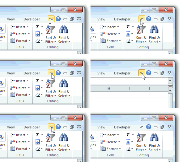
Now you can collapse the ribbon using this simple button. No need to double click on ribbon menus to collapse the ribbon.
Bye bye Office button, welcome back “File” menu
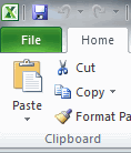
With excel 2010, MS is bringing back the “file” menu. When I started using excel 2007, it took me a week to get used to the office button. Now, thankfully the file menu is back.
Double click on chart items to format them
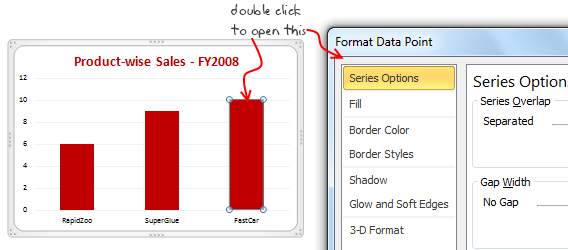
With Excel 2010, you can again click on chart items (like labels, data series, axis, titles etc.) to open the format dialog. This is a nice improvement. Of course, the dialogs are still 2007 like.
Search inside filters (oh, this feels recursive)

When you set auto filters in excel 2010, now you can use a little search bar inside the filter to select the items you want to filter. This makes life lot more simpler for those of you aksing questions like “so how many are from alabama?”
Tables show filters even when you scroll down

Another interesting improvement is that when you make a data table in excel 2010, you will see filters and sort options even when you scroll down.
Excel 2010 UI less flashier than 2007
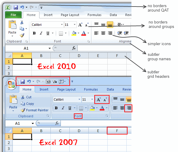
Excel 2010 UI looks considerably better and less stressful than 2007. The colors are dull and subtle. The icons don’t call for attention unless you want to do something. The menus / ribbons feel smoother and slicker. [Learn to use Excel Ribbon with this Free e-Book]
All new print previews
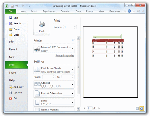
The print previews are now part of backstage. Printing seems much more easier with excel 2010 than earlier versions.
You can customize ribbon

With Excel 2010, you can customize the ribbon very easily (you can do that in Excel 2007 too, but it is bit more intricate). Just go to Excel options and select “customize ribbon” option. You can make your own ribbon menus and add the buttons / tools you prefer.
[Originally this point read “you can select multiple objects…” but as my good friend Jon pointed, it was a mistake. So I have deleted that part and added a new improvement]
You can select multiple objects using mouse, again
In excel 2003 and earlier, if you had to format multiple objects (like charts, drawings, clip arts etc.) you could use the “select objects” from drawing toolbar (the icon that looks like a mouse pointer). Sadly, MS removed this feature in Excel 2007, so to format multiple objects, we had to manually click on each object while holding SHIFT key. Now, the select objects is back. This can be a time saver if you work with several charts or shapes at a time.
Slicers to filter pivot tables with ease

And of course, the much touted slicers. Slicers are easy to use and make analysis more fun. See the demo.
Have you tried Excel 2010 ?
Did you try excel 2010? If not download it from MS site. Give it a try and let us know what you think about it.
What are the features that you liked / hated?


24 Responses to “10 Supercool UI Improvements in Excel 2010”
The best improvement by far is the Collapse Ribbon ^ button !
Kind of a shame that some of the best improvements are actually returns to old functionality. One thing I don't like is that to get to recent files I need to do an extra click after File - apart from Save As, that's why I'm usually in the File menu. I like the sparkline options, though they are still as not fully featured as some of the free and pay options out there.
The collapse button for the ribbon menu is good news. Can you make the ribbon menus stick too?
Nine improvements, not ten. You can also select multiple objects in 2007. Click on the Find & Select item at the far right of the Home tab, and the dropdown looks remarkably like your 2010 screenshot.
@Jon.. Thank you. Dumb me, I somehow thought we couldnt select objects in Excel 2007. Just saw the "select menu" and it is there. I have corrected the post and removed the point. I have added the "you can make your own ribbons" instead. Thanks once again.
@Arti: what do you mean by make ribbons stick?
@Alex: May be it is my installation, but when I go to "File menu" I see "recent files" by default.
For example, if I am working with one of the contextual ribbon menus (Pivot tables, Drawing/Chart etc), as soon as I click away from the selected object, the menu tabs vanish. If I click on the object again immediately, then Excel will remember what I was looking at, but if I wander away and click on a Pivot, then back again on the Chart, the menus will 'appear' but not get activated, thereby causing much annoyance and additional clicking.
I want to "pin" the whole menu (not invididual commands) somehow, so that I can have the menu there for the length of the time I am working with graphics. Excel 2003 used to have the Drawing toolbar you could detach and hover while you were working, but this functionality disappeared in Excel 2007.
My thought was Excel should just allow a 'pin', similar to the Recently Opened files menu, for the Ribbon Menus as well. If I have not selected any Drawing object, the commands can be greyed out, but I want the menu as a whole to 'stick'.
@Arti... I think MS solved this problem differently. When I select a pivot and go to "design" tab Excel 2010 remembers this and automatically takes me to "design" tab when I reselect the pivot.
Apart from this you can also define your own ribbon with all the things you normally do. See the above article (I have added this after Jon's comments)
Nice feature. About time for a upgrade for MS Office
Oh... okay. That might be a start. I'd probably just copy-paste the Drawing tab haha. Thanks. I'll definitely give Excel 2010 a try.
Btw - have you considered getting into / gotten into the world of Excel as it meets SharePoint?
Actually, the replacement new thing is probably better than all the rest. One thing that the designers of the Office 2007 ignored was allowing regular users to customize their own interface. Office 2010's interface was expanded in this way to address the huge uproar.
Is there still a limit on how many things you can add to the QAT bar? (I'm too lazy to look myself.)
@Jeff.. it seems to take quite a few, but only shows one line and gives a little arrow button at the end. (summary: shucks!)
The best thing is you can edit the ribbon directly from excel, so now i can create my own bar with just the things I use regularly!
One of the annoying things in 07 for me is the Add-Ins menu bar - in 03 I could keystroke directly to menu add ins.. In 07 I needed an extra keystroke just to activate the add-in menu, then the keystrokes as normal.. Hope this marek sense..
John -
If you remember the old Excel 2003 Alt-key shortcuts, you can still use them in 2007. To get to the Add-In dialog:
Alt-T-I
Dear Arti & Chandoo
Seen your comments over some issues. Hope you are form India, gone through your comment expecting a pin to command it as a whole, great, hope if someone out of MS have read it, it may be kept in mind while the next R & D of Office Ver. 16
Just incase someone forgot CTRL+F1 will collapse the ribbon.
[...] was pleasantly surprised when I ran Microsoft Excel 2010 for first time. It felt smooth, fast, responsive and looked great on my [...]
I like the sparklines, and the ability to modify the charts
How do you get rid of the advertisment on the right hand side? If you upgrade then will it take off the ads?
Once again Microsoft has re-decorated the Office and we are NOT pleased!
The graphics object selector can be found in the Home ribbon under Find & Select, Select Objects near the bottom of the drop down. You can make it part of the Quick Access toolbar by right click over it and selecting Add to Quick Access toolbar.
The graphics "cursor" will now appear on the mini-toolbar at the top left of the window.
How to get rid of "Add-Ins" button in Backstage (File)" menu by means of XML code, i.e. to hide, to delete or to disable this button?
This button is usually situated in the Backstage menu between "Help" and "Options" buttons.
Vladimir, did you ever get an answer to your question?
I am tying to customize the ribbon UI for a file using XML, and this is precisely the piece I can't figure out. I can hide other tabs, remove items from QAT and backstage - all except the options that are showing up under add-ins in backstage. If there is an XML syntax for referencing this thing and making it invisible, I cannot find it.
Hey, nice tutorial. Please check my video tutorial on similar topic at the below link and provide your comments:
http://www.youtube.com/watch?v=TeIFc0jYjpA