After a really long wait finally I have used … Excel 2007 (drum roll) and contrary to what many people think, I have found Excel 2007 to be a very well designed piece of software. Of course there are various issues with it and I am sure folks at MS are working on them so that next versions of MS Office are much more pleasant and simpler to use.
I wanted to share 10 wow factors in Excel 2007 that may convince you to try it.
1. The interface is gorgeous and easy on eyes

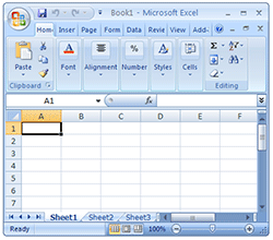
The Excel 2007 interface is very well polished and looks neat. It is easy on eyes with simple colors. All the file related activities can be accessed from office button on the top-left corner, while ribbon UI provides access to all excel features.
2. When you right click on a cell it shows formatting options as well

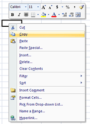
Usually when you right click on a cell (or a range of cells) it is to format them. Now you can do that even faster. When you right click excel 2007 shows the standard formatting options as well.
3. Status bar now shows average and count as well

Remember how you can select a bunch of cells in excel 2003 and earlier and findout out their sum (or average or count) quickly by looking at status bar ? Well, now you can find out average, count and sum from status bar (actually you can add more options, just right click on status bar and choose the statistics you want)
4. Improved conditional formatting with micro charts

One of the significant new features of Excel 2007 is improved conditional formatting. It has all the goodness of excel 2003’s conditional formatting and on top added new features like incell micro charts. They are very easy to use.
5. You can format tables in a jiffy

One of the most common formatting tasks is table formatting. Excel 2007 totally automated it with some gorgeous table formats. You can customized these styles very easily.
6. They have a Remove Duplicates button !!!

That is right, finally a remove duplicates button. Select the data, press this button and mention whether you want to overwrite or paste in another place and that is all. Now, if only they could add other common data clean up tasks as buttons…
7. The default chart formatting is way better than that of Excel 2003

The default charts look much much better than those generated in earlier versions of Excel. What more, they have disabled annoyances like font-scaling by default. 🙂
8. Better and Visually Appealing Color Scheme

The default color scheme is very good and provides excellent contrast when used in charts and tables. What more, the colors are no longer limited to 56 but you can add your own colors with much ease.
9. Ribbon is not that difficult to use

The Ribbon UI has been criticized by lot of people. But it is not really that difficult to use and get used to. Although you would need 2-3 clicks for activities that previously took 1-2 clicks. It would have been excellent if MS had provided an option to switch to classic menu navigation.
10. Despite the new look most of the dialogs are same

Even though Excel 2007 may seem like a huge leap from Excel 2003, the underlying dialog boxes, customization options are all same as that of Excel 2003. For eg. you can see that Ctrl + 1 on a cell produces the above “format cells” dialog box which is almost same what you get in 2003 version of excel.
Another thing is all the excel 2003 keyboard shortcuts work in excel 2007, so power users who have learned the shortcuts over a period need not worry about productivity loss.
All in all, I found Excel 2007 pretty ok except for few glitches. I am planning to install (not upgrade) it on my personal computer as well so that I can experiment and learn more.
What is your take on Excel 2007 ? What are the features that wowed you?
PS: This review is based on my first look at the Excel 2007 and not an exhaustive review. I haven’t tested features like pivot tables, VBA, new formulas etc. Stay tuned for more excel 2007 articles in the coming weeks.


27 Responses to “9 Box grid for talent mapping – HR for Excel – Template & Explanation”
Great stuff! I can understand how to add a slicer to the pivot table, but how do you implement the departmental selector on the 'Filter' formula scheme?
Just saw this on your Youtube channel, and it’s areat idea...!
An easy way to overcome the "ugliness" of pivot tables and get it to look nice (in the format of the Output sheet), would be to simply build a sheet with the nice map at the top, a pivot underneath it and a slicer next to formatted map and then reference each of the 9 cells in the formatted map to the “related” cell in the Pivot.
Keep up the good work!
/Claus
Thanks Claus. That is a great idea 🙂
Hi Chandoo,
This is great! Curious how to make additional columns operate the same as the Department column (ex. have a "manager column") that would allow you to sort a 9 box by manager, area, or team in addition to department?
Feel free to email me if needed! mfry01@minnetronixmedical.com
Happy New Year
Madison Fry
I am curious about the smae thing. I would like to populate the 9 box with other views as well by adding additional columns. IE., I would like to add location, region, etc. Thank you.
This is great, thank you!
How can i see the whole data set of all the teams in the output table. Need a formula that will pick up all the employees
Hello,
Love the template. Thank you. Question - the drop down to pick a department on the Output tab does not seem to work on the downloadable template. Am I doing something incorrectly?
Thank you!
Hi Heather... Thank you. I am using Excel 365 to make the calculations. If you are using an older version of Excel, then the drop-down filter won't work.
Hi
I was able to follow your 9 box grid and modified based my needs. However, you tutorial did not show how to you create the filter for the "Pick a department. Can you kindly share how to create that filter that updated the grid. Thank you.
I am working on this project but I am struggling with the data validation for the department. I copy the worksheets data entry and output as the managers want to see different tabs for each managers.
I updated the source reference for each tab but It does not update the grid based on the new source. The list was updated but it does not populate the grid based on the performance and potential listed.
In addition the hyperlink Update Data and View Talent Map no longer works. Can you please help me.
I keep getting this error message in the pivot table:
This formula is invalid or incomplete: 'The expression is not valid or appears to be incomplete. Please review and correct the expression.
The following syntax error occurred during parsing: Invalid token, Line 1, Offset 14, ‘.
Hi, I used your 9-box excel template with excel 365. First off, thank you so very much. It is incredibly helpful!! My only question is that the boxes aren't big enough for all of the employees (specifically the middle which we call 'Core Employee'). Is there a way to make the boxes larger? Even though it is in excel, I am not able to increase row height (like I normally do in a speadsheet). Any ideas? Thanks again, Jody
Hi Chandoo,
Thanks for the great content. Re. 9 box grid, pls advise how do I increase the size of the box to accommodate more names?
Hi Chandoo,
I figured it out. Excel 365 has the format row height on the ribbon. Thank you
Merci Chandoo pour le modèle proposé,
j'ai une question et un souhait est il possible de développer davantage ce modèle en insérant la photo de chaque employé.
Hi Chandoo!
Great tutorial and tool, thank you! Your tutorial didn't include how to create additional filters on the "Output" tab. Could you please share how you did it?
Can this be done exactly in google sheets?
Hi Chandoo,
Thanks for the video it was really helpful. Is there any way to multi select the dropdown to display multiple or all departments rather than just one at once?
Hello Prish
I have Microsoft 365 and I am struggling to make the boxes larger/unable to increase row height; any idea how you made this work? Specifically in the Output tab where the map is?
Many thanks
Hello Jody, I have Microsoft 365 and I am struggling to make the boxes larger/unable to increase row height; any idea how you made this work? Specifically in the Output tab where the map is? Many thanks
Is there a way to change the 9 box wording descriptions, i.e. Work Horses, to our own internal langauge?
You can edit the file. The descriptions are textboxes.
Hi Chandoo, this is awesome and has worked perfectly. Due to a big organisation the 9 box grid on the output file is too small. I tried adjusting using the row/width ribbon under the format ribbon however it doesn't seem to work. Is there an easier way to adjust this?
Thanks!
When I drag the formula, it doesn't work, and the order I use with the data changes. In the beginning, the order is it is " candidates," " potential," and " performance," but when it goes to another column, it is " Potential," Performance," and "Candidates."Can you help me? Thank you very much, sending love from vietnam
Hi- I am working on the 9 grid project and I am trying to expand the box since I have over 100 names on a few of the columns. How do I do that?
Hi, Thank you this is great stuff and really useful.
As well as department as demonstrated on your clip, how can I display all candidates on the grid at once?
Many thanks in advance