Welcome back. In part 3 of Making a Customer Service Dashboard using Excel let us learn how to create the charts in our dashboard.
Designing Customer Service Dashboard
Data and Calculations for the Dashboard
Creating the dashboard in Excel
Adding Macros & Final touches

Deconstructing the header area – Customer Service Dashboard
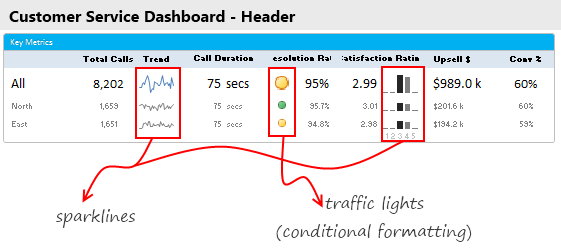
I like to keep a header area on all my dashboards. The purpose of header is simple. It shows key summaries and gives the users a sense of what is going on. In our customer service dashboard, the header has various key metrics & their trends, as shown below.

Constructing the spark-line for trend
 The trend of calls for “All” and 2 selected options is shown as sparklines. Sparklines, a new feature introduced in Excel 2010 is very handy and easy to use. All you had to is select the 28 day call volume figures for ALL & 2 selected options and then go to Insert > Sparkline. Select the line sparkline & bingo, the sparklines are added to your workbook. Just cut them and paste them on the dashboard sheet.
Related: Learn how to use Excel 2010 Sparklines for dashboards
Constructing the traffic lights for call resolution
This is done with Conditional formatting. Another favorite feature. First we need to decide the traffic light conditions. In our case, I have defined below rules.

Related: Using Conditional Formatting Traffic Lights for your dashboards
Constructing Satisfaction Rating Chart
Distribution of customer satisfaction ratings is shown as a column chart. This is in fact a sparkline. The data for this is in Calcs!L42:N46. This is calculated using beloved SUMPRODUCT as shown in 2nd installment.
To insert the chart, just select L42:N46 in Calcs sheet and click on Insert > Sparklines (Column) chart. Move the chart to Dashboard sheet.
Related: Learn how to use Excel 2010 Sparklines for dashboards
Deconstructing the Dynamic Comparison Chart
The heart of this dashboard is dynamic chart at bottom. It has a lot going on,
- You can change the 4 week period for this chart
- You can select how you want to compare
- You can select which 2 options you want to compare
- You can tell what type of chart to show – (call volume, talk time, resolution rate, satisfaction rating & upsell $s)
To explain the dynamism of this chart, I have made a brief video. Please watch it first.
[Watch the video on our Youtube Channel]
So how this chart is made?
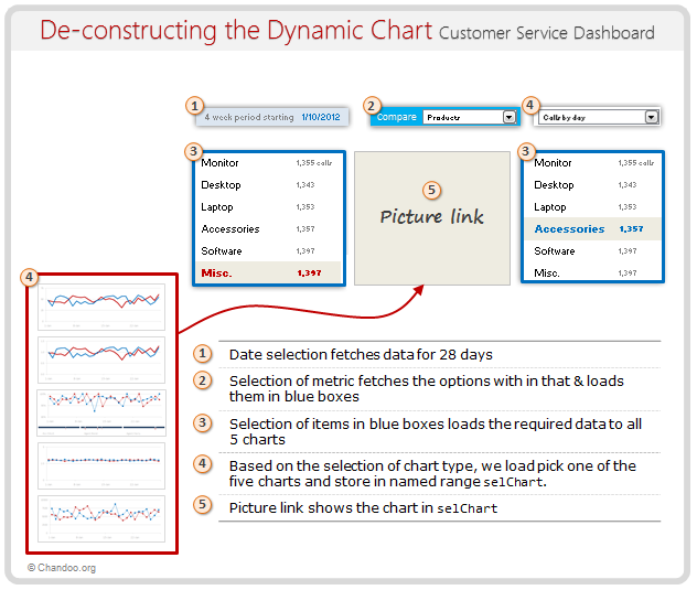
Even though we see dynamic chart in our dashboard, it is actually a picture link. This is how the chart works:
- From the calculations we have learned in 2nd part, you know that we constructed 28 day information for all 5 charts.
- Select each of these 5 types of info & create charts.
- We will end up with 5 charts. Place them neatly in empty cells.
- Next, define a named range
selChart, that returns one of these 5 cell ranges based on which chart user wants. - The definition for selChart is, =CHOOSE(valChartToDisplay, calcs!$C$73:$H$81, calcs!$C$84:$H$92, calcs!$C$95:$H$103, calcs!$C$114:$H$122, calcs!$C$125:$H$133)
I am sure you can figure out the rest of the details. See this illustration to understand how this chart is made.

Download Customer Service Dashboard
Excel 2010 version: Click here to download the dashboard workbook
Excel 2007 version: Click here to download the dashboard workbook
Examine the charts to learn better. Change the drop-downs, date values in dashboard sheet to see how the formulas work.
What next? – Adding final touches to the dashboard
So far, we have learned about the design of this dashboard, calculations behind it & how the charts are put together.
In the final installment, learn about the remaining pieces of the puzzle – VBA code, design tricks & future direction of the dashboard.
What charts you would put in this dashboard?
I liked the challenge of creating one dynamic chart that can show any data & analysis based on user’s wants. But I am sure there are more interesting ways to display call center data. So go ahead and tell me what charts you would include in a customer service dashboard. Bonus points if you can make the dashboard and share it with us. Go ahead and share your thoughts using comments.
Learn more about Dashboards
If you are looking for examples, information & tutorials on Excel dashboards, you are at the best. At Chandoo.org we have elaborate examples, tutorials, training programs & templates on Excel dashboards, to make you awesome. Please go thru below to learn more:
- Customer Service Dashboard Example
- KPI Dashboards in Excel – 6 part tutorial
- Excel Dashboards – Information, Examples, Templates & Tutorials
- Excel Dynamic Charts – Examples, tutorials & inspiration
- Excel School Dashboards Program – Learn how to create this and other dashboards in Excel


