In the 9th session of Chandoo.org podcast, lets raise above AVERAGEs.

What is in this session?
At this exact time, one in every 3 analysts in the world are calculating an AVERAGE(). – Someone
AVERAGEs are a very popular and universal way to summarize data. But do you know they are mean? Mean as in, AVERAGEs do not reveal much about your data or business. In episode 9 of Chandoo.org podcast, we tackle this problem and present solutions.
In this podcast, you will learn,
- What is AVERAGE?
- Pitfalls of averages
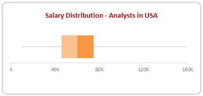
- 5 statistic concepts you must understand
- Standard Deviation
- Median
- Quartiles
- Outliers
- Distribution of data
- What next?
NOTE: This is a 2 part podcast. 2nd part will be published next week.
Go ahead and listen to the show
Podcast: Play in new window | Download
Subscribe: RSS
Links & Resources mentioned in this session:
Average Formula – Syntax, examples
Explanation of Standard Deviation
Statistics & Probability for analyst – a guide
Transcript of this session:
Download this podcast transcript [PDF].
Do you use AVERAGEs for your analysis? What do you think about them?
AVERAGE is such an easy and convenient thing that we use it often. For many of my reports I start with AVERAGE and then improve the metrics to show insights.
What about you? Do you calculate AVERAGE() for your reports? What other types of statistics you use to summarize data? Where do you find AVERAGE to be useful (or useless)? Please share your thoughts using comments.
Subscribe to Chandoo.org Podcast
Do you know that you can subscribe and receive latest episodes of our podcast right to your ears? Use one of the below links to get started.
- For iPhone or iPod or iPad: Click here to subscribe.
- Andriod Phones & Tabs: Click here to subscribe on Stitcher. (You can download Stitcher free app from that link)
- Windows Phone: For Windows phone, search your podcasts app for our show.
- Or… As always, you can get latest episodes, show notes & resources from our Podcast page.


18 Responses to “Best Charts to Compare Actual Values with Targets – What is your take?”
Great post. I can't vote, though, because the answer I want to put down is "it depends". As with all visualisations, you've got to take into account your audience, your purpose, technical skills, where it will be viewed, etc.
I'm with Andy: It depends. Some I would use, some I might use, some I won't touch with a barge pole.
Naturally I have comments 🙂
The dial gauge, though familiar, is less easy to read than a linear type of chart (thermometer or bullet). It's really no better than the traffic lights, because all it can really tell you is which category the point falls in: red, yellow, or green.
By the same token, pie charts are so familiar, people don't know they can't read them. Remember how long it takes kids to learn to read an analog clock?
Bullet charts don't show trends.
With any of the charts that have a filled component and a marker or ine component, it makes more sense to use the filled component (area/ column) for target, and the lines or markers for actual.
[...] Best Charts to Compare Actual values with Targets (or Budgets … [...]
I voted for #6 even though I agree with the other comments that it depends.
The majority of the votes are for the #2, thermometer chart. I still have yet to understand what happens when you are above plan/goal, which was brought up in yesterday's post.
Also, I agree with Jon in that it would be better to flip the series and make the filled part the target or goal and the line or marker the actual.
I am also a fan of using text when appropriate if the data is among other metrics in a type of dashboard. Calling it out by saying actual and % achievement is a good option.
Another "it depends" vote. Are you just looking at one or are you comparing a number of targets with actuals? You didn't include a text box. The problem with sentences is that they can get lost in a page of gray text. A text box can call attention to the numbers and line them up effectively.
I'm with Jon: "Some I would use, some I might use, some I won’t touch with a barge pole" and I'm surprised that some of your readers voted for the last group.
Jon says:
With any of the charts that have a filled component and a marker or line component, it makes more sense to use the filled component (area/ column) for target, and the lines or markers for actual.
Why does this make more sense? I like 6 the way it is, although I would use a heavy dash for the plan/target marker.
"It depends" is also my take. What I usually try to drill into my clients dashboard design is the fu ndamental difference between spot results (am I on target for this month) and long term trends.. I always try to create 3 different set of graphs to represent real perormance:
- spot results vs objectives
- cumulative results vs objectives
- long-term trend (moving average) mostly) to see where we're going
[...] Best Charts to Compare Actual Values with Targets – What is your take? (tags: excel charts) [...]
[...] Related: Charting Principles, How to compare actual values with budgets [...]
[...] Excel Charting Alternatives to compare values [...]
Jon says:
With any of the charts that have a filled component and a marker or line component, it makes more sense to use the filled component (area/ column) for target, and the lines or markers for actual.
Why does this make more sense? I like 6 the way it is, although I would use a heavy dash for the plan/target marker.
I totally agree, Bob. I would normally favour a line for the target and a column for the actual, you can see quite easily then which columns break through the line, then.
[...] best charts to compare actual values with targets — den Status mal anders zeigen, z. B. als Tacho [...]
Thermometer charts: "Not appropriate when actual values exceed targets" - this is easily solved by making the "mercury" portion a different color from the border, then you can clearly see where the expected range ends and the actual values keep going.
People seem to knock gauges quite a bit in dashboarding, but trying to show comparison of realtime data between operating sites and targets for each site can easily be done with a bank of gauges that have the optimal operating points at 12 o'clock.
The human eye is great at pattern stripping, and any deviation of a gauge from the expected 12 position will quickly register with an operator and attract his attention. Using a colour background, or meter edge, will also indicate the sensitivity of a particular site.
[…] Best charts to compare actual with target values […]
[…] Best charts to compare actual with target values […]
[…] work laptop I have a favorites folder just dedicated to Excel charts. Its got things like “Best Charts to Compare Actuals vs Targets” and “Best charts to show progress“. I love me some charts […]
I am wondering how will the plotting work, for some of the targets which may have been achieved before time. E.g. for the month of Jul the target was 226 and the actual was 219. So the chart will show a deficit in meeting the target by 7 points but what if this 7 may have been completed earlier in month of June. So ideally it not a deficit.