
This post is part of our spreadcheats series – 30 Excel and Charting Tips & Hacks aimed to make day to day spreadsheeting fun and productive.
One of the most common charts is “YoY Growth Rates of Our Superawesomekickass Product”. While not everyone may have a superawesomekickass product, most of us in fact make a YoY (Year on Year) growth rate charts for various types of data.
A simple label formatting hack can improve the effectiveness of these charts by adding color to differentiate positive vs. negative growth (or mediocre vs. sky rocketing growth rates). See this example:

You can get this effect by applying custom number formatting to the data label. It is one of my favorite tricks in excel and I have written about it in introduction to custom cell formatting in excel, number formatting in excel using custom codes, showing decimal values only when needed articles.
How you can get colors in Axis Labels
First apply data labels to your chart and now select the data labels and press ctrl+1 (aww, come on now, you are reading this blog, you should what ctrl+1 means) and go to numbers tab. Select “custom” as category and specify the formatting code like this:
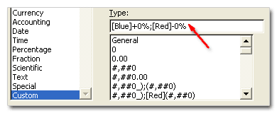
[blue]+0%;[red]-0%
Now, that was easy, isn’t it. But you might think, “Chandoo, what the heck the above format code is doing?”
Well, it tells excel to apply red color and add a minus symbol if the data label value is less than zero and apply blue color and add + symbol if the value is above zero. You see the custom number formatting codes have 3 parts in them, like this:
formatting for positive numbers ; formatting for negative numbers ; formatting for zero values
If you are noob (hi noob!) and lost in all these codes and square brackets, you may want to checkout our post on introduction to number formatting in excel to learn more about custom codes.
Ok, that was fun, What else you can do?
You can do much more using custom codes to format data labels. For example, a code like [Red][<0.15]0%;[Blue][>=0.15]0%; will, Oh, forget it, you can guess that. Just remember that excel allows only 3 parts in custom codes. So go nuts, but just thrice.
Like this post, I mean REALLY like it?
Awesome, You should sign up for e-mail updates or get our full RSS Feeds so that you never miss a post.
Why you should never miss a post? Because my friend, one of the posts might help you make your product superawesomekickass.


11 Responses to “Use Alt+Enter to get multiple lines in a cell [spreadcheats]”
@Chandoo:
One more useful trick.......
In a column you have no. of data in rows and need to copy in the next row from the previous row, no need to go for the previous rows but entering Alt + down arrow, you will get the list of data, (in asending order), entered in the previous rows...
This is another great tip. I use this all the time to make sense of some *very* long formulas. As soon as the formula is debugged I remove the break.
Great tip Chandoo!
I use this feature often and it has even gotten the, "how did you do that" response.
Thanks!
@Ketan: Alt+down arrow is an awesome tip. I never knew it and now I am using it everyday.
@Jorge, Tony: Agree... 🙂
[...] Day 1: Insert Line Breaks in a Cell [...]
how can we merge a two sheet.
excellent idea. Chandoo you are genious
Hi chandoo,
I have used ctrl+enter to break the cell. But I did not get the result.
Please tell me how can i break the cell in multiple lines.
Hi, Ranveer,
Its not Ctrl+enter to break the cell, use Alt+Enter to make it happen.
hi Chandoo....
how we can use Alt+Enter in multiple rows at the same time please reply hurry i have lot of work and have no time and i m stuck in this. 🙁
Alt+J worked once 🙁
So I found another more reliable way:
=SUBSTITUTE(A2,CHAR(13),"")
Where A2 is the cell that contains the line breaks which the code for it is CHAR(13). It will replace it with whatever inside the ""