
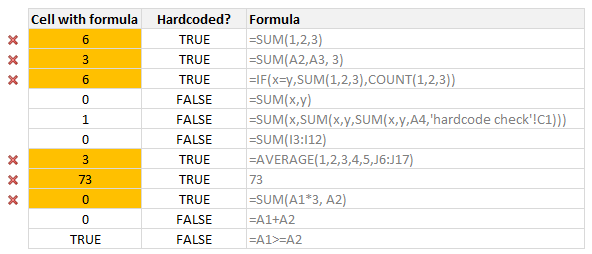
Here is a common problem. Imagine you are looking a complex spreadsheet, aptly titled “Corporate Strategy 2020.xlsx” which as 17 tabs, umpteen formulas and unclean structure. Whoever designed it was in insane hurry. The workbook has formulas like this, =SUM(Budget!A2:A30, 3600)+7925 .
It was as if Homer Simpson created it while Peter Griffin oversaw the project.
So how do you go about detecting all cells containing formulas with hard-coded values?
Alas, the usual methods fail
The usual methods to audit formulas are of no help here. Let’s see:
Show formulas (CTRL+`): Since we have way too many formulas, this approach requires a lot of squinting and gallons of coffee.
Go to special > Constants: This will only detect constant cells (ie input cells), but not cells containing formulas like =IF(2=2, Budget2014!A2, Budget2015!A2)
Trace Precedents: This can be used only for formulas that contain all hard-coded values (ex: SUM(1,2,3) will have no arrows, where as SUM(A1,A2, 7) will have some arrows
FORMULATEXT(): There is a new function called as FORMULATEXT() introduced in Excel 2013. This can tell us what is the formula in a cell. But we still need to develop additional logic to see if the formula text contains any constants.
Let’s build ‘Detect hard-coded formulas’ feature for Excel
The beauty of Excel is that, if there is something you can’t do with on screen features, you can build it. This is where VBA comes handy.
So we can create a hasConstants() user defined function that takes a cell as input and tells us TRUE or FALSE. True if the cell has constants (or hard-coded values) as formula parameters and False otherwise.
But what should be the logic for hasConstants()?
The process for detecting hard-coded values can be defined like this:
- Read the formula from left to right
- For each argument of the formula
- See if the argument is a valid reference or name
- If not, break the loop and return TRUE
- Return FALSE
How do we detect only the parameters?
There is no direct way to extract only the parameters of a formula. So what we do is we split the formula in to an array using the delimiter COMMA.
And we check each item of this array to see if it is
- a function call (like SUM, COUNT, VLOOKUP)
- a valid name or reference
What about nested functions?
The approach works the same way.
What about arithmetic, text or comparison operations?
For example, a formula like =A1+A2+17 should throw TRUE as it has hard-coded value.
So what we do is, we replace all such operators with delimiter (COMMA) before splitting the formula text.
We can consider +-*/%&><= as operators.
So how does the code look like?
Here is how it looks like:
Const COMMA = ","
Const OPERATORS = "+-*/%^&><="

Public Function hasConstants(thisCell As Range) As Boolean
    'finds out if thisCell has a formula with constants in it
    'i.e. hardcoded values

    Dim formula As String, args As Variant, i As Long
    Dim testRange As Range

    formula = replaceOperators(Mid(thisCell.formula, 2))

    args = Split(formula, COMMA)

    For i = LBound(args) To UBound(args)
        If Not (Len(args(i)) = 0 Or Right(args(i), 1) = "(" Or args(i) = ")") Then
            'not a function or null, must be one of the parameters
            'see if it is a valid name or reference
            If Not nameExists(CStr(args(i))) Then
                'name or reference doesn't exist, must be a constant / hard-coded value
                hasConstants = True
                Exit Function
            End If
       End If
    Next i
End Function

Function replaceOperators(formula As String) As String
    'replace operators such as +-/%^&>< with COMMA
    Dim char As Long

    For char = 1 To Len(OPERATORS)
        formula = Replace(formula, Mid(OPERATORS, char, 1), COMMA)
    Next char
    formula = Replace(formula, "(", "(" & COMMA)
    formula = Replace(formula, ")", COMMA & ")")
    replaceOperators = formula

End Function

Function nameExists(name As String) As Boolean
    'Check if a name or reference is valid
    Dim testR As Range

    On Error GoTo last

    Set testR = Range(name)
    nameExists = True
    Set testR = Nothing
last:

End Function
How to use this code?
Simple. Copy this code and add it to your personal macros workbook. (Tip: how to setup personal macros workbook?)
 Then use it in your complex workbook like this:
- To check if a cell contains hardcoded formulas, write =hasConstants(A1)
- To check if an entire range has hardcoded values,
- Select the range
- Go to home > conditional formatting > new rule
- Select formula type rule
- Type =hasConstants(top-left-cell relative reference)
- Format by filling a color or changing font style to detect easily
- Done
Does it work in all cases?
For most normal formulas this approach should work. I have tested it with various combinations and it seems to hold up good. I suggest you to double check the results for any type II errors (ie missed hard coded formulas) during initial few rounds.
Also, please share your observations in the comments so that we can improve this code.
Download Example Workbook
Click here to download this VBA code. After downloading the file, go to Module 1 (press ALT+F11) to see the code. Copy it or modify it as you see fit.
Your comments please?
I never had the need to check for hard-coded values until recently. But once I had that need, I found there is no simple way to do it. I believe this kind of check can be very useful for people in modeling, risk management or auditing positions.
What about you? How do you check for hard coded formulas? What methods do you use? Please share your thoughts and tips in the comments section.
More on spreadsheet auditing & risk management:
Check out below articles to learn more about how to audit spreadsheets and prevent risk of miscalculation:
- Spreadsheet risk management – 4 part series
- Show all names & references
- Go to special, a powerful way to navigate your workbooks


40 Responses to “How to check for hard-coded values in Excel formulas?”
Very good article and makes even better the conditional formatting trick. Thanks for sharing.
P.S: VBA may needs little alteration for array formulas. Invariably for subtotal function, function number is hard coded. And also for lookup functions, the exact match condition is hard coded.
Good pickup. Same goes with VLOOKUP - either the Columns argument, or using 1 or 0 instead of True or False.
Good catch. Implementing these nuances means adding more code to check individual functions. The macro would become very complicated when considering nested formulas. So I chose the happy medium.
Yeah. It may become lengthy cumbersome to cover all the cases. I just put my thoughts on this great forum.
On another note, is there any way to check the each substring EVAL with its text. If they both are same, they should be constant. Not sure how it works though 🙂
Interesting implementation. I like the way you substitute all operators with a comma.
Note you can replace this:
For i = LBound(args) To UBound(args)...with this:
For i = 0 To UBound(args)...which saves VBA having to evaluate the LBound, as it's always going to be zero (unless the user has set it to 1 in the declarations section).
I wonder if using the Evaluate method would be a quicker test of whether something is a range or not.
Good suggestions Jeff. I have not thought about Evaluate approach. We could also invoke any of the simple application.worksheetfunctions like N(), T(), COUNTA() to check validity of names / references. (some of them only work if the name points to a cell, not to a value)
You can let us know if the EVALUATE approach is faster. To me the whole thing about setting a variable to range seems a little slow.
Chandoo,
None of the Worksheetfuntion you mention will work because they can use constant. However, what about counting the number of Row/Columns of the range.
Function nameExists(name As String) As Boolean
'Check if a name or reference is valid
Dim testR As Long
On Error GoTo last
testR = Range(name).Rows.Count
nameExists = True
last:
End Function
Regards
I apologize for my limited experience with VBA, but I copied the code into my personal workbook, as I've done successfully with other VBA code many times. Then I added the conditional formatting to a range that I knew had formulas with constants in it, but nothing happened. The one part that I may be misunderstanding is step 4 under "How to use this code?" It says "Type =hasConstants(top-left-cell relative reference)." Does that mean I should type "=hasConstants(C1)" if the upper left cell of the range I selected is C1? If so, it isn't working for some reason. I checked my Developer tab and my formulas were not set to use relative reference, but I changed it and it still doesn't work.
This was something I was just wondering yesterday how to do, so the solution is very timely and valuable to me.
Thank you!
Gary
Though I couldn't visualize your situation well, following may be of help.
1>Check the user defined function is working well. Just use “=hasConstants(C1)” and shall return true if C1 has some constants. If it is giving right answer, then VBA part is fine.
2>Conditional formatting. Select the cell in which you want to format. As shown in the figure above posted in the article, add conditional formatting with reference to same cell. When you select the cell to give reference in conditional formatting, by default it fixes the reference (like $C$1) which needs to be unfixed. Then use format painter to apply this conditional formatting to all cells.
I'd be interested to hear from any readers about whether they routinely have to identify cells with constants. We could include this in an add-in that my business partner and I are working on, but I don't want too many 'niche' functions cluttering up the interface. I don't know if this is a common requirement or not. If it is, please let me know.
Jeff,
As an accountant, this would be useful. We often send budgets off to be reviewed and they are amended by people hardcoding values - a nuisance in any situation - which are difficult to find at times.
Jason
Hi Jeff,
I'd use it too.
Cheers
Nick
Is there a way to make such a custom function available in the personal workbook? I love this idea, but I'd hate to have to copy and paste the code into each workbook I'm using that I want to use it in.
Adam,
Yes you can:
https://support.office.com/en-us/article/Copy-your-macros-to-a-Personal-Macro-Workbook-aa439b90-f836-4381-97f0-6e4c3f5ee566
Great concept!
It seems like the conditional formatting trick only works when the UDF is in the workbook (not in Personal macro workbook), but still very handy to have.
Cheers
This is Great!
But I am having the same problem, is it possible to have the function available on all workbooks and also for it to work on conditional formatting?
Thanks!
This is a good area if something can be developed. Many time this will be useful when you work on the workbooks you received from the external world.
Rather opposite to this is also a good idea.
if the file is using number of references within the sheet or across sheets, one may want to get all those cell (controlling element) at one sheet and control from there. we generally found this problem in workbooks where formula is build with many sheet reference to check. i generally have one dedicated sheet for all variables (reference) used in formula.
I found this udf in David Hager´s Excel Experts E-letter (EEE) on J Walkenbach's website: http://spreadsheetpage.com/index.php/site/eee/issue_no_20_july_8_2001/
by John Walkenbach and John Green
---How can I locate cells containing formulas with literal values?---
Use the following UDF as your conditional formatting formula.
Function CellUsesLiteralValue(Cell As Range) As Boolean
If Not Cell.HasFormula Then
CellUsesLiteralValue = False
Else
CellUsesLiteralValue = Cell.Formula Like "*[=^/*+-/()><, ]#*"
End If
End Function
It accepts a single cell as an argument. It returns True if the cell's
formula contains an operator followed by a numerical digit. In other words,
it identifies cells that have a formula which contains a literal numeric
value.
You can test each cell in the range, and highlight it if the function
returns True.
Wow, so simple!
You could put that in conditional formatting or add a Sub that calls the function to handle ranges with a 'For Each Cell in Selection' loop
Amazing find Oscar. It works for all numeric literals flawlessly and is far simpler than my macro. Thanks for sharing it with all of us.
This udf is indeed wonderful, but don't we need to also return true if the cell contains simply a number, like:
23
and testing isNumeric(cell) will do that.
Chandoo - nice work. As usual, you've lit a fire and shown people how to do it. Now they'll be off using it to do things ranging from lighting a scented candle to stoking massive infernos that can melt metal.
Oscar - nice find. Sort, succinct and does the job (for the most part).
Jeff - your add-in sounds like a great idea. Like you say, catering for every exception on every function will get unwieldy, so maybe you can give the user a menu option to add their commonly-used functions to an exceptions list where they choose how each argument is dealt with (eg. check/ignore/NA). If you take VLOOKUP for example, whether you use TRUE/FALSE or 1/0 for the fourth argument, it should not affect the outcome of the UDF, since VLOOKUP can't work properly without it, so the fourth argument would be in the NA category (unless of course you get someone who does use a formula to determine the fourth argument!). For the third argument, many people want to use a constant as the column identifier, so would not want the UDF to highlight this. They would then choose Ignore for the third argument. I'd submit that most people would only ever add a handful of functions to the exceptions list, so it shouldn't slow down performance too much, but it will be of great benefit.
Vad,
Thank you for your response. That was a good way to check the VBA code, and it seems there is a problem with the code. I copied it exactly as it is above into my Personal.xlsb workbook, under the Modules folder. In that folder I have a file called "MyFavoriteMacros," and I put all of my macros in it. When I did the test you mentioned on a cell that had "=149513.4+27.4" in it I got a "#NAME?" error.
Gary
NAME error comes for undefined functions. It seems like, the Macro is not loading.
I've used a non-VBA solution in the past, though not sure if it covers every possibilities, but haven't had it come up wrong yet.
Assuming Cell A1 is the cell you're checking:
=IF(AND(CELL("prefix",A1)="",CELL("type",A1)"b"),TRUE,FALSE)
Oscar,
I copied the code into VBA and it highlighted one of the lines in red. Then I realized you said to use the code as your CF formula, so I created a new rule, and copied the code in as my formula, but nothing. This would be really helpful, but for some reason nothing seems to be working.
You need to replace the " with
Chandoo I don't quite understand your reply. Is something missing, and who is this a reply to?
Thank you!
Hi Chandoo,
Thanks for the great code. I was wondering where in your code can we add Oscar's input?
Thanks,
Neeraj
I saved the John Walkenbach CellUsesLiteralValue code as an addin. It works fine when tested directly on a Excel 2010 worksheet. However, when I tried to use it on the same worksheet as a conditional formatting formula
for example, =CellUsesLiteralValue(C46)
I got this error message: This type of reference cannot be used in a Conditional Formatting formula. Anyone have thoughts on am I doing wrong?
Now I copied the code into a module in the workbook I have been testing. Now the conditional formatting works fine - no error message and formulas with literal values are highlighted. Having the code in the active workbook seems to be the only way to make this work - or am I missing something?
Thanks for the instructions, Chandoo. I'm a bit new to this, but have everything setup properly and it does not seem to be working. Did anyone else have any challenges followed by a break-through?
I also cannot get this to work and am also new to this. I tried saving in personal workbook and using PERSONAL.XLSB! in conditional formatting formula and i was not allowed to use that type of formula. Chandoo were you able to use this functional saved in personal workbook without typing the prefix in the formula? It seems above you alluded to saving in personal but your formula does not use the personal prefix. I am simply trying to highlight an entire column with say 1,000 rows and look into all formulas at once for a hard coded value so that when I copy the column over to the next, I know which cells I (someone) made a manual adjustment to. Any help would be greatly appreciated as this is being done by me looking into each cell at the moment for a constant. thank you.
Could this formula be modified to not highlight a cell if the only hardcoded number is a 1? would "1" just be added to the Operators?
I was thinking one liner can be used too.
'True means its a Formula
'False means not formula
Function IsFormulaBK(cell As Range) As Boolean
IsFormulaBK = Not (IIf(cell.formula Like "*[=^/*+-/()><, ]#*[0-9]*", True, False))
End Function
Thanks for sharing this tip. I tried using this, my only concern is that the function seems to return TRUE for a cell containing a formula that links to another worksheet in the same workbook, even though there is no constant within that formula. Any idea on how to fix this? I'd like to be able to identify constants only.
Thanks in advance
The conditional formatting doesn't work for single digit hard coded numbers. However, it does work for hard coded numbers with multiple digits.
Please advise.
Thanks!
Thanks, legend!
Hi mate
I get a false alarm with this code when a formula has a reference to the worksheet which has an ampersand in the name (eg 'A&B!'C2) - what happens - "&" get dropped then "'A" is giving the false true in the HasConstants code.
How about using the embedded Excel function isFormula()?