
Yesterday we have a post on using thermometer charts to quickly compare actual values with targets. Today we follow up the post with 10 charting ideas you can use to compare actual values with targets.
I have added my comments to each option along with useful links to learn how to make such a chart.
There is a poll too, at the end.
(1) Gauge / Speedometer Chart

What is good about this approach?
- Familiar metaphor thus easy to understand
- Easy to construct
- Good for communicating one data point
What is bad?
- Takes too much space
- Bad design choice for most professional situations
Tutorials to make Gauge / Speedometer Chart
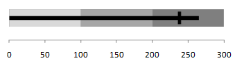
(2) Thermometer Chart

What is good about this approach?
- Familiar metaphor thus easy to understand
- Easy to construct
- Good data to ink ratio
What is bad?
- Do not say anything about trends
- Not appropriate when actual values exceed targets
Tutorials to make Thermometer Chart
(3) Bullet Chart
What is good about this approach?
- Comprehensive
- Aesthetic and very good data to ink ratio
What is bad?
- Difficult to construct in Excel
- Takes time to read the first time
Tutorials to make Bullet Chart
Tutorial 1 | A bullet chart alternative
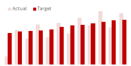
(4) Area Chart
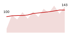
What is good about this approach?
- Shows trend along with current status
- Easy to construct
- Easy to compare
What is bad?
- Not good for small data sets
(5) Line Charts
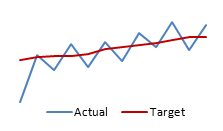
What is good about this approach?
- Easy to construct
- Shows trend along with current status
- Easy to read and understand
What is bad?
- Looks too simple
(6) Column Chart with Markers
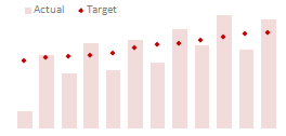
What is good about this approach?
- Easy to compare & read
- Easy to construct
What is bad?
- Not good for small data sets
Tutorials to make Column Chart with Markers
(7) Partially Overlapped Chart
What is good about this approach?
- Easy to construct
What is bad?
- Difficult to compare
(8) Traffic Lights
What is good about this approach?
- Familiar metaphor thus easy to understand
- Easy to construct (with Excel 2007 Conditional Formatting)
- Good for tables
What is bad?
- Do not tell the entire story, so should be used only in tables or with other displays
(9) Pie Charts

What is good about this approach?
- Familiar metaphor thus easy to understand
- Easy to construct (with Excel 2007 Conditional Formatting)
- Good for tables
What is bad?
- Works when targets are 100%
- Cannot show when actual values are more than targets
- Pie charts can be hard to read
Tutorials to make Pie Charts
(10) Using Text – Just say the thing

What is good about this approach?
- Easy to read
- Highest Data to ink ratio
- Very easy to construct
What is bad?
- Too simple
- Leaves the finer details out
If you are reading this post on email or feed reader, please click here to access the poll.


89 Responses to “Hui’s Excel Report Printer”
Woa!
This is a really impressive macro, I will probably use it in one of my KPI Dashboard I'm currently building in my company
Many, many thanks to you Hui. You're a invaluable contributor !!! (have you ever think of a fork of Chandoo.org ??? 🙂
We have a colour printer at work which defaults to B&W (company policy), however, changing this from Excel would be handy, but I suspect this aspect of the print setup is outside of the Excel object...
this comprehensive tutorial is so unexpectedly wonderful. thank you. i particularly appreciated the insight into the use of "With ActiveSheet.PageSetup" and being able to pick up anything required for footers and headers. this will save me me a ton of time. thank you.
you could copy this formula down the rows in column "O":
=IF(D5="Off","-","Page: "&COUNTIFS($D$5:D5,"On")&" of "&COUNTIFS($D$5:$D$14,"On")&" -Print date: "&TEXT(NOW(),"mmm dd, yyyy")&" Copyright 2011 - Hui Corporation")
and then reference the appropriate cell in the VBA call. This formual does not take into consideration of "pages" more than 1 page wide or 1 page tall. converting more of this formula to VBA and making the formula in column "O" a simple count of pages could probably take care of that. probably doing all the math in VBA is even better. i do not know how to write this formula in VBA.
also, Hui, do you know of links to more information about pdf's in general? i find myself wanting to print a package of reports into the same pdf file from Excel. i can't figure out how to do that. at times. i want to take a pdf file and add the pages to a Word document (images are fine as long as there is some automated way to split the pdf into Word document "pages"). sometimes i just want to add a few of the pages of a pdf (as images) to a Word document. as far as i can tell this can't be done.
Chandoo and Hui: as we say in the US: Providence! I was just today sitting down to start creating a excel report writer and lo behold, what pops into my Inbox? A beautiul Excel report writer! Again, Providence!
Thanks so much, this is super sweet and tasty.
Super sweet and tasty! A real time saver. thanks so much
This is very cool Hui.
For me the fact that many "non Excel" users can't understand why a report may print, but the graphs don't print at the same time or why just the graph prints without the data tables etc, also the fact that each work sheet may have separate print formatting.
It is a real confidence builder when people can use your files without having little issues or bugs that even printing a file can create for non frequent Excel users.
It allows quick, easy & user friendly use of your files.
Thanks
Hey, could Hui or someone else give a short description of exactly what steps to follow to use this in a different workbook.Seems really useful but I'm not able to use it by just copying over the the sheet Print_Control.What do i need to add or replace to the code?
If you've copied the sheet to a new workbook
Did you select the small button described in the instructions above?
.
If it didnt work keep reading below
.
Run tha VBA subroutine called
Setup_Print_Control_Named_Formula
.
or
.
Right click on the small button
Assign Macro
Select Setup_Print_Control_Named_Formula
Apply
.
or
.
Manually add the two named formulas described in the post above
neat. another thing as i was looking at the page size comment is that you could have drop down lists in various places that would limit choices
On/Off; Landscape/Portrait; Page Size: Letter/Legal/etc. and Rows: 1-8
@All, Thanx for the appreciative comments
@Rich, I'm a minimalist, So don't like controls, but you can add them if you desire.
@Bill, I do have a version that does allow you to include auto-incrementing page numbers into comments using a code #Pg#, But I stripped it out of this to keep it simple and functional and just demonstrate the techniques.
@Bill, in VBA you can use
ActiveWorkbook.ExportAsFixedFormat Type:=xlTypePDF
to print a package of Excel reports into one PDF (as long as all the reports are in the same Excel workbook).
Please help me also.... i need to put page # of # in printing excel...
i already has a code
Sub Button2_Click()
ActiveSheet.Range("A1:K45").Select
ActiveSheet.PageSetup.Orientation = xlLandscape
Selection.PrintOut Copies:=1, Collate:=True
MsgBox "Successful!"
End Sub
Hi Simon... where in the current macro would you include this code to combine the pages into one report?
“=OFFSET(Print_Control!R4C2,1,,COUNTA(Print_Control!R5C2:R24C2),COUNTA(Print_Control!R4))” piece has a problem.
In Russian locale formula parameters need to be separated by semicolons. So if the code throws error in Setup_Print_Control_Named_Formula subroutine, you would want to change commas to semicolons.
Pls discard my previous comment. Not true.
Great tool. Appears that the VBA code currently limits the number of worksheets it will print to 20 (sheets listed on rows 5 to 24 (Excel 2010 version). How do I modify so it will print more than 20? Also, it you have a version that allows for more flexibility with headers and footers, I would appreciate seeing it. One last item - are paper margins set in the normal Excel fashion or somewhere in the Print_Control worksheet? Again, wonderful tool - just made my life much easier - thanks.
[...] Automatically Generate Report Variations using Excel [...]
I have a workbook that includes 18 sheets with 160 named ranges. My desire is to print to a pdf with each range showing up on it's own sheet. I inserted your sheet into my workbook, removed your information and inserted mine pertaining to the workbook. Some of my named ranges contain graphs, by the way, and I still included them. When clicking the "Setup Print Control" button, I get the message that because of my security settings macros have been disabled. I get the same message when clicking the "Print all on areas" button. I saved and reopened the file, enabling macros and still get the error message.
I don't use macros very much, and your VBA code discussion is greek to me. I saw the one comment about using "ActiveWorkbook.ExportasFixedFormat Type-xltype.pdf" and will try to incorporate that - if I can get this macro to run. Any suggestions? Thank you - PS - does your hair really look like that?
Hi Hui,
This is great. I am amending the code to add more page setup parameters and also to automatically populate the "visible" worksheets. When done, I shall post a link back at this thread for others. Thanks to you for this and it is indeed saving on tons of hours.
I have retained the credit to you in the code.
Regards,
Ninad.
This macro works for Excel 2011 for MAC, with the following caveats:
In the print macro:
The EvenOddHeaderFooter errored out for me, deleting those lines (numerous) caused the rest of macro to work perfectly
in the SetupPrintControl macro, the lines attempting to "insert a comment" error out. Deleting those permitted the macro to work as intended.
(i'm not familiar with VBS, so others feel free to correct anything unclear, or erroneous)
@Bret
Thanx for the feedback
I don't have access to Excel 2011 Mac to test these type of things
Unfortunately MS keep adding features to different versions which can result in small inconsistencies between versions
I'm glad you worked it out in this case
I thought about you and this blog post last night! I was tinkering around with linked images (via the Camera) when it occurred to me that they could be used to give the user a "print preview" of another spreadsheet. Since this spreadsheet program you've posted allows the user to define a print area - do you think a linked image (ie a "print preview" window) that automatically updates based on the print area supplied is useful feature? or, do you think it might just get in the way?
As you say This doesn’t fix the printing multiple pages to multiple files when printing to PDF issue
I wonder if I could ask how ou do overcome this problesm. Is it caused ourely and simply by having different formatting/page setup settings oer worksheet?
This is not working for me when I got to install it. I have may worksheets.
Any advice?
@John
What version of Excel are you using ?
Can you email me your 2 files
Click on Hui... above, email at bottom of page
Hello Hui,
Been looking forward using your print-areas macro, but I encounter a problem; When I open the 'Print-Areas.xlsm' file and then hit the 'Setup Print Control Named Formula' I get an error (visual basic 400 error). I looked at the code but can not solve it. I tried it on another PC as well, but the same error.
As all people above do have it working, can it be a version problem of my software? I use Windows 7 and Excel 2010 professional Plus.
Hope you can help me, the print feature will save me lots of work printing all the different pages in my excel file.
Thanks,
Marc.
@Marc
can you email me the file
Click on Hui...
email add at bottom of page
Hui,
This sounds almost to good to be true but I am having the same 400 error. Sadly I cannot upload the file (company policy) can you still help me?
Also I was wondering if I can define multiple print areas on the same sheet with this.
Many thanks in advance!
@Daniel
The macro only sets up 2 named Formula
These need to be
Copies: =Print_Control!$M$26
ie: The Number of Copies cell
Print_Control: =OFFSET(Print_Control!$B$4,1,,COUNTA(Print_Control!$B$5:$B$24),COUNTA(Print_Control!$4:$4))
This is the range from B5 to the lower right corner of the populated data area
in the download file it is N14
If these named Formula exist there is no need to run the "Setup print controls named Ranges" macro
"Can define multiple print areas on the same sheet with this" - Absolutely
Including collapsed or expanded groups
This is all described in the post.
BTW I am using Excel 2013 if that changes anything
nice code very halpful
thanks
Hi All,
Using the 2003 version i receive a VB error, "Object doesn't support this property or method". If I rem out the following lines of the Setup_Print_Control_Named_Formula sub routine it will run but does nothing:
'ActiveWorkbook.Names("Print_Control").Comment = _
' "Used by the Print_Reports Subroutine"
'ActiveWorkbook.Names("Copies").Comment = _
' "Specifies the No. of Copies for the Print_Reports Subroutine"
Not good with VBA so any ideas would be appreciated.
Printing side of things is working fine if I manually enter the sheet names.
Cheers,
Brad
@Brad
Those two lines only add comments to two Named Ranges and so aren't required
The macro adds two Named Ranges
If they are there the main macro will now run ok
If it doesn't can you email me and I'll check
@Hui
Thanks for the fast reply mate, yeah the named ranges are there. A bit of confusion by me, I thought it populated the table with the sheet names automatically. Pretty sure I have a code snipet around that can do that for me though 😉
Cheers,
Brad
@Brad
You might also want to have a look at the last few comments in:
http://chandoo.org/forums/topic/print-macro-for-selected-sheets-from-200-worksheets
This builds the list automatically, but allows less control and only uses the existing Print Area on each page
Hi All,
I have added a button and the following macro to populate the sheet names on the Print_Control table............ However it runs backwards, so it pulls the last sheet name and adds it to the first slot of the table.
Anyone know how to reverse the order in which it pulls the sheet names?
Cheers,
Brad
CODE:
Sub PopSheets()'Populates Print_Control with workbook sheet names
Dim Counti
Dim SheetName As Variant
Dim Cell
Dim i As Integer
Dim r
r = "E"
i = 3 + 1
Counti = 1
Worksheets("Print_Control").Range("E5:E24") = ""
Application.DisplayAlerts = False
For Counti = Sheets.Count To 1 Step -1
If Sheets(Counti).Name "" And Sheets(Counti).Name "Print_Control" Then
SheetName = Sheets(Counti).Name
Worksheets("Print_Control").Activate
With ActiveSheet
i = i + 1
Cell = r & i
ActiveSheet.Range(Cell) = SheetName
End With
End If
Next
Application.DisplayAlerts = True
End Sub
@Brad
Change the line
For Counti = Sheets.Count To 1 Step -1
to
For Counti = 1 to Sheets.Count
Please let me know how to use it since it returns a syntax error whenever i copy this code in the project & run it
@Rajeev
It relies on a few named formula being setup
Make sure they are in place and point to the correct ranges
@Hui
Sorry, I didn't see your post before I put up my code. Thanks for the assist though 😉
Geez I should have seen that, as soon as i read your reply it clicked.
Cheers,
Brad
Hello Hui & Chandoo, it is wonderfull, amazing. I was just trying to find out a way for printing solution like this. It is really interesting, but you have contributed with your very hard work and dedicative effort. I thank you so much for sharing this one.
With warm regards,
Mani
@Mani
I hope you also have a look at my solutions to printing many sheets at this post:
http://forum.chandoo.org/threads/print-macro-for-selected-sheets-from-200-worksheets.5795/
Hi All,
I am using Excel 2010 and need the Page & P of & N to show in footer, where P and N changed based on the number of pages turned on? Also my print areas are variable so the number of pages printed for each sheet is not consistent.
Any help is appreciated.
Thanks sir This Is very Help full but i want to ask one thing suppose i Have an Excel worksheet C08 long than how can i print that sheet in one page or ..can i print long excel sheet one by one on different Pages..an excel Sheet having 30 wide Length than can i print 6 column in one page and 6 another page automatically..
Thanks
Rahul Kumar
@Rahul
Can you please send me a copy of the file with specific instructions so I can review
ihuitson at gmail dot com
I just created 100 pages of daily lesson plans for my son's homeschooling this year using your routine.
Thank you Jesus!
I've never been comfortable with excel cause it's math-we're not a very good mix. But I am learning a lot from your newsletters, thank you. I have a workbook with 10 worksheets that I tried this formula on. It does work but it prints out 2 pages onto one. I also can't figure out how to make it print with different headings, ie: sheet b, section one is cars, sheet b section two is trucks. each has to include the headings but print out on separate sheets. Maybe this isn't the formula to use?
I'm curious as to whether the whole printing multiple pages to multiple files when printing to pdf thing ever got a work around? Is there a way to have all of them automatically save in numerical order to a specified folder? That way you could just ctrl - a and put them in a pdf merger and do it quickly or do I actually have to sit there and name each pdf manually for them to save? I have a 70 sheet monthly board package that has to be ordered in certain ways for sum(start:ends) - index match add ups for the 6 companies bogs the speed down too much. The on/off report is great for when I print, but ultimately I need that fresh pdf.
Thanks,
Carolyn
@Carolyn
It would be fairly simple to change the code to save each sheet to a Sequentially numbered PDF file
Give me a few minutes
awesome! thank you!
Hello,
As Carolyn, I too want to send all the ("ON" status) worksheets to a .pdf file but I want them in one file.
In other words, I want to run your macro and end up with all the same sheets in a single .pdf file rather than printed.
Any insights would be appreciated.
Regards,
PS. Thank you for such a useful macro!
Hi Hui,
Sign me up for this solution...this would save a good amount of time in consolidating a monthly 50 pg pdf report that we generate. Could you send me the solution you came up with for Carolyn?
Much thanks!
Ben
thank you SO MUCH - - so kind of you to share this with us, and it's SO HELPFUL!!!!!
@David
Delete that line and the next one
i get an error when trying to run that says:
ActiveWorkbook.Names("Print_Control").Comment = _
Any thoughts?
Hello Hui. Looking to set up just the same thing and found your post. Cant quite get the Print_Range macro to work. When I copy this tab from your demo into my workbook when I first ran, it opened your original workbook again. No matter how I try I just can't seem to save the VBA into my local workbook. Now after trying for a while I get the VBA 400 error code that some others describe. I must be doing something really silly...
Any help welcomed
@Chris
Can you either email me the file or post it in the forums
http://chandoo.org/forum/
Hui thanks for your help and looking at the file. Managed to figure thesis the end. Again many thanks for all the excellent posts and help you supply.
KR. Chris
Please help me also…. i need to put page # of # in printing excel…
i already has a code
Sub Button2_Click()
ActiveSheet.Range(“A1:K45?).Select
ActiveSheet.PageSetup.Orientation = xlLandscape
Selection.PrintOut Copies:=1, Collate:=True
MsgBox “Successful!”
End Sub
Dear,
from the following code, I want 2 copies of "PROFORMA A" and 4 copies of "FORM NO. 16" to print. So would you modify the following vb code and send me to my mail id i.e. bhaiswarpravin@gmail.com
please do it for me......I shall be very thankful to you.
Sub print_sheet()
'
' print_sheet Macro
'
'
Sheets(Array("PROFORMA A", "FORM NO 16")).Select
Sheets("PROFORMA A").Activate
ActiveWindow.SelectedSheets.PrintOut Copies:=2, Collate:=True, _
IgnorePrintAreas:=False
End Sub
Hui -
This is great stuff. One question, what about fitting the print area to size of the paper? I am printing legal, letter, legal. They are printing on the correct paper types, but the data is not adjusting.
Hello. Thank you so much for an awesome post and routine!
I would love it if you could please send me the solution you did for Carolyn to print multiple pages to a single PDF. I have a large workbook and need to print several pages as one print job to both a printer and PDF.
It seems from reading the VBA code that there could be the case where another's print job can get pages inserted since your printing is done with a loop. Is that true?
I had read that by using the Sheets.Printout method multiple sheets are sent out as one job, however I have the problem that it only uses the first sheet’s layout, zoom, etc for all the other sheets and ignores the printer settings manually put on. I really need to meet both requirements: one print job, multiple orientation, zoom, etc. Do you think this is possible? I appreciate so much your comments. Thank you!
Hello, i have a range and i named as Front_PrintArea and another range named Back_PrintArea. Those areas are in the same sheet of excel. Can i have in first area 75% scale for printing and in second 55%?
@Nick
Yes
But you will need to add another column to the Table with Print Size
The adjust the code accordingly
Please can you help me with this? I record a macro but isnt too clear for me..
Sub PrintDouplexPages()
'
' PrintDouplexPages ?a???e?t???
'
'
Range("B2:AF44").Select
Application.PrintCommunication = False
With ActiveSheet.PageSetup
.PrintTitleRows = ""
.PrintTitleColumns = ""
End With
Application.PrintCommunication = True
ActiveSheet.PageSetup.PrintArea = "$B$2:$AF$44,$AH$2:$AR$64"
Application.PrintCommunication = False
With ActiveSheet.PageSetup
.LeftHeader = ""
.CenterHeader = ""
.RightHeader = ""
.LeftFooter = ""
.CenterFooter = ""
.RightFooter = ""
.LeftMargin = Application.InchesToPoints(0.078740157480315)
.RightMargin = Application.InchesToPoints(0.078740157480315)
.TopMargin = Application.InchesToPoints(0.21)
.BottomMargin = Application.InchesToPoints(0.15)
.HeaderMargin = Application.InchesToPoints(0.07)
.FooterMargin = Application.InchesToPoints(0.11)
.PrintHeadings = False
.PrintGridlines = False
.PrintComments = xlPrintNoComments
.CenterHorizontally = True
.CenterVertically = True
.Orientation = xlLandscape
.Draft = False
.PaperSize = xlPaperA4
.FirstPageNumber = xlAutomatic
.Order = xlOverThenDown
.BlackAndWhite = True
.Zoom = 75
.PrintErrors = xlPrintErrorsDisplayed
.OddAndEvenPagesHeaderFooter = False
.DifferentFirstPageHeaderFooter = False
.ScaleWithDocHeaderFooter = True
.AlignMarginsHeaderFooter = False
.EvenPage.LeftHeader.Text = ""
.EvenPage.CenterHeader.Text = ""
.EvenPage.RightHeader.Text = ""
.EvenPage.LeftFooter.Text = ""
.EvenPage.CenterFooter.Text = ""
.EvenPage.RightFooter.Text = ""
.FirstPage.LeftHeader.Text = ""
.FirstPage.CenterHeader.Text = ""
.FirstPage.RightHeader.Text = ""
.FirstPage.LeftFooter.Text = ""
.FirstPage.CenterFooter.Text = ""
.FirstPage.RightFooter.Text = ""
End With
Application.PrintCommunication = True
Range("AH2:AR64").Select
Application.PrintCommunication = False
With ActiveSheet.PageSetup
.PrintTitleRows = ""
.PrintTitleColumns = ""
End With
Application.PrintCommunication = True
ActiveSheet.PageSetup.PrintArea = "$B$2:$AF$44,$AH$2:$AR$64"
Application.PrintCommunication = False
With ActiveSheet.PageSetup
.LeftHeader = ""
.CenterHeader = ""
.RightHeader = ""
.LeftFooter = ""
.CenterFooter = ""
.RightFooter = ""
.LeftMargin = Application.InchesToPoints(0.078740157480315)
.RightMargin = Application.InchesToPoints(0.078740157480315)
.TopMargin = Application.InchesToPoints(0.21)
.BottomMargin = Application.InchesToPoints(0.15)
.HeaderMargin = Application.InchesToPoints(0.07)
.FooterMargin = Application.InchesToPoints(0.11)
.PrintHeadings = False
.PrintGridlines = False
.PrintComments = xlPrintNoComments
.CenterHorizontally = True
.CenterVertically = True
.Orientation = xlLandscape
.Draft = False
.PaperSize = xlPaperA4
.FirstPageNumber = xlAutomatic
.Order = xlOverThenDown
.BlackAndWhite = True
.Zoom = 55
.PrintErrors = xlPrintErrorsDisplayed
.OddAndEvenPagesHeaderFooter = False
.DifferentFirstPageHeaderFooter = False
.ScaleWithDocHeaderFooter = True
.AlignMarginsHeaderFooter = False
.EvenPage.LeftHeader.Text = ""
.EvenPage.CenterHeader.Text = ""
.EvenPage.RightHeader.Text = ""
.EvenPage.LeftFooter.Text = ""
.EvenPage.CenterFooter.Text = ""
.EvenPage.RightFooter.Text = ""
.FirstPage.LeftHeader.Text = ""
.FirstPage.CenterHeader.Text = ""
.FirstPage.RightHeader.Text = ""
.FirstPage.LeftFooter.Text = ""
.FirstPage.CenterFooter.Text = ""
.FirstPage.RightFooter.Text = ""
End With
Application.PrintCommunication = True
End Sub
I dont know if i was clear for what i want so, in the same sheet i have the range B2:AF44 and i named this range "Front_PrintArea" and the range AF2:AR59 i named "Back_PrintArea". Can i have for Front 75% scale and for Back 55% scale? Because i want to print with duplex mode.
Thanks
@nick
Can you email Me the file
Ok just one moment please to delete sensitive data.. Thanks in advance
For some reason whenever I use this when it goes to print anything beyond page 2 I get a VBA error 400 warning. Any thoughts as to why?
Thanks for any help you can provide. This is going to be incredibly helpful when it gets up and running.
Thanks.
Hi Hui. Late to the party, but just wanted to say This is cool!.
Funnily enough I arrived here after finding the code in a spreadsheet I'm helping someone troubleshoot, and the previous owner of the sheet had removed your name from the comments at the top and inserted his own. I googled some of the code, which led me here.
Sooo busted!
Cheers, Jeff
Damn,
No wonder my Royalty Cheques are so low
They sent you a royalty check?!?
Sadly No...
This is so very wonderful. The only request is to make it compatible with duplex printing.
Thanks Hui
Hi
I'm also getting the VB 400 error. I am running Excel 2013 so had to save my spreadsheet as an xlsm. I also note when I run the "setup print control" button, it opens your demo file and is not creating the named ranges in my spreadsheet because the button is linked to your spreadsheet name not mine. Have manually re-assigned macro and its now created named ranges, but still giving VB400 error. Will see if I can track it down with a few breakpoints
.
ok sorted. VB400 error is because I had an invalid print range. Also had to manually reassign the macro for the print button as it was also still referencing to your demo spreadsheet macro.
@Grant
Great News
I hope you enjoy this system
Hmm...VBA for Excel is pretty clumsy compared to Access!
Does not seem to be any way to assigned macros specifically to the current spreadsheet. If you copy the print_control worksheet into another spreadsheet the command buttons are still linked to the macro in the source spreadsheet!@#$ so the user then has to manually reassign the macros.That is just plain dumb!
ok here is modified code to fix the macro reassignments
--------------------------------------------------------
Sub Setup_Print_Control_Named_Formula()
' reassign macros to this spreadsheet
ActiveWorkbook.Activate
ActiveWorkbook.Sheets("Print_Control").Shapes.Range(Array("ButtonPrint")).Select
Selection.OnAction = "'" & ActiveWorkbook.Name & "'!sheet0.Print_Reports"
ActiveWorkbook.Sheets("Print_Control").Shapes.Range(Array("ButtonSetup")).Select
Selection.OnAction = "'" & ActiveWorkbook.Name & "'!sheet0.Setup_Print_Control_Named_Formula"
' Setup Print Control Named Range
' not sure if this is necessary as named ranges come accross when worksheet is copied
GoTo xx
ActiveWorkbook.Names.Add Name:="Print_Control", RefersToR1C1:= _
"=OFFSET(Print_Control!R4C2,1,,COUNTA(Print_Control!R5C2:R24C2),COUNTA(Print_Control!R4))"
ActiveWorkbook.Names("Print_Control").Comment = _
"Used by the Print_Reports Subroutine"
ActiveWorkbook.Names.Add Name:="Copies", RefersToR1C1:= _
"=Print_Control!R26C13"
ActiveWorkbook.Names("Copies").Comment = _
"Specifies the No. of Copies for the Print_Reports Subroutine"
ActiveWorkbook.Names.Add Name:="PrintToPDF", RefersToR1C1:= _
"=Print_Control!R27C13"
ActiveWorkbook.Names("PrintToPDF").Comment = _
"Specifies wheter to print to pdf or paper"
ActiveWorkbook.Names.Add Name:="OpenWithPDF", RefersToR1C1:= _
"=Print_Control!R28C13"
ActiveWorkbook.Names("OpenWithPDF").Comment = _
"Specifies whether to open pdf after being created"
xx:
MsgBox ("Macros reassigned ...your ready to rock!")
End Sub
--------------------------------------
you can see I have remmed out the named ranges as you dont need to create these in new workbook as they come over when the print_control worksheet is copied across.
I've also changed following code to print routine so can choose print or pdf
------------------------------------------
If Worksheets("Print_Control").Range("PrintToPDF").Value = "Yes" Then
' save to pdf
Set ws = ActiveSheet
'check/make directory
strPDF = ThisWorkbook.Path & "\" & "PDF\"
'check if tmp folder exists
If Dir(strPDF, vbDirectory) = "" Then
MkDir (strPDF)
End If
'define pdf filename
strFile = Replace(Replace(ws.Name, " ", ""), ".", "_") _
& ".PDF"
'& Format(Now(), "yyyymmdd\_hhmm") _
'& ".pdf"
strFile = ThisWorkbook.Path & "\PDF\" & Format(i, "00") & "-" & strFile
If Worksheets("Print_Control").Range("OpenWithPDF").Value = "Yes" Then
bnOpenWithPDF = True
Else
bnOpenWithPDF = False
End If
'create pdf's
ws.ExportAsFixedFormat _
Type:=xlTypePDF, _
Filename:=strFile, _
Quality:=xlQualityStandard, _
IncludeDocProperties:=True, _
IgnorePrintAreas:=False, _
OpenAfterPublish:=bnOpenWithPDF
'Debug.Print strFile
'MsgBox strFile & " created"
Else
'print to paper
ActiveWindow.SelectedSheets.PrintOut Copies:=NCopies, Collate:=True
End If
-----------------------------------------
This will create a subfolder called pdf and drop each print range in there as separate pdf, and open them after. I use Bluebeam pdf editor, which has a combine function so its only a couple of clicks to combine all the pdfs into one file.
There are a few free pdf utilities that support VBA so could in theory write code to append all the pdf's into one pdf as part of this process.
Hui...great printing tool here. This has been in the back of my mind for a number of years now, so great to finally find your site and solution
Cheers
Grant
@Grant
Many Thanx Grant
Fixing these issues has been on my to do list for a while
I will be incorporating your code into the sample files with the appropriate recognition very soon
Hui...
Its really humming now.
I've added defaults for margins, 4 row header, 2 row footer that accepts formating and & codes for filemane, sheet name date page no etc and printing to PDF. PDF option prints each sheet to temp PDF file, then shells out to PDFTK.exe to combine the PDF's into one PDF with same name as spreadsheet, then deletes temp PDF's
About then only thing I'd still like to add would be to be able to list a number of external pdf files to also combine as part of the single pdf doc....hmm I can probably do that too. Will report back if I can get that to work.
Hi Hui
Just found your Excel Report Printer which could really help me produce a monthly invoice and statement run with a few mods if possible. Saving to individual PDF files is good but could they automatically save each file as the names listed in column C (Description Header) to a single pre determined file folder?
Thank you!
@Steve
This happens because of the way Microsoft Excel sends the print job. Excel assumes that all your individual sheets have different page setups, so it sends them as multiple print-jobs.
You can override this using the technique here:
http://www.tracker-software.com/know...n-a-single-PDF
If the pages do have different setups, some PDF drivers allow printing of multiple pages to a single PDF file
Have a read of http://www.novapdf.com/kb/printing-a...-file-135.html
particularly Pt 5
Another technique is that discussed here:
http://www.clearlyandsimply.com/clea...d-version.html
Hui
I have looked at the links but they are not like your routine in that they offer little control or flexibility like your sheet does. Thanks anyway for your input.
I Think I have a solution for the pdf's. I use PDFCreator. It can be selected as a printer. After you press the print button it starts a print action for al the sheets. PDFCreator lines up the prints in a que and it also has an option to merge the que.
I hope it helps.
Hui,
I have a different problem. When I input a number in the copies field in the "K" column it only prints one copie of that sheet. I used your Demo as it is.
I have created a solution.
I placed the line "ActiveWindow.SelectedSheets.PrintOut Copies:=NCopies, Collate:=True" in a for loop.
It looks like this:
End With
Application.ScreenUpdating = True
End If
For c = 1 To NCopies
ActiveWindow.SelectedSheets.PrintOut Copies:=NCopies, Collate:=True
Next c
End If
End If
Next i
Next j
I hope others will benefit from this too.
Dear,
from the following code, I want 2 copies of "PROFORMA A" and 4 copies of "FORM NO. 16" to print. So would you modify the following vb code and send me to my mail id i.e. bhaiswarpravin@gmail.com
please do it for me......I shall be very thankful to you.
Sub print_sheet()
'
' print_sheet Macro
'
'
Sheets(Array("PROFORMA A", "FORM NO 16")).Select
Sheets("PROFORMA A").Activate
ActiveWindow.SelectedSheets.PrintOut Copies:=2, Collate:=True, _
IgnorePrintAreas:=False
End Sub
Sub print_sheet()
'
' print_sheet Macro
'
Sheets("PROFORMA A").Activate
ActiveWindow.SelectedSheets.PrintOut Copies:=2, Collate:=True, _
IgnorePrintAreas:=False
Sheets("FORM NO 16").Activate
ActiveWindow.SelectedSheets.PrintOut Copies:=4, Collate:=True, _
IgnorePrintAreas:=False
End Sub
Hello i have a excel in that i have a path where my all PDF File already save i just want to open that pdf file one by one and print it but i have a problem in that before printing that pdf i have to setup page sizing and handling setting to multiple and page order in vertical