
Moving average is frequently used to understand underlying trends and helps in forecasting. MACD or moving average convergence / divergence is probably the most used technical analysis tools in stock trading. It is fairly common in several businesses to use moving average of 3 month sales to understand how the trend is.
Today we will learn how you can calculate moving average and how average of latest 3 months can be calculated using excel formulas.
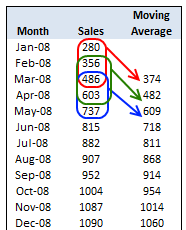
Calculate Moving Average
To calculate moving average, all you need is the good old AVERAGE excel function.
Assuming your data is in the range B1:B12,
- Just enter this formula in the cell D3
- =AVERAGE(B1:B3)
- And now copy the formula from D3 to the range D4 to D12 (remember, since you are calculating moving average of 3 months, you will only get 10 values; 12-3+1)
- That is all you need to calculate moving average.
Calculate Moving Average of Latest 3 Months Alone
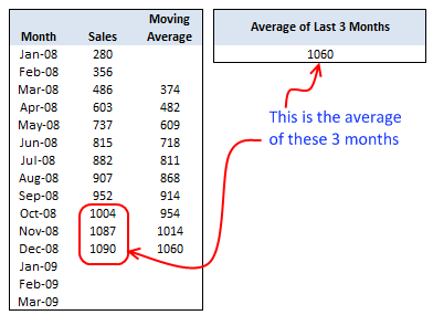
Lets say you need to calculate the average of last 3 months at any point of time. That means when you enter the value for the next month, the average should be automatically adjusted.
We can do that using excel formulas AVERAGE, COUNT and OFFSET
First let us take a look at the formula and then we will understand how it works.
=AVERAGE(OFFSET(B4,COUNT(B4:B33)-3,0,3,1))
So what the heck the above formula is doing anyway?
- It is counting how many months are already entered – COUNT(B4:B33)
- Then it is offsetting count minus 3 cells from B4 and fetching 3 cells from there – OFFSET(B4,COUNT(B4:B33)-3,0,3,1). These are nothing but the latest 3 months.
- Finally it is passing this range to AVERAGE function to calculate the moving average of latest 3 months.
Your Home Work
Now that you have learned how to calculate moving average using Excel, here is your home work.
- Lets say you want the number of months used to calculate moving average to be configurable in the cell E1. ie when E1 is changed from 3 to 6, the moving average table should calculate moving average for 6 months at a time. How do you write the formulas then?
Don’t look at the comments, go and figure this out for yourself. If you cant find the answer, come back here and read the comments. Go!
This post is part of our Spreadcheats series, a 30 day online excel training program for office goers and spreadsheet users. Join today.


23 Responses to “Learn Top 10 Excel Features”
What it looks like if excel without formula?? 🙂
It would be not excel it would just be fancy tables in which you could just use power point. (Chandoo) would Access be an alternative?
Awesome piece of work!!!
Great article.
Chandoo - my biggest interest in the article was the awesome word-graphic at the top - where did you go to get it done into a shape?
@Rich.. thank you. I used http://www.tagxedo.com/ to generate this word cloud. I took all the comments in the original post, pasted them in tagxedo website and set up the shape etc.
Awesome Chandoo.. You need always needs coffee to start up with. BTW , how did u created the Heart Shaped picture filled with High Repetitive text in it .. Please put it on your Next blog ...
Chandoo, good article. I’ve added a link to it from Connexion – our collection of the most useful and interesting spreadsheet-related articles from the web. See http://www.i-nth.com/resources/connexion
Hi,
Just one small question. Where the hell have been I in the past for not discovering this website sooner?
I've lost a job interview recently where even though I had the subject knowledge, I was not upto their mark in Excel.
Thank you for all the free tips, guidance and for creating this forum environment.
[PS: I've just been through the site for the 1st time, and have signed up for the newsletter. You can expect pretty stupid questions from me soon]
Hy Chandoo, you always inspire me with to explore something new in excel. This data structure table is only for excel 2007 or compatible to 2010. I recently installed latest excel version 2013 in my System and experience problems regarding operating according to previous one. I'm waiting your article relates to that excel version.
Thanks
Awesome article Mr. Chandoo and that is a awesome heart shaped pic you created. Great tips as well.
[...] Learn Top 10 Excel Features | Chandoo.org – Learn Microsoft Excel Online. [...]
Chandoo is awesome..
Thanks, i got better, And i always get 90.50 in my grade card but now i get 96.50 i improved because of the tutorials you gave, Thank You Very Much Chandoo Guy.
Hi chandoo, i am intersted in seeing the video or step by step done procedure of analysing the comments and presenting in the data percentage steps. I think this one would be first step in finding out how generally happens data calculation. Thank you.
As well i would like to know how to get that black shape art of your face which i see in chandoo. I am interested in making it for me.
Nice to see the features considered by Excel users to be most useful. It might be a good idea to also analyze StackOverflow Excel questions to see what keywords appear most often.
Here are my top 10 Excel Features (for advanced users):
http://www.analystcave.com/excel-10-top-excel-features/
Thanks a ton for this it totally helped with my homework ????
Very good effort
Thank you for this. Lots of learning in the links you've provided for this septuagenarian.
Pls send me new post
Dude, your humor ? ?
Loved your work.
Hello Sir,
I am Sanjeev Khakre and i from Indore City, India , I am your big follower and i have watch your videos and learnt a lots of excel trick or function and many more . thanks so much for all of your excellent support.
Your excel knowledge is real awesome.
Thanks
Sanjeev
Your work is excellent but pls willing to know more details about the features of microsoft excel
Chandoo Would Access be a better alternative than VB?