
First a Quick Announcement
Our VBA Class enrollments will be closed this Friday (Sep 16). If you want to learn VBA & Excel, please consider joining our course. More than 120 students have already joined us in the second batch and are learning VBA as you read this.
Click here to learn more about the VBA Classes and join us.
Moving on…,
As you may know, Chandoo.org offers quite a few Online Excel training programs. Over the last few weeks, many of you have emailed us and asked which training program is best for your situation. This got me thinking. “It should be easy for YOU to know what is best.”
So today morning, I locked my office room, took out my drawing pad and designed the most comprehensive course recommendation engine. It starts with a survey asking you 12 detailed questions. Then we make you go thru an Excel exam with 15 questions to test your proficiency with the tool. Then the engine would do a lot of calculations and finally recommend a list of training programs that suit you.
Then I threw it out.
Because, it was too complex.
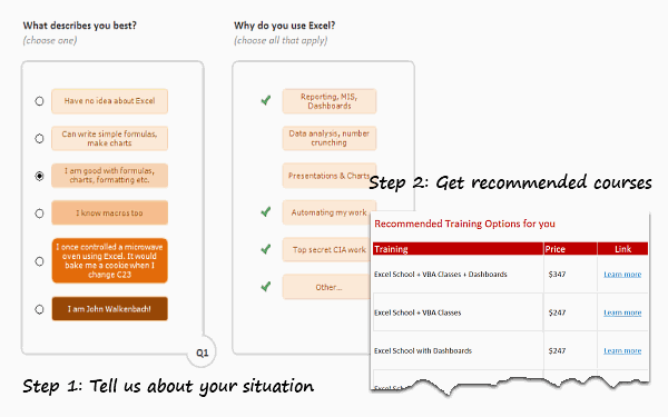
Instead, I made a beautiful Excel workbook that asks you only 2 questions and tells you which training programs are best for you.
How our Training Recommender works?
- You tell us about your Excel skill level
- You tell us why you use Excel
- You get a list of recommended courses
- There is no step 4. I just like 4 bullet points for every thing.
How to get your recommendations?
Simple. Click here to download the tool. Open it using Excel 2007 or above. Just answer the 2 questions to see your recommendations.
How does the Training Recommender Work?
I made a short video explaining how the workbook is constructed. Watch it below or on our Youtube Channel.
Do you like the Training Recommender?
I really enjoyed constructing this. It shows what is possible in Excel.
What about you? Do you like this?
Similar Articles & Ideas
Since I run a small business, I always look for ways to use Excel to enhance areas of my business. Here are some more ideas that you may find helpful.
- Quotation Template made using Excel
- Product Catalog using Excel
- Is Excel School right for me? Assessment Tool
Last but not least…
This is week is the last week to join our ongoing VBA Classes. Next batch will be in 2012.
So go ahead and enroll here.


19 Responses to “Free Invoice Template using Excel – Download”
Nice post! Invoicing for the small biz or solo entrepreneur is something I see a lot of interest in. Also there are great templates from http://office.microsoft.com/en-us/templates
This is awesome.
I would need a little more. e.g. say I generate a Inv. # 1 with all the details. Once done I can click a button all the relevant details gets stored in some table. Further, when i generate a new invoice those details gets stored in same table but just below the previous invoice.
Is their a way to do this?
I did create a solution you are looking for, however its wrapped in a larger 'Medical Scheduler' and it uses VBA, But you can Save, Update, Lookup, Email, Print & Apply Payments to the Invoice.
You are welcome to download it here:https://www.dropbox.com/s/2yvo0o2tgq9quhe/Medical_Massage_and_Salon_Application-Free.xlsm
The Invoice Items are created from the Appt. Types & Service Items table.
I would love all feedback from this
Thank you for sharing. I will definitely have a look at it.
Daily dose of Excel held a competition in 2005 for this same topic
It obtained 9 solutions which are shown:
http://dailydoseofexcel.com/archives/2005/10/27/invoice-app-the-results/
[…] http://chandoo.org/wp/2014/03/19/free-invoice-template/?utm_source=feedburner&utm_medium=email&a… […]
How can i removed Dollar Sign, As want to use this in india.
Please reply.
Also if possible then can i use Indian Rupee Sign and how?
Hi Chandoo,
Thanks for sharing this invoice template, Let me tell you this template will definitely help me since I got a process to handle where this invoice piece comes. Just a small doubt, can we store all the invoice details in PRODUCT & SERVICES sheet. So that whenever I select an invoice number from invoice sheet I can take print out and I can share it as well. Can we do that?? Since I will be dealing with this on monthly basis.
It would be great if you can help me with this.
Thanks in advance for your help!
Regards,
Gaurang Mhatre
Hi Chandoo,
I was thinking learning excel is quite tuff task but your blog proved me wrong. You made it very interesting. Thank you. Also the template you have provided for Invoice is very helpful to us.
Thanks thanks thanks.. Very helpful. 🙂
Hi i love the speadsheet but would like to ask how do i get it to add the description into the invoice as well
Hi Randy, I tried to download one of your link "https://www.dropbox.com/s/2yvo0o2tgq9quhe/Medical_Massage_and_Salon_Application-Free.xlsm" However, i found the link unavailable. Can you please help me get the new link or can you please send this VBA file on my Email-ID.
Hello Anuj,
Thanks for alerting me to the broken link. This one should work:
https://www.dropbox.com/s/gz89gshex1ad0ex/Medical_Massage_and_Salon_Application-Free.xlsm?dl=0
Please let me know if you have any questions.
Randy
Thank you so much Buddy. will check and revert you soon.
Hi, is there any chance that this can work with the "Products & Service" sheet outside of the Invoice sheet. I create multiple invoice files for the numerous clients. Updating the product sheet for each of them maybe a task. Hence, I want to create a MASTER FILE from which data can be picked up without having to insert new data in each of the invoice files.
Possible? Or am I asking for the moon 😉
Thank you so much for tutorial.
This example can be reviewed for the example of the advanced invoice that made with excel userform :https://youtu.be/Qr-4of-38DI
Good Day
i love this template may i ask if it could be modified to have the following
when you lookup a item code in the next column to the right it brings up the description then the quantity, unit cost, discount and then total otherwise i love the template
Item Code Description Quantity Unit Cost Discount Total
When creating an Invoice template in Excel are you able to utilize the auto row height and wrap feature when the cell is a merged cell? I need to have a number of cells merged together to allow for enough space to type in the description of work performed (lets say cells A-D are merged in each row) however it seems that I am unable to utilize the auto format feature. To work around this I have to manually increase the row height after each entry. Is there a better solution for this? Thank you!