
Bar & Column charts are very useful for comparison. Here is a little trick that can enhance them even more.
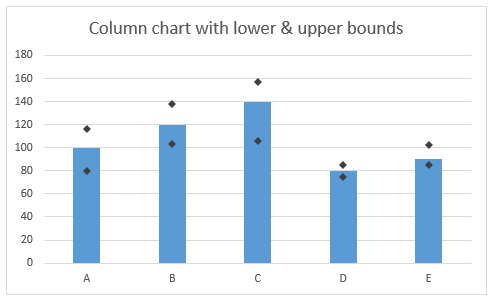
Lets say you are looking at sales of various products in a column chart. And you want to know how sales of a given product compare with a lower bound (last year sales) and an upper bound (competition benchmark). By adding these boundary markers, your chart instantly becomes even more meaningful.
How to create a chart with lower & upper bounds?
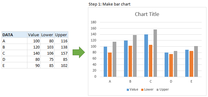
1. Select data and make a column chart
Lets say your data looks like this. Select it all and insert a column chart from insert ribbon.
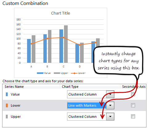
2. Convert lower & upper columns to lines
 In Excel 2013:
- Right click on either lower or upper bound columns.
- Choose “Change series chart type…”
- Select “line chart with markers” as the chart type for both lower & upper series
- Done!
In earlier versions:
- Right click on lower series
- Choose “Change series chart type…”
- Select “line chart with markers”
- Repeat the process for upper series
- Done
- Related: How to create combination charts in Excel?
After this step, your chart looks like this:

3. Set line color to “no line” and format markers
This is easy. Just set the line color to “no line” and format the markers so that they are prominent.

Your column chart with lower & upper bounds is ready.
Bonus step: Custom shapes for lower & upper bounds
If you want something fancy, you can use custom shapes for lower & upper bounds, as shown below.

To get this:
- Draw custom shapes using drawing tools in Insert ribbon.
- Make sure they are really small (else the markers will be shown at wrong places)
- Copy the shape (CTRL+C)
- Select marker series for which you want this shape.
- Paste (CTRL+V)
- Done!!!
Video tutorial of Column chart with lower & upper bounds
Here is a video tutorial of column chart with lower & upper bounds.
This video is also part of my Excel School program. If you like the video, you are going to love our Excel School program, where more than 50 such videos will help you become awesome in Excel.
Click here to know more about Excel School & join us.
Download the chart workbook
Click here to download the workbook. It contains column chart with lower & upper bounds example, detailed instructions and custom shape example.
When do you use lower, upper bounds in your charts?
I use this technique all the time. I apply markers for extra data like average, KPI targets, last year values etc. Here is one more example.
What about you? Do you use lower, upper bounds in your charts? In which scenarios you apply them? Please share your experiences using comments.
For more charting tips…
Make sure you check out our charting page. It has 100s of Excel tutorials, templates & design examples on charts.
If you still want more, consider joining Excel School. You will be a charting pro soon.


14 Responses to “Bar chart with lower & upper bounds [tutorial]”
Good One! But sad part is I don't have 2013 version in my lappy.
@Abhilash, I dont think you need excel 13 to do this. I work on excel 10 and was able to try this.. nice one Chandoo!
thanks and keep sharing!
@Navin, Thank you
I created a chart just like this for company metrics. The only thing I added was one more column to the data that showed an average. The column chart is the average and the other statistics are line charts. I changed the current value data to an "X" marker to distinguish it from the Max/Min. This way I can show Max score, Min score, Current score, and running Average score.
Nice tutorial.
Chandoo
Great chart.
You should one on "Waterfall charts" with negative values.
I am having some issues with showing negative values in my waterfall chart.
For example, Gross sales $100, commission -$25, discount $10, delivery $10, net sales $55
My negative values above are showing below the x-axis and I want them to show above the x-axis in a waterfall manner.
thanks.
like usually
amazing.......
same general idea, different technique:
http://www.clearlyandsimply.com/clearly_and_simply/2011/04/an-underrated-chart-type-the-band-chart.html
This chart looks like it wants to be a boxplot when it grows up.
I love the various tips that are sent our way by you! Thanks, Chandoo!!
On this one, I especially like the idea of being able to put in a custom shape into a chart. I don't think I ever would have thought about being able to do that.
[…] Bar chart with lower & upper bounds […]
I have very recently found your website and I am impressed beyond words. I used a few of your tips, including this one and it is amazing to see the results.
Thanks a lot and please keep posting awesome posts.
[…] Indicating lower & upper bounds on a chart […]
[…] Bar chart with lower & upper bounds […]
Thanks for this. This is nice for column charts (vertical), but bar charts (horizontal) are another matter. To use this technique with a bar chart, you'd need to be able to transpose the axes of a line chart... Do you know a way to do that?
As a hack, I suppose you could create the whole chart "sideways"--rotated left 90 degrees--so that you use this technique, and then you could make a bitmap of that and rotate it back 90 degrees right.