Asset Allocation Chart Turns Zombie [ChartBusters #1]

Share

Facebook
Twitter
LinkedIn

This is the first installment of Chart Busters.

Chart busters is a new series of posts on PHD and Jon Peltier’s blog. We take turns to exterminate bad charts and associated evils. Although our proton packs are still not perfect, together we are confident of tackling most ghosts trapped in bad charts.

In this installment we take a look at Asset Allocation Chart that looks like it is hexed.

The bad chart

Our reader DMurphy submitted a poorly made asset allocation chart,

If you are looking for an early contender, here’s one which came in to my wife from her Pension company this week showing (or at least attempting to show) the make-up of her investments.

http://www.box.net/shared/goynhfo7zb

Poorly made asset allocation chart in a pension report

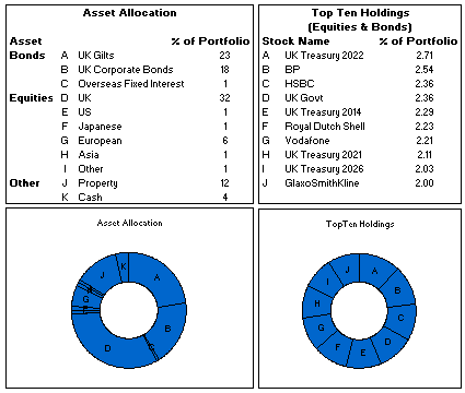
The above image is an excel reconstruction of even sadder looking chart.

What is wrong with it?

  • Poor chart selection: Pie charts are good for 3-4 data elements. When we need to present 10 or so items, it is better to use a bar chart or a line chart.
  • Not grouping and sorting the information: In the first chart which is displaying Asset Allocation is made from data that has 3 different series – Bonds, Equities and Other. But the chart shows everything in the same way, thus making it difficult to understand how assets are allocated to various classes of investment. Also, the data is not sorted in any meaningful order.
  • Poor use of labels: The labels A,B,C … are non descriptive. They are also repeated on the other chart although they mean different things.

The Chart Busters’ Fix

Thanks to guest parachartanalyst Joe Mako, who contributed this fix:
Asset Allocation Chart - Better Alternative #1

I have taken Joe’s ideas and slightly modified them to create the below chart

Asset Allocation Chart - Better Alternative #2

Click here to download the above fix in excel and see it yourself.

Added Later: Readers Submitted Fixes

Submitted by Paulo Cesar Semblano da Costa:

Asset Allocation Chart - Better Alternative #3

  • I think Paulo’s version manages to reduce chart clutter a bit more. Very good effort.
  • You can download this version from here.

Submitted by Jeff Wier

Asset Allocation Chart - Better Alternative #4

  • Jeff’s version is very good. Again, like Paulo, he managed to reduce the chart clutter bit more and made it look very slick.
  • You can download this version from here.

What we have learned?

  • Zombies are scary, even when they are looking like donuts.
  • Always try to sort the data in some meaningful order before pushing it to charts
  • Use a variation of panel chart or color the series sensibly to bring out key differences
  • Try to avoid generic labels like 1,2,3 or A,B,C and instead use the actual values and category names

How would you have tackled this?

We dont know how open source the ghost busters were. But Chart Busters are 100% open source. Share your ideas and suggestions for improving this scary little chart to something that makes sense.

When ya gonna call…?

Consult chartbusters today. Send us your bad charts. All you have to do is fill out this google form.

Arent ya gonna read these… ?

What to do no when no one likes your pie | Non sucky excel chart templates

Facebook
Twitter
LinkedIn

Share this tip with your colleagues

Excel and Power BI tips - Chandoo.org Newsletter

Get FREE Excel + Power BI Tips

Simple, fun and useful emails, once per week.

Learn & be awesome.

Welcome to Chandoo.org

Thank you so much for visiting. My aim is to make you awesome in Excel & Power BI. I do this by sharing videos, tips, examples and downloads on this website. There are more than 1,000 pages with all things Excel, Power BI, Dashboards & VBA here. Go ahead and spend few minutes to be AWESOME.

Read my storyFREE Excel tips book

Overall I learned a lot and I thought you did a great job of explaining how to do things. This will definitely elevate my reporting in the future.
Rebekah S
Reporting Analyst
Excel formula list - 100+ examples and howto guide for you

From simple to complex, there is a formula for every occasion. Check out the list now.

Calendars, invoices, trackers and much more. All free, fun and fantastic.

Advanced Pivot Table tricks

Power Query, Data model, DAX, Filters, Slicers, Conditional formats and beautiful charts. It's all here.

Still on fence about Power BI? In this getting started guide, learn what is Power BI, how to get it and how to create your first report from scratch.

7 Responses to “Extract data from PDF to Excel – Step by Step Tutorial”

  1. Jinesh Vasa says:

    Dear Chandoo,

    Thank you very much for this and it is very helpful.
    However, all the Credit Card Statements are now password protected.
    Please advise how can we have a workaround for that

  2. Sivakumar H says:

    Hello sir,
    How to check two names are present in the same column ?
    Thanks and Regards

  3. Ahmed Mallook says:

    Hi, Thank you for the great tip. One problem, when I click on get data >> from file, I don't see the PDF source option. How can I add it?
    I tried to add it from Quick Access toolbar >>> Data Tab, but again the PDF option is not listed there.
    I am using Office 365

  4. PP says:

    Hi, Thank you for your video. I see you used the composite table, but I when I load my pdf, it does not load any composite table. It has 20 tables and 4 pages for one bank statement. I have about 30 bank statements that I want to combine. Your video would work except that I can't get the composite table and each of the tables I do get or the pages does not have all the info. what to do?

  5. Jr. H says:

    Dear Chandoo,
    How do we select multiple amount of tables/pages in one PDF and repeat the same for rest of the PDF;s in the same folder and then extract that data only on power query.

    Thank you

  6. antonlagi says:

    Hi, Thank you for your video. I see you used the composite table, but I when I load my pdf, it does not load any composite table. It has 20 tables and 4 pages for one bank statement. I have about 30 bank statements that I want to combine. nice share

  7. One bank statement takes up 20 tables and four pages in this document. I need to consolidate roughly thirty different bank statements that I have. Your video would be useful if I could only get the composite table, which I can't for some reason, and each of the tables or pages that I can get is missing some information.

Leave a Reply