
We have a new Excel Challenge folks!
I know our friends in US are away celebrating Memorial Day weekend. But that should not leave rest of us from fun. So, we have a new Excel Challenge. This time, you need to make a chart, to visualize product sales data.
The data you need to use:
Is this,
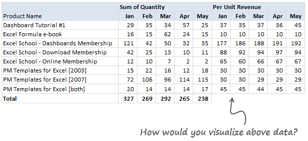
Download Excel File with this data.
The Instructions:
1) Make one chart (you can make panel charts too, but not a dashboard or multiple charts) to visualize the product sales breakup in our data. Your chart should help answer any of these questions:
- What is the overall composition of revenue, how it is changing over time?
- Which products bring in more $s?
- Trend of sales from Jan to May
2) You are free to make charts that answer additional questions. Just think like a owner of a company that sells these products (think like me, because these are the sales of some of our products) and try to make sense of the data.
3) You can use Excel or Tableau or your favorite visualization tool to make this chart.
How to submit your work?
- Prepare your chart and save the workbook
- Send an email to chandoo.d @ gmail.com with the subject “EC 2 – Solution”
- Or upload your work to skydrive.com, share it with public and post the URL here thru comments.
Note: Submit your work by 6th June , 2011This contest is closed now.
What do you get?
I will post a collection of all your entries on Chandoo.org for our readers to see. I will also pick one random winner from the best charts.
The random winner will receive an Amazon Kindle Reading Device – Wi-Fi Version

Fine Print
Note: Submit your work by 6th June , 2011This Contest is closed now.- You can submit multiple entries
- Or upload your work to skydrive.com, share it with public and post the URL here thru comments.
- Email your workbook to chandoo.d @ gmail.com with the subject “EC 2 – Solution”
- Please do not use add-ins or macros to generate the charts.
- Please send unlocked files only. You also agree that Chandoo.org can publish your files for other to learn.
So go ahead and visualize the product sales data. Enjoy!
Previous Visualization Challenges
Charting is one of my favorite areas. Charts are very good for discovering patterns and communicating. We run contests on charting all the time. Browse some of our previous contests,


28 Responses to “How Would You Visualize Product Sales Data? [Excel Challenges #2]”
[...] Chandoo’s excellent Excel and Data blog has a data challenge to win a Kindle. I’m not entering but thought I’d show what Tableau can do with just a few hours of work. The challenge was to create a single chart that showed the data story the best. Below is what I think works, but the visualization also provides the ability to look at the data in different ways (running sum, difference from prior month, and so on) to explore it further (can this still be considered a single chart?). [...]
Hey Chandoo, I sent you an email with my solution.
Can't wait to get the Kindle 🙂
Just to clairfy - does Per unit Revenue mean the amount of revenue each unit of a product produced? ie. Dashboard Tutorial #1 in Jan generated 29x$37= $1073 Revenue
Chandoo,
are you sure that you want to add up QUANTITIES of different products and not REVENUE?
Hope for reassurement in time for end of contest.
Thank you in advance.
Best regards,
hgl
@Shellie.. you are right.. Per unit revenue means unit price. You can multiply that with number of units to get total revenues.
@Heinz... I am not sure I understand your comment. But you are free to make any type of chart as long as you can justify what information it provides
Hello Chandoo,
thanks for answer. But may I try to ask for your enlightenment ?
1. In your answer to Shellie you say: "Per unit revenue means unit price" and "You can multiply that with number of units to get total revenues". That leaves me a bit confused about the type of the value in your table. Would you help out with an additional comment?
2. The last row in your table sums up quantities of 8 different products. In school they taught me never to add apples and oranges, because the 'result' wouldn't make sense. Maybe I don't grasp the idea behind the calculation here. Could you clarify?
Thank you in advance.
Best regards,
H.G. Lamy
Hi Chandoo,
I have uploaded my entry (created with NeoOffice) on skydrive: http://tinyurl.com/5v3kd7v
There is a pdf-screenshot and .odf-workbook
Kind regards,
Tessa
@Heinz... Each sale is by one customer (well, we have a very few customers buying multiple copies, but you can ignore that). So, the totals indicate the total number of customers we have.
I added up the numbers because, that way I know how many units I sold (together) thus I know how many customers we had in a give month. I know the total does not make sense, but it is there just for info.
Chandoo, you've not mentioned when the results will be declared.
Hi Chandoo!
I've just seen this thread! A quick make up for this contest! I've posted my file at https://cid-4bb533dbfb43de31.office.live.com/view.aspx/.Documents/mohanvisualize-product-sales-data.xlsx. Hope, to see the best one among the entries.
Krishnasamy mohan
Hi Chandoo,
Sorry for joining in so late, nice contest, hope to see amazing stuff.
Office firewall cannot access Skydrive, So sent my entry via email.
Regards,
Nuruddin
Desperately waiting to see different charts prepared by everyone & results.
When will it be displayed ?
Hi Chandoo,
When will the different entries be posted ? Had mailed you my entry last week
@Arpita & all.. Thanks for participating in this. I received more than 50 entries, so it will take time to sort thru the emails and post the results. Please give 2 weeks time.
Just sent one in (i know it's late). I'm not trying to join the contest now. But just want to show that there is a price sensitivity between total revenue and quantity sold due to changes in prices. Too often marketing or sales would raise product price just because it was selling hot in the short run. but fail to realize that customers may take a flight for competitive products, even if there is a slight change in prices.
Chandoo,
When will you post the winning entries
Gada
Ten days over ---> Still not able to see entries.
Please confirm how much more time will it take.
@All
Chandoo recieved over 50 entries and they are still coming in.
I am sure he is busy assessing them as well as running the Chandoo.org site, Chandoo.org Forum and Excel classes as well as his regular Excel Training courses.
I am sure he will get to it as soon as he can.
Hi Hui,
Thanks for the information.
In case if it is at all possbile that Chandoo or you can confirm the date when results will be out so that we dont have to peek every now & then to know whether the results are out or not.
Please if at all possible.
@Sachin
I'd recommend peeking every day!
As there is always new and exciting posts coming and we would hate you to miss them! 🙂
Next weeks sneak peek
+ Automating Data Analysis without VBA
+ User Poll (Accidentally published this week by mistake and quickly withdrawn)
+ Automating monotonous tasks with VBA
I wouldn't miss any of them!!!
Hui,
That sounds interesting.
By sneak peek I meant to say for only this particular thread. You know it takes so much pain to find this thread & goto last comments to see if Chandoo has posted any updates about the results. But everything goes in vain as you dont see any updates. (My hard luck)
I am not interested in winners but particulary Different Charts which users have posted using their analytical skills & that too 50 of them. I am more excited now !!!
@Sachin, I'm sure that Chandoo will send everyone an email when it's done. So, if you don't want to keep on checking back on this thread, then just wait for an email.
@All.. thanks for your patience.. It has been quite intense week as I was busy recording lessons, writing new posts and replying to 50 odd emails each day. But I squeezed sometime yesterday to download all the files and name them. Then I gave them to my assistant (Ravindra), who took screenshots of all the charts. So, now we have 80 charts made by 50 contestants. The next step is to go thru these, open the excel files, learn more about the charts and make a mammoth post.
However, I cannot do it next week, As I am busy doing an in-house training for a corporate client of mine. So, you need to wait at least 10 days. Sorry to under-estimated the amount of work this takes. But I am learning a lot from your submissions, so it is fun.
@Sachin... when the results are out, they will be posted in a new article. So no need to check this page. Also, you can subscribe to comments, that way, I send an email when there is a new comment on this page.
@Chandoo
Thank you so much for the update.
You are doing a wonderful job. May God bless you always.
Chandoo! We're waiting!
[...] I ran a contest asking you to analyze a bunch of sales data and present your results in charts. We received a total of 78 charts from 45 people. The contest [...]
@Chandoo....
thankyou so much for bringing variety and making our brains tickle
@All.. the results are here: http://chandoo.org/wp/2011/06/30/sales-analysis-charts-in-excel/