Make your Chart Legends Legendary

Share

Facebook
Twitter
LinkedIn

We all know that legend can be added to a chart to provide useful information, color codes etc.

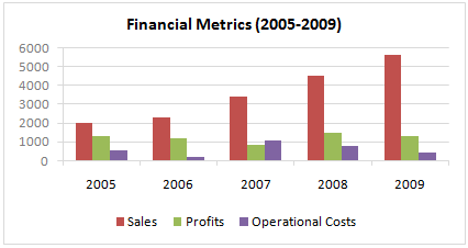
Today we will learn how to make the chart legends smarter so that they provide more meaning and context to the chart, like this:

Smart Chart Legends in Excel

To make your chart legends legendary, just follow these simple steps:

Step 1: Make a regular chart

Chart with Regular Legend

Step 2: Create legend messages in separate cells

Now, for the above chart, there are 3 series. So, we need 3 legend messages. Let us say we want to show how much the % change has been since 2005 in each of the three series. The message pattern can be like this:

[arrow symbol] [label] by [% change]

We can find up and down arrow symbols from Insert > Symbol menu.

Insert Symbol Excel

Let us write a simple formula like this to create the message.

(assuming data is in table B1:D5)

=IF(B5>B1,"up arrow symbol","down arrow symbol")&" Sales by "&TEXT(B5/B1-1,"0%")

Now repeat similar formulas for other 2 series as well.

Step 3: Add three text boxes to the chart area.

This is simple. Select the chart. Now go to Insert > Textbox (ALT+NX in Excel 2007+). Type anything in it.

Now, color the text boxes in such a way that the background colors match chart series fill colors.

Step 4: Assign legend message cells to text boxes

Select first text box. Go to formula bar, press = and then select the first legend message cell. See this screencast to understand.

Using Text Boxes inside Excel Charts - How to?

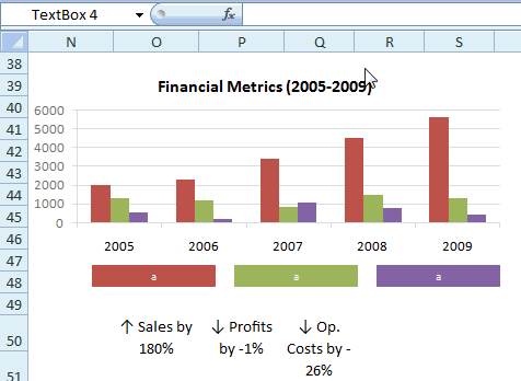
Repeat the same step for other 2 text boxes

Step 5: Show off your chart

That is all. Now your chart legends are legendary. Go ahead and show off.

Download the example chart and play with it

Click here to download the excel file containing this example. Play with it to understand this trick.

Related Charting Tricks & Ideas:

> Show colors in Chart Labels, Axis Labels
> Show symbols in Chart Labels, Axis
> 5 Chart Formatting Tricks
> More charting tutorials and tips

Facebook
Twitter
LinkedIn

Share this tip with your colleagues

Excel and Power BI tips - Chandoo.org Newsletter

Get FREE Excel + Power BI Tips

Simple, fun and useful emails, once per week.

Learn & be awesome.

Welcome to Chandoo.org

Thank you so much for visiting. My aim is to make you awesome in Excel & Power BI. I do this by sharing videos, tips, examples and downloads on this website. There are more than 1,000 pages with all things Excel, Power BI, Dashboards & VBA here. Go ahead and spend few minutes to be AWESOME.

Read my storyFREE Excel tips book

Overall I learned a lot and I thought you did a great job of explaining how to do things. This will definitely elevate my reporting in the future.
Rebekah S
Reporting Analyst
Excel formula list - 100+ examples and howto guide for you

From simple to complex, there is a formula for every occasion. Check out the list now.

Calendars, invoices, trackers and much more. All free, fun and fantastic.

Advanced Pivot Table tricks

Power Query, Data model, DAX, Filters, Slicers, Conditional formats and beautiful charts. It's all here.

Still on fence about Power BI? In this getting started guide, learn what is Power BI, how to get it and how to create your first report from scratch.

5 Responses to “Preparing Profit / Loss Pivot Reports [Part 2 of 6]”

  1. maury sway says:

    I am not getting sound from the videos. I have checked all the settings and spent several hours searching the Internet to no avail.

    Has anyone else had this problem?

  2. anne says:

    Is there anyway to get the Grand Total to be broken out in the same fashion as the items above it?  For instance, if you have in column 1, widget a, widget b, and have their sales by month in column 2, I'd like to see the grand total also be by month, for widget a & b combined.

    I can't get anything other than a single line for the grand total, rather than the same format as the data above.

    Widget A       Month    Sales
                        Jan        100
                        Feb        200
    Widget B 
                        Jan        150
                        Feb        250
    Grand total - here I would also like to have Jan, Feb.
                        Jan        250
                        Feb        450
     

Leave a Reply