
Jon Peltier can stand on his roof and shout in to a megaphone “Use Bar Charts, Not Pies“, but the fact remains that most of us use pie charts sometime or other. In fact I will go ahead and say that pie charts are actually the most widely used charts in business contexts.
Today I want to teach you a simple pie chart hack that can improve readability of the chart while retaining most of the critical information intact.
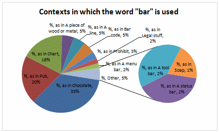
We will take the pie chart on left and convert it to the one on right. The beauty of this trick is, it is completely automatic and all you have to do is formatting.

Interested? Then just follow these steps. [more examples and commentary on pie charts]
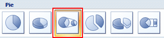
1. Select Your Data Create a Pie of Pie Chart
Just select your data and go to Insert > Chart. Select “Pie of Pie” chart, the one that looks like this:
At this point the chart should look something like this:
2. Click on any slice and go to “format series”
Click on any slice and hit CTRL+1 or right click and select format option. In the resulting dialog, you can change the way excel splits 2 pies. We will ask excel to split the pies by Percentage. (In excel 2003, you have to go to “options” tab in format dialog to change this).
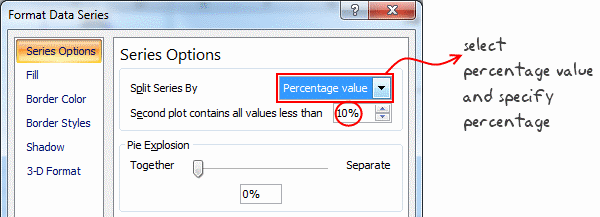
Select “Split series by” and set it to “percentage”. Specify the percentage value like 10%.
3. Format the Second Pie so that it is Invisible
Individually select each slice in the second pie and set the fill color to “none”. You can speed up this step by setting first slice’s fill color to none and then using F4 key to repeat the last action (ie setting color to none) on other slices.
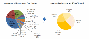
That is all. We have successfully converted a gazillion sliced pie chart to something meaningful and simple.
Additional commentary on Pie charts
Pie chart is not the devil, a pie chart that fails to tell the story is. I think we make pie charts because they are safe. Next time you set out to make a pie chart, I suggest you to spend a minute and think about,
- What is it that I am trying to tell here?
- How can a Pie chart help my audience understand my point?
- Can I use an alternative to pie chart?
I can promise you that in most situations using an alternative is better and easier than you thought. After all, that is why Peltier is on his roof.


6 Responses to “Make VBA String Comparisons Case In-sensitive [Quick Tip]”
Another way to test if Target.Value equal a string constant without regard to letter casing is to use the StrCmp function...
If StrComp("yes", Target.Value, vbTextCompare) = 0 Then
' Do something
End If
That's a cool way to compare. i just converted my values to strings and used the above code to compare. worked nicely
Thanks!
In case that option just needs to be used for a single comparison, you could use
If InStr(1, "yes", Target.Value, vbTextCompare) Then
'do something
End If
as well.
Nice tip, thanks! I never even thought to think there might be an easier way.
Regarding Chronology of VB in general, the Option Compare pragma appears at the very beginning of VB, way before classes and objects arrive (with VB6 - around 2000).
Today StrComp() and InStr() function offers a more local way to compare, fully object, thus more consistent with object programming (even if VB is still interpreted).
My only question here is : "what if you want to binary compare locally with re-entering functions or concurrency (with events) ?". This will lead to a real nightmare and probably a big nasty mess to debug.
By the way, congrats for you Millions/month visits 🙂
This is nice article.
I used these examples to help my understanding. Even Instr is similar to Find but it can be case sensitive and also case insensitive.
Hope the examples below help.
Public Sub CaseSensitive2()
If InStr(1, "Look in this string", "look", vbBinaryCompare) = 0 Then
MsgBox "woops, no match"
Else
MsgBox "at least one match"
End If
End Sub
Public Sub CaseSensitive()
If InStr("Look in this string", "look") = 0 Then
MsgBox "woops, no match"
Else
MsgBox "at least one match"
End If
End Sub
Public Sub NotCaseSensitive()
'doing alot of case insensitive searching and whatnot, you can put Option Compare Text
If InStr(1, "Look in this string", "look", vbTextCompare) = 0 Then
MsgBox "woops, no match"
Else
MsgBox "at least one match"
End If
End Sub