
A Pareto chart or pareto graph displays the importance of various factors in decreasing order in columns along with cumulative importance in a line. Pareto charts are often used in quality control to display most common reasons for failure, customer complaints or product defects.
The principle behind pareto charts is called as pareto principle or more commonly the 80-20 rule. According to wikipedia,
The Pareto principle (also known as the 80-20 rule,[1] the law of the vital few, and the principle of factor sparsity) states that, for many events, roughly 80% of the effects come from 20% of the causes.
The pareto chart is a great way to do the pareto analysis. Today, we will learn how to use excel to make a pareto chart.
See an example pareto chart of visits to this website:
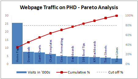
(Please note that in this example, the 80/20 rule does not hold as I have chosen very small sample of data. In reality, the 80/20 principle applies to my website as well)
Making a Pareto Chart in Excel
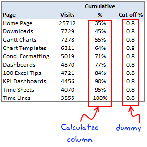
In order to make the pareto chart in excel, first you must have the data ready. Once we have the values for each cause, we can easily calculate cumulative percentages using excel formulas. We will also require a dummy series to display the “cutoff %” in the Pareto chart.
I have arranged the data in this format. You can choose any format that works for you.
Once you have the data ready, making the pareto chart is a simple 5 step process.
1. Make a column chart using cause importance data
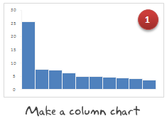
In our case, we select the first 2 columns in the above table and then make a new column chart.
2. Add the cumulative %s to the Pareto Chart as a line

Select the third column, press ctrl+c (copy). Now select the chart and press ctrl+v (paste). Excel will add another column series to the chart. Just select it and change the series chart type to “line chart”. Learn more about combining 2 different chart types in excel combo charts.
3. Move the cumulative %s line to secondary axis


Select the line chart, go to “format data series” (you can also press ctrl+1) and change the axis for this chart series from “primary” to “secondary”.
4. Add the cut-off % to the pareto chart

Select the fourth column in our data table, copy and paste it in the chart. This should ideally be pasted as a new line chart. If not, follow step 2 for this as well.
5. Finally, adjust formatting to make the final pareto chart

Now, our basic pareto chart is ready. We should adjust the chart formatting to make it more presentable. Once you are done, the final output will be something like above chart.
Download the Pareto Chart Template in Excel
Click here to download the excel pareto chart template.
When to use Pareto Chart?
Pareto charts can be used,
- During quality control to analyze the causes of defects and failures
- When you want to focus your resources on few important items from a large list of possibles
- To tell the story that attacking problem A might be better than solving problem C, D and F
Pareto charts and pareto analysis has great practical uses for almost anyone in a managerial role.
Have you used Pareto analysis or Pareto charts in your job?
Pareto principle is the first real management lesson I have learned during my MBA. It is the topic for my first presentation too. During the presentation, Anoop, my jovial team mate said, “80-20 principle can be tested anywhere. For eg. in most parties 80% of the beer will be consumed by 20% of people”, and the whole class started laughing.
Jokes apart, I think pareto principle is a very powerful idea told in an extremely simple way. I use the pareto analysis to find best way to invest my time. What about you? Tell me about your experiences of using pareto analysis using comments.
Related Material:


56 Responses
Download link broken…
@Rick.. thank you.. I forgot the http in the url. I have fixed the url now. Here is the link btw, http://chandoo.org/img/p/pareto-chart-template.xls
It’s very useful!!
Thanks a lot!!!
he analysis toolpak can steps you through a wizard to generate histogram and pareto. Tools -> Data Analysis (an add-in) -> Histogram
Cool as always. I did something very similar a month ago but also combined it with some of the techniques from the dashboard tutorial to to get the cause importance data in descending order without having to manually sort the list.
Hello Chandoo, thank you,
I used this for inventory control. Like 20% of sales come from 80% of inventories/stocks of products. I learned it during my internship.
cheers, La Guerrière
@Saz.. I found that out today. Unfortunately the analysis tool pak version is kind of different. It is asking me to define buckets and works based on histogram data. I will try to post another tutorial on using analysis tookpak to do a pareto chart sometime later.
Thanks alot for telling me about this. You get a donut 🙂
@Neil.. yes, that is the next natural step. You can use SMALL () and LARGE () formulas to sort the chart range either dynamically or statically.
I prefer to use a single vertical scale with a pareto, so that the line starts atop the first bar. Dual axes cause more confusion than the apparent benefits they provide.
@Jon … I agree with you. Even I found the the secondary axis a bit confusing. I could make it more presentable by removing the grid lines, and making the axis more subtle.
Btw, here is a version that you might like…
Chandoo –
That chart more than the first helps to emphasize that although the first bar is substantially taller than all the rest, it only accounts for one-third of the total. In your case, 80% of the hits come from the first 60% of the categories.
If using a dual axis, you can always format the axis, axis name, and axis numbers the same color as the series it refers to, to make it clearer which axis refers to which series (although red would not be a good choice for a series in that case).
Alternately, you could do without the axis if you used data lables for the pareto series.
Peltier, 80 – 20 is a tecnical word, only by reference. This provides an idea about the major cause of problems. Other fast way to make the graphic, is using line and column 1, on personal graphics.
@Jeff.. I have toyed with the idea of changing axis colors. But the graph felt more complicated that way. So I left the way it is.
@Jair you are right 🙂
Jair –
I was commenting on the inability of a dual axis chart to show the precise relationship (which happened to be 80-60 in this case), not that the relationship differed from 80-20.
Ah!. Sorry, Its ok.
I use these sorts of Pareto charts often. In a current example, I have analyzed the cumulative contribution to sales among salesman and regions. There might be 3-4 salesman per region. I have formatted all of this info into a table. Without filtering, I calculate cumulative percentages as described above.
I want to be able to filter the table (by region, for example) without having to recalculate the cumulative percentages against the filtered total for the data that remains.
I guess I need a formula that refers to a cell in the row directly above it so that hidden cells aren’t calculated once they’re filtered out.
@Tyler Ellis: if you use SUBTOTAL() formula to calculate the cumulative sales then the totals will be adjusted based on the displayed rows only (ie if you filter out few regions, the corresponding sales values will be neglected in the total).
Let me know if you have problems still.
Thank you, sir. However, I am not very familiar with the subtotal function. After a quick read of the help file on it, I am not sure how to implement it in my situation.
Do I use subtotal to calculate the cumm% of each data point? I will describe the data in []. Let’s say this starts in D2.
D2=subtotal(109,[% of 1st customer]+[% of 2nd])
E2=subtotal(109,[D2]+[% of 3rd]
F2=…
That doesn’t seem to work for me. I think I am misunderstanding your advice (of which I am appreciative regardless).
@Tyler… You can try something like this:
Assuming the values are in the range B1:B20, and we need to calculate the cumulative percentages in C1:C20, write the formula
=SUBTOTAL(9,$B$1:B1)/SUBTOTAL(9,$B$1:$B$20)
the option “9” calculates SUM. Now, when you apply filter, the percentages will be adjusted automatically.
The trick lies in proper use of absolute and relative formula references. For more on this see here: http://chandoo.org/wp/2008/11/04/relative-absolute-references-in-formulas/
Thanks again, sir. This worked out great.
Hi, How I can get the adress (row and column) from a value found with vlookup?
@Jair.. you should use MATCH(). It works the same way as VLOOKUP but returns the row number. Then you can pass this to INDEX or OFFSET formula to get to the target cells.
Examples here: http://chandoo.org/wp/2008/11/19/vlookup-match-and-offset-explained-in-plain-english-spreadcheats/
Pareto charts often have a “Useful Many” bar displayed on the right side as well. It’s done this way, because the collection of others is an aggregation of many small values that form a group called “Useful Many’ as opposed to the few larger items (on the left) collectively called the Vital Few.
Bill –
Rather than passing judgment on the agglomerated items from the tail of the distribution (How useful are they really if they each make up 1% of the defects?), just call this last bar “Other”.
Jon;
Other or UsefulMany might just be a preference call. In the area of quality improvement, they can become useful once the big items are reduced or eliminated.
I see your point, but I disagree with the philosophy behind your terms. This gives unwarranted importance to the minor causes.
Sure, the “useful many” might someday become important. On the other hand, the changes made to eliminate the so called “vital few” may either eliminate these “tiny many”, or they may bring to light other factors which were previously masked or nonexistent.
Suppose one cause of defects is illegibility of labeling, because the guy on the shop floor uses a Sharpie. Switching to a computer driven etching system will eliminate illegibility. It will also eliminate lesser causes, such as misspelled labels. It’s better to treat misspelled labels as among the noise variables, rather than promoting it for no good reason. “Misspelled label” is irrelevant compared to the big causes, and may continue to be irrelevant.
@Bill & Jon: Offtopic, but you can automate the “useful many” / “others” calculation / plotting using OFFSET formulas. Here is a tutorial that shows how to make such a dynamic pareto chart – http://chandoo.org/wp/2009/11/12/topx-chart/
Dear Sir,
I need your help to find how the pareto analysis will display or prompt us regarding the 80% of the effects are due to 20% of causes when it comes to inventory management. request you to kindly help me out with the help of an example in excel sheet
Raghavendra
A Pareto chart is simply a sorted Column/Bar Chart
It Is sorted so that the Columns with the highest values are next to the Y Axis and as you go away from the axis in sucessive bars, the values decrease.
This makes the causes with he most vlue stand out as you can see howimportant it is compared to the next most important cause etc.
So in your example the causes will be ranked from Highest value to lowest value left to right.
The statement “80% of the effects are due to 20% of causes” refers to the first half dozen or so Columns will contain 80% of the value.
Have a read of
http://chandoo.org/wp/2009/09/02/pareto-charts/
&
http://chandoo.org/img/p/pareto-chart-template.xls
I ma unable to get the pareto options in Office2010 Version kindly guide me.
regards
Raji reddy.K
Raji,
Are you referring to the small in cell Column Charts ?
If so, goto the Insert, Sparklines panel and select the chart type you want
Select the Data Range and the Chart Location you want
Once you select the Sparkline Cell you can edit the properties using the Sparkline Tools tab
This is a nice example/template. I also created a working template on my blog. Feel free to download and use it as you all see fit.
http://scorecardanalysis.blogspot.com/2010/09/pareto-chart-template.html
Any ideas to make it better/more usable are always welcome.
i like the new version (http://chandoo.org/img/p/pareto-chart-with-diff-axis-option.png) where the height of the primary Y axis is Fixed and reflects the Sum of all the frequencies – that way we are be able to see if the pareto principle truly holds. that is, to separate the Vital Few from the Trivial Many.
in line with this, is there a way in excel to automatically Fix/Adjust the maximum or minimum values (under the format axis > axis options) based on the value specified in a particular cell?
thanks.
thank you! my stats final just got done with help from you!
Chandoo, I am curious to know how is it possible to get the values such as “Home Page, Gannt Charts, Chart Templates etc..” inside the coloumn. When I prepare a chart, the same values appear below the x-axis rather than inside the coloumn. I would appreciate if you could let me know how this is done ?
This was very useful to prepare a pareto chart to analyse my office process problems. 🙂
Thanks so much for the easy to follow Pareto guide. I know you’ve helped a lot of students and professionals.
Take care. I’m looking forward to checking in with your site again soon.
Dear Sir,
Thank you very much for your guidelines to creat Pareto Chart without buying any software.
These steps are very easy to understand a new chart maker.
God bless you.
Hello,
This may sound like a really stupid question.
But I’m unable to get the percentage on the side of the chart.
Can somebody help me with this. I’m really desperate :s
Thanks in advance
Willeke
Thanks a lot, you never disappoint me !
Hi Chandoo
I need to make Pareto charts using Pivot table but I am unable to do so .
Any1 know how to calculate cumulative % in pivot and den create Pareto..?
Rgds,
Akash Khandelwal
Thanks.
Saved my *** in a class I’m doing.
select the data and press F11. line cahrt will be generated..
then move the cumu% to secondary axis..
Liek Chandrahasan, I’d like to know how to get the x-axis labels on top of the data bars.
OK, I’ve found my own answer – use Format Data Labels and use Label Option/Lavel contains: Category Name
Excelent Template. Saved by you. Tks!
Hi Chandoo.
I need to do in a pivot table a 80/20 analisys. I’m using Excel 2007.
In the row labels I have two fields: customer_code and customer_name…I’m afraid!! :S because I don’t know how can I do it. Please help me!
The chart formatting makes it very presentable. Great tutorial too.
Bro I need a crystal clear definition of accumulative factor
I need to know the accurate definition of the Contribution factor