
![]() This is the first installment of Chart Busters.
This is the first installment of Chart Busters.
Chart busters is a new series of posts on PHD and Jon Peltier’s blog. We take turns to exterminate bad charts and associated evils. Although our proton packs are still not perfect, together we are confident of tackling most ghosts trapped in bad charts.
In this installment we take a look at Asset Allocation Chart that looks like it is hexed.
The bad chart
Our reader DMurphy submitted a poorly made asset allocation chart,
If you are looking for an early contender, here’s one which came in to my wife from her Pension company this week showing (or at least attempting to show) the make-up of her investments.
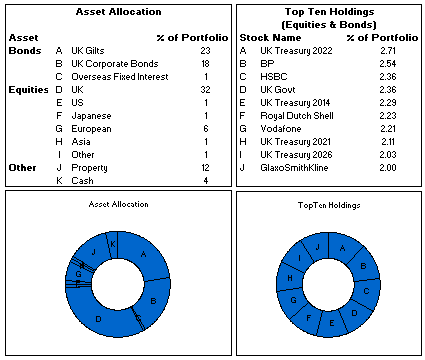
The above image is an excel reconstruction of even sadder looking chart.
What is wrong with it?
- Poor chart selection: Pie charts are good for 3-4 data elements. When we need to present 10 or so items, it is better to use a bar chart or a line chart.
- Not grouping and sorting the information: In the first chart which is displaying Asset Allocation is made from data that has 3 different series – Bonds, Equities and Other. But the chart shows everything in the same way, thus making it difficult to understand how assets are allocated to various classes of investment. Also, the data is not sorted in any meaningful order.
- Poor use of labels: The labels A,B,C … are non descriptive. They are also repeated on the other chart although they mean different things.
The Chart Busters’ Fix
Thanks to guest parachartanalyst Joe Mako, who contributed this fix:

I have taken Joe’s ideas and slightly modified them to create the below chart

Click here to download the above fix in excel and see it yourself.
Added Later: Readers Submitted Fixes
Submitted by Paulo Cesar Semblano da Costa:

- I think Paulo’s version manages to reduce chart clutter a bit more. Very good effort.
- You can download this version from here.
Submitted by Jeff Wier

- Jeff’s version is very good. Again, like Paulo, he managed to reduce the chart clutter bit more and made it look very slick.
- You can download this version from here.
What we have learned?
- Zombies are scary, even when they are looking like donuts.
- Always try to sort the data in some meaningful order before pushing it to charts
- Use a variation of panel chart or color the series sensibly to bring out key differences
- Try to avoid generic labels like 1,2,3 or A,B,C and instead use the actual values and category names
How would you have tackled this?
We dont know how open source the ghost busters were. But Chart Busters are 100% open source. Share your ideas and suggestions for improving this scary little chart to something that makes sense.
When ya gonna call…?
Consult chartbusters today. Send us your bad charts. All you have to do is fill out this google form.
Arent ya gonna read these… ?
What to do no when no one likes your pie | Non sucky excel chart templates


17 Responses
Here is a full size image of the graph I made: http://joemako.com/files/asset_allocation.png
I couldn’t improve on your horizontal bar graph for the top ten, if any graph is to be made. The only thing I’d have instead is… no graph at all. There’s no useful structure to the top ten, they’re all just a few percent of the portfolio, and they’re all much like each other. A table will say everything that needs to be said here.
For the other graph, I’m tempted to be bad and try a two-level pie chart, with bonds/equities/other in the inner pie, and the categories in the outer.
On Proton Packs:
Dr. Egon Spengler: There’s something very important I forgot to tell you.
Dr. Peter Venkman: What?
Dr. Egon Spengler: Don’t cross the streams.
Dr. Peter Venkman: Why?
Dr. Egon Spengler: It would be bad.
Dr. Peter Venkman: I’m a little fuzzy on the whole “good/bad” thing here. What do you mean, “bad”?
Dr. Egon Spengler: Try to imagine all life as you know it stopping instantaneously and every molecule in your body exploding at the speed of light.
Dr. Ray Stantz: Total protonic reversal!
Dr. Peter Venkman: That’s bad. Okay. All right, important safety tip. Thanks, Egon.
On Asset Allocation charts:
CFO: There’s something very important I forgot to tell you.
Reporting Department: What?
CFO: Don’t show the fund’s performance.
Reporting Department: Why?
CFO: It would be bad.
Reporting Department: I’m a little fuzzy on the whole “good/bad” thing here. What do you mean, “bad”?
CFO: Try to imagine all credit markets as you know them stopping instantaneously and every cent in your retirement fund exploding at the speed of light.
Marketing Dept: Total retirement reversal!
Reporting Department: That’s bad. Okay. All right, important safety tip. But the Graphic Design department have already finalised the disclosure layout, and now there’ a gap in it. Oh well, guess I’ll use a donut chart and show the makeup of the fund, rather than anything actually helpful.
Some thoughts.
1. Don’t neet to be so precise i.e. 2.71 percent adds little more than the ‘easier on the eye ‘ 2.7%
2. Don’t need repetititve lables in the ‘Type’ column. Just one heading row each for Bonds, Equities, Other in bold, and format the background of the above header row a light grey so you can tell it’s a first level heading as opposed to the 2nd level headings of Bonds, Equities, and Other
3. Should make it clear whether the % of Portfolio for Equities & Bonds relates to the % that these top 10 make up of the entire asset alloctation portfolio (whic is what I suspect) , or just of the Equities and Bonds subset. Better to show what % they make up of the equities group, because the story you’re trying to tell is ‘how is your risk managed across your equities portfolio’. You’ve already shown how the equities risk is managed across the entire portfolio, so no need to break this down into how individual equites make up the portfolio.
4. I don’t think you need the asset class in both the graph legend and in the y series description. Get rid of the legend, and instead just have the words Bonds, Equities, and Other under the graph. But don’t repeat them – just draw some kind of visual bracket that shows that ‘Bonds’ relates to the first three series, Equities relates to the next 6 series, and Other to the last two.
5. When using text on top of colours, such as you have in your legend, make sure there’s as much contrast as possible between the text font color and the background colour. Readability is key, and many people have eyesight like mine.
6. Should also consider whether colours will pose a problem to the significant amount of viewers with color blindness. I’d use three shades of grey rather than three completely different colors – the human eye is great at picking up different shades of the same colours, and this will look less ‘jarring’.
7. I’d be inclined to have equities to the far left of your Asset Application graph, even though bonds contribute more to the entire mix, because the very large UK series would look more pleasing to me if it was on the left rather than sticking up like PHD’s hair in the photo above in the middle of the graph 🙂
8. Put some kind of units on the numbers above the series in the graph. Make it clear that 23 means 23% – adding just one more character means people don’t have to go and look for what the units are somewhere else. I’d probably prefer a legent, rather than numbers at the top, but that’s just me.
You know what…I’d be tempted to *gasp* use a pie chart to show the breakdown between Bonds, Equities, and other. Why? Cause there’s only three large numbers, and because of all the ways you could present it, a pie chart is probably the one that the majority of your audience would probably be most comfortable with.
I’m not saying pie charts are good. I’m just saying that there’s only three numbers, and that most of your audience won’t have spent much time reading PHD blogs.
Congratulation on releasing the first entry of ChartBusters!
I agree with last 2 comments from Jeff. In the first chart asset break up can be given as a pie chart on right hand corner.
I would try out a stacked column chart for the asset allocation table, it would give 3 coulmns with the components arranged in ascending order. As for the top 10 holding chart, I would agree with derek that “No-Chart” seems the best choice, come to think of it, the only difference between the table and the horizontal bar chart is the length of the bars between the names and the figures.
Somnath – a potential problem with a stacked column chart is that while they save space and can certanly portray the information at hand, they may be outside the ‘comfort zone’ for those readers who aren’t particularly chart savvy to start with. So if space is not at a premium, it’s probably safest to split the information out for easier digestion.
The goal of the investment company concerted should be to educate investors, while making it very easy for them to assimilate the information. Granted, anything proposed above is a heck of a lot better than their donut charts!
Cheers. Jeff
My contribution from Brazil:
http://www.sendspace.com/file/xv6553
Paulo,
How do you make three color distiction between bonds equities and other (and adding the labels), without defining three different data series?
Thanks
Erika
I posted my version at http://cid-f380a394764ef31f.skydrive.live.com/self.aspx/.Public/Copy%20of%20AssetAllocationChartFix.xlsx
It’s in excel 2007 format, but includes pictures in case the charts don’t render well in pre 2007 versions (which is usually the case).
@Derek: I have toyed with the pie idea, but have chosen against it because I felt a pie with 10 segments is going to be as much zombie as a donut with 10 segments. But I think a 3 segment pie chart is pretty cool. Coming to using a table instead of bar chart for the top 10 in the portfolio, I think you are right. A table could have been equally efficient.
@Jeff.. I love your chartbuster’s skit. This chart actually looks like the investment department deliberately wanted to hide the information.
Coming to your comments,
1. Don’t neet to be so precise i.e. 2.71 percent adds little more than the ‘easier on the eye ‘ 2.7%
> Agree
2. Don’t need repetititve lables in the ‘Type’ column. Just one heading row each for Bonds, Equities, Other in bold, and format the background of the above header row a light grey so you can tell it’s a first level heading as opposed to the 2nd level headings of Bonds, Equities, and Other
> I feel the same. But I didnt go and do this because excel makes it painful if you want to do this. While the objective is to make good looking alternatives, we also want to limit to something that would take as little time as possible. That is why I didnt suggest this alternative.
3. Should make it clear whether the % of Portfolio for Equities & Bonds relates to the % that these top 10 make up of the entire asset alloctation portfolio (whic is what I suspect) , or just of the Equities and Bonds subset. Better to show what % they make up of the equities group, because the story you’re trying to tell is ‘how is your risk managed across your equities portfolio’. You’ve already shown how the equities risk is managed across the entire portfolio, so no need to break this down into how individual equites make up the portfolio.
> Unfortunately I have very little idea if these 2 tables of data is inter-related. If I knew the data better, I would surely have made better charts with different axes and values.
4. I don’t think you need the asset class in both the graph legend and in the y series description. Get rid of the legend, and instead just have the words Bonds, Equities, and Other under the graph. But don’t repeat them – just draw some kind of visual bracket that shows that ‘Bonds’ relates to the first three series, Equities relates to the next 6 series, and Other to the last two.
> I like the way you have solved this in your example.
5. When using text on top of colours, such as you have in your legend, make sure there’s as much contrast as possible between the text font color and the background colour. Readability is key, and many people have eyesight like mine.
> I will keep this in mind and next time we bust (or make) a chart, we will try to use shades of same color or simpler primary colors.
6. Should also consider whether colours will pose a problem to the significant amount of viewers with color blindness. I’d use three shades of grey rather than three completely different colors – the human eye is great at picking up different shades of the same colours, and this will look less ‘jarring’.
> Same as 5.
7. I’d be inclined to have equities to the far left of your Asset Application graph, even though bonds contribute more to the entire mix, because the very large UK series would look more pleasing to me if it was on the left rather than sticking up like PHD’s hair in the photo above in the middle of the graph 🙂
> Good idea…
8. Put some kind of units on the numbers above the series in the graph. Make it clear that 23 means 23% – adding just one more character means people don’t have to go and look for what the units are somewhere else. I’d probably prefer a legent, rather than numbers at the top, but that’s just me.
> good suggestion.
[Excel makes it painful if you want to do this] – granted, Excel can be tricky if you want to do stuff like add brackets in my example – lining them up was a bit painful. But just a little bit. An extra 15 minutes of pain from the chart creator is worth it if it saves just 30 seconds each of 30 readers. This chart would be going out to hundreds – if not thousands – of investors who were nice enough to risk their money with the company. Those investors are worth the extra pain 🙂
[While the objective is to make good looking alternatives, we also want to limit to something that would take as little time as possible.] – If you spend an extra hour playing around, and you discover some new or better way of doing something that you can use again in future, then that hour was a good investment. It depends on what’s at stake.
At the moment I’m working with a lot of multivariate data and need to get some quite complex ideas across to the strategy team. I’ve spent hours and hours playing around with charts in order to present the information in the cleanest and most informative way possible. In my opinion, the presentation of information can be just as important as your original analysis, if you need to ‘market’ a particular action. If you are trying to persuade people to take a particular viewpoint, then charting is marketing, pure and simple.
@Jeff: Agree. [This chart would be going out to hundreds – if not thousands – of investors who were nice enough to risk their money with the company. Those investors are worth the extra pain] I didnt think of this dimension. Thanks 🙂
[At the moment I’m working with a lot of multivariate data and need to get some quite complex ideas across to the strategy team. I’ve spent hours and hours playing around with charts in order to present the information in the cleanest and most informative way possible.] I (and I am sure our readers here too) would love to learn from you. I like the way you have used brackets to show the break-up.
I love them all and agree that they are much better than the original.
One thing that is not picked up on is that you are mis-grouping the data. You are showing cash in the same category as other and grouping it with Property. The upshot is that your riskiest, least liquid assets are grouped with the least risky, most liquid assets. I think cash should generally be broken out seperately even if is tiny because that can be a warning sign in and of itself. If you are really stuck on 3 categories then put it with bonds. The main point is to advance the analysis of the portfolio with the charting!