
Every week Pointy Haired Dilbert celebrates the art of chart making by sharing 5 of the most beautiful, innovative and effective infographic ideas from various sites. Click here to see the visualizations featured earlier.
Pop, Soda or Coke? – Countywise terms used for sweetened carbonated water

The pop-vs-soda map tells how marketers have been effective and creating a habit in people. The blue colors are for pop, yellow for soda and red for coke. As you can see, quite a few people call any soda as coke, especially in the southern regions of US. [via strangemaps]
Document Contrast Diagram – State of Union Address in 2007 and 2008

Visualizing text is a difficult thing to do. More so when you have 2 texts and need to compare. Document contrast diagrams seem like an interesting way to explore two large pieces of text to see how they space out. The state of union address for 2007 and 2008 are shown above, 2007 is on left. [via Tim Showers]

VisualPoetry project aims to take various poetic texts and connect them to show how words (sequences) appear on various poems. Very beautiful. [via information aesthetics]
History of World Records in Olympics

Another NY Times Olympic visualization. This shows how in each successive olympics the world records are created. A simple graphic, but the message is powerful: You should never give up., also see the Olympic medal visualization
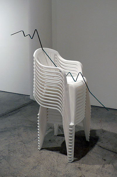
What happens when graphs go physical

This is an innovative idea by Joshua Callaghan. He took the graphs like military spending by country (shown on the right), world population since 0 AD, consumer confidence and converted them to public art so that many more people can become aware of the situation. Very powerful and effective way to tell the story. [via flowing data]
Bonus Infographic : [NSFW] Flesh Map

Dont click on it from work, seriously! [via information aesthetics]
Like this edition of cool infographics? Do you know any charts that should be featured here, drop a comment.


