
This is a guest post by Drew Kesler.
You’ve been there before. It’s almost 5:00, and you are going crazy trying to finish the presentation due for a monthly performance meeting the next morning. The model is refreshed, and now it just takes a LOT of copying, pasting, and positioning to get the PowerPoint ready. Finally, the slides are finished…, until you read a new message from your boss requesting a minor change. But of course her change means you have to start all over with the copy and pastes…
There is always a better way! In the Oil and Gas industry, I constantly have monthly reports to assess the performance of our operating assets. Excel VBA makes it a cinch to automate the entire process. So when a simple change is requested, the presentation is automatically generated with the click of a button. No more wasting time!
So, here it is – How to Save TONS of Time by Using an Excel VBA Macro to Build Your Presentation:
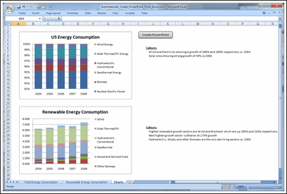
1. Build your charts in Excel
2. Create a new worksheet and paste in all the charts you need for the presentation.
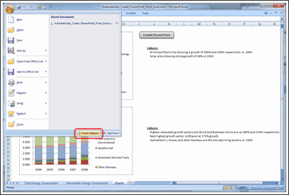
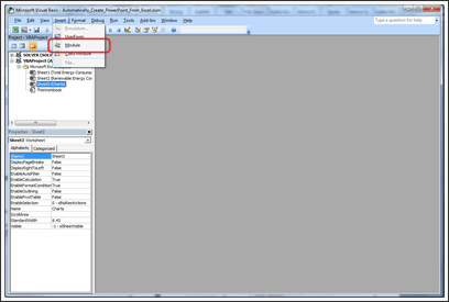
3. Open VBA. To do this, you can either press ALT + F11, or you can take the following steps:
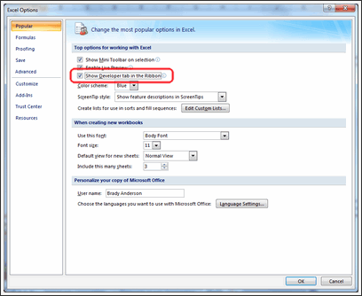
a. To show the developer tab, click on the Microsoft Office Button and click Excel Options.
b. Click Popular and then select the Show Developer tab in the Ribbon.
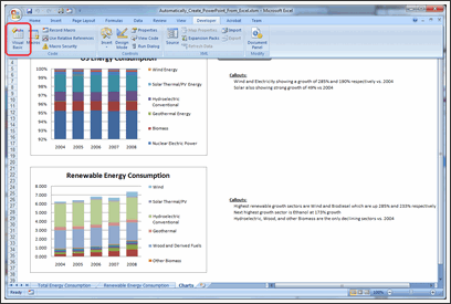
c. Click on the Developer tab in the ribbon and click Visual Basic.
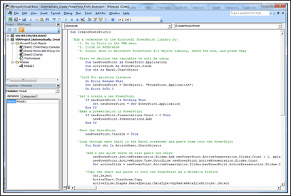
4. In your VBA Editor window, click File => Insert => Module.
5. Paste the following code into the module (I included comments so you can customize it to your liking).
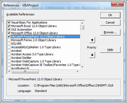
6. Click Tools => References.
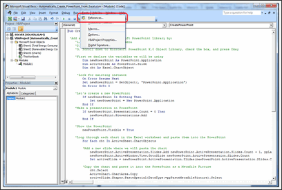
Add the Microsoft PowerPoint Library.
7. Now all you need to do is go to Excel and run the CreatePowerPoint macro! To make this easy, draw a rectangle shape in your Excel worksheet which contains all the charts you want to export to PowerPoint.
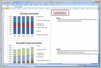
8. Right click the rectangle and click Assign Macro.
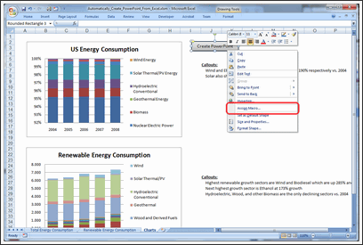
9. Click on the CreatePowerPoint macro and press Okay.

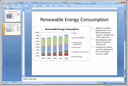
10. That’s it! Just click your rectangle button then sit back and watch it run! You’ll have your presentation in no time!
Download the Example Workbook & Play with this Macro
Click here to download the example workbook and play with the macro.
Note: If you have an error with Power Point application activation, use this code instead.
AppActivate ("Microsoft PowerPoint") <-- if this doesn't work
AppActivate "PowerPoint" <-- use this
Thanks Drew
Thank you so much Drew for writing this insightful article and showing us how to automate PPT Creation thru Excel VBA. I have really enjoyed playing this idea. And I am sure our readers will also like it.
If you like this technique, say thanks to Drew.
How do you Automate PPT Creation?
During my day job, I used to make a lot of presentations. But each one was different. So I used to spend hours crafting them.
And nowadays, I hardly make a presentation. But I know many of you make PPTs day in day out. And this technique presented by Drew is a very powerful way to save time.
Do you use macros to automate creation of presentations? What are your favorite tricks & ideas? Please share using comments.
Learn More VBA – Sign-up for our VBA Class Waiting List
Chandoo.org runs a VBA Class that teaches you from scratch, how to build macros to save time & automate your work. We opened our first batch in May this year and had an excellent response. More than 650 students signed up and are now learning VBA each day.
If you want to learn VBA & advanced Excel, this is a very good class to join.
Click here for full information on VBA classes.
About the Author:
Drew Kesler specializes in process automation and data visualization. He currently performs analytics and modeling for the Oil and Gas industry. His most recent projects include using GIS mapping technology to visualize data and enhance interaction across organizations.


29 Responses to “Customer Service Dashboard using Excel [Dashword Week]”
Looks good, Mara. Keep up the good work!
Thx Mara, your work is great, congratulations...
wow ! Great stuff Mara !!
I am amazed on the work you did !
What I like about your dashboard
1. The first impression is the colors used. Very smart use of colors that matches each other, easy on the eye - make people wants to find out more !
2. Clear message shown for the tweetboard for Quick overview on the state of situation.
3. Use of creative titles for your charts "Information Desk".
4. Clear and uncluttered charts. Gives reader a clear perspective with good use of charts colors too.
5. Good use of Legend to describe what color meant "Highest Sales out of the three months"
6. Of course, good use of Check boxes and Slider bar to offer interactiveness on your charts.
Suggestions
1. You may want to consider formatting your Y and X axis labels to show thousands, in $500K format instead of $500,000, so you can even made your chart look much neater.
2. Budget Variant Chart - This one is special...I took a second look and try to understand it. I am not sure if this is the best chart to visualize Sales VS Budget and Variances. And the Variance of 16.19% is positive, so u may want to use conditional formatting to make it green color, red if negative.
Overall is Great Work and Great Effort !!! Keep it up and I am so proud of you !
Francis Chin
http://www.francischin.com
Great Work Maya, just wondering if "5" Scrollable list of various gift shop items, can compare the previous 2 and current month selected in the above picklist, just one more suggestion if we can use top 5 gift category by using donut and bar mix chart to show sales mix for different months
Chandoo I would like to thank you for posting such helpful tricks for creating dashboards, I have learned a lot from your KPI Dashboard demo, I have created one dashboard to compare performce of Sales Associates, thaks a lot again
Thanks for the idea! Great job! You are giving me a lot of inspiratons!
Thanks everyone for the nice comments. I'm such a novice at this so I was so grateful for Chandoo's class and for everyone who submits ideas on his blog.
Francis: Thanks so much for your comments. You're an inspiration. For the budget variance chart, I actually got that idea from one of Chandoo's post on budget vs actual. There was one that was simple and easy to read so I learned how to do that and made it dynamic. I'm open to any other ideas you have for budget vs actual. I'm always looking for ways to improve.
Sabrina: Thank you for you for your suggestion on the top 5.
Dear Mara,
Great work.
But i one suggestion regarding the INFORMATION DESK graph is consist of month but which year it belong is not there if it would be there it would be great.
Warm Regards
Bhushan Sabbani
+91 98208 26012
Thanks for this idea... Great Stuff !!
Excellent dashboard Mara.
The best I like about the dashboard is the choice of colors. They are cool and not distracting. Thanks for sharing the file.
@Chandoo
Thanks for the dashboard week Chandoo. I am learnt a lot in the last 2 days. I am excited over the next 3 days! 🙂
Regards,
Ravi.
Great work Mara ! Thanks for sharing .
Mara, I liked the line, "Need to be more helpful." Our government needs to print this line, laminate it and post it in all government offices for the staff to see.
Hi there, i have been recently visiting this blog it is really great, the best one for Excel, wish Chandoo great success ahead.
I have one query, if you protect the data sheet the chart with the checkbox gives and error saying the data is protected and cannot be modified, is there a way around. This is cause if we want to publish this to someone who should only see it and do no changes to the data, is it possible please guide.
This could be a silly but bear me i am novice to excel 🙂
Thanks.
nice work.
inspired me a lot, working on few dashboard projects...
[...] Customer Service Dashboard in Excel 14,326 [...]
[...] Customer Service Dashboard Example [...]
dear mara
looks great .any reason why you have not used the bullet chart for the actual vs target chart.on the whole it is simple and elegant .jay.
Dear Chandoo,
The word Dashboard in the heading is misspelt.
Wow. Very Nice work Mara. Next week I am going to take the Course, I will try to post my work here.
Thank you so much for your helpful blog. Always appreciated your tips and tricks.
I am proud that you belongs to our Vizag City.
The above comment, I forgot mentioned about Chandoo, those two paras is about Chandoo. 😀
Thank you Mara!
Thx Mara, your work is great, congratulations…
Great Work Mara!!!!!!!!!!!!!!!!!!!!!!!!!!
Hi Chandoo,
I had been following your blogs for tips and tricks on excel. I am working with Media agency and we collect the data. Now this data has several parameters based on several legends. For eg Class A - legend color red, classB - legend color green and so on. Class A has several characteristics and parameters and heading etc. Now everytime we gather data and make pivot then based on the data in the pilot tables - top 10 we need to insert those in charts manually and also need to change the colors of legends and also. We create nearly 300 slides every month sector wise and it takes nearly our 4-5 days in doing that. Do you have any sample dashboard which will be helpfull to us and we can create it in a day.
Thanks really amazing one,
it helped me in desgining OTACE report
Regards
Gowravan M
9980651792
Awesome Job done here .............
very good master piece but wont to know if you can design KPI's for a financial institution. Thank you
I need help to make performance for our company
we have about 10 products from 5 years old