
A Pareto chart or pareto graph displays the importance of various factors in decreasing order in columns along with cumulative importance in a line. Pareto charts are often used in quality control to display most common reasons for failure, customer complaints or product defects.
The principle behind pareto charts is called as pareto principle or more commonly the 80-20 rule. According to wikipedia,
The Pareto principle (also known as the 80-20 rule,[1] the law of the vital few, and the principle of factor sparsity) states that, for many events, roughly 80% of the effects come from 20% of the causes.
The pareto chart is a great way to do the pareto analysis. Today, we will learn how to use excel to make a pareto chart.
See an example pareto chart of visits to this website:
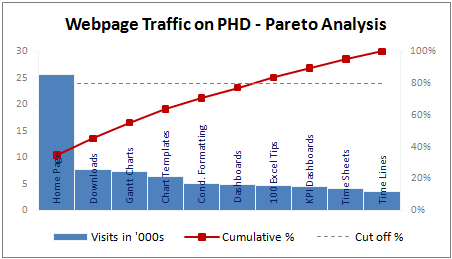
(Please note that in this example, the 80/20 rule does not hold as I have chosen very small sample of data. In reality, the 80/20 principle applies to my website as well)
Making a Pareto Chart in Excel
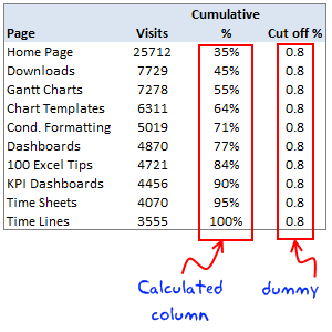
In order to make the pareto chart in excel, first you must have the data ready. Once we have the values for each cause, we can easily calculate cumulative percentages using excel formulas. We will also require a dummy series to display the “cutoff %” in the Pareto chart.
I have arranged the data in this format. You can choose any format that works for you.
Once you have the data ready, making the pareto chart is a simple 5 step process.
1. Make a column chart using cause importance data
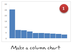
In our case, we select the first 2 columns in the above table and then make a new column chart.
2. Add the cumulative %s to the Pareto Chart as a line

Select the third column, press ctrl+c (copy). Now select the chart and press ctrl+v (paste). Excel will add another column series to the chart. Just select it and change the series chart type to “line chart”. Learn more about combining 2 different chart types in excel combo charts.
3. Move the cumulative %s line to secondary axis


Select the line chart, go to “format data series” (you can also press ctrl+1) and change the axis for this chart series from “primary” to “secondary”.
4. Add the cut-off % to the pareto chart

Select the fourth column in our data table, copy and paste it in the chart. This should ideally be pasted as a new line chart. If not, follow step 2 for this as well.
5. Finally, adjust formatting to make the final pareto chart

Now, our basic pareto chart is ready. We should adjust the chart formatting to make it more presentable. Once you are done, the final output will be something like above chart.
Download the Pareto Chart Template in Excel
Click here to download the excel pareto chart template.
When to use Pareto Chart?
Pareto charts can be used,
- During quality control to analyze the causes of defects and failures
- When you want to focus your resources on few important items from a large list of possibles
- To tell the story that attacking problem A might be better than solving problem C, D and F
Pareto charts and pareto analysis has great practical uses for almost anyone in a managerial role.
Have you used Pareto analysis or Pareto charts in your job?
Pareto principle is the first real management lesson I have learned during my MBA. It is the topic for my first presentation too. During the presentation, Anoop, my jovial team mate said, “80-20 principle can be tested anywhere. For eg. in most parties 80% of the beer will be consumed by 20% of people”, and the whole class started laughing.
Jokes apart, I think pareto principle is a very powerful idea told in an extremely simple way. I use the pareto analysis to find best way to invest my time. What about you? Tell me about your experiences of using pareto analysis using comments.
Related Material:


6 Responses to “A quick personal update”
Thank you for the personal update. It was quite encouraging and a breath of fresh air in my Inbox. Take care and stay safe.
David
Doctors advise:
Virus obstructs lungs with thick mucus that solidifies.
Consume lot hot liquids like tea, soup, and sip of hot liquid every 20 min
Gargle w antiseptic of lemon, vinegar, & hot water daily
It attaches to hair/clothes detergent kills it, when come from st go straight shower
Hang dirty clothes in sunlight/cold overnight or wash immediately.
Wash metal surfaces as it can live on them 9 days
Do not touch hand rails
Do not smoke
Wash hands foaming 20 sec every 20 min
Eat fruit/veg and up zinc levels.
Animals do not spread it
Avoid common flu
Avoid eat/drink cold things
If feel sore throat do above immediate as virus is there 3-4 days before descends into lungs
Would love help with my database mgt in excel.
Thanks for being thoughtful of us.
BTW How do you track your expenses/income in excel? Can you share the worksheet please.
Stay safe you and your family, best wishes.
Thanks for the update and happy to know that you and family are doing good. A 21 day lockdown has now been announced in India (I live around Kolkata) so it's uncertain times ahead. I check up on your wonderful articles often and will do so even more regularly now. Stay safe and God bless.
Hi from Argentina, I follow you for a lot of years now. We here are in a quarantine for 2 or 3 weeks, because the pandemia.
Excel is also my passion and I came here looking for a Num2Words formula, but in spanish. If anyone have it, please let me know.
Best regards.
Pablo Molina
La Rioja - Argentina
I'm glad to have your personal update. I'm from India & following you for so many years. Cheers to have any further personal update.