
Sparklines are fun and very insightful. They are easy to create, easy to maintain and fit into any dashboard.
But there is one tiny problem with them. Usually we have a lot of data, but we don’t to visualize all of it. We just want to visualize latest 30 days trend or last 12 months trend or QTD or something similar. What then?

In this video, learn a powerful and very simple way to create dynamic sparklines using Excel.
Create dynamic sparklines in Excel – Video
You may watch this video on our YouTube Channel.
Download dynamic sparklines example workbook
Please click here to download the example workbook for this post. Examine the chart & pivot table to learn more.
Sparklines = more power to your dashboards
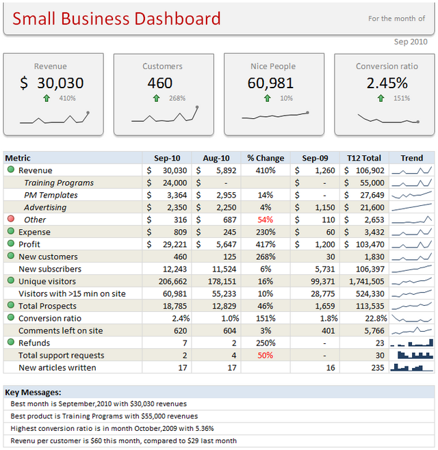
I add sparklines to all my dashboards. They are elegant, space-saving and insightful. They are an integral part of my Excel School online class on Advanced Excel & Dashboard reporting. Sample this dashboard:
If you want to learn how to use sparklines & other powerful Excel features to create awesome dashboards, Please consider enrolling in our Excel School program.
How do you use sparklines?
Please share your favorite tips & implementations of sparklines in the comments section.
This post is part of our Awesome August Excel Festival.


12 Responses
Its Awesome !!
Hello Chandoo,
Thanks for sharing this insight for Sparklines.
I am wondering if there’s an easy method like this for charts where we just want to use data for last 30 days or 12 months.
I remember reading somewhere on your web that offset formula can be used to do this thing however is there any simple way to accomplish it? Also, if could please share the link of that post here then it will be really helpful.
Hope this is clear. Thank you.
Very nice and simple trick !!!
Great technique that I’m sure I’ll be using in future dashboards! Thanks Chandoo.
Thanks Chandoo. I’ve never used sparklines. You’ve opened a door to more learning about Excel capabilities.
Grace and Peace,
jerry
So, all in all you just limit your dataset by sourcing the plotdata from the first 30 entries of a sorted pivot table. Sleek .
Thanks for this very useful trick.
Thanks chandoo to provide such a useful tips.
I want to learn Production and sales regarding chart for 12 months and 30 days with pivot table.
Good Morning.
Awesome…. It is very awesome trick.
I did not use this before.
Now I learned and start to use this.
Thanks Chandoo.
Ramesh.S
Great Idea! Offset and Named ranges don’t with sparklines so this is a quick and easy workaround.
Thanks Chandoo, great tip! I’ve always debated the usefulness of sparklines in general, but making them dynamic and giving them a little more real estate definitely improves the case for utilizing them.
Hey, thank You! That was very informative. While I like your approach, my suggestion would be to keep it short. While you used a Pivot table, you could have simply used a filter on the columns. Please suggest if it gives any errors while using filters?