Here is a situation all too familiar.
You are looking at a spreadsheet full of data. You need to analyze and tell a story about it. You have little time. You don’t know where to start.
Today let me share 15 quick, simple & very powerful ways to analyze business data. Ready? Let’s get started.
1. Describe data with quick stats
You know…, the good old AVERAGE, COUNT, SUM, MIN, MAX, MEDIAN, and Range of the data.
You can calculate all of these with simple Excel formulas.
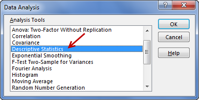
If you are lazy (or in a bit of hurry), you can use the Descriptive statistics feature of Data Analysis Tools add-in (this is available in Excel by default. You just need to enable it by going to File > Options > Add-ins > Manage Excel Add-ins > Go).
Related: Going beyond AVERAGE to summarize data – Podcast part 1 & part 2
2. Heatmap it
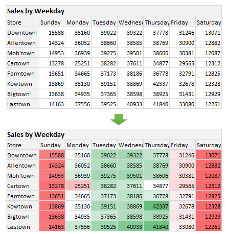
When you have a bunch of numbers, you can use heatmaps / color scales to to find what’s going with it in the quickest & most fun way.
Just select the numbers and go to Home > Conditional Formatting > Color-scales and pick a color scale you like.
See the numbers light up based on how high / low they are.
3. Spot the trend
Your data may have some trends buried in it. Uncovering these trends can be hard if you look at numbers alone. But with a simple line chart, you can quickly see how things are going, what has been the general direction of your numbers and may be even predict what is going to happen next.
To spot the trend, simply select the data and create a line chart (or even a sparkline)
4. 80 / 20 – Pareto Analysis
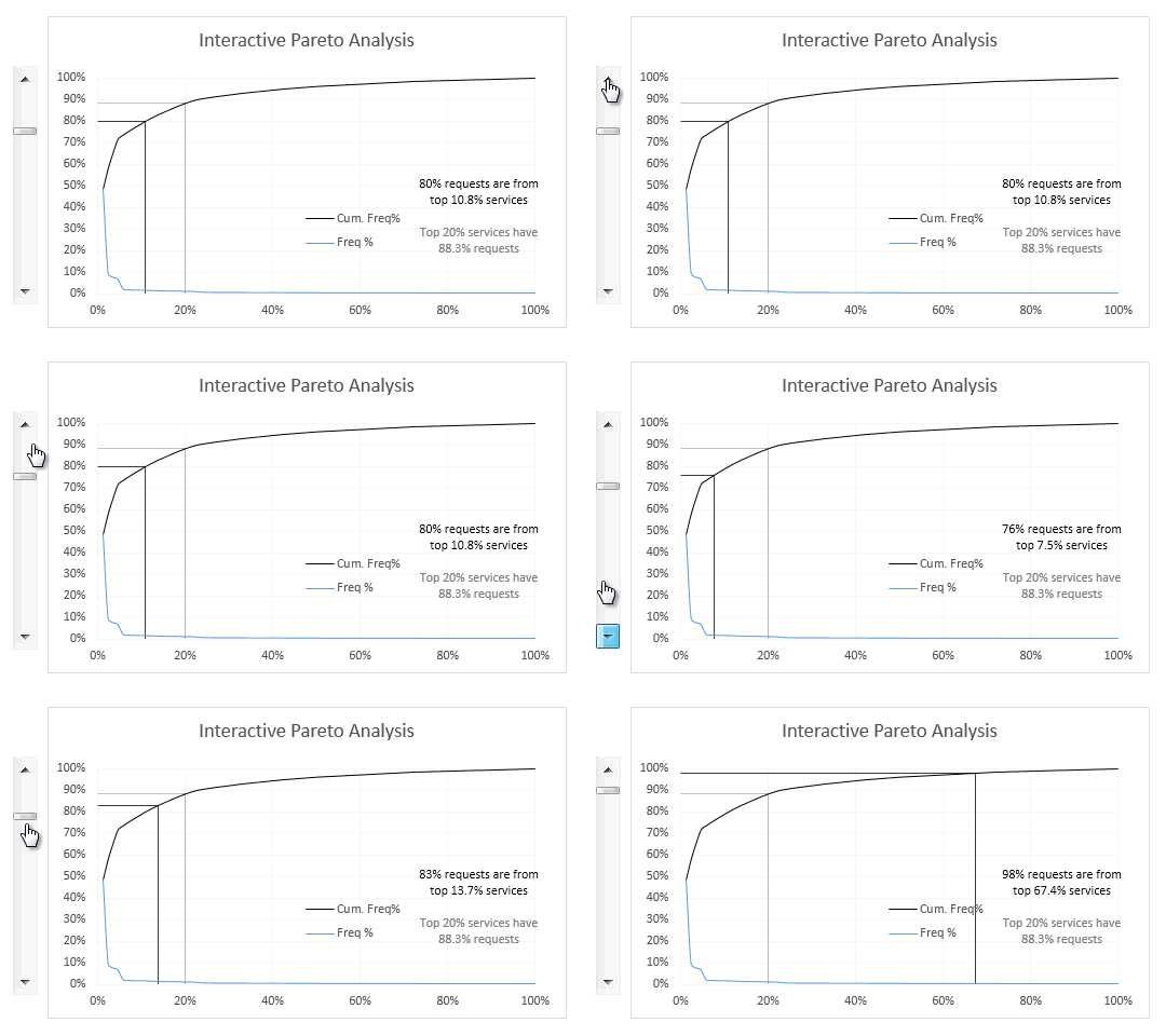
Pareto analysis (also known as 80/20 analysis) refers to the idea that 80% of outcomes in many situations are governed by 20% factors.
For example, in a manufacturing company 80% of defects may be reported by just 20% of the process steps
or in a website, 80% of visitors may be going to 20% of the pages.
5. Index the numbers
Let’s say you are looking at sales of various products. Product A sells between 4000 and 5000 units per month. Product B sells between 1000 and 1500 per month. How would you compare these two product performances?
You can index their sales to a common starting point, like 100 and then analyze relative performance with the help of indexed charts.
Something like this:

6. Weighted average it
Pop quiz: If a cup of coffee at Joe’s Brew costs $4 on weekdays and $3 in weekends, what is the average cost of coffee over a week?
Hint – the answer is not $3.5

When analyzing real-life data, calculating average may not cut it. You may have to calculate weighted average to get the true picture of your numbers.
Related: learn more about weighted average formula.
7. Find the outliers
Quick story – A professor walked in to the freshmen class of an MBA program. She took out a blank sheet of A4 paper, placed a dot with red marker on it somewhere. Then she showed the paper to students and asked them “what do you see?”
Everyone said “a red dot”.
Not a single person said “a white paper”.
That’s because our focus is always on outliers (things that are not normal).
So next time you are looking at business data, find out those red dots.
8. Slice & Chart it
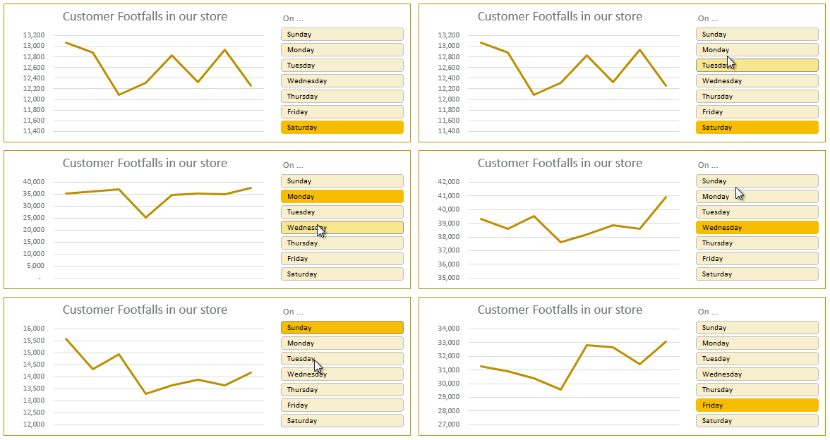
If you create a chart from lots of data, then it looks cluttered.
But when you apply filters or slicers to original data, the chart will show only filtered data.
This is a quick & powerful way to slice your data and visualize sub-sets to spot trends or insights.
9. Check out the distribution on this curve!
When you understand the shape of your data, you can tell better stories about it.
To quickly check the shape of your data,
- Find the range of your data (min & max values)
- Divide this range in n equal ranges (start with n=10 and refine until you are happy)
- Find out how many values fall in each of those n ranges (calculate the frequency using formulas like COUNTIFS)
- Create a column chart with this frequency data (called as histogram)
- Spot the shape from this histogram.
10. Rank it / Sort it
Sort your data using Excel sort options or rank the data points against all values using RANK() formula. This will tell you where each value fits in.
Related: Sort values using formulas in your dashboards
11. Top 5 it
Sometimes when you have too many items, it’s better to focus on just top 10 values or bottom 5 values. For example, if you are analyzing sales of 745 products, looking at all the 745 items is going to be very tiring. Instead you can filter the list down to top or bottom few values and then focus on these unique items.
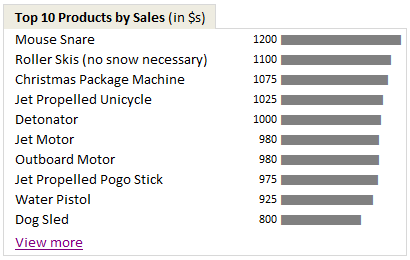
To do this, you can use
- Regular data: Auto filter > Number filters > Top 10 option
- Pivot tables: Filter > Value filters > Top 10
Also, you can use conditional formatting to highlight top or bottom n items. You can also highlight top or bottom x% values.
12. Got change?
When you have data for more than 1 year (or month), you can analyze % change year over year to spot valuable information.
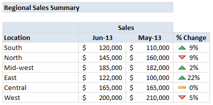
These kind of % changes (YoY, MoM etc.) are very useful in companies that experience business cycles. For example, if you sell scarves, you can expect more sales in winter months. So when comparing % change, you should compare with last year same month values instead of previous month to understand how good the performance has been.
To visualize such changes, you can use conditional formatting > icons > arrows
Related: Never use simple numbers in your dashboards
13. Spot the the duplicates
When comparing two or more sets of data, often understanding how many values are duplicated (or not) in your lists can be helpful.
For example, if you are analyzing list of customers visiting your store this month & last month, you may want to know how many people visited your store both months (ie how many customers are loyal?)
To spot the duplicates quickly, you can use Conditional Formatting > Duplicates (related: compare 2 lists in Excel).
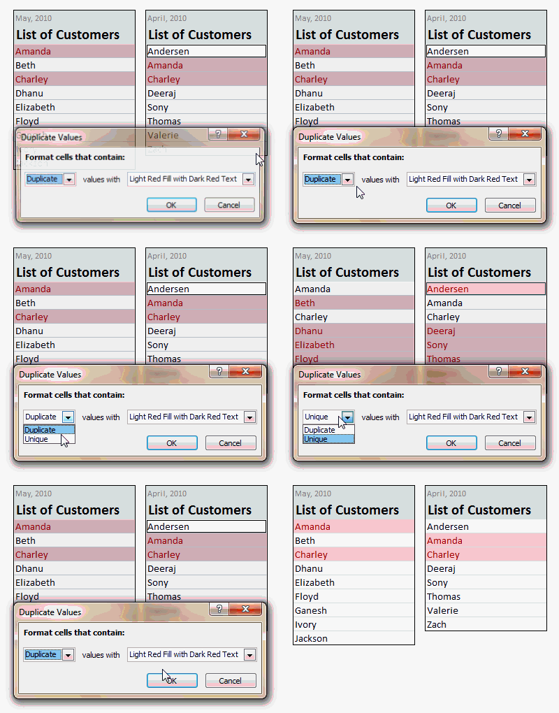
To count how many values are overlapping in 2 sets of data, you can use formulas.
14. Find the rate of return
Question time: It was year 2015. Johnny is new to stock market. He bought company K’s shares for $500 in 1st of Jan 2015. Fast forward to July 2015. He wanted to find out how much his $500 investment is worth now. So he looked at company K’s share price data. Here is what he found.
The stock went up (or down) by -10%, 10%, -15%, 15%, -10%, 10% in first 6 months of the year.
So what is his investment worth now?
This is where ideas like FV (future value) come in to picture.
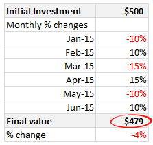
You can use a formula like FVSCHEDULE() to quickly calculate how much the investment is worth after a series of % changes.
Related: Calculating CAGR using Excel.
15. Count by occurrence
When analyzing textual data (like customer names, vendor IDs, part numbers etc.) you may want to know how many times each item has occurred in the list, what is the most frequent item etc. To get this quickly, just set up a pivot table. Add the customer name column to both row labels & value field area of the pivot table. Sort the pivot by value field, largest to smallest. And your report is ready.
Want more? 50 Ways to Analyze Data course is for you:
If your job involves data analysis & story telling (to be honest all jobs require these skills), then you are going to love 50 ways to analyze data online course.
This course offers 50 case studies, each dealing with a specific type of business problem, analysis situation or modeling scenario and offers a variety of solutions using Excel. You will learn how to analyze data better, faster, and present the information more beautifully.
We are not accepting students in to this program. Check out 50 ways to analyze data program course page for more information and enrollment process.


19 Responses to “15 Quick & powerful ways to analyze business data”
This is just great Chandoo! Aspiring operation managers should be knowing these powerful analysis approach. Thank you for sharing.
It's very helpful stuff and I am expecting much more awsome in coming training program.
Thanks for sharing.
This awesome! I always enjoy their excel quick tricks!
I meant 'your' texcel tricks
This is Fantastic.
I use quite a few of them on a fairly regular basis. Now I will have a one stop location for a lot of the fire power I need for my analysis
Great help and thanks for sharing Chandoo.
Thanks Chandoo!!!! You work "Hard" to put our lives at "Ease".......
Thank-you Chandoo. 🙂
Thank you Chandoo! This came at a right time!
Thank you chandoo!
Superb!
good.
good
simply awesome stuff. you got my attention can't wait for more.
[…] http://chandoo.org/wp/2015/07/01/how-to-analyze-business-data/ […]
it`s nice man! Thanks. I like it: brief explanations, powerful functions.
hi, awesome.
I want to join
What's stopping me using powerpivot:
#link powerpivot tables on more than one criteria, e.g. Customer Name and postal code as they might have multiple delivery addresses.
#update names across multiple pivots (especially when grouping)
#grouping dates/number into non linear chunks, e.g 1-10, 10- 15, 15-28,28-31
#Quickly changing number format (i.e. rather than right click -> number format, click any cell and change the format for all numbers in that field, in that report.
other things:
#fiscal calendar calcs -> 4/4/5 week vs calendar, P1= april? jan? September?
#mileage() -> variables are(Start point, end point, postal code/geocords, route option, route planner) output = mileage as per route planner (google/bing maps) and economic, fastest... etc
#Coffee() -> variables are (Number of drinks, mug size, type, milk, sugar, flavour, takeaway) -> obviously a joke, but well done for making it to the end...
[…] http://chandoo.org/wp/2015/07/01/how-to-analyze-business-data/ […]
Hi Chandon,
I would like ask a question. I’m now warp ling with a project to analyse the Bottom 10 performance products with 6 parameters (like rating, no. Of clients etc). May I know if I can use proportion of each parameters and get score & 5 star rating for each of them?
Appreciate if you can help with this. Thanks!