
Recently, we discussed about the case of unwieldy data and how we lookup what we want using formulas like SUMIFS. Today, let us learn few more ways to solve the same problem.
First, a re-cap of the problem:
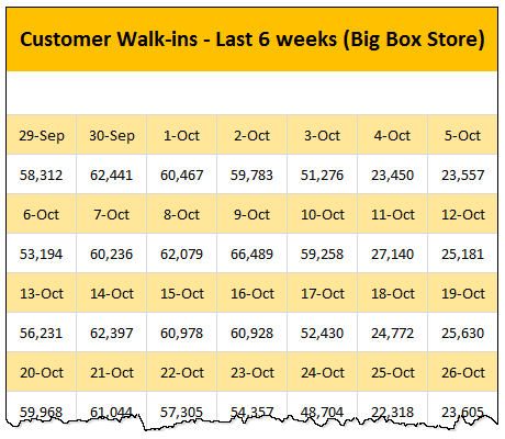
Here is a data-set:
The problem – build a lookup formula
And the problem. Oh, simple. Write a lookup formula to find how many customer walk-ins we have on any given day.
In the previous article, we discussed how to use SUMIFS to solve this problem. There were several amazing & awesome solutions shared by our readers in the comments section too.
Suitable structure spawns simple solutions
Poorly structured is the 2nd biggest problem of analysts. The first one is not enough coffee. That is why there is a dictum in the data analytics world.
Structure is everything
So, we can easily solve our lookup problem, if our data were to magically re-arranged in 2 column fashion – Data & Value.

This transformation can be done in 2 ways:
Option #1: Transforming Data – Using Formulas
We can use data fetching formulas like OFFSET or INDEX to re-arrange data in 2 columns.
Assuming,
- Our 2D data is in a named range data,
- There are running numbers starting with 0 in the cell J5
We can use below formula to fetch first column:
=IFERROR(INDEX(data,2*(INT(J5/7))+1,MOD(J5,7)+1),"")
for the second column, below formula works:
=IFERROR(INDEX(data,2*(INT(J5/7)+1),MOD(J5,7)+1),"")
How does this formula work?
I will explain the formula for first column. Deciphering 2nd column formula is your homework.
Here is the formula again: =IFERROR(INDEX(data,2*(INT(J5/7))+1,MOD(J5,7)+1),"")
Before understanding the formula, let’s take a minute to examine the structure of our raw data.
- Odd rows contain dates
- Even rows contain values
- There are 7 columns in total
- So to get the first date, we need to go to row 1 (first odd number), column 1
- To get the first value, we need to go to row 2 (first even number), column 1
- But to get 8th date, we need to go to row 3(2nd odd number), column 1
- So on
Let’s go from inside out.
2*(INT(J5/7))+1portion: This gives row number (ie odd number). J5 refers to running number and its value is 0. So we get 2*(INT(0/7))+1 = 1- This will be 3 when J5 becomes J12 (ie 8th date)
MOD(J5,7)+1portion: This gives column number. It will result in values 1 thru 7 in a cyclical fashion. Thanks to MOD.INDEX(data, ..., ...)portion: Now that we have both row & column numbers, INDEX formula kicks in and gets the corresponding date.IFERROR(INDEX(...),"")portion: This is to help in case we ran out of all dates & values in our INDEX formula. Read about IFERROR here.
Once you have the formulas for first date & value, simply drag them to get rest of the values.
Option #2: Transforming data – Using VBA
VBA Macros are perfect for scenarios like this. Usually transformation is something you need to do every-time you import data from external systems. So simply write a macro that can do this automatically.
Assuming our data is in the range data and the first cell of our extraction range is startHere, you can use below macro:
Sub rearrangeData()
    'takes the values in DATA named range and rearranges them
    'from the named cell startHere

    Dim cell As Range, i As Long, j As Long, evenRow As Boolean, firstRow As Long

    i = 0
    j = 0
    firstRow = Range("data").Cells(1).Row

    For Each cell In Range("data")
        evenRow = (cell.Row - firstRow + 1) Mod 2 = 0
        If evenRow Then
            Range("startHere").Offset(j, 1).Value = cell.Value
            j = j + 1
        Else
            Range("startHere").Offset(i, 0).Value = cell.Value
            i = i + 1
        End If
    Next cell
End Sub
How does this macro work?
Before jumping in to the lines of code and demystifying the logic, Let’s understand what we need to do:
- For each cell of data,
- If it is in odd row, put the cell data in Date column at end
- Else, put the cell data in Value column at end
- Repeat
This is what our code is trying to do.
Let’s examine the For Each loop, as this is the most critical part of our macro.
- For each cell in the range data
- We check if we are in evenRow using simple arithmetic on row numbers
- If we are in evenRow then
- We put the cell value in row j (number of values so far), column 2
- We increment j
- Else
- We put the cell value in row i (number of dates so far), column 1
- We increment i
- Close the IF condition
- We check for next cell in the data range
Advantages of Transformation over SUMIFS approach
Both options for transforming data have few advantages:
- They work with any type of data (unlike SUMIFS, which works only for numeric lookups and has few other issues)
- Once data is restructured, you can do other types of analysis like creating pivot tables, adding extra calculated columns etc. easily.
Download Example Workbook
Click here to download example workbook that shows original SUMIFS solution, both options for transforming data & few other formulas. Play with it to learn more. Check out the code by pressing ALT+F11.
How would you transform data?
My favorite techniques for transforming data are – VBA, formulas, Power Query, pivot tables & SQL. Depending on the situation, time availability, where my data is, I choose one of these options to scrub my data.
What about you? How do you clean up / scrub data like this? Please share you thoughts & tips with us in comments.
Instructions for washing your dirty data
If your work involves scrubbing dirty data, check out below tutorials too:
- Extract numbers from text using VBA and formulas
- Filling blank cells with above values in tables
- Cleaning up in-correctly formatted dates
- Fixing in-correctly formatted phone numbers
- Reverse a list using INDEX formula
- Transpose a table using formulas


9 Responses
Sadly I think using KNIME is perhaps the easiest way to structure, transform and do amazing things with data.
I would use:
* Table Creator, or any other input you can think of
* Chunk Loop, where I take 2 rows each time
* Transpose the 2 rows
* Extract the column header to normalize it
* Rename the normalized headers in “Date” and “Value”
* Loop End, which collects each loop vertically into one table
Option #1Bis: Transforming Data – Using Formulas
J4 =Col, K4=Row, L4=Date, M4=Value
J5 =IF(J4=7,1,N(J4)+1)
K5 =N(K4)+(J5=1)
L5 =IFERROR(INDEX(data,K5,J5),0)
M5 =IFERROR(INDEX(data,K5+1,J5),0)
Now just copy formulas down.
Regards
Why not using Power Query to create the rearranged data table.
I created the power query for the example here, it was not to long to do and it works great.
chain linkling method:
I4?=B6
I5?=B7
select I4:I5?drag down to I15?then select I4:I15?drag right to AQ,now you will find B4:AL5 is what you need!
Power Query
Inspired by https://www.youtube.com/watch?v=SOXvcBeXeyA
let
Source = Excel.Workbook(Web.Contents(“http://img.chandoo.org/f/2d-data-lookup-formula-alternatives.xlsm”), null, true),
#”lookup alternative 2!data_DefinedName” = Source{[Item=”lookup alternative 2!data”,Kind=”DefinedName”]}[Data],
#”Added Index” = Table.AddIndexColumn(#”lookup alternative 2!data_DefinedName”, “Index”, 0, 1),
#”Added Custom” = Table.AddColumn(#”Added Index”, “Custom”, each if Number.IsOdd([Index]) then [Index]-1 else [Index]),
Custom1 = #”Added Custom”,
#”Removed Alternate Rows1″ = Table.AlternateRows(Custom1,0,1,1),
DataSet1 = Table.UnpivotOtherColumns(#”Removed Alternate Rows1″, {“Custom”, “Index”}, “Attribute”, “Value”),
#”Removed Alternate Rows2″ = Table.AlternateRows(Custom1,1,1,1),
DataSet2 = Table.UnpivotOtherColumns(#”Removed Alternate Rows2″, {“Custom”, “Index”}, “Attribute”, “Date”),
#”Merged Queries” = Table.NestedJoin(DataSet2,{“Custom”, “Attribute”},DataSet1,{“Custom”, “Attribute”},”NewColumn”,JoinKind.Inner),
#”Expanded NewColumn” = Table.ExpandTableColumn(#”Merged Queries”, “NewColumn”, {“Value”}, {“Value”}),
#”Changed Type” = Table.TransformColumnTypes(#”Expanded NewColumn”,{{“Date”, type date}, {“Value”, Int64.Type}}),
Output = Table.RemoveColumns(#”Changed Type”,{“Custom”, “Attribute”, “Index”})
in
Output
Power Query – 11rows (slightly shorter)
Inspired by https://www.youtube.com/watch?v=SOXvcBeXeyA
let
Source = Excel.Workbook(Web.Contents(“http://img.chandoo.org/f/2d-data-lookup-formula-alternatives.xlsm”), null, true),
#”lookup alternative 2!data_DefinedName” = Source{[Item=”lookup alternative 2!data”,Kind=”DefinedName”]}[Data],
#”Added Index” = Table.AddIndexColumn(#”lookup alternative 2!data_DefinedName”, “Index”, 0, 1),
#”Added Custom” = Table.AddColumn(#”Added Index”, “Measure”, each if Number.IsEven([Index]) then “Date” else “Value”),
#”Added Custom1″ = Table.AddColumn(#”Added Custom”, “Custom”, each if Number.IsOdd([Index]) then [Index]-1 else [Index]),
#”Unpivoted Columns” = Table.UnpivotOtherColumns(#”Added Custom1″, {“Measure”, “Custom”, “Index”}, “Attribute”, “Value”),
#”Merged Columns” = Table.CombineColumns(Table.TransformColumnTypes(#”Unpivoted Columns”, {{“Custom”, type text}}, “sv-SE”),{“Custom”, “Attribute”},Combiner.CombineTextByDelimiter(“”, QuoteStyle.None),”Merged”),
#”Removed Columns” = Table.RemoveColumns(#”Merged Columns”,{“Index”}),
#”Pivoted Column” = Table.Pivot(#”Removed Columns”, List.Distinct(#”Removed Columns”[Measure]), “Measure”, “Value”, List.Sum),
#”Changed Type1″ = Table.TransformColumnTypes(#”Pivoted Column”,{{“Date”, type date}, {“Value”, Int64.Type}}),
Output = Table.RemoveColumns(#”Changed Type1″,{“Merged”})
in
Output
One more Power Query alternative
let
Source = Excel.CurrentWorkbook(){[Name=”Table1″]}[Content],
AddIndexCol = Table.AddIndexColumn(Source, “Index”, 1, 1),
AddTypeCol = Table.AddColumn(AddIndexCol, “Type”, each if Number.IsEven([Index]) then “Value” else “Date”),
AddMatchRowNum = Table.AddColumn(AddTypeCol, “OrderNum”, each if Number.IsEven([Index]) then [Index]-1 else [Index]),
UnpivotCol = Table.UnpivotOtherColumns(AddMatchRowNum, {“Index”, “Type”, “OrderNum”}, “Attribute”, “Value”),
RemIndexCol = Table.RemoveColumns(UnpivotCol,{“Index”}),
PivotTypeCol = Table.Pivot(RemIndexCol, List.Distinct(RemIndexCol[Type]), “Type”, “Value”),
RemExtraCol = Table.SelectColumns(PivotTypeCol,{“Date”, “Value”}),
FormatDateCol = Table.TransformColumnTypes(RemExtraCol,{{“Date”, type date}}),
SortByDate = Table.Sort(FormatDateCol,{{“Date”, Order.Ascending}})
in
SortByDate
Hi all I’m a chandoo fan but never actually post (still a bit self-conscious that I’m still learning and aren’t as expert as the rest of you). I know I’m a bit late to the party but I really wanted to try to figure this one out using my own method so when I eventually got there I thought I would post my version.
I did the following:
I used your downloadable file as a template chosing “Lookup Alternative 1” as the sheet to work on.
In the named range “Data”, there are 84 cells in total (7 cols x 12 rows), which gives us a split of 42 pairs of data. 42 dates and 42 Values.
Based on this info I setup the first of my columns.
In AB3, I title my column “Sequence / Pair”
In AB4 I begin input the number sequence in each row eg. AB4 is 1, AB5 is 2 etc. all the way to AB45 which contains 42
In the next column AC3 I label “Col ref” (I plan to use an index match to ultimately get the data so this column will identify the column number).
In AC4 I enter the following formula:
=IF(MOD(AB4,7)=0,7,MOD(AB4,7))
I drag this down to cel AC45
In the next column AD3 I label “Paired row”. There are 12 rows of data in the named range “Data” i.e. 6 pairs containing a Date and a Value. Although I need to know the row number when using index match I just want to get which pair of rows at this moment (all will be come clear in the next two columns!)
This is a bit of a large formula, but it’s entered into AD4:
=IF(AB4=0,1,IF(AND(AB4>=1,AB4=8,AB4=15,AB4=22,AB4=29,AB4=37,AB4=43,AB4=50,AB4=57,AB4=64,AB4=71,AB4=78,AB4<=84),12)))))))))))))
This formula is then dragged down to AD45
In the next column AE3 I label "Date", this is where I start to bring the information together.
I enter the following formula into AE4:
=IF(IF(AD41,INDEX(data,AD4+(AD4-1),AC4),INDEX(data,AD4,AC4))=””,””,IF(AD41,INDEX(data,AD4+(AD4-1),AC4),INDEX(data,AD4,AC4)))
This formula is then dragged down to AE45
Finally in the next column AF3 I label it “Value”
I enter the following formula into AF4:
=IF(IF(AD41,INDEX(data,AD4+1+(AD4-1),AC4),INDEX(data,AD4+1,AC4))=””,””,IF(AD41,INDEX(data,AD4+1+(AD4-1),AC4),INDEX(data,AD4+1,AC4)))
This formula is then dragged down to AF45
Bingo, Voila, hey presto, whatever you like to say. The data has now been rearranged and can then be retrieved also using the same type of vlookup that you used in (lookup alternative 1). I just edited your “No. of customers” formula as follows:
=VLOOKUP(W5,$AE$5:$AF$45,2,FALSE)
Hope this helps someone (as I’ve been helped so many times on this site).
Thanks