
Hola folks…
My trip to Houston & Dallas was very successful, fun & awesome. I got back home on Friday and instantly I am in another fun, awesome & happy place with my kids, Jo (my wife), rest of the family & friends.
Today, I want to share a very simple yet super awesome trick with you. I learned this from Augie, one of the Houston Masterclass participants.
You can drag slicer items to multi-select them.
Selecting multiple items in a slicer quickly
We know that slicers are powerful, friendly and fun way to filter the pivot tables, pivot charts, power pivot tables and regular tables (only in 2013). They are visual filters that can be used to instantly filter the data (or report). But when it comes to selecting multiple items, slicers can be hard. We must hold CTRL key and tap multiple slicer items one at a time to select them. At least that is how I used to do it.
Do you know we can drag to multi-select?
See this demo:
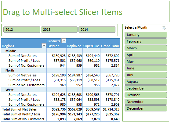
How to multi-select slicer items quickly
- Select the first item on slicer with mouse.
- Drag your mouse pointer to the last item you want to select.
- Instantly, all items in-between will also be selected.
Thanks Augie for teaching this to me.
Here are few more quick tips to start your day.


9 Responses
Thanks for the Kudos Chandoo!
Actually I have to pass along the credit to one of my team members back here @ TMIC — Rhonda Barker — she’s actually the one who showed me this trick!
Glad to hear the rest of your trip went well, and you’re back home with the family =)
-Augie
I think I’m being a bonehead – I can’t get this to work. Could someone detail it even more (even though it appears simple enough) so I can’t screw it up?
_____
Select the first item on slicer with mouse. – By select, do you mean so that the slicer shows the resizing dots/handles?
Drag your mouse pointer to the last item you want to select. – To drag my mouse after selecting, I have to put my cursor on the spreadsheet or slicers somewhere? Do I need to hold any modifier keys?
@Jim.. Sorry I wans’t clear. Simply click on the first item in your slicer as if you are slicing (filtering) the report. Then drag to last item.
I get it now. I thought you were referring to selecting multiple slicer objects at the same time, to make bulk changes to the slicer properties/size/etc., by dragging across the screen. You were actually talking about the items within the slicer itself. Sorry for my confusion.
Does anyone know how to select multiple slicer objects at the same time, to make bulk changes to the slicer properties/size/etc., without pointing to and clicking on each one of them?
The CTRL + Click (non-contiguous) or Shift + Click (contiguous) methods work as well if one desires to select more than one item in a slicer.
Hi Chandoo,
Happy Navaratri to you and all my fellows excel lovers.
Good to see you back. Will you be sharing your experiences in Houston via blog or podcast? I am eagerly waiting….! 🙂
Hi Chandoo,
I ll be very glad if you can share me the excel working of the Drag to multi-select slicer.
Hi Chandoo,
Hope all is well. Can you please share the sample file.
Thank you so much.
Thong
Hey,
Voting Thong – May we have sample file. It would be easy to understand oh i mean it would be very easy.
Thanks & keep smiling