
Hi friends, readers & fans of Chandoo.org,
I want to share a happy news with you all.
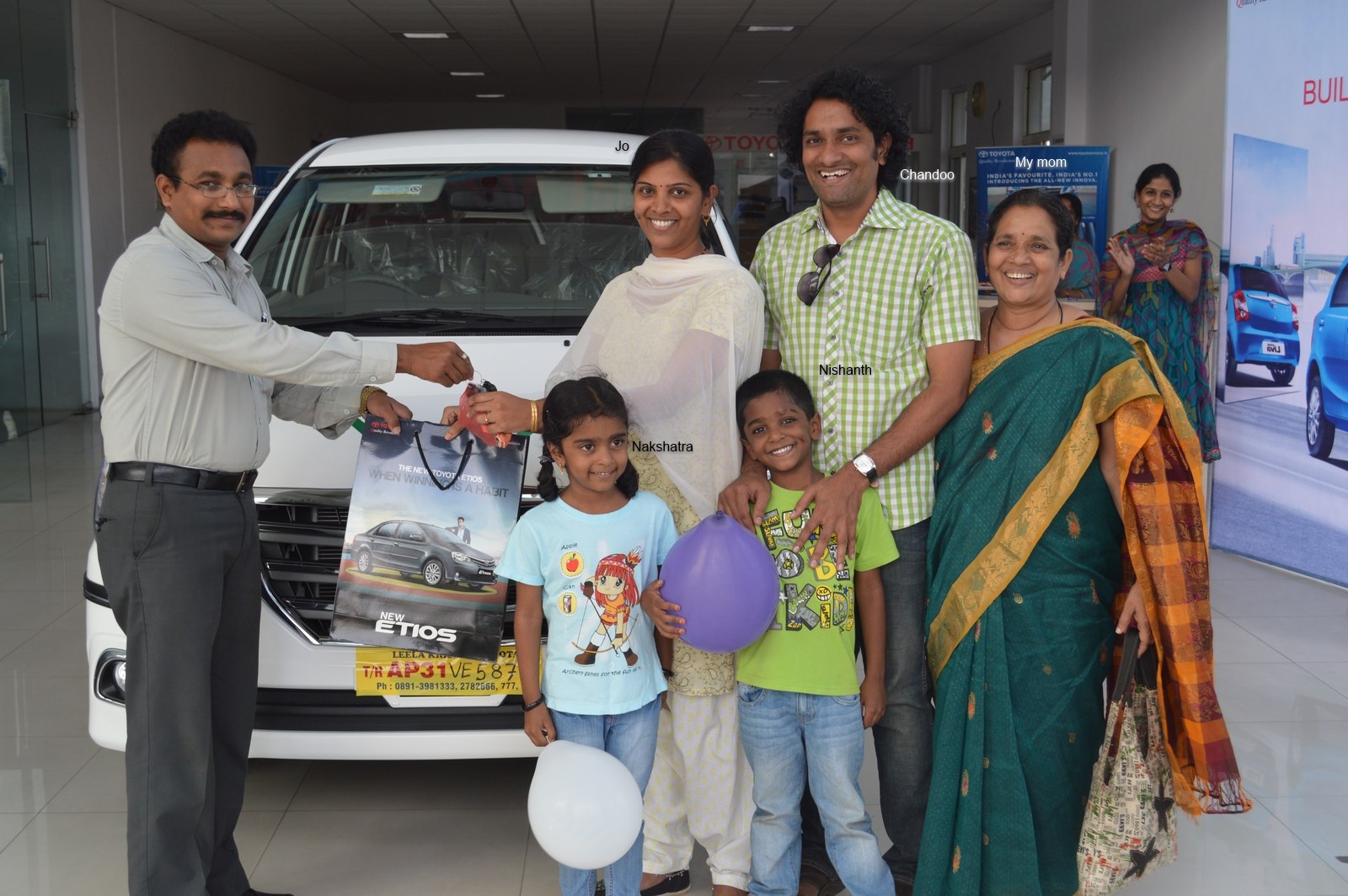
On Saturday (1st of February), we bought a new car. It is Toyota Innova. Pictures below (click to enlarge.)
Thank you & Excel
Before I tell you why I bought another car or how it is, first let me tell you this – Thank you. You constantly inspire me to learn more and share my knowledge. You support my little business in numerous ways – by joining our courses, purchasing our templates and recommending our site. With out your support and love, I would not even thought about buying a comfortable and lovely car like this. Thank you.
And I want to thank Microsoft Excel too. It is the reason why today my family is living a happy, healthy and peaceful life. Thank you Excel.
Why another car?

Long time readers of Chandoo.org remember that we already have a car. And if you know me, you know that I like to consume less and lead a frugal life. So adding another car to our family seemed like a conflicting choice. But we (my wife Jo & I) rationalized this by,
- Our current car doesn’t have any security features (no airbags, ABS etc.) So when we go on long drives, we have this nagging thoughts in our minds.
- Our current car is good for 4 people. As we frequently travel with other family members or friends, going out became an exercise in human squeezing.
- Driving Alto is fun, but driving it for anything more than an hour proved to a back-breaking punishment.
After spending few weeks short-listing car models, we narrowed down to our choice to Toyota Innova. Almost everyone we asked said, ‘Get Innova, it is boringly reliable’. It matched our expectations.
A little more about our car
- Our car is Innova ZX variant.
- It can seat 7 people (2,2 and 3)
- It has good safety features (2 airbags, ABS etc.)
- It drives like a car instead of MPV. Very convenient and comfortable.
- It has all the features you would expect in a car of this size.
- We paid roughly Rs. 1,800,000 (US $28,000) for this. No loan of course (I do not like buying things that I cannot afford.)

Thank you once again
Almost everyday I wake up with a smile, spend the day learning, feeling passionate about my work and go to sleep thinking nothing but how fortunate and blessed my family & I are. All thanks to you. Thanks to your kind support, generous attitude and love for learning, we have a home, car and all the comforts anyone can ask for. Thank you.
And thank you Microsoft & Excel for making my life exciting every day.
More personal stories:


75 Responses
Congratulations Chandoo!!
Somehow the name of car model suggests the choice was not a coincidence, ZX looks very similar to an excel column reference. Better change to $Z$X just in case 😉
You are an inspiration to all of us, drive it responsibly and enjoy it, congratulations!
Congratulations on the new car! Your contributions to the Excel community have been tremendous, and it is nice to see that your contributions and efforts are translating into successes.
PS, I recently purchased your Dashboard course in conjunction with Daniel’s Excel Hero course, and it was very helpful. Thanks so much!
Great, well done Chandoo. May the car serve you and your family well.
You truly are an inspiration..All the Best and happy motoring
Congratulations with your new car.
Keep up the amazing work, because with 3 kids, you will need to buy them a car too in the future. 😉
Thanks for your support.
All the best with your beautiful family.
Greetings from Europe/Guatemala/Indonesia.
Oliver
Oliver… Thank you. We have 2 kids. The tallest one is my niece. My sister-in-law’s family accompanied us to the car showroom.
I was thinking already with your professional skills, you will be able to give her also a car in the future.
Congratulations Chandoo! Wow ! How wonderful it must be for you and family. Wishing you all a safe and long journey with your new Toyota. You deserve this for being so awesome with the Excel classes !
Congratulations Chandoo!! In my opinion, your kids will have to work hard as their father to get whatever they want. Your example is a great lesson for them. Best regards.
Both as a dad & a person, I prefer if my kids can finance their own cars (and pretty much everything else). There is no better wealth than hard work & humility.
Congratulations on the new car. It’s great to read your personal stories. Excel is great in itself but this is the real gift of Excel: supporting and caring for your family. A very humbling thought.
Congratulations Chandoo!
You do and amazing job and this part of the result. Thanks for sharing with the class/Chandoo community, it’s great to learn more about you and not only Excel, very happy for you and all you do for us as well. Enjoy the car with your family!!!
Lina 🙂
Congrats Chandoo.
Congrats Chandoo !
Wishing you happy and safe journeys in your new ‘palace on wheels’ 🙂
It’s a *very good* choice… I’ve driven it a few times, and I fully agree with the list of pros you have put up.
Chandoo, você tem fãs em todo o mundo! 🙂
Sou Brasileiro e leio sempre seus post, aprendo cada dia mais e mais sobre excel, graças as suas dicas!
lhe desejo muito sucesso!!!!
Congrats Chandoo,
You earned it, through your innovative approach and easy instructions on how to be awesome in excel and your ‘ask a question’, no wonder people use your site and pay for your classes. I have purchased your class and slingshotted my career, in fact i am now working on much larger projects with data warehousing because of the skills you teach and how i was able to use them in my field of work. because of my success, others at my work are purchasing your classes.
Your family deserves a nice new car and a safe one. Enjoy it. I am also inspired by your financing approach and bought when you had cash. Something i have aspired to do but have failed to accomplish so far.
Again, Congrats and keep going, you are an inspiration.
A man of your awesomeness deserves a Bentley!
Enjoy your new acquisiton
Chandoo,
Congratulations! Getting a new car is ALWAYS exciting. A new adventure every time you get in it.
Best of luck and thank you for all of your service.!
Congrats Chandoo. You deserved to reward yourself. And thank you for helping so many people to be awesome. Yesterday I learnt to combine Pivot Table and Vlookup to reduce time spent on a task by almost an hour. I know I too am about to thank Excel.
Congratulations to you Chandoo – very well deserved! I have owned several Toyotas over the years and I have been quite happy with every one of them. I currently have an ’05 Tunda.
One thing in your note caught my eye – you mentioned that you were adding the Innova – does that mean you are keeping the older vehicle that lacks any kind of safety features? It’s great to have a second car but if it’s unsafe you might be better off either being a one car family or replacing it with something that does have those features…Just a thought.
Enjoy that new car smell!
For time being we are keeping 2 cars. The reasons are simple.
– The new car is good but it is too big when 1-2 people are riding.
– Our old car offers excellent fuel economy and easy drive-ability in city traffic (Indian cities are congested, narrow and wild)
– It is my first car, so lots of fond memories.
– It is barely 3 years old with lots of miles left on it.
We will eventually replace it with a sedan, may be in 2 more years.
Chabndoo,
I am sure that once you teach Jo to drive, you will need two cars anyway…
She does drive. But since we both work from home and we use bike for all short distances, this is a rare case.
Congrats on the new ride. I LOVE the fact that you paid cash and didn’t get a car payment. That is impressive to me! Thanks for posting such an inspiring message.
You deserved it.. You are an excellent professional I have ever seen. Really great news and Congratulations. God will always with you..
Congratulations Chandoo and family,
You deserve to reap the rewards from your hard work and discipline. May you receive continued blessings.
Congratulations Chandoo! As someone who considers themselves an Excel Expert, I am constantly impressed with what you are able to teach me above and beyond what I already know. You definitely deserve to get your family what you deserve to get you safely where you want to go. And as a huge Dave Ramsey fan, you also made me proud to hear you bought it with cash. Fantastic!!
Congratulations Chandoo
Chandoo,
Its wonderful that you would share your good news with your e-community.
I hope the car repays your hard work many times over.
D
A new Car…Congratulations!!!
Dear Chandoo, Congrats on the purchase of new car. Good choice too. your thought of sharing it with your readers is wonderful. Also thanking MS is also showcasing the human in you. Great and God bless.
hey chandoo, congrats, can I borrow your car ?.,
hey chandoo, congrats, can I borrow your car?
congrats chandoo, can I borrow your car?
Congrats and my wishes to you to continue to grow further with your mother and your family.
First of all, I wish you all the best with that car and with your family.
What I would like to learn is that how you can make an animated-like video-pic while using in your emails to us. It would be really great if you respond that:))
@Serdar.. thank you. I use Camtasia Screen Recorder to create animated GIFs. Please visit http://chandoo.org/wp/about/what-we-use/ to know more about the tools we use.
Congrats, Chandoo – no one deserves it more thay you. You are an inspiration to me and every morning I wake up to a cheerful mail in my Inbox waiting to be opened and explored, with a cup of coffee, that is!
Enjoy! 🙂
Congratulations Chandoo,
You are a perfect role model for many of us. You inspired me to learn macro.
A Big THANKS for sharing this happiness with all of us. May you and your family keep smiling every moment.
With Regards
Rudra
Congrats
Congratulations Chandoo!!
Thanks for sharing your sweet memories with us.
Congratulations Chandoo….
Congratulations Chandoo!!
Congratulations Chandoo…
Thanks for sharing good news.
My dear lovely Brother,
First of all I congratulating you to get a new Car. If you permit me to say something about your new car is that, It is just entering the basic excel functions to Advance excel functions like sum to Sumifs, count to countifs, vlookup and micros. not only that but now you have the power of POWER PIVOT and VBA function support with that CAR.
I am great fan of your excel examples listed in your website, I have learned a lot from these examples and generated my own small-small Excel databases for my organization for daily use. These databases are look like a software in use and n number of database has been developed till now for various sections of the organization. one of the favourate database named as ‘FOOGLE’ which i have generated. It is basically designed for searching the files lying in one section (Just like a library of files) of our organization and kept in various almirah.
Thanks brother for the love. I am so happy to hear that you are putting what you learn here in to practice. All the best.
Hearty Congratulations! and wishing safe, happy and enjoyable driving! It is really great to know that Excel helped you in this. May you ‘Excel’ in everything you do in future!
Congratulations Chandoo!!
Congratulations Chandoo……….!!!!
Congratulations Chandoo on the new acquisition! And thank you for the wonderful lessons on excel. I’ve been able to achieve better results at work because of your VBA course. Kudos again!
Congratulations Chandoo! A new car is always a reason to give thanks. I had that experience 2 years ago. Thanks to you I am more excited about Excel and wake up each day with an Excel solution in my head. You rock! Hope you and family build lots of memories with this new car!
Congratulations Chandoo! Thanks to you I am more excited about Excel and wake up each day with an Excel solution in my head. You rock! Hope you and family build lots of memories with this new car!
Congrats Chandoo.
Here downunder, we had a Toyota Avensis – a very similar compact 7-seater – for a great 12 years and 292,000kms, sadly traded two weeks ago. My two daughters sat in the middle row and we separated my son to the back. We could comfortably fit the hockey goalkeeper gear in as well for our many all around NSW trips to carnivals and championships, and holidays.
Good to see that it doesn’t appear to have a cream interior!
I’m sure you and your beautiful family will have the same years of enjoyment that we had from ours.
And thankyou for such a great community.
Thanks to shared the moment Chandoo.
A new car just cool like you…Congratulations!
Congratulations Chandoo,
Keep Growing, Stay Healthy, you inspired me alot…
Enjoy…….
I am very happy for you chandoo…. Proud to found this site for myself 🙂
Congratulations Chandoo! You deserve it. Personally I can say since I found your website my own salary has increased from $18/hr to 27! Not too shabby for one year, and I bought a 20 year old Subaru to celebrate. Your PowerPivot class was great, I’m impressing the Controller and CFO every day, and even though I’ve never liked charts, I’m learning to like them. And I never thought I’d care about arrays or macros but lately I’ve been wondering if I could figure those out too, with your help of course. Keep it coming, thanks so much!
Wow.. that is a wonderful testimonial. Thank you so much for sharing. And many congratulations for being awesome (and your hike and car).
Nice! I wonder what the spreadsheets used to make this decision look like.. 🙂
I was tempted to go the spreadsheet route. But decided it after speaking with several people, test driving few cars and asking my wife.
Thanks everyone for your wishes, kind words & love. I feel so blessed and fortunate to have supporters like you.
Congratulation.
I hope that you and your family have a good time with new car.
Congrats Chandoo… I still remember your post about small Alto car and happy to see with a bigger car with a big family 🙂 Safe drive !!
Congrats Chandoo…
Congratulations. As a true excel nerd you will need a gas mileage table. I started my first in 2006 when I bought a car running on ethanol (lots of friends told me I was crazy). Excel proved that my decision, at that time in Stockholm, Sweden, was economically very viable. Today I have a different car, burning gasoline, but I still have a gas mileage table.
Monday I will enroll in BundlePowerPivotOblivion, so from now on I will be very much around on this site.
As long as I learn I live!
congrats chandoo sir
you are a true inspiration for new bloggers in india.
Congratulations!!!
^^
Congratulation Sir………!!!
Excel …ent from Lima Peru…
Dear Chandoo,
Heartiest Congraluations !!!! One day you will have BIG BMW.
Regards,
Raj
Teacher, you deserve to have IT!!
Respect from your apprentice in Indonesia
U really deserve it……………..Great.
Cgts Chandoo..Wish you good luck and drive safe 🙂