
If this Excel problem is a Bollywood (Indian movie) plot, it would go like this:
Situation: Your boss gave you a worksheet. It has a lot of number chunks. And you need to calculate the sum of each chunk. Quickly!
Twist #1: The villain (your boss, who else) has abducted your spouse. For every extra hour you spend on the problem, your boss will make your spouse go thru one of the boring 97 slide strategy presentations. And his laptop is full of those strategy presentations.
Twist #2: The F1 key on your keyboard is missing.
Twist #3: The coffee machine in your floor is broken again.
Twist #4: And just when you are pressing CTRL+S, the movie steers in to an item song.
—-
Fortunately, no one abducted your spouse. And hopefully the coffee machine is working. But the Excel problem remains unsolved.
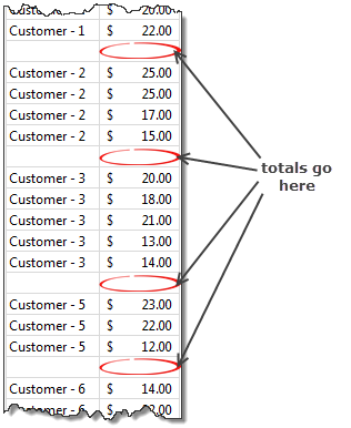
Sporadic totals
This problem is based on a call I received last week from one of our readers in UK. He had a worksheet full of numbers with blank rows between every few numbers. And he wants to calculate the totals of individual chunks of numbers quickly. He cannot write one formula and paste it everywhere as the chunks are not uniformly sized. He cannot write individual formulas as the data is very large.
So what to do?
If we are still in a Bollywood film, you can write all the 10,000 formulas and simultaneously sipping screwdrivers & shimmying to a snazzy song with sexy starlets.
Alas, this is not a movie.
But we still manage to look awesome. Thanks to superb sidekicks – Goto Special & Autosum.
Calculating Sporadic Totals in a second
See this short video to understand how to calculate sporadic totals in a few seconds. With the time saved, you could fix yourself a cocktail (or coffee) and hum a beautiful song.
Watch the video on our YouTube Channel or Facebook Page.
Sporadic Totals – Alternative treatment
It is an awesome co-incidence that both MrExcel (Bill Jelen) and Kevin Lehrbass also published videos about this concept around the same time. MrExcel shows how to use VBA to do this, where as Kevin talks about using formulas. Check out both videos too.
Not enough sporadic data? Try this practice file
If you want to practice this technique, use this Excel file.
Leave the drama to movies, Learn Excel
We all love film drama like blowing up cars, high-speed chases, super-human stunts and spicy songs. But you sure don’t want that in your life. So learn Excel. Save time, use that to enjoy the drama elsewhere.
Click here to join our newsletter. Get awesome one step at a time.


40 Responses
I noticed that your method doesn’t work when one of the chunks only contain one row. Could you double check on that?
You are right. This approach works only when all chunks have more than 1 number.
noticed if only one row you could do:
select the data in col C
F5 – select blank cells
autosum
F5 – select formulas
F5 – select dependents (direct only)
hit delete
F5 – select formulas, then format appropriately
only problem is Cell C202 will not sum as the select blanks will not select that cell unless something is in cell B203, but knowing that only applies to the last data set, you could just put a character in there
My preference is almost always to keep the data and the calculations as separate as possible. (I am well aware that bosses can easily and often demand otherwise) To that end I would use one of two approaches to calculate this information.
The easiest would be to simply create a pivot table and hide the blank item. This wouldn’t sort this data correctly, but you could also easily add further calculations on the same data set.
The second approach would be to copy the customer column, paste it into another sheet, remove duplicates, and then calculate the totals using SUMIF. [i.e. =SUMIF(‘sporadic totals – practice’!$B$5:$B$197,A2,’sporadic totals – practice’!$C$5:$C$197) ]
VBA handles this very nicely:
[code]
Sub gettotals()
Dim toprange
Dim bottomrange
Application.ScreenUpdating = False
ActiveSheet.Range(“C5”).Select
beginloop:
toprange = ActiveCell.Address
If IsEmpty(ActiveCell.Offset(1, 0)) Then GoTo onevalue
Selection.End(xlDown).Select
onevalue:
bottomrange = ActiveCell.Address
ActiveCell.Offset(1, 1).Select
ActiveCell.Formula = “=SUM(” & toprange & “:” & bottomrange & “)”
ActiveCell.Offset(0, -1).Select
Selection.End(xlDown).Select
If IsEmpty(ActiveCell) Then Exit Sub
GoTo beginloop
Application.ScreenUpdating = True
End Sub
[/code]
Another fast way to calculate sporadic totals (using the example worksheet with two xollumns) is by using DATA/SUBTOTAL in the menu. In trhis case you have to select both collumns and add subtotals for Sales when Customer changes.
We can also use subtotals in excel . that is also simple
Great tip! One trick to add… You can get AutoSum to use the SUBTOTAL function instead of the SUM function if you apply a filter before clicking the AutoSum button.
For example, if you follow the steps in the video with the example workbook. BEFORE you select the constants by using the GoTo>Special menu, select cell C4 and click the Filter button on the Data tab of the Ribbon. In the filter drop-down in C4, uncheck (Blanks) from the criteria list. Now select the range C5:C97 and select constants with the GoTo>Special menu (you can also use keyboard shortcut Alt+; to select visible cells).
Now press the AutoSum button (Alt+=) and the blank cells below each group of values will be automatically filled with the SUBTOTAL function instead of SUM. You could then use any of the SUBTOTAL functions – Count, Average, etc. to return various results in the sheet.
I’m not sure of the practical application of this yet, but it does work. 🙂
@Jon Acampora
Super Awesome!
Very beautiful tip. Was aware of GoTo Sprecial but never knew that it can be used to solve this kind of problem. Thank you!!!!
yes, that’s true 🙂
1 – Goto the most top blank cell in amount column (assume is column C)
2 – type in formula =sumif(B:B,B11,C:C) (B11 is the most bottom cell of contain “Customer – 1”)
3 – Copy the formula cell
4 – Select column C blank cell by Control-G Goto Special
5- Paste the formula
Here is my attempt in VBA .
It seems to work. Comments welcome.
Sub addTotalsToDataBlocks()
‘————————————————————
‘Adds a sum function to the base of the rightmost column
‘of sporadic blocks of data within a worksheet
‘————————————————————
Dim oArea As Range
Selection.SpecialCells(xlCellTypeConstants).Select
For Each oArea In Selection.Areas
oArea.Cells(oArea.Rows.Count, oArea.Columns.Count).Offset(1, 0).Formula = “=sum(” & “R[” & -oArea.Rows.Count & “]C:R[-1]C)”
Next
End Sub
What a great tip – I’ve got a regular data checking procedure which I can use this (VBA Solution) on, saving me hours.
The MrExcel link resulted in me buying Bob Ulmas’s book ‘Excel Outside the box’. It’s thanks to Chandoo, MrExcel and other MVPs like Bob Ulmas that I’m where I am today.
Hi
Try this line in place of the existing Selection.SpecialCells( .. )
Selection.SpecialCells(xlCellTypeConstants, xlNumbers).Select
This overcomes some problems I found where there were column and row headers. It now only selects numbers in each chunk.
BTW it doesn’t like empty cells.
Every day is a school day !!
Cheers
Hello ! I am Brazilian , and I’m sorry I do not speak English as I’m using an online translator .
First wish a happy new year, or rather a happy every day . after all, time is something of the calendar.
Only hope I can make myself understood , and the translator translated properly .
is about conditional formatting formulas and macros .
I know that would not be the appropriate place to ask the question but do not know where to ask .
I already use conditional formatting with formulas , and I’m starting in vba in excel too, but not the point right .
I even managed to create a formatting rule using macro . But …
The manager conditional formatting rules seems not to exist for vba .
I want to use the ability to adjust the formulas when changing the area of operation of the condition .
the ability to be able to use vba identify colors , for searches with complex formulas in different areas of the worksheet.
Does it have to do something?
Anything will do , even if it is palliative.
So long and thank you for taking your knowledge with others .
Jorge Eduardo .
The easiest way is to filter the data & apply subtotals, that should do the job quickly. Cant think of VBA’s in this situation 🙂
Hello Yatheesh.
Thanks for responding.
But how do I do that? as I said, I’m new to excel, and also in vba. Despite the outlandish ideas. : P
The idea is to use different formulas, to find items that are correlated by some factor. to make cross-checks.
Happy New year
Now I thought, was that reply for me?
My idea can also be used to achieve subtotals.
Using formulas to find and make formatting of the values ??that you want, use a macro to find the colors and pick values??, copy and paste these values ??in other place then make the calculations you want.
or simply raved here.
Hi Chandoo,
Cool to share ideas even if accidentally! Once again, I really enjoyed your site in 2013 and I’m looking forward to your tips and humour in 2014.
Cheers,
Kevin Lehrbass
Thanx for sharing this tip on using “F5 special”.
I have a similar but different problem: a looong database where people marked modifications by changed formatting (eg red font or cell background).
It would be nice if you could find abberant formatting with F5 special, but that doesn’t seem to be the case.
Would anyone have an idea how to filter these, short of writing a VBA macro?
Thanx, Gijs.
I do not know if it works with F5 or is the case, You can leave a conditional formatting in place, she would act only if the value of a cell to be “x” or “y”.
example:
Select ($ b $ 12: $ b $ 120),
going to create conditional formatting with formula put the formula = $ A $ 1 = “X”, create the formatting that you want.
Now the B12 to B120 can put any formatting. but if you put “X” in A1 formatting will be the one you chose.
Well I think you already know that. I’m the only beginner here. “But sometimes the ideas elude us, even the simplest”
If it works, you can create a formula that format specific cells,
Type: = AND (B $ 11 = $ B $ 1, $ A $ 1 = “x”) that will format the column below that has a value equal to ($ B $ 1) if the value of A1 is “X”. may be even more complex, for example seeking, higher value and lower than.
=E(B$11=$B$1;$A$1=”x”)
the translator screwed formula
I found my answer, the very answer I gave,
something silly and easy to apply.
no need to change the area of ??operation of the conditional form,
just add a rule, and make it work like it’s INDEX and MATCH, and only do research in the area of ??the same name to one of the arguments, simple, fast and direct.
Jorge, I appreciate the input but none of what you say makes sense to me… The formatting is done already by others. I need to find the cells that have different formatting from all untouched ones. Regards, Gijs.
Sorry maybe could not understand, because of the online translation.
if he’d like to post a sample spreadsheet, you would understand.
http://www.sendspace.com/file/qpmgah
While there could be many alternate methods of doing it but still the best method according to me is just use the subtotals tool. It works fine. I just tried it.
Hi S K srivastava,
Yes, Subtotals is a great feature and it’s often all that is required.
However, the solution must fit the problem and sometimes the problem requires more steps. If for example the data is constantly changing or the data is in multiple columns then you would need something besides the subtotal function. This would either be VBA (Hui is a VBA expert here at Chandoo.org) or a series of formulas to automate the task.
Cheers,
Kevin
With my search for solution of my problem.
I think I found the solution for you.
The only thing I can do is formulas for conditional formatting. so I had to find solutions to various problems it. and unable to make self-sum with the values ??found by the formulas and has an easy to discover macro indendificar colors through conditional formatting.
If you guys are interested talk to me if you accept excel “E”, “OU”(“AND”, “OR”) in formulas I send a sample spreadsheet, I sent another wrong, then blacked out.
Can you make filtering even with> = <, well, all conditional formatting allows.
Create a macro that if you click a cell of “blue” color,
she does sum or count the items that are in another color, “red”, for example.
In B2 has (up), and C2 have (sum) sum the values ??of the top.
In B2 has (up), and C2 have (count) count items from the top.
In B2 has (low), and C2 have (sum) sum the items from below.
In B2 has (low), and C2 have (cont) Count the items below.
In B2 has (Lef), and C2 have (sum) sum the values ??of the left.
In B2 has (Lef), and C2 have (cont) Count the items on the left.
but only by color
I will modify, and make a formula in conditional formatting,
will be able to sum ??or count in any part of the spreadsheet with filters formulas conditional formatting, if you want to send a basic spreadsheet, I rely on it.
I will add function, X> = <Y
I hope you have been understandable.
I am using inline translator.
Se tiver alguém que entenda português BR,
eu acho mais fácil usar a formatação condicional do Excel para filtrar o que se quer,
E pelas cores, fazer a operação de soma das coluna ou das linha.
eu sei como identificar as cores, descobri a base de muitas noites de sono,
Se fizerem uma macro para pegar pela cor eu modifico e ainda faço uma formatação condicional para filtrar , com índice e tudo, eu sou fraco com macros.
eu realmente não preciso de parte de soma
eu vou corrigir as formulas para funcionar com OR e AND
escrevam uma macro,
Que, se clicar em uma célula de cor “azul” ou outra,
ela faça “soma ou contagem”, dos valores ou itens, que estão em uma outra cor, “vermelho”, por exemplo.
E se:
Em B2 tiver (up), e C2 têm (s), ela some os valores de cima.
Em B2 tiver (up), e C2 têm (c), ela conte os valores de cima.
Em B2 tiver (b ou d), e C2 têm (s), ela some os valores abaixo.
Em B2 tiver (b ou d), e C2 tem (c), ela Conte os itens abaixo.
Em B2 tiver (e ou L), e C2 têm (s), ela some os valores à esquerda.
Em B2 tiver (e ou L), e C2 tem (c), ela conte os itens à esquerda.
mas apenas pela cor,
estou colocado assim para se adaptar a qualquer planilha, já que vou fazer para que trabalhe até a linha 6000, e coluna zz,
Não vou colocar outros tipos de formulas nem outras macros, apenas modificar a macro para ela trabalhar com formatação condicional e fazer uma formula que trabalhe como índice vertical e horizontal.
Se alguém se interessar. vou colocar colocar bastantes opções na formula para se testar,
caso vc´s fiquem felizes e eu acredito nisso. eu queria pedi uma macro quase a mesma coisa, mas eu não preciso de soma nem nada disso.
Jorge Eduardo
Hey Chandoo,
You are doing great job by giving lots of sample templates. I have done some dashboards for my company using ur templates and putting some of my ideas.
May God bless you and your family.
Thanks once again. I learnt a lot.
Thanks this is nice approche.
I was think to select blanks only and entering some if logic with countifs formula
-Zuber
Purna this is my version of the video in Portuguese:
https://www.youtube.com/watch?v=XyNDQOdUx1A
Best regards
This problem can be solved by using PivotTable…it works awesome and easy to calculate…