Its what happens when you have to write a lot of vlookup formulas before you can start analyzing your data. Every day, millions of analysts and managers enter VLOOKUP hell and suffer. They connect table 1 with table 2 so that all the data needed for making that pivot report is on one place. If you are one of those, then you are going to love Excel’s data model & relationships feature.
In simple words, this feature helps you connect one set of data with another set of data so that you can create combined pivot reports.
Practical Example – V(X)LOOKUP hell vs. Data Model heaven
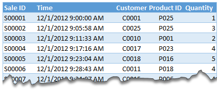
Lets say you are looking sales data for your company. You have transaction data like below.
And you want to find out how many units you are selling by product category and customer’s gender.
Unfortunately, you only have product ID & customer ID.
With VLOOKUP Hell,
You first fetch all the customer and product data and place them in separate ranges.
Then write a vlookup formula to fetch product category, another to fetch customer gender.
Then fill down the formulas for entire list of transactions.
Now make a pivot table.
Assuming you have 30,000 transactions, you have to write 60,000 VLOOKUP formulas to create this one report!!!
With Data Model heaven,
Create relationships between Sales, Products & Customer tables
Create a pivot table
Creating a relationship in Excel – Step by Step tutorial
First set up your data as tables. To create a table, select any cell in range and press CTRL+T. Specify a name for your table from design tab. Read introduction to Excel tables to understand more.
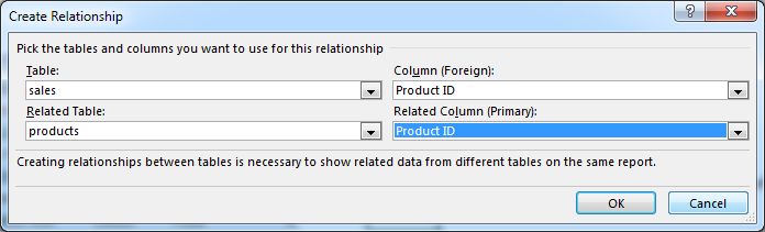
Now, go to data ribbon & click on relationships button.
Click New to create a new relationship.
Select Source table & column name. Map it to target table & column name. It does not matter which order you use here. Excel is smart enough to adjust the relationship.
Add more relationships as needed.
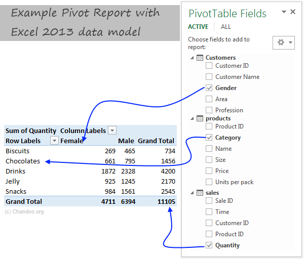
Using relationships in Pivot reports & analysis
Select any table and insert a pivot table (Insert > Pivot table, more on Pivot tables).
Make sure you check the “Add this data to data model” check box.
In your pivot table field list, check “ALL” instead of “ACTIVE” to see all table names.
Select fields from various tables to create a combined pivot report or pivot chart
Example: Category & Gender Sales Report
Add category to row labels
Add gender to column labels
Add quantity to values
and your report is ready!
Things to keep in mind when you using relationships
Same data types in both columns: Columns that you are connecting in both tables should have same data type (ie both numbers or dates or text etc.)
One to one or One to many relationships only: Excel 2013 supports only one to many or one to one relationships. That means one of the tables must have no duplicate values on the column you are linking to. (for example products table should not have duplicate product IDs).
You can add slicers too: You can slice these pivot tables on any field you want (just like normal pivot tables). For example, you can further slice the above report on customer’s profession or product’s SKU size.
Benefits of Data Model based Pivot Tables
Once you have a data model in spreadsheet, you will enjoy several benefits (apart from multi-table pivots that is). They are,
Distinct counts: This simple but often tricky to calculate number is easy to get once you have data model based pivot. Just go to value field settings and change the summary type to “Distinct count”. Here is a tip explaining how to get distinct counts in Excel pivots.
Measures & DAX: Once you have a Data Model, you can unleash the full Power Pivot features on your workbook. You can create measures (using DAX language) and calculate things that are otherwise impossible with regular Excel. Here is an example of percentage of something calculation with DAX & Data Model, to get started.
Pivots from data in other files & databases: You can combine data model with the abilities of Power Query to create pivots from data in other places. For example, you can make a pivot from sales data in SAP with customer data in CRM system. Here is an overview of what is Power Query?
Convert Pivot Tables to formulas: Once you have a data model based pivot table, you can turn it in to a set of formulas. You can access this feature from “Analyze” ribbon. This will replace your pivot with a bunch of CUBE formulas. Here is an overview of CUBE formulas.
Drawbacks of Data Model:
Of course, its not all cup cakes and coffee with Data Model. There are a few drawbacks of data model based pivot tables.
Compatibility: Data model & relationship feature is available only in Excel 2013 or above. This means, you cannot create or share such pivot reports with people using older versions of Excel.
Not able to group data: In regular Pivot Tables, you can group numeric, data or text fields. But with data model pivot tables, you can no longer group data. You must create another table with the group mapping and use it as a relationship.
Ever since discovering PowerPivot, I kind of stopped using VLOOKUP (or XLOOKUP) for most of my own analysis. Now that relationships are part of main Excel functionality, I am using them even more.
What about you? Are you using relationships & data model in Excel? What cool things are you doing with it? Share your tips with us using comments.
Want even more? Try PowerPivot
If you want even more out of your reports, then try PowerPivot. It is a new feature in Excel 2013 (available as add-in in Excel 2010) that can let you do lots of powerful analysis on massive amounts of data. Here is an introduction to PowerPivot.
Thank you so much for visiting. My aim is to make you awesome in Excel & Power BI. I do this by sharing videos, tips, examples and downloads on this website. There are more than 1,000 pages with all things Excel, Power BI, Dashboards & VBA here. Go ahead and spend few minutes to be AWESOME.
Read my story • FREE Excel tips book
Data is Excel 2013 behaves so much like a OLAP cube when using with PivotTables. And this is actually wow. Consider learning not just DAX but MDX too 🙂 Happy Excel
@Chandoo.. Have a nice and safe time in US. Best Wishes. And when they are publishing your interview in Entrepreneur 🙂
I have been using PowerPivot in Excel 2010. My understanding was (via PowerPivot Pro blog) that Power Pivot would NOT be available in Excel 2013 in all versions; my recollection is that it was only going to be available in certain enterprise subscription editions. Thus, for individual users, it will no longer be available? For that reason I have moved some of my projects to Tableau, and do not expect to upgrade to Excel 2013.
Can you confirm the availability of Power Pivot for all Excel 2013 users , or will it be restricted and unavailable for some users?
This is something that Excel is doing very poorly: letting people know what’s available with what. It also doesn’t help that they have so many packages and versions.
Excel Professional Plus has Power Pivot and Power View. I went through this last week. Spent 4 days upgrading from 365 Home Premium ($99 for the 1-yr subscription) to an additional $7/month for Professional Plus.
Also, one page on Microsoft’s site says that their Sharepoint Online Package 2 has Power View. NO! It’s not true. Sharepoint Online Package 2 will INTERACT with a spreadsheet that has PP or PV, Package 1 will not.
Just this weekend I upgraded from Home Premium to Professional Plus and spent time with Power View and PowerPivot.
Up to that point I never saw myself in VLOOKUP Hell, and it may not be going away any time soon. I’m surprised to discover how many of my clients are still on Excel 2003. And then I have Mac users who don’t have a lot of this great stuff available to them at all.
These are great features and I’m going to dive into the Data Models. Unfortunately, I suspect, for me, the practical use may be limited to blogposts because I can’t teach Power View in my workshops or send a client a spreadsheet that has a Power View in it.
I think the Microsoft would only upgrade the excel to a certain level instead of making it so powerful that it might threat their BI product. You know these “powerful” stuff can be easily done with a entry level crystal reports version.
Glad to listen to ur opinion on it.
I spent quite some time and energy on Excel and used it a lot, but now I am focusing energy on BI software like crystal reports.
We both know that based on the technology today. All the time we spend on the Macro and advanced function of Excel can be done easily with other softwares which costs only hundreds of bucks.
@Thondom
I don’t think Excel tries to be the solver of all problems
It is a generic tool
Which for about 95% of people will do what they want 95% of the time
There will always be specifics where specific custom software will do better than Excel
It is the commonness of Excel which means that I can send a model to you and it will work , most of the time, that is its strength, of course combined with its flexility in being able to be adapted to suit most needs
for the business and individual, who spend too much resource on Excel to meet their BI requirements and other processing requests.
Should they open their eyes to other ways to do it, in this age? Especially for many people try too much time to process stuff with thousands lines of macro programming.
It is just as when human being created gun fire, the martial arts would not be that effective.
Ppl need to be prodent when they choose their solution.
Hi guys, I just came across your conversation. I have an example of BI vs. Excel stuff. Here in Russia there is an ERP-system called “1C”. It became a defacto standart for accounting, planning and BI / analytics. It is positioned as a flexible and powerful system and it really is.
But its reporting abilities aren’t user-friendly (or maybe just not me-friendly).
Many reports require programming and all those SQL things, so that is common for a company to have a couple of programmers who develop and code those reports.
So the common solution is to export data to Excel and then process it to be more suitable for further analysis or reporting.
Well, it’s obviously not a rule of thumb that special BI software can outperform Excel in day-to-day routine.
Hi Chandoo, thanks for publishing great Excel information. Pardon the ignorance as I havent used Data Model nor PowerPivot. But having seen your video clip on PowerPivot, how does Data Model differ from PowerPivot – the “process” seems familiar? Have a great day! And Excel to new heights! Regards,
Also, keep in mind that Data model only lets you combine tables. If you want to create powerful measures (for example show % improvement over last year sales), then PowerPivot is the way to go. For a tour of PowerPivot, visit http://chandoo.org/wp/2013/01/21/introduction-to-power-pivot/
Excellent posting, some pride themselves for having sheets with thousands of formulas or complicated formulas, but in the end the important thing is to work as little as possible.
@Nolberto let’s not gloat yet. Some people are forced to have thousands of complicated formulas when they don’t have the fancy tools. I’m sad for the 2003 users who have to use SUMPRODUCT when the rest of us have SUMIFS available.
In the end, I think the important thing is clean, trustworthy data–however you arrive at it. People survived more than 300 years with slide rules and paper. No PowerPivot for the Wright Brothers.
i added 2 column into sales, 1st column vlookup customer ID to CUST sheet to get the male or female, then 2nd column vlookup Product ID to Product sheet to get the product name, then after that i make pivot table out of sales sheet.
but then the result is really different from yours
the purposes is just try to do the vlookup vs add to data model to see if they get same result
Hi Chandoo, .I am interested to know whether we can build a star schema or snow flake data models through relations in Excel? (trying to correlate with Qlikview)
What if customer.profession change its value after sometime?
Supposed we have monthly data for Sales. What if one customer is a doctor in Feb, then a pilot in October, for example?
Hello ,
I find this option similar to that of MS Access.
In MS Access as well we have relationship concept and once you create a relationship, you can start creating number of queries based on that.
But MS Access is not so user friendly and basically its database. Good that we are getting those options/functions in Excel.
Thanks for sharing this info.
Hi there, can anyone help? I tried testing this out in Excel using two tables. When I go to the Data tab the Relationships button does not appear at all. I am using Microsoft version 14.0.4760.1000, Microsoft Office Professional Plus 2010. Does this version have this capability? Or is there an add-in required?
I need to use a slicer to allow a user to select vendor by name. In the background, I need to obtain the vendor ID to link to multiple datasets where the name may not be spelled consistently. Any advice?
I’d suggest try that and then if you have troubles ask the question in the Chandoo.org Forums http://forum.chandoo.org/
Attach a sample file to simplify the response
I’ve tried this in Excel 2016. It works great.
I can even create Cube Formulas on the Data model after I’ve inserted the pivot table.
Just for the fun of it, I tried to see if I could do Cube Formulas without creating the pivot table in advance. I can define Cube members, but it seems as if the measure part is playing tricks on me.
I can’t get a Cube Value for Chocolates sold to Male customers.
With the Pivot created the formula looks like this (and works fine)
=CUBEVALUE(“ThisWorkbookDataModel”;”[Customer].[Gender].&[Male]”;”[Product].[Category].&[Chocolates]”;”[Measures].[Sum of Quantity]”)
Does anyone know how I can solve this, or am I asking the impossible?
What if customer.profession change its value after sometime?
Supposed we have monthly data for Sales. What if one customer is a doctor in Feb, then a pilot in October, for example?
In such case, you need to make relationships based on two columns. This kind of feature is not supported in Excel. You can use Power Query to merge tables based on multiple columns and return a consolidated giant table to Excel for reporting.
Hi. This has really taken my interest.. I have huge data tables to work with…and I use vlookup to fetch certain data. I have different data in different sheets…
Like customer sales (customer code, product code,qty, piece rate, total amount, branch code) data in one sheet
Branch details in another (branch code, branch address, state , region)
Customer Geographical Data in third sheet (region, region name)
Product details in fourth sheet (product code, product description and related)
Now I use a vlookup to get branch name, state and product name respectively into my main sheet.
Now what I want is
customer code, product code,qty, piece rate, total amount, branch code) data in one sheet, branch address, state , region, region name, product description
Can’t his be done thru data model… I tried but it’s not working… Eitherway, I will gonthru thr session on e again and give a try… Any help, is appreciated. Thankyou
i am striving to do reverse relationship in Power pivot ,
example : –
1 – Data sheet
2. – Source data
step to stops – import first data sheet in power piovt and then source data , made relationship with both sheet , after created relationship i am able to do put related formula in source data sheet only (=releted(‘Source data'[Amount]), if i go to put formula in data sheet , parameter of Source data are not visible ,
could someone educate me how can i do , and utilize related formula in data sheet.


41 Responses
Data is Excel 2013 behaves so much like a OLAP cube when using with PivotTables. And this is actually wow. Consider learning not just DAX but MDX too 🙂 Happy Excel
@Chandoo.. Have a nice and safe time in US. Best Wishes. And when they are publishing your interview in Entrepreneur 🙂
I have been using PowerPivot in Excel 2010. My understanding was (via PowerPivot Pro blog) that Power Pivot would NOT be available in Excel 2013 in all versions; my recollection is that it was only going to be available in certain enterprise subscription editions. Thus, for individual users, it will no longer be available? For that reason I have moved some of my projects to Tableau, and do not expect to upgrade to Excel 2013.
Can you confirm the availability of Power Pivot for all Excel 2013 users , or will it be restricted and unavailable for some users?
@Buzz
I believe that Power Pivot is included with all MS Office installs in 2013.
Have a read of:
http://office.microsoft.com/en-001/excel-help/version-compatibility-between-powerpivot-data-models-in-excel-2010-and-excel-2013-HA103929426.aspx
http://office.microsoft.com/en-001/excel-help/whats-new-in-powerpivot-in-excel-2013-HA102893837.aspx
http://en.wikipedia.org/wiki/Microsoft_Office_2013#Comparison (Note that Excel isn’t listed as having Multiple editions)
This is something that Excel is doing very poorly: letting people know what’s available with what. It also doesn’t help that they have so many packages and versions.
Excel Professional Plus has Power Pivot and Power View. I went through this last week. Spent 4 days upgrading from 365 Home Premium ($99 for the 1-yr subscription) to an additional $7/month for Professional Plus.
Also, one page on Microsoft’s site says that their Sharepoint Online Package 2 has Power View. NO! It’s not true. Sharepoint Online Package 2 will INTERACT with a spreadsheet that has PP or PV, Package 1 will not.
Just this weekend I upgraded from Home Premium to Professional Plus and spent time with Power View and PowerPivot.
Up to that point I never saw myself in VLOOKUP Hell, and it may not be going away any time soon. I’m surprised to discover how many of my clients are still on Excel 2003. And then I have Mac users who don’t have a lot of this great stuff available to them at all.
These are great features and I’m going to dive into the Data Models. Unfortunately, I suspect, for me, the practical use may be limited to blogposts because I can’t teach Power View in my workshops or send a client a spreadsheet that has a Power View in it.
Hi OZ,
I think the Microsoft would only upgrade the excel to a certain level instead of making it so powerful that it might threat their BI product. You know these “powerful” stuff can be easily done with a entry level crystal reports version.
Glad to listen to ur opinion on it.
I spent quite some time and energy on Excel and used it a lot, but now I am focusing energy on BI software like crystal reports.
We both know that based on the technology today. All the time we spend on the Macro and advanced function of Excel can be done easily with other softwares which costs only hundreds of bucks.
@Thondom
I don’t think Excel tries to be the solver of all problems
It is a generic tool
Which for about 95% of people will do what they want 95% of the time
There will always be specifics where specific custom software will do better than Excel
It is the commonness of Excel which means that I can send a model to you and it will work , most of the time, that is its strength, of course combined with its flexility in being able to be adapted to suit most needs
Hi Hui,
You are right.
But,
for the business and individual, who spend too much resource on Excel to meet their BI requirements and other processing requests.
Should they open their eyes to other ways to do it, in this age? Especially for many people try too much time to process stuff with thousands lines of macro programming.
It is just as when human being created gun fire, the martial arts would not be that effective.
Ppl need to be prodent when they choose their solution.
Hi guys, I just came across your conversation. I have an example of BI vs. Excel stuff. Here in Russia there is an ERP-system called “1C”. It became a defacto standart for accounting, planning and BI / analytics. It is positioned as a flexible and powerful system and it really is.
But its reporting abilities aren’t user-friendly (or maybe just not me-friendly).
Many reports require programming and all those SQL things, so that is common for a company to have a couple of programmers who develop and code those reports.
So the common solution is to export data to Excel and then process it to be more suitable for further analysis or reporting.
Well, it’s obviously not a rule of thumb that special BI software can outperform Excel in day-to-day routine.
Hi Chandoo, thanks for publishing great Excel information. Pardon the ignorance as I havent used Data Model nor PowerPivot. But having seen your video clip on PowerPivot, how does Data Model differ from PowerPivot – the “process” seems familiar? Have a great day! And Excel to new heights! Regards,
@Tris, one main difference is that Data Model is part of Excel Home Premium. You’ve got to upgrade to ProPlus to get PowerPivot and Power View.
Also, keep in mind that Data model only lets you combine tables. If you want to create powerful measures (for example show % improvement over last year sales), then PowerPivot is the way to go. For a tour of PowerPivot, visit http://chandoo.org/wp/2013/01/21/introduction-to-power-pivot/
Excellent posting, some pride themselves for having sheets with thousands of formulas or complicated formulas, but in the end the important thing is to work as little as possible.
@Nolberto let’s not gloat yet. Some people are forced to have thousands of complicated formulas when they don’t have the fancy tools. I’m sad for the 2003 users who have to use SUMPRODUCT when the rest of us have SUMIFS available.
In the end, I think the important thing is clean, trustworthy data–however you arrive at it. People survived more than 300 years with slide rules and paper. No PowerPivot for the Wright Brothers.
hi chandoo,
i added 2 column into sales, 1st column vlookup customer ID to CUST sheet to get the male or female, then 2nd column vlookup Product ID to Product sheet to get the product name, then after that i make pivot table out of sales sheet.
but then the result is really different from yours
the purposes is just try to do the vlookup vs add to data model to see if they get same result
thanks
Hi Koi,
We are using gender vs. category in the report. Can you try with that? I am sure the results will match.
ups sorry, didnt see that you’re filtering using slicer..then it is good now the result are same with less effort 🙂
thanks
Hi Chandoo, .I am interested to know whether we can build a star schema or snow flake data models through relations in Excel? (trying to correlate with Qlikview)
Hi there,
You can create a Star schema for sure. Snow-flake is possible too. As long as all relationships are one to many (or one to one) anything is possible.
What if customer.profession change its value after sometime?
Supposed we have monthly data for Sales. What if one customer is a doctor in Feb, then a pilot in October, for example?
How to build data model for such that situation?
Thank you.
Hello ,
I find this option similar to that of MS Access.
In MS Access as well we have relationship concept and once you create a relationship, you can start creating number of queries based on that.
But MS Access is not so user friendly and basically its database. Good that we are getting those options/functions in Excel.
Thanks for sharing this info.
Regards,
Raghavendra Shanbog
What is star schema and snow flake.??? Can we have next article on that if it is useful for us???
Hi there, can anyone help? I tried testing this out in Excel using two tables. When I go to the Data tab the Relationships button does not appear at all. I am using Microsoft version 14.0.4760.1000, Microsoft Office Professional Plus 2010. Does this version have this capability? Or is there an add-in required?
Chandoo/Hui,
The dates grouping feature does not seem to work in Data Model. Is that true or am I making a mistake somewhere?
I don’t think this is really for “lookups”…
Try creating a pivot with sale ID and customer name in row fields. It will give you ALL customer names per sale ID.
You’d need to use RELATED function in a new column in powerpivot if you want something equivalent to “vlookup”
Please explain the difference between data model and power pivot, the functions of both of them are different and similar
thanks
I need to use a slicer to allow a user to select vendor by name. In the background, I need to obtain the vendor ID to link to multiple datasets where the name may not be spelled consistently. Any advice?
@Bernadette
You can use the technique described here:
http://chandoo.org/wp/2016/05/11/apply-conditional-formatting-using-slicers/
I’d suggest try that and then if you have troubles ask the question in the Chandoo.org Forums http://forum.chandoo.org/
Attach a sample file to simplify the response
I’ve tried this in Excel 2016. It works great.
I can even create Cube Formulas on the Data model after I’ve inserted the pivot table.
Just for the fun of it, I tried to see if I could do Cube Formulas without creating the pivot table in advance. I can define Cube members, but it seems as if the measure part is playing tricks on me.
I can’t get a Cube Value for Chocolates sold to Male customers.
With the Pivot created the formula looks like this (and works fine)
=CUBEVALUE(“ThisWorkbookDataModel”;”[Customer].[Gender].&[Male]”;”[Product].[Category].&[Chocolates]”;”[Measures].[Sum of Quantity]”)
Does anyone know how I can solve this, or am I asking the impossible?
I want to see the video on this topic
What if customer.profession change its value after sometime?
Supposed we have monthly data for Sales. What if one customer is a doctor in Feb, then a pilot in October, for example?
How to build data model for such that situation?
Thank you.
In such case, you need to make relationships based on two columns. This kind of feature is not supported in Excel. You can use Power Query to merge tables based on multiple columns and return a consolidated giant table to Excel for reporting.
Is it able in MS Access?
I have never used access before.
thanks chandooo your article is very helpfull for troubling peoples’ especially in office environment under boss pressure.
Here is an introduction to PowerPivot.
The link above is broken
Hi. This has really taken my interest.. I have huge data tables to work with…and I use vlookup to fetch certain data. I have different data in different sheets…
Like customer sales (customer code, product code,qty, piece rate, total amount, branch code) data in one sheet
Branch details in another (branch code, branch address, state , region)
Customer Geographical Data in third sheet (region, region name)
Product details in fourth sheet (product code, product description and related)
Now I use a vlookup to get branch name, state and product name respectively into my main sheet.
Now what I want is
customer code, product code,qty, piece rate, total amount, branch code) data in one sheet, branch address, state , region, region name, product description
Can’t his be done thru data model… I tried but it’s not working… Eitherway, I will gonthru thr session on e again and give a try… Any help, is appreciated. Thankyou
Dear All,
i am striving to do reverse relationship in Power pivot ,
example : –
1 – Data sheet
2. – Source data
step to stops – import first data sheet in power piovt and then source data , made relationship with both sheet , after created relationship i am able to do put related formula in source data sheet only (=releted(‘Source data'[Amount]), if i go to put formula in data sheet , parameter of Source data are not visible ,
could someone educate me how can i do , and utilize related formula in data sheet.