
When comparing 2 sets of data, one question we always ask is,
- How is first set of numbers different from second set?
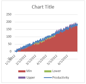
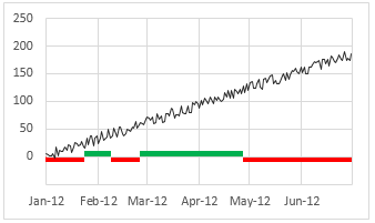
A classic example of this is, lets say you are comparing productivity figures of your company with industry averages. Merely seeing both your series as lines (or columns etc.) is not going to tell you the full story. But if we can shade our productivity line in red or green when it is under or above industry average… now that would be awesome! Something like below:
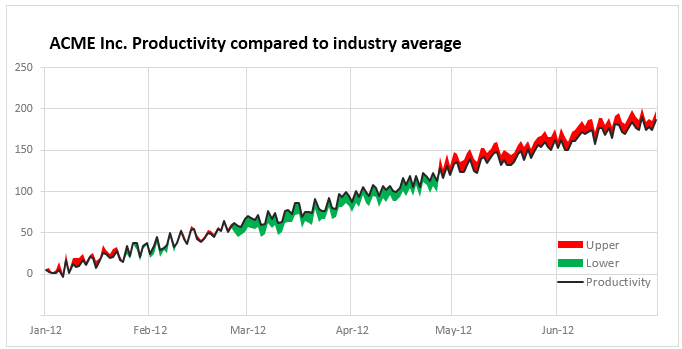
The above chart tells us where we are lagging and where we are good. It will let us ask poking questions about the gap and find answers (may be removing coffee machine from 2nd floor last May was a bad idea!)
So how do we create such a chart?
PS: This chart and article is inspired from a question asked by arobbins & excellent solution provided by Hui here.
Creating a shaded line chart in Excel – step by step tutorial
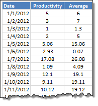
1. Place your data in Excel
Lay out your data like this.
2. Add 3 extra columns – min, lower, upper
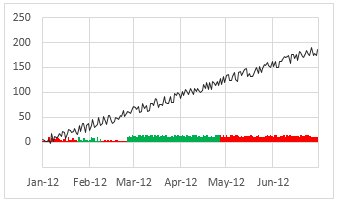
If you look at the chart closely, you will realize it is a collection of 4 sets of data. See this illustration to understand.
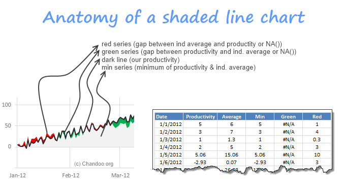
Write formulas to load values in to min, lower (green) & upper (red) series.
- Min is minimum of productivity and ind. average
- Lower (green) is difference between productivity and ind. average (or NA() if negative)
- Upper (red) is difference between ind. average and productivity (or NA() if negative)
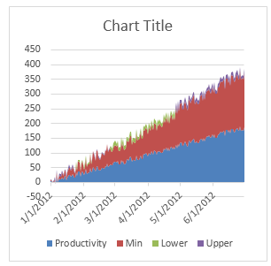
3. Create a stacked area chart from this data
Select all the 4 series (productivity, min, lower & upper) and create a stacked area chart.
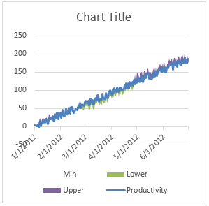
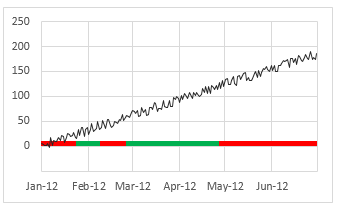
This is how it looks.
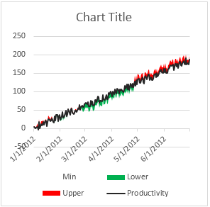
4. Format the productivity series as line
Right click on productivity series and using “Change series chart type” option, change it to line chart.
5. Make the min series transparent
Select min series and fill it with “No color”
6. Format lower & upper in green & red colors respectively
And you are done!
Optional: adjust series formatting, add grid lines etc.
As a bonus, you can add vertical grid lines (so that we can understand the red green changes easily) and format the horizontal axis. You can also move around the legend and remove the words “min” from it.
This will make the chart look really awesome.
Is this the only way to compare productivity with industry averages?
Although our shaded line chart is an excellent way to visualize differences between 2 series of data, I kept thinking if there are other ways to compare this.
After a bit of doodling & drawing inspiration from various charts I have seen earlier, here are 4 more options we can consider.
Option 1 – Productivity vs. variance wrt Ind. average
This chart shows the variance (industry average-productity) at bottom so that we can easily look at overall trend & understand how we fared with respect to industry.
To create this chart, you just have to calculate the variance in a separate column and create a column & line chart combination (column for variance & line for productivity). Once such a chart is ready, go to fill options for the column chart and check invert colors if negative option and set up green & red colors!
Option 2 – Productivity vs. better or worse indicators
This chart just shows whether productivity surpassed industry average or not in a boolean state (green for yes, red for no)
This chart is a combination of line & column chart with same principle as above (invert if negative option).
Option 2 (made using Excel 2010 Sparklines)
You can create this chart very easily with Excel 2010 sparklines. Line chart for productivity and win-loss chart for better or worse indicators.
Option 3 – Collapsed Productivity vs. variance wrt Ind. average
Since the color is already telling us whether variance is negative or positive, we can collapse both to same side of axis (thus saving some space & reducing redundant information).
To create this chart, we need two series of data – positive variance & negative variance as 2 sets of areas on the chart.
Option 4 – Collapsed Productivity vs. better or worse indicators
Well, this is same as option 2 but collapsed.
Download Example workbook
Click here to download the Excel workbook containing all these examples. You can also see detailed steps for making the shaded line chart in it.
How do you compare one series with another?
I must confess that I never made shaded line chart until today. For smaller data sets (<15 items), I usually compare by making column charts or thermo-meter charts. These are easy to make and easy to understand. For larger data sets, I try to make dynamic charts so that I can choose which series to include in comparison or make indexed charts.
Now that I learned how to set up shaded line charts, I will try them in my upcoming projects & consulting assignments to see how they fare.
What about you? Which types of charts do you use to compare one series with another? Please share your techniques & implementations using comments. I would love to learn more from you.
Compare often? Check out these charts
If you compare apples to apples (or to an occasional bushel of oranges) for living, then check out these charting tutorials & techniques.
WARNING: After learning these techniques, Suddenly you will become incomparably awesome in your office.


19 Responses
Great topic.
Your Option 1 is one of my preferred methods, subject to a change of colour scheme. I know RAG (Red/Amber/Green) is a de facto standard, but red and green is the worst colour pairing of all for showing opposites, as 10% of males are red-green colour blind. Especially when using similar colour densities your options 3 and 4 would be quite unreadable to that section of the population. Unless mandated by management I also try to avoid using pairs of complementary colours for aesthetic reasons.
My other preferred method is similar, but shows the variation as a percentage of the actual productivity rather than the plain value. Ideally, the two would be combined in a small multiple.
I was just looking on how to do something like this for work. Oh the irony! This is great, thanks
EVEN THIS IS VERY GOOD TIP
This is fantastic.
I love it when a chandoo post happens to show a perfect solution for what you’re going to be working on that day.
I was using daily performance data & found that the chart jumped from above to below average too frequently to make any real sense.
Once I changed the data to look at a rolling 7 day average, the graph was perfect.
Thank you!
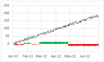
Thank you for this nice training. Just one minor thing a coundn’t handle: how disapear the -50 value in the axis? .. strange
Kind regards, SomeintPhia
Have you tried right clicking on the axis, selecting ‘format access’ & setting the minimum value to 0?
.. yes, I did, but then the space below is gone (but not on the example above)
.. now I found it, a custom style without showing the negatives .. 😉
Once again Chandoo shows us how we can doll up a chart. Thanks Chandoo.
Superb tip!
Out of interest would it be possible to have just the productivity line and colour code it red/green as appropriate?
@Snook

Yes
To do that create a new Chart using just the Date and Column N & O for the series
In Column N & O delete all the cells contents that have a #N/A error
Reformat as required:
I produce a weekly labor utilization graph that compares current year actual to target and two prior year actuals. The target utilization is represented by a medium density area graph (kind of mud colored).
The currently week actual is a dense line. Comparison is easy, if a week is below target it dips into “the mud”. Favorable weeks show the line above “the mud”.
The prior years are progressively lighter density lines. It is very easy to see what is going on currently and where the prior year cycles are.
The chart is nice, but there are some errors if you look in it with high definition!
Please try the main chart with x-values: Feb 22nd-28th and y-values 40-70. The important days are the 25th and 26th. The productivity changes from upper to lower, but there are both (red and green) areas.
The problem is, that the color have to switch between two points.
Bigger and often changes makes the problem more visibly.
A solution maybe possible with a (not stacked) area chart, but that means, that the area below “min” get the color white and the grid is not visible.
This does look pretty cool. I am having a small issue though with the 1st chart. I discovered the issue when I tried to add a line that would follow allong the “ind. average”. When I did this I saw that in cases when we switch from green to red or red to green the the area chart was not in-line with my newly added “ind. average” line.
For example if ind. average goes from being less than productivity to greater than, the 1st point of the red area starts on where productivity was on the last date before the switch which makes the slope of the top of the area less steep than the “ind. average” would.
What I think would be ideal is in the case where there is a change in area color, that the chart should show a vertical cliff on both on the last point befor the change and the 1st point after. Excel 2010 wont let me do this.
Does my issue make sense?
Wondering if this would be possible to set up using VBA to populate multiple graphs using multiple data sets?
This is so great!!! Thank you so much for sharing your work!